
SVG Drawing Animation
In Playground, by Manoela Ilic
A little experiment that explores the usage of SVG line drawing animations to precede the appearance of graphics or website elements, simulating the loading of them.
In Playground, by Manoela Ilic
A little experiment that explores the usage of SVG line drawing animations to precede the appearance of graphics or website elements, simulating the loading of them.

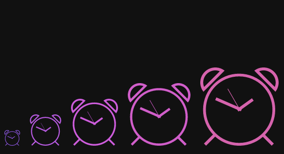
In Playground, by Manoela Ilic
The Codrops team wishes everybody a Merry Christmas and a happy new year! A big “Thank You” from us in form of a little demo with a bursting animated gift box and some flying icons.

In Playground, by Manoela Ilic
Some effects for a perspective page view navigation where the page itself gets pushed away in 3D to reveal a menu or other items. This navigation idea is seen in mobile app design and we wanted to explore some more effects.

In Playground, by Manoela Ilic
A set of flat and 3D progress button styles where the button itself serves as a progress indicator. 3D styles are used for showing the progress indication on one side of the button while rotating the button in perspective.

In Tutorials, by Sara Soueidan
In this article we’ll explore all the current techniques for creating image or texture filled text and show you how to apply them.
In Tutorials, by Oleg Solomka
Despite the growing popularity of SVG, its time around and excellent browser support, we have a lack of good vector icon approaches. It’s time to fill this gap and use SVG as icons in our web projects.

In Articles, by Kayla Knight
Should we let app design guide us more in website design? In this article we’ll explore how app design concepts can help rethink the planning and design of websites for a better user experience.

In Articles, by Sara Soueidan
When it comes to responsive type on the web, there’s more to do than just resizing the text’s container and having the text reflow inside of it. This in-depth article covers various techniques for making text responsive.

In Tutorials, by Diego Pardo
A tutorial on how to create an interesting animated 3D opening type effect with pseudo-elements, CSS transforms and transitions. The idea is based on Edenspiekermann’s Open Type project and it’s a very creative way to display and play with letters.

In Playground, by Manoela Ilic
ElastiStack is a little script that let’s you navigate through a stack of items by dragging away the first one. It comes with an elastic touch meaning that when dragging the top-most item, the other ones will follow as if they were connected elastically. When reaching a certain distance, the dragged item will release itself and the next item will pop out.

In Articles, by Sara Soueidan
There are several techniques for creating overlays: from using an absolutely positioned element to outlines and pseudo-elements. In this article we are going to explore each technique’s styles with their pros and cons.

In Playground, by Manoela Ilic
Using SVGs on websites is becoming more and more easy with great libraries like Snap.svg. Today we want to explore what we can do with it and animate some SVG icons as a practical example.
In Tutorials, by Brian Gonzalez
An article on how to achieve Medium’s next page transition effect—an effect that can be seen by clicking anywhere on the “Read Next” footer at the bottom of the page. This effect is characterized by the lower article easing upward as the current article fades up and out.

In Playground, by Manoela Ilic
Ever thought that clicking on multiple checkboxes is not a very user-friendly task? Imagine rows and rows of junk mail that you’d like to select in your email app. This little script tries to ease that task by allowing a rapid and simple selection of multiple items by clicking, holding and moving over the desired items.

In Blueprints, by Manoela Ilic
A template for a split layout with two sides. When clicking on a half in the initial view, the layout moves into the respective direction with some transition effects.

In Playground, by Manoela Ilic
There are many parts of a website where we can apply nice transitions to make things more interesting. Images are certainly great entities for playing with fancy effects and today we’d like to show you some inspiration for thumbnail effects using CSS animations.

In Playground, by Manoela Ilic
By animating an SVG path with JavaScript, we can do many fancy things. Today we want to show you some effects for checkboxes and radio buttons. The idea is to hide the inputs, use pseudo-elements to create a more appealing style and then animate the SVG paths once an input is selected.

In Playground, by Manoela Ilic
A collection of separator styles for horizontally dividing sections on a website. The dividers are created using several techniques, including styling pseudo-elements, using gradients and inserting SVG graphics with responsiveness in mind.
