From our sponsor: Leverage AI for dynamic, custom website builds with ease.
A while back we explored a morphing button concept where the active element gets transformed into its target, aiming to create a fluid UI experience with a semantic connection of the involved elements. Today we want to apply that same concept and some other ideas to the first step of the checkout process. The checkout process in online stores is one of the most challenging and crucial in terms of UI design. Done well it can create a pleasant and smooth purchasing experience for the user; done wrong, it can lead to an abandoned shopping cart and no sale at all. There are many carefully planned and well designed e-commerce sites out there and making the UI uncluttered is definitely a great trend welcomed by anyone who buys things online.
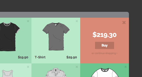
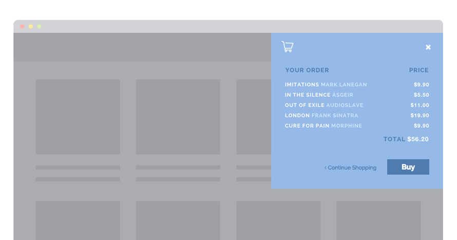
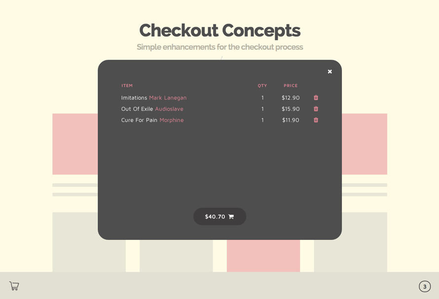
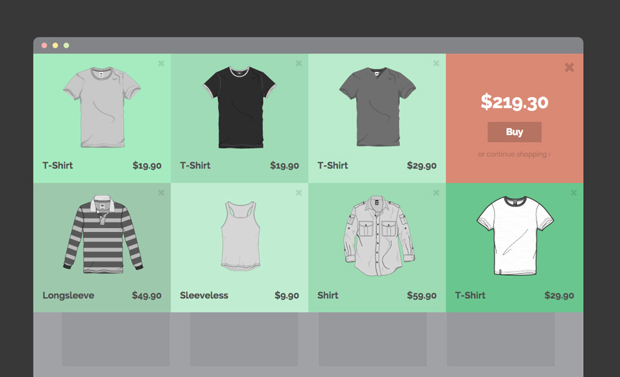
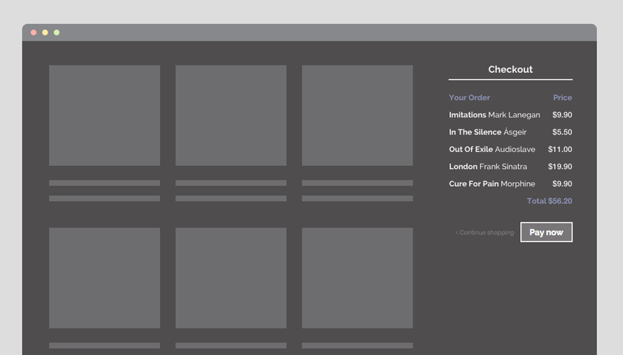
With the demos we’ve created today we are looking into how we can make the peek into the shopping cart, one of the potential first steps of the purchase process, more fun and engaging while exploring some new layouts and effects.
They are simple concepts that hopefully spark your imagination for new ideas.
Please note that we use lots of new CSS properties that will only work in modern browsers.
IE does not allow a transformation of table rows which is a real shame; so you might not see the table rows animating in some of the effects.
The shopping cart icon used in the demos is by Freepik from www.flaticon.com and it’s licensed under CC BY 3.0.
Here are the screenshots of the demos:
We hope you enjoy these ideas and get inspired 🙂


first comment 😀
This actually reminds me of the new Kohl’s checkout process. It is not quite as modern as this but it is definitely showing some better UI.
Awseome work!
Amazing! Really cool. I love the smoothness of the elements.
Just curious, I noticed on certain elements you had declared
transform: translate3d() translate3d();. Why was there a need to have it twice with different values? I figured the second would override the first. I wasn’t aware that you could have it twice on transform.Great use of CSS transitions by the way! They really work great!
I have an eCommerce site that I’m working on, and this tutorial/code couldn’t have come at a better time. Thanks Mary Lou! =D
You guys doing an amazing work on this… i just love codrops team, keep sharing and create new good things… im one of your fans… you guys help me in so many ways..
thank you
very good idea and more efficient use of UI/UX
Nice and Important article….! Thanks Mary..
AWESOME! 🙂 Love it!
Awesome Concept Mary Lou 🙂
I would of liked to have seen a worse case scenario including, subtotal, delivery, qty, long item names and descriptions. But overall very nice and inspiring!
How can I integrate that on my WordPress?
Es un excelente trabajo, muy limpio y con mucha funcionalidad, además es posible darle otros usos….
It looks really cool – you have talent!
so cool thanks for that
Mary – You are outstanding.. I love your creativity.. Great stuff !!
I’m alway interrested in these kind of visual effects and always want to use it for my projects. But does these kind of animations compatible with most of the browser of today? I can’t find any information for this.
I love them all but my favorite is the sidebar.
i like it 🙂
Thanks for sharing this. I normally love all that have some UX issues here. When shopping online the cart is very important and in all these examples there isn’t a running total visible prior to clicking the button or opportunity to “pay now” without reviewing the cart.
In terms of reviewing items in cart, I could see the final example being useful though and with all that said, still pretty, thanks for sharing
This design looks very nice, but i have some hesitation because even that looks very nice, something very important as the conversion must be contemplate before any changes on the checkout. Besides that it looks pretty good.
Hi! I’m trying to learn UX design and web development, and I’m really amazed at how you did these things! I would love to make some of these one day! How difficult are these to do? I still have a lot lot to learn, and I would love some advise
Mary Lou <3 <3 <3 <3
really cool and very clean ideas…. but its a shame they dont work on IE… still many people that use it 🙁
Mary Lou, thank you for the post!!
It’s beautiful and truly polished Checkout design. Might use it in my next web project. 🙂
Hey Mary Lou,
I really your creativity with the UX designs. so talented.
Absolutely love this! Working on an e-commerce now, definitely opened my eyes to a bit more innovation, thanks Mary!
i hope you moving towards social commerce, the next big thing.
Wow these are really good. Thanks
Wow!This is amazing.We at have been exploring some of these concepts.Cheers!