
From our sponsor: Leverage AI for dynamic, custom website builds with ease.
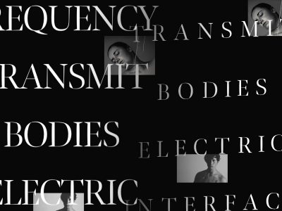
Happy new year, everybody! Today we will create a CSS-only fullscreen background image slideshow. We’ll create different image transitions and also make a title appear using CSS animations.
The images are by Mark Sebastian and they are licensed under the Creative Commons Attribution-ShareAlike 2.0 Generic License.
Note that this will only work in browsers supporting CSS animations.
This tutorial is a part of our latest CSS3 experiments; you can find more of those here:
- Original Hover Effects with CSS3
- Animated Buttons with CSS3
- Splash and Coming Soon Page Effects with CSS3
- Experiments with background-clip: text
- Experimental CSS3 Animations for Image Transitions
- Slopy Elements with CSS3
- CSS3 Lightbox
The Markup
We’ll use an unordered list for the slideshow and we’ll add a span for each image and a division with a heading:
<ul class="cb-slideshow">
	<li>
		<span>Image 01</span>
		<div>
			<h3>re·lax·a·tion</h3>
		</div>
	</li>
	<li><!--...--></li>
	<li><!--...--></li>
</ul>
The spans are going to be the elements that will have the background images of the slideshow.
The CSS
Let’s style the unordered list first. It will be fixed and we will stretch it over the viewport. We’ll also use a :after pseudo-element in order to place a pattern on top of the image:
.cb-slideshow,
.cb-slideshow:after {
    position: fixed;
    width: 100%;
    height: 100%;
    top: 0px;
    left: 0px;
    z-index: 0;
}
.cb-slideshow:after {
    content: '';
    background: transparent url(../images/pattern.png) repeat top left;
}
We’ll use a repeated dot pattern but you could as well use, for example, a css gradient with some transparency.
The span that will contain a slideshow image will be positioned absolutely and have a width and height of 100%. Since we have some text inside, we’ll make the color transparent because we don’t want to see it. The background-size property value “cover” will make sure that the background image covers all the area of the element and hence it is the size of the screen, it will cover all the visible viewport. The opacity is set to 0. We’ll then change that in our animation:
.cb-slideshow li span {
    width: 100%;
    height: 100%;
    position: absolute;
    top: 0px;
    left: 0px;
    color: transparent;
    background-size: cover;
    background-position: 50% 50%;
    background-repeat: none;
    opacity: 0;
    z-index: 0;
    animation: imageAnimation 36s linear infinite 0s;
}
The animation for each span will last 36 seconds and run an inifinite number of times. But let’s look at the details in a while, first, we will style the division with the headline:
.cb-slideshow li div {
    z-index: 1000;
    position: absolute;
    bottom: 30px;
    left: 0px;
    width: 100%;
    text-align: center;
    opacity: 0;
    color: #fff;
    animation: titleAnimation 36s linear infinite 0s;
}
.cb-slideshow li div h3 {
    font-family: 'BebasNeueRegular', 'Arial Narrow', Arial, sans-serif;
    font-size: 240px;
    padding: 0;
    line-height: 200px;
}
The animation for the title division will also take 36 seconds.
Now, we will define the background images for all the spans and the animation delay, so that each following slideshow image and title appear after 6 second of the previous one:
.cb-slideshow li:nth-child(1) span {
    background-image: url(../images/1.jpg)
}
.cb-slideshow li:nth-child(2) span {
    background-image: url(../images/2.jpg);
    animation-delay: 6s;
}
.cb-slideshow li:nth-child(3) span {
    background-image: url(../images/3.jpg);
    animation-delay: 12s;
}
.cb-slideshow li:nth-child(4) span {
    background-image: url(../images/4.jpg);
    animation-delay: 18s;
}
.cb-slideshow li:nth-child(5) span {
    background-image: url(../images/5.jpg);
    animation-delay: 24s;
}
.cb-slideshow li:nth-child(6) span {
    background-image: url(../images/6.jpg);
    animation-delay: 30s;
}

.cb-slideshow li:nth-child(2) div {
    animation-delay: 6s;
}
.cb-slideshow li:nth-child(3) div {
    animation-delay: 12s;
}
.cb-slideshow li:nth-child(4) div {
    animation-delay: 18s;
}
.cb-slideshow li:nth-child(5) div {
    animation-delay: 24s;
}
.cb-slideshow li:nth-child(6) div {
    animation-delay: 30s;
}
Now, let’s have a look at the slideshow animation. Each span will have an animation time of 36 seconds. In those 36 seconds we will change the opacity from 0 to 1 when the animation reaches 8%. And then this opacity gets kept until 17% are reached. When reaching 25% the opacity should already be 0 again and stay like that until the end.
Now, why those values? We want each image to be visible for 6 seconds and we know that at the end of a cycle, we want the first image to show again. We have 6 images, so we will need 36 seconds for a whole cycle to finish. Now, we need to “time” the opacity values accordingly. Knowing that our second image will start animating at 6 seconds, we need to know at what percentile of the animation this will require the first image to fade out. Dividing 6 by 36 gives us 0.166… which would be 16% for our keyframe step. Now, because we don’t want our image to just fade all the time, we’ll define an inbetween step, which we’ll set at half of what we calculated, i.e. 8%. That’s the point that we want to show the image completely and we only want to start fading it out at 17%, making it disappear completely at 25%.
@keyframes imageAnimation {
    0% { opacity: 0; animation-timing-function: ease-in; }
    8% { opacity: 1; animation-timing-function: ease-out; }
    17% { opacity: 1 }
    25% { opacity: 0 }
    100% { opacity: 0 }
}
We have the same reasoning for the title, just that we want it to disappear a bit quicker, hence the opacity 0 at 19%:
@keyframes titleAnimation {
    0% { opacity: 0 }
    8% { opacity: 1 }
    17% { opacity: 1 }
    19% { opacity: 0 }
    100% { opacity: 0 }
}
For browsers that don’t support animations, we’ll simply show the last slideshow image by setting the opacity of the span to 1:
.no-cssanimations .cb-slideshow li span{
	opacity: 1;
}
The no-cssanimations class is added by Modernizr.
Let’s as well take care of the title’s font size when the viewport is smaller. We’ll use media queries in order to set the font size smaller at specific widths:
@media screen and (max-width: 1140px) {
    .cb-slideshow li div h3 { font-size: 140px }
}
@media screen and (max-width: 600px) {
    .cb-slideshow li div h3 { font-size: 80px }
}
And that’s all for the simple version of the slideshow! Now, let’s see how we can spice up the transitions a bit.
Alternative animation example
Now, we can play a bit with the animations for showing the images and their titles.
The following animation will make the image scale up a bit and rotate it slightly:
@keyframes imageAnimation {
	0% {
	    opacity: 0;
	    animation-timing-function: ease-in;
	}
	8% {
	    opacity: 1;
	    transform: scale(1.05);
	    animation-timing-function: ease-out;
	}
	17% {
	    opacity: 1;
	    transform: scale(1.1) rotate(3deg);
	}
	25% {
	    opacity: 0;
	    transform: scale(1.1) rotate(3deg);
	}
	100% { opacity: 0 }
}
The title will slide in from the right (we’ll have to change the text-align for the title division to “right”), and disappear by sliding to the left and fading out:
@keyframes titleAnimation {
	0% {
	    opacity: 0;
	    transform: translateX(200px);
	}
	8% {
	    opacity: 1;
	    transform: translateX(0px);
	}
	17% {
	    opacity: 1;
	    transform: translateX(0px);
	}
	19% {
	    opacity: 0;
	    transform: translateX(-400px);
	}
	25% { opacity: 0 }
	100% { opacity: 0 }
}
There are many possibilities for the image and title transitions, just experiment!
Demos
Here you can find some demos with alternative animations:
- Demo 1: Simple Fade in, fade out
- Demo 2: Slight rotation, title slides from the right
- Demo 3: Image moves up, title moves down
- Demo 4: Image scales, title moves up, scales and fades out
Currently, the animations are smoothest in Webkit broswers like Chrome and especially Safari.
I hope you enjoyed this tutorial and find it useful and inspiring!