From our sponsor: Leverage AI for dynamic, custom website builds with ease.
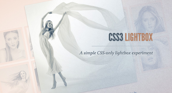
Today we want to show you how to create a neat lightbox effect using only CSS. The idea is to have some thumbnails that are clickable, and once clicked, the respective large image is shown. Using CSS transitions and animations, we can make the large image appear in a fancy way.
With the help of the pseudo-class :target, we will be able to show the lightbox images and navigate through them.
The beautiful images are by Joanna Kustra and they are licensed under the Attribution-NonCommercial 3.0 Unported Creative Commons License.
Please note that this will only work with browsers that support the :target pseudo class.
Let’s do it!
The Markup
We want to show a set of thumbnails, each one having a title that will appear on hover. When clicking on a thumbnail, we want to show a large version of the image in an overlay container that will make the background a bit more opaque. So, let’s use an unordered list where each list item will contain a thumbnail and a division for the overlay with the respective large version of the image:
<ul class="lb-album">
	<li>
		<a href="#image-1">
			<img src="images/thumbs/1.jpg" alt="image01">
			<span>Pointe</span>
		</a>
		<div class="lb-overlay" id="image-1">
			<img src="images/full/1.jpg" alt="image01" />
			<div>
				<h3>pointe <span>/point/</h3>
				<p>Dance performed on the tips of the toes</p>
				<a href="#image-10" class="lb-prev">Prev</a>
				<a href="#image-2" class="lb-next">Next</a>
			</div>
			<a href="#page" class="lb-close">x Close</a>
		</div>
	</li>
	<li>
		<!-- ... -->
	</li>
</ul>
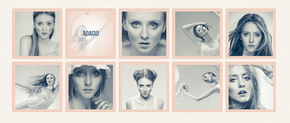
The anchor for the thumbnail will point to the element with the id image-1 which is the division with the class lb-overlay. In order to navigate through the images, we will add two link elements that point to the previous and next (large) image.
In order to “close” the lightbox, we will somply click on the link with the class lb-close which points to the element with the ID page which is our body.
Note that we only use a navigation in the last demo.
Let’s beautify this naked markup.
The CSS
I’ll omit the vendor prefixes for some of the new properties here in order not to bloat the tutorial. You can, of course, find them in the download files.
Let’s give some basic layout to our unordered list and the thumbnails:
.lb-album{
	width: 900px;
	margin: 0 auto;
	font-family: 'BebasNeueRegular', 'Arial Narrow', Arial, sans-serif;
}
.lb-album li{
	float: left;
	margin: 5px;
	position: relative;
}
.lb-album li > a,
.lb-album li > a img{
	display: block;
}
.lb-album li > a{
	width: 150px;
	height: 150px;
	position: relative;
	padding: 10px;
	background: #f1d2c2;
	box-shadow: 1px 1px 2px #fff, 1px 1px 2px rgba(158,111,86,0.3) inset;
	border-radius: 4px;
}
The title for each thumbnail will be invisible and we’ll add a transitions for the opacity which will change to 1 once we hover over the thumbnail anchor. We’ll use a smooth radial gradient as background:
.lb-album li > a span{
	position: absolute;
	width: 150px;
	height: 150px;
	top: 10px;
	left: 10px;
	text-align: center;
	line-height: 150px;
	color: rgba(27,54,81,0.8);
	text-shadow: 0px 1px 1px rgba(255,255,255,0.6);
	font-size: 24px;
	opacity: 0;
	background:
		radial-gradient(
			center,
			ellipse cover,
			rgba(255,255,255,0.56) 0%,
			rgba(241,210,194,1) 100%
		);
	transition: opacity 0.3s linear;
}
.lb-album li > a:hover span{
	opacity: 1;
}
The overlay will have the same radial gradient and we’ll set its position to fixed, with zero height and width:
.lb-overlay{
	width: 0px;
	height: 0px;
	position: fixed;
	overflow: hidden;
	left: 0px;
	top: 0px;
	padding: 0px;
	z-index: 99;
	text-align: center;
	background:
		radial-gradient(
			center,
			ellipse cover,
			rgba(255,255,255,0.56) 0%,
			rgba(241,210,194,1) 100%
		);
}
Once we click on a thumbnail, we’ll cover the whole screen with the overlay, but first, let’s take a look at the children.
Let’s style the division for the main title and the description:
.lb-overlay > div{
	position: relative;
	color: rgba(27,54,81,0.8);
	width: 550px;
	height: 80px;
	margin: 40px auto 0px auto;
	text-shadow: 0px 1px 1px rgba(255,255,255,0.6);
}
.lb-overlay div h3,
.lb-overlay div p{
	padding: 0px 20px;
	width: 200px;
	height: 60px;
}
.lb-overlay div h3{
	font-size: 36px;
	float: left;
	text-align: right;
	border-right: 1px solid rgba(27,54,81,0.4);
}
.lb-overlay div h3 span,
.lb-overlay div p{
	font-size: 16px;
	font-family: Constantia, Palatino, serif;
	font-style: italic;
}
.lb-overlay div h3 span{
	display: block;
	line-height: 6px;
}
.lb-overlay div p{
	font-size: 14px;
	text-align: left;
	float: left;
	width: 260px;
}
We’ll position the link element for closing the lightbox absolutely above the image:
.lb-overlay a.lb-close{
	background: rgba(27,54,81,0.8);
	z-index: 1001;
	color: #fff;
	position: absolute;
	top: 43px;
	left: 50%;
	font-size: 15px;
	line-height: 26px;
	text-align: center;
	width: 50px;
	height: 23px;
	overflow: hidden;
	margin-left: -25px;
	opacity: 0;
	box-shadow: 0px 1px 2px rgba(0,0,0,0.3);
}
The image will have a maximum height of 100%. That’s one way of making the image somewhat reponsive and nicely fittin into the viewport (i.e our overlay). We’ll also add a transition for the opacity level. Once we “open” a large image, the opacity will get animated. We’ll see later how we can use an animation for the image.
.lb-overlay img{
	max-height: 100%;
	position: relative;
	opacity: 0;
	box-shadow: 0px 2px 7px rgba(0,0,0,0.2);
	transition: opacity 0.5s linear;
}
Let’s style the navigation elements:
.lb-prev, .lb-next{
	text-indent: -9000px;
	position: absolute;
	top: -32px;
	width: 24px;
	height: 25px;
	left: 50%;
	opacity: 0.8;
}
.lb-prev:hover, .lb-next:hover{
	opacity: 1;
}
.lb-prev{
	margin-left: -30px;
	background: transparent url(../images/arrows.png) no-repeat top left;
}
.lb-next{
	margin-left: 6px;
	background: transparent url(../images/arrows.png) no-repeat top right;
}
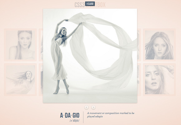
When we click on a thumbnail anchor, it will point to the respective large version of the image which is in the division with the class lb-overlay. So, in order to address this element we can use the pseudo class :target. We’ll add a padding to the overlay and “stretch it” over the whole viewport by setting the width and height to auto (it’s actually not needed explicitely) and set the right and bottom to 0px. Remember, we’ve already set the top and left before.
.lb-overlay:target {
	width: auto;
	height: auto;
	bottom: 0px;
	right: 0px;
	padding: 80px 100px 120px 100px;
}
Now we will also set the opacity of the image and the closing link to 1. The image will fade in, because we’ve set a transition:
.lb-overlay:target img,
.lb-overlay:target a.lb-close{
	opacity: 1;
}
And that’s all the style!
Let’s take a look at the two alternatives that we are using in demo 1 and demo 2.
In the first demo we make the image appear by using an animation that scales it up and increases it’s opacity value:
.lb-overlay:target img {
	animation: fadeInScale 1.2s ease-in-out;
}
@keyframes fadeInScale {
  0% { transform: scale(0.6); opacity: 0; }
  100% { transform: scale(1); opacity: 1; }
}
In the second demo we’ll create the opposite effect, i.e. scale the image down:
.lb-overlay:target img {
	animation: scaleDown 1.2s ease-in-out;
}
@-webkit-keyframes scaleDown {
  0% { transform: scale(10,10); opacity: 0; }
  100% { transform: scale(1,1); opacity: 1; }
}
Demos
- Demo 1: Scale-up / fade-in animation
- Demo 2: Scale-down / fade-in animation
- Demo 3: Fade-in & navigation
You will see that each browser performs quite differently when it comes to the transitions/animations. Adjusting duration, timing functions and delays, one can make the effects smoother, i.e. you can change the timing for Firefox only by changing the -moz- properties.
And that’s it! I hope you enjoyed this tutorial and find it inspiring!


This is freaking awesome. I love it.
It’s really beautiful! That’s exactly what I was looking for. Thanks a lot for sharing this tutorial.
can i make it that when the bigger image is clicked, it can be closed rather than using a close button?
Amazing! THX! 😉
Gorgeous Mary Lou!
Could someone tell me – what happens on old browsers that don’t have the :target pseudo class ? Is the page all messed up? I’d really love to use this to display my portfolio.
Thanks,
Ally
Hello,
awesome tutorial! I added a YouTube video to the lightbox, only when I close the lightbox, the video will keep on playing.
Does anyone has a solution to this??
Has anyone managed to get this working for IE?
help me, thanks!
It works great on IE but without animations, what doesnt work for you?
I have the same problem.
The lightbox doesn’t work at all.
I have a script to fix this, but that does not work yet. I need to change some classes, but do not exactly know which.
I would be so thankful if anyone could help me get the images to crossfade into each other when the navigation link is clicked.
Anyway, thanks for the tutorial!
Thanks for the great demo/tutorial, the effect looks amazing. I did spot one bug, and am curious if you (or any of the readers/commenters) would be privvy to a CSS3 only solution? I fixed it by resetting the opacity with javascript when the close element is clicked.
Ugh, forgot the main portion of my comment.
Thanks for the great demo/tutorial, the effect looks amazing. I did spot one bug, and am curious if you (or any of the readers/commenters) would be privvy to a CSS3 only solution? Once you’ve viewed an image in the lightbox and closed it, if you reopen the image in the lightbox, the close element’s opacity is already at 1. I “fixed” it by resetting the opacity with javascript when the close element is clicked.