
From our sponsor: Leverage AI for dynamic, custom website builds with ease.
With the CSS property “background-clip: text” (which is currently only supported in Webkit browsers), we can add a background image to a text element. Today we will experiment with it and create some fun examples by adding CSS3 transitions.
The images in the first demo are by Andreas Preis and the image in the last demo is by Joanna Kustra.
The Markup
The structure will simply be an h3 heading element with a wrapper:
<div class="it-wrapper">
	<h3>Andreas</h3>
</div>
We’ll be applying the class “it-animate” to the wrapper with jQuery in order to show the transitions.
Example 1
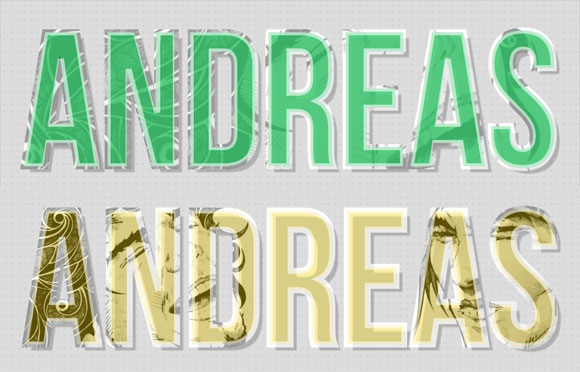
In the first example we want to add two background images. Initially we want the images to occupy all the word, so we’ll set the background size to 100%. Since we are only giving one value, the second value, i.e. the vertical “stretch”, will be auto. This means that the image will preserve its aspect ratio while fitting horizontally into the h3 element.
When using a background image and setting the background-clip to “text”, we need to make sure that the color of the text is either transparent or semi-transparent in order to be able to see the image. We’ll use a rgba value which allows us to set an opacity.
We’ll also add a semi-transparent white text-stroke where the images will shine through.
The initial position of the background images will be centered.
.it-wrapper h3{
	font-size: 320px;
	line-height: 188px;
	padding: 60px 30px 30px;
	color: rgba(67, 201, 117, 0.9);
	font-family: 'BebasNeueRegular', Arial, sans-serif;
	text-shadow: 10px 10px 2px rgba(0,0,0,0.2);

	-webkit-text-stroke: 10px rgba(255,255,255,0.6);

	background-color: #fff;
	background-repeat: no-repeat;
	background-image: url(../images/2.jpg), url(../images/1.jpg);
	background-position: 50% 50%;
	background-size: 100%;

	-webkit-background-clip: text;
	/* let's assume that one day it's supported */
	-moz-background-clip: text;
	background-clip: text;

	transition: all 0.5s linear;

	/* for now, let's just add some niceness for Firefox */
	-moz-border-radius: 30px;
	-moz-box-shadow: 0px 0px 1px 8px rgba(67, 201, 117, 0.2);
}
For Firefox we want to add some kind of fallback. Although the background-clip for the text will not work here, we can still make the background image animate in a pretty nice way.
So, we’ll leave the background image, but add some nice border radius and some box shadow for Firefox only.
(If you are wondering what’s happening in IE don’t get too excited, we’ve just added a stylesheet that will simply override the color of the text and remove the background image.)
The properties that we want our text to transition to are the following:
.it-wrapper h3.it-animate{
	background-size: 50%;
	background-position: 0% 50%, 130% 50%;
	color: rgba(242, 208, 20, 0.4);

	-moz-box-shadow: 0px 0px 1px 8px rgba(242, 208, 20, 0.4);
}
The background size for the images will be reduced to 50% and we’ll change the background position in order to move one image to the left and the other to the right side. We’ll also change the color.
For Firefox we want the box shadow color to change.
Example 2
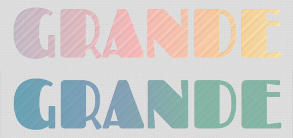
In the second example, we’ll play around with gradients. Of course, we don’t have to go extremely nuts with the colors, but hey, it’s a gradient: let’s make a freakin’ rainbow!
I’ll omit the vendor prefixes for the gradients here, just check out the download file.
The first background image is a linear gradient with lots of colors and the second one is a repeating linear gradient with stripes.
If you want to easily create your own gradients, you should give the Ultimate CSS Gradient Generator from ColorZilla. It’s really awesome and you can choose different color formats and easily custom build your gradient. If you use Photoshop, you will instantly know how to use this.
And check out Lea Verou’s CSS3 Patterns Gallery for more ideas on what can be achieved with gradients!
The background size for both gradients will be three times the size of our word in length and 100% in height.
.it-wrapper h3{
	font-size: 270px;
	line-height: 180px;
	padding: 30px 30px 40px;
	color: rgba(255,255,255,0.1);
	font-family: 'Fascinate', 'Arial Narrow', Arial, sans-serif;
	text-shadow: 1px 1px 1px rgba(255,255,255,0.3);

	background:
		linear-gradient(
			left,
			rgba(105,94,127,0.54) 0%,
			rgba(255,92,92,0.57) 15%,
			rgba(255,160,17,0.59) 27%,
			rgba(252,236,93,0.61) 37%,
			rgba(255,229,145,0.63) 46%,
			rgba(111,196,173,0.65) 58%,
			rgba(106,132,186,0.67) 69%,
			rgba(209,119,195,0.69) 79%,
			rgba(216,213,125,0.7) 89%,
			rgba(216,213,125,0.72) 100%
		),
		repeating-linear-gradient(
			-45deg,
			rgba(255,255,255,0.5),
			transparent 20px,
			rgba(255,255,255,0.3) 40px
		);

	background-size: 300% 100%;
	background-position: center left, top left;

	-webkit-background-clip: text;
	-moz-background-clip: text;
	background-clip: text;

	transition: all 1.8s linear;

	-moz-border-radius: 90px 15px;
	-moz-box-shadow: 0px 0px 0px 10px rgba(255,255,255,0.4);
}
For Firefox we’ll again add some border radius and some box shadow.
We then want the background position and the color to change. The change of the position will make the gradients move and we’ll be able to see the other end of the rainbow gradient:
.it-wrapper h3.it-animate{
	background-position: center right, top right;
	color: rgba(39,137,149,0.5);

	-moz-box-shadow: 0px 0px 0px 10px rgba(39,137,149, 0.9);
}
For Firefox we’ll animate the box shadow color to match with the text color.
Example 3

In our last example, we want to animate the background image size from huge to 100%. The idea is to not be able to see the background image’s motive until the transition takes place. The size of the background image will shrink to the point that we can recognize the image.
.it-wrapper h3{
	font-size: 180px;
	line-height: 180px;
	padding: 20px 30px;
	color: rgba(0,80,81,0.7);
	-webkit-text-stroke: 2px rgba(0,0,0,0.5);
	font-family: 'Gravitas One', 'Arial Narrow', Arial, sans-serif;
	text-shadow: 15px 15px 1px rgba(255,255,255,0.3);

	background-image: url(../images/3.jpg);
	background-repeat: no-repeat;
	background-position: center center;
	background-size: 400%;

	-webkit-background-clip: text;
	-moz-background-clip: text;
	background-clip: text;

	transition: all 0.3s linear;

	-moz-box-shadow:
		-10px -10px 0px rgba(255,255,255,0.4),
		10px 10px 0px rgba(0,81,81,0.4),
		0px 0px 50px 50px rgba(255,255,255,0.9) inset;
}
Besides the background size, we’ll also change the opacity level of the rgba value, and add some fancy box shadow transition for Firefox:
.it-wrapper h3.it-animate{
	background-size: 100%;
	color: rgba(0,80,81,0.1);
	-moz-box-shadow:
		-20px -20px 0px rgba(255,255,255,0.4),
		20px 20px 0px rgba(0,81,81,0.4),
		0px 0px 40px 0px rgba(255,255,255,0.4) inset ;
}
And that’s it! I hope you enjoyed this experiment and find it inspiring!


Great Work
first comment? the last…:D
i ? demo number 3 \m/
These look great!
Good work Mary….Thanks
Thank you Manoela..beatiful..
Your tutorials only get better and better
…..;)
Lovely!!!!!!!!
cool
I have been thinking I need to add some texture to my site with this sort of thing. Thanks for sharing. Perhaps I will.
Nice work!
It’s amazing!!!
Very cool.
In the future, web designers would be doing stuff like these and more using only CSS without worrying about browser compatibility. How I long for that day to come.
Great article BTW. This is the first time I saw this effect with CSS. Thank you for sharing!
This is awesome !!
Mind=Blown
CSS has really come a long way
Marry. . . You’re awesome .. Can’t find the words to express your passion
Awesome Work !!!
Thank you for the awesome work and great examples, but I have to mention that ‘text’ value of ‘background-clip’ property is not a part of CSS standard. The CSS3 Backgrounds and Borders module (which is now Candidate Recommendation, that means that it won’t change significally in the future) has only 3 values for this property, and even the CSS4 draft doesn’t have more. ‘-webkit-background-clip: text’ is a propritary extension of CSS, so I wouldn’t hope that other browsers will implement this soon. So this solution could be used primarily in mobile web where Webkit-based browsers dominate. But the similar effect can be achieved in a more cross-browser (though more complicated) way with inline SVG.
Good work Thank you