From our sponsor: Leverage AI for dynamic, custom website builds with ease.
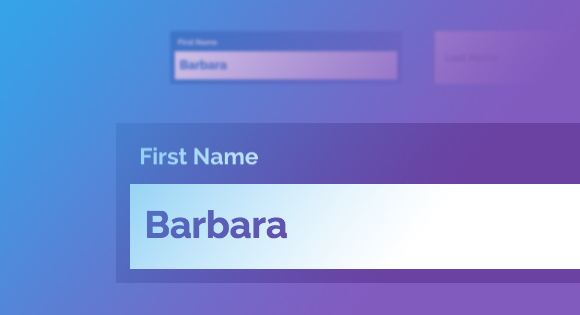
Form inputs offer a great opportunity to add some subtle and interesting effects to a web page. They are elements that your user will interact with at some point and making them fun to use can enhance the experience. We are used to the default form resembling its paper counterpart but in the digital world we can be more creative. Today we want to share some experimental styles and effects for text inputs with you. Andrej Radisic has done some great work on Dribbble, like the Jawbreaker input field, which we’ve based one of the effects on. Most of the effects use CSS transitions together with pseudo-elements.
Please note that this is for inspiration only and that we use CSS properties which only work in modern browsers.
For the markup we use a span as a wrapper for the input and its label. For the effects to work, we are putting the label after the input which usually should only be done when using checkboxes and radio inputs. This is not necessary if you rely entirely on dynamically adding a class that will trigger what we do on focus. For the purpose of this demo, we are going to rely on the CSS :focus pseudo-class as well to show its potential in combination with the adjacent sibling selector. But you can use a more semantic order together with the trigger class we also use in order to keep the inputs open that get filled (and can’t be closed due to the label position). Note that not all effects have the trigger class (input–filled) defined in the CSS.
<span class="input input--haruki">
	<input class="input__field input__field--haruki" type="text" id="input-1" />
	<label class="input__label input__label--haruki" for="input-1">
		<span class="input__label-content input__label-content--haruki">First Name</span>
	</label>
</span>
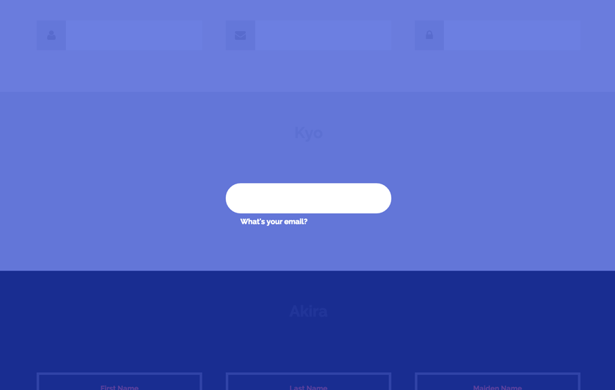
The label is our powerful element here. We can use the pseudo-classes :before and :after for defining ornaments like borders and backgrounds that we can then move around and play with — ideally only using the properties that we can animate cheaply. We can even create an overlay like we do in the effect called “Kyo”:
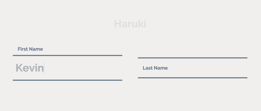
The first effect, “Haruki”, might look like as if we animate the height of something that has borders, but we actually animate the two pseudo elements of the label, each resembling a border (vendor-prefixed properties left out):
.input--haruki {
	margin: 4em 1em 1em;
}

.input__field--haruki {
	padding: 0.4em 0.25em;
	width: 100%;
	background: transparent;
	color: #AFB5BB;
	font-size: 1.55em;
}

.input__label--haruki {
	position: absolute;
	width: 100%;
	text-align: left;
	pointer-events: none;
}

.input__label-content--haruki {
	transition: transform 0.3s;
}

.input__label--haruki::before,
.input__label--haruki::after {
	content: '';
	position: absolute;
	left: 0;
	z-index: -1;
	width: 100%;
	height: 4px;
	background: #6a7989;
	transition: transform 0.3s;
}

.input__label--haruki::before {
	top: 0;
}

.input__label--haruki::after {
	bottom: 0;
}

.input__field--haruki:focus + .input__label--haruki .input__label-content--haruki,
.input--filled .input__label-content--haruki {
	transform: translate3d(0, -90%, 0);
}

.input__field--haruki:focus + .input__label--haruki::before,
.input--filled .input__label--haruki::before {
	transform: translate3d(0, -0.5em, 0);
}

.input__field--haruki:focus + .input__label--haruki::after,
.input--filled .input__label--haruki::after {
	transform: translate3d(0, 0.5em, 0);
}
Note that we have some default styles defined initially for the input wrapper, the input and its label.
The label is on top of the input and when focusing the input, we will animate its content span up while translating the two pseudo elements up and down.
In Firefox (on Mac) the text-rendering is not very nice so you might see some “crisping up” of blurred text in the end of transitions. But blurry text is not only an issue on Firefox. It’s really sad that fonts don’t render nicely in Chrome either when something is transitioned. Some font-sizes work well when for example, scaling an element, but then others don’t.
Note that the SVG stroke animation of effect “Madoka” does not work in Internet Explorer (we are using a transition on the stroke-dashoffset).When you do your own effects, keep in mind that animating the text input itself might be a bad idea due to some bugs on iOS and Internet Explorer (the cursor of the input won’t move until you actually type).
We hope you enjoyed these effects and get inspired!


Wonderful. Very Eye Catchy. I even did some experiments with its implementations. There are some glitches like text resolution when the input size is reduced. Besides an awesome experiment. I even posted about it on my blog
I´m using chisato in a form, but the label ist no kepping on top as it sould. its there a reason for this behavior?
Yes, you delet classie.js
i got an issue that my input field did not close when it’s been filled, can anyone tell me which code in the css is the poin of that problem?
Hi the forms work good in wordpress?
Gorgeous form element designs… almost zen-like! I would really like to see some examples of applying this to and non-text-input elements such as radio and checkboxes, in a single form. Thanks for sharing.
Good Job Guys , Keep Going
very nice works!
hello, nice text box effacts, but not working in safari browser (Hoshi) textbox effact
It’s so cool.
Does this work in wordpress?
Will it work if I want to get info from the input fields? Is it standard form coding?
Hi Mary, This is an amazing piece of work!! Am a backend developer and i suck at all this beautiful design and all. I was in need of something like this and you saved my whole day with the code 🙂
i would like to be in touch with you for some projects.. so, lemme know if we both can work something out. Thanks again for the code
When i add this effect in my login form its work fine, but when i remember password and username when effect not work and password and username overlap on placeholder so i think it is wrong i try to find out this but i cant resolve it so please help me.
yes..same problem for me too.. pls fix the issue or tell me the solution for this as soon as possible.
Very nice effect.
Set2 Nao i have replaced input to textarea & added rows=”10″.
The Stroke width is increased while increasing rows.
This is super good Mary. Thanks a lot. Can we include select box dropdown in the form with these effects?
In Hoshi effect, while filling the data it works perfectly. when the same page redirects from a different page, already filled input will get overlaps with input label. need a solution as soon as possible.
add this script to fix the bug
$(“input”).blur(function(){
if($(this).val()!=null&&$(this).val()!=””){
$(this).parent().addClass(” “+”input–filled”)
}else{
$(this).parent().removeClass(“input–filled”)
}
});
This is all kinds of fantastic. Thank you!
Where is the radio ???
WOOOOWWWW!!! This is amazing, You inspired my day!!! You rock. Please, never stop doing this.
Just Awesome design. WOOOOOOOOOOOOOOOOOOOOOOOOOOW Design.
how can we use this effects in this form vfb-pro in wordpress.
They are awesome. Only problem, I found was as soon as you click somewhere else, the labels goes back to their places even it inputs already have values.
Thanks.
Not experiencing the same thing here. Which browser are you using? Cheers.
Yes, because you need to add this:
(function() {
// trim polyfill : https://developer.mozilla.org/en-US/docs/Web/JavaScript/Reference/Global_Objects/String/Trim
if (!String.prototype.trim) {
(function() {
// Make sure we trim BOM and NBSP
var rtrim = /^[\s\uFEFF\xA0]+|[\s\uFEFF\xA0]+$/g;
String.prototype.trim = function() {
return this.replace(rtrim, ”);
};
})();
}
[].slice.call( document.querySelectorAll( ‘input.input__field’ ) ).forEach( function( inputEl ) {
// in case the input is already filled..
if( inputEl.value.trim() !== ” ) {
classie.add( inputEl.parentNode, ‘input–filled’ );
}
// events:
inputEl.addEventListener( ‘focus’, onInputFocus );
inputEl.addEventListener( ‘blur’, onInputBlur );
} );
function onInputFocus( ev ) {
classie.add( ev.target.parentNode, ‘input–filled’ );
}
function onInputBlur( ev ) {
if( ev.target.value.trim() === ” ) {
classie.remove( ev.target.parentNode, ‘input–filled’ );
}
}
})();