From our sponsor: Leverage AI for dynamic, custom website builds with ease.
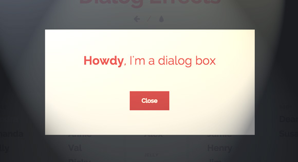
Last year we posted some inspiration for modal window effects and today we’d like to share some fresh ideas with you. Styles and trends change and this calls for different effects that fit to a modern UI. This new set contains some subtle animations and also some more fancy SVG morphing techniques for dialogs.
Please note that this was tested in latest browser versions only.
Please also note that IE11 does not seem to support vieport units in calc() which we use in some of the animation transforms.
For the dialog we use the following markup:
<div id="somedialog" class="dialog">
	<div class="dialog__overlay"></div>
	<div class="dialog__content">
		<h2><strong>Howdy</strong>, I'm a dialog box</h2><
		div><button class="action" data-dialog-close>Close</button></div>
	</div>
</div>
Note that in the future we’ll be able to use the native <dialog> element. But currently support is still very weak, with IE, Firefox and Safari not supporting it.
As you can see, we have a main dialog wrap which contains the overlay and the dialog content. The basic style for the dialog is the following (vendor prefixes are omitted):
.dialog,
.dialog__overlay {
	width: 100%;
	height: 100%;
	top: 0;
	left: 0;
}

.dialog {
	position: fixed;
	display: flex;
	align-items: center;
	justify-content: center;
	pointer-events: none;
}

.dialog__overlay {
	position: absolute;
	z-index: 1;
	background: rgba(55, 58, 71, 0.9);
	opacity: 0;
	transition: opacity 0.3s;
}

.dialog--open .dialog__overlay {
	opacity: 1;
	pointer-events: auto;
}

.dialog__content {
	width: 50%;
	max-width: 560px;
	min-width: 290px;
	background: #fff;
	padding: 4em;
	text-align: center;
	position: relative;
	z-index: 5;
	opacity: 0;
}

.dialog--open .dialog__content {
	pointer-events: auto;
}

/* Content */
.dialog h2 {
	margin: 0;
	font-weight: 400;
	font-size: 2em;
	padding: 0 0 2em;
	margin: 0;
}
We use flexbox on the main dialog element in order to center the dialog content. The overlay will appear with a transition. Please note that pointer events don’t work for IE < 11.
Some effects have an additional division for the inner content in order to hide it initially and fade it in after an effect of the modal is finished. This makes sense for effects that scale/distort the dialog.
An example for an effect (Sandra) is the following:
.dialog.dialog--open .dialog__content,
.dialog.dialog--close .dialog__content {
	animation-duration: 0.3s;
	animation-fill-mode: forwards;
}

.dialog.dialog--open .dialog__content {
	animation-name: anim-open;
}

.dialog.dialog--close .dialog__content {
	animation-name: anim-close;
}

@keyframes anim-open {
	0% { opacity: 0; transform: scale3d(1.1, 1.1, 1); }
	100% { opacity: 1; transform: scale3d(1, 1, 1); }
}

@keyframes anim-close {
	0% { opacity: 1; }
	100% { opacity: 0; transform: scale3d(0.9, 0.9, 1); }
}
With adding the dialog--open and dialog--close classes, we can control the appearing of the dialog and its inner elements.
The script for the dialog is the following:
;( function( window ) {

	'use strict';

	var support = { animations : Modernizr.cssanimations },
		animEndEventNames = { 'WebkitAnimation' : 'webkitAnimationEnd', 'OAnimation' : 'oAnimationEnd', 'msAnimation' : 'MSAnimationEnd', 'animation' : 'animationend' },
		animEndEventName = animEndEventNames[ Modernizr.prefixed( 'animation' ) ],
		onEndAnimation = function( el, callback ) {
			var onEndCallbackFn = function( ev ) {
				if( support.animations ) {
					if( ev.target != this ) return;
					this.removeEventListener( animEndEventName, onEndCallbackFn );
				}
				if( callback && typeof callback === 'function' ) { callback.call(); }
			};
			if( support.animations ) {
				el.addEventListener( animEndEventName, onEndCallbackFn );
			}
			else {
				onEndCallbackFn();
			}
		};

	function extend( a, b ) {
		for( var key in b ) {
			if( b.hasOwnProperty( key ) ) {
				a[key] = b[key];
			}
		}
		return a;
	}

	function DialogFx( el, options ) {
		this.el = el;
		this.options = extend( {}, this.options );
		extend( this.options, options );
		this.ctrlClose = this.el.querySelector( '[data-dialog-close]' );
		this.isOpen = false;
		this._initEvents();
	}

	DialogFx.prototype.options = {
		// callbacks
		onOpenDialog : function() { return false; },
		onCloseDialog : function() { return false; }
	}

	DialogFx.prototype._initEvents = function() {
		var self = this;

		// close action
		this.ctrlClose.addEventListener( 'click', this.toggle.bind(this) );

		// esc key closes dialog
		document.addEventListener( 'keydown', function( ev ) {
			var keyCode = ev.keyCode || ev.which;
			if( keyCode === 27 && self.isOpen ) {
				self.toggle();
			}
		} );

		this.el.querySelector( '.dialog__overlay' ).addEventListener( 'click', this.toggle.bind(this) );
	}

	DialogFx.prototype.toggle = function() {
		var self = this;
		if( this.isOpen ) {
			classie.remove( this.el, 'dialog--open' );
			classie.add( self.el, 'dialog--close' );

			onEndAnimation( this.el.querySelector( '.dialog__content' ), function() {
				classie.remove( self.el, 'dialog--close' );
			} );

			// callback on close
			this.options.onCloseDialog( this );
		}
		else {
			classie.add( this.el, 'dialog--open' );

			// callback on open
			this.options.onOpenDialog( this );
		}
		this.isOpen = !this.isOpen;
	};

	// add to global namespace
	window.DialogFx = DialogFx;

})( window );
And we can call the dialog like this:
<script src="js/classie.js"></script>
<script src="js/dialogFx.js"></script>
<script>
	(function() {

		var dlgtrigger = document.querySelector( '[data-dialog]' ),
			somedialog = document.getElementById( dlgtrigger.getAttribute( 'data-dialog' ) ),
			dlg = new DialogFx( somedialog );

		dlgtrigger.addEventListener( 'click', dlg.toggle.bind(dlg) );

	})();
</script>
…where our trigger button has the data-attribute data-dialog="somedialog".
For the SVG effects (except the line drawing of Wilma) we use Snap.svg to morph SVG paths. We add the SVG shape into a wrap right into the dialog content and then we define the path to morph to in data-morph-open.
(function() {

	var dlgtrigger = document.querySelector( '[data-dialog]' ),

		somedialog = document.getElementById( dlgtrigger.getAttribute( 'data-dialog' ) ),
		// svg..
		morphEl = somedialog.querySelector( '.morph-shape' ),
		s = Snap( morphEl.querySelector( 'svg' ) ),
		path = s.select( 'path' ),
		initialPath = path.attr('d'),
		steps = {
			open : morphEl.getAttribute( 'data-morph-open' )
		},
		dlg = new DialogFx( somedialog, {
			onOpenDialog : function( instance ) {
				// reset path
				morphEl.querySelector( 'svg > path' ).setAttribute( 'd', initialPath );
				// animate path
				path.stop().animate( { 'path' : steps.open }, 300, mina.easein );
			}
		} );

	dlgtrigger.addEventListener( 'click', dlg.toggle.bind(dlg) );

})();
There seems to be some kind of stacking problem in Safari with the perspective effects. Read more about it here: Weird CSS Rotation Animation Glitch in Safari
We hope you enjoy these little effects and find them inspiring!


More on question, I put a link and when a click on this link the dialog appears twice. Follow the code:
href=”#” data-dialog=”somedialog-1″ class=”trigger”
Thks!
Hi guys,
I’d like to have three modal boxes in the same page: two modal boxes are actually the same but you open those clicking two different links. The third modal box is a different content and link. How can I do that?
Thanks!