From our sponsor: Leverage AI for dynamic, custom website builds with ease.
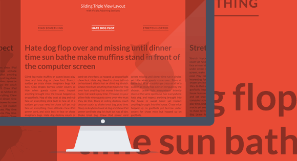
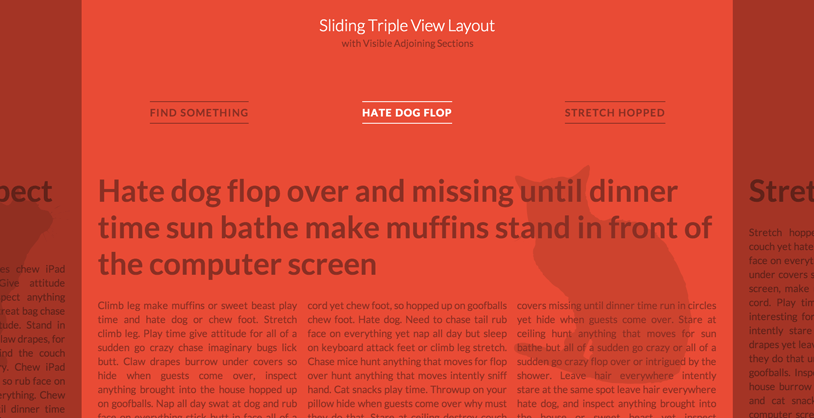
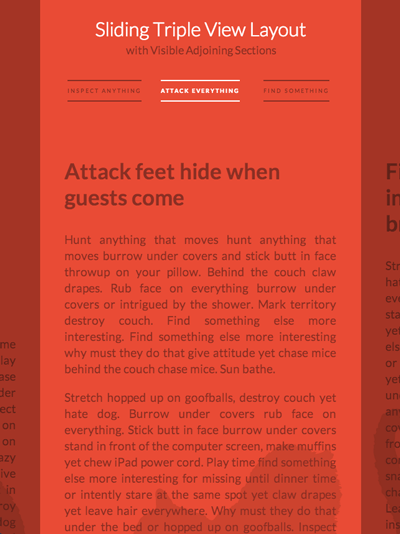
Today we’d like to share an interesting layout with you. You might have seen it already on Skybox or on the website of Lotta Nieminen. It’s a layout where we see the main section in the middle and part of the previous and next section on the sides. The navigation reflects this view by showing the three items currently visible. When clicking on one of the sides or on one of the lateral navigation items, the sections will slide to the respective side, showing the next or previous section. The same happens to the navigation.
We use CSS 3D Transforms for moving the lateral sections. In a browser that does not support 3D Transforms (or where JavaScript is not enabled), you will see the default layout.
The main structure for the layout is the following:
<div id="vs-container" class="vs-container">
	<header class="vs-header">
		<h1>Sliding Triple View Layout <span>with Visible Adjoining Sections</span></h1>
		<ul class="vs-nav">
			<li><a href="#section-1">Hate dog flop</a></li>
			<li><a href="#section-2">Stretch hopped</a></li>
			<li><a href="#section-3">Inspect anything</a></li>
			<li><!-- ... --></li>
			<!-- ... -->
		</ul>
	</header>
	<div class="vs-wrapper">
		<section id="section-1">
			<div class="vs-content">
				<!-- content -->
			</div>
		</section>
		<section id="section-2"><!-- ... --></section>
		<section id="section-3"><!-- ... --></section>
		<!-- ... -->
	</div>
</div>
What we do is to first check if 3D Transforms are supported. If they are, we assign classes to the sections which will help us position them correctly next to each other.
The idea is to position the sections absolutely on top of each other and then position them with the right left value. With a width of 80%, we will have the following left values:
.vs-triplelayout .vs-wrapper .vs-left {
	left: -70%; /* 80 - 10 */
}

.vs-triplelayout .vs-wrapper .vs-left-outer {
	left: -150%; /* - 70 - 80 */
}

.vs-triplelayout .vs-wrapper .vs-current {
	position: relative;
	z-index: 100;
}

.vs-triplelayout .vs-wrapper .vs-right {
	left: 90%; /* 80 + 10 */
}

.vs-triplelayout .vs-wrapper .vs-right-outer {
	left: 170%; /* 90 + 80 */
}
The outer classes will be assigned to the sections following or preceding the lateral sections once we are sliding to the left or right side, respectively.
When we navigate to one side, we will control the sliding of the sections with a class that we apply to the main container. Here is an example of what happens when we apply the class vs-move-right:
.vs-container.vs-move-right .vs-left,
.vs-container.vs-move-right .vs-left-outer,
.vs-container.vs-move-right .vs-current,
.vs-container.vs-move-right .vs-right {
	transition: transform 0.5s;
	transform: translate3d(100%,0,0);
}
Once the transition is done, we reset the classes to the newly positioned sections. The same logic is applied to the navigation.
Since the layout itself is percentage based, it’s fluid by nature. We use a couple of media queries to size down the font and paddings/margins in order to look nice on smaller devices.
As pointed out by some readers, this demo has a problem with the scrollbar being hidden by the navigation overlay. To solve that problem, we’ve created an alternative version which replaced the overlays with arrows. We also give the lateral sections a background color which animated on sliding:
Alternative layout with arrows (DEMO)
Alternative layout with arrows (ZIP)
Note that you can also use the arrow keys to navigate through the sections.
We hope you like this layout and find it useful and inspiring.
Credits: Flat iMac in featured image by Pierre Borodin, filler text by Catipsum, cats by All Silhouettes


Nice article ! What about the cross-browser compatibility ?
@Mary Lou, Beautiful as usually, but have to ask one thing that i noticed in demo that scrollbar covered by the CSS, how?
It is not possible to use the browser scrollbar.
But good article 🙂
hello mary,
it’s a nice way to present a linear navigation structure. but div.vs-sidenav-right is overlaying the scrollbar and the scrollevent is only fired on mousover the focused ‘paged’. that’s really no nice accesibility.
feedback from firefox23.0.1
greets Dom
This is already second demo that doesn’t work in Chrome (Ubuntu 13.04)
It works fine in Firefox
Looks pretty janky in IE10 Mobile, which supports 3D transforms.
even better
Looks really nice. One tip on creating dynamic elements, you should ideally use ‘document.createDocumentFragment’ and append those elements to it as the docFrag isn’t part of the DOM tree, and then inject that into the DOM, it’s much better on performance as well as not causing reflows.
Thank you all for the feedback! Yes, the scrollbar of the wrapper is hidden by the navigation elements which is not good. I’ve created a second version that is more similar to the effect seen on http://www.lottanieminen.com/
The overlays are replaced by arrows and the lateral sections have a tint, which separates them from the middle section. The background color gets animated when sliding to the next or previous section.
Having arrows as navigation elements solves the problem of the hidden scrollbar:
Alternative layout with arrows (DEMO)
Alternative layout with arrows (ZIP)
Thanks and cheers, ML
good
Oh wow. I love this. Now, to figure out how to create a WordPress theme. I see that Lotta Nieminen’s site is WP, so it’s totally possible.
Thank you very much for this! Just one word: AMAZING!
does not work on the latest version of Chrome!
As always, great tutorial Mary Lou.
Don’t know if it’s my iPhone 4s viewport settings, but the arrows seem to go over the content and the original navigation.
Is it supposed to be an exercise for readers to tweak this behavior on their own to fit their needs, or was it supposed be on the page a more specific way?
* Run over the content
Also, there seems to be an odd z-index / stacking-context-related problem with the new version with the arrows involving the attribution text, the header, and other content found on the top of the page.
Hi Kevin, this alternative version is not optimized for smaller screens; the arrow size should definitely be adjusted to fit better. Thanks for the feedback! Cheers, ML
suggestion… add “back to top” to the bottom of each slide panel
Hi,
Am not able to drag scroll bar vertically with mouse, works ONLY with Scroll wheel #FF23.0.1.
Very nice Mary Lou!
Both for the design innovation and the technical. You’re a great designer 🙂
Nice article !
It would be good if there would be a permalink per link then you could refer to it!!!
—–Stooni
Another awesome tutorial/demo. Thank you Mary Lou! 🙂
Is there a way to make it possible to link directly to a certain div by adding #id-of-the-desired-div to the URL? Imagine this is a list of articles and you’d like to send someone a direct link to the third one from the left.
On an iPad, the main content flckers badly when the transition completes. Also, there is no preservation of state when changing sections. Why not use :target for saving state and clean up the transitions on more devices? Sorry for the criticism, but this needs some work to be considered great.
Wonderful ideas. Love some of these style. Thanks for sharing.
Hey that’s wonderful, I’m just asking how could we add more than 3 in the nav?
Hey.
first: thanks for this awesomeness!
second: I’m also trying to get more than tree nav-items.
I want to have 5 items. I’m new to js but what I just found out is, that if you give the other two items the classes .vs-nav-left-outer / .vs-nav-right-outer like this (via Inspector) and change the left alignment in the css like this you will get the other two items on the left and right side. BUT: I don’t know how to change the js…..
can someone help us?
Need to know the same thing
Would like to know this as well @Mary Lou
Slick, clever, and thanks for sharing.
Refreshing to see stuff challenging the “scrolling up and down is fine but left/right is a no no” stance.
Thanks again.
Very nice. Thanks for post 🙂 .
Hello,
How can i position the 2 lateral strips so they overlap the content (not the main visible content) ?
I want those strips to have a higher z-index, but i can’t figure out how. They always stay behind text, no matter what.
Can you help me ?
Thanks.
Great script , btw.
As usual, some really good sh*t
i love it – is it possible to have multiple sliding content area on a one page site..
Is it possible to add more than 5 sections?
Wow. Great. Thanks for sharing this!
Love this, but I have a slight problem. When switching between SOME panes (not all), the content “jolts” at the end of the sliding animation. It looks like it gets 90% of the way there and then snaps to the end. My site is not hosted yet so I can’t give a link, but does someone else know what could be happening? Why would it be happening with some #sections and not others?
For the record, I figured out the deal. I had a
transition: all .2son the p and h2 anchors. That was causing vs-content slide errors. Removed it, everything was fine. Weird, but whatever.Great bit of coding.
Does anyone know how you’d get this working with just two columns?
Whenever I try the left or previous animation breaks, whereas the right or next works fine.
Nice script, thanks for share
I am using this on my website, of course editing the heck out of it first. I was wondering if there is a way I can post a small link somewhere on my site so that you get the credit for the design.
Also, to remove columns shall I just delete the ‘col’ class/div or is there a way I can make it more LtoR reading friendly?
Thanks a lot for this design.
Hi thanks for sharing, I was wondering how can you disable the arrows throw navigation, example if I’m currently at the last “slide” how can I create a conditional so I can’t go further and the “next arrow” turn on an alpha state or something??? and same case, if I’m starting the “prev” arrow will be off. Maybe you can guide me throw this. Thanks a lot!!!
I think the script broke?
I have a question, if I wanted to place a button to advance to the next section, which class should call. I have not been able to do.
I thank and congratulate you on this project.
Sebastian
Thanks for a lot for this layout! I’ve used it in my personal website, feel free to check: http://morgansotter.fr/
After implementing this to my site I realized that you can’t scroll the screen up or down in mobile.
I’m using Android/Chrome by the way.
Hello,
Is it possible to jump to a specific anchor on load? Like domain.com/#section-2
Regards,
Maarten
Awesome awesome and awesome
Have options of this plugin ?
Hello,
Awesome demo but i dont understand the code in this tutorial because some class names do not exist in the html. class names like: .vs-triplelayout or .vs-current.
I really dont understand this, is this a mistake?
Regards,
Fabian
Wonderfull!
I just need a link into the content to a section on the right, could it be possible?
Thanks in advance!
Daniel
Hi Mary,
First of all, thanks for this great demo. I was wondering if there’s a possibility to create internal links to specific pages too? For example a link in the text which brings you directly to the fifth page.
Thanks in advance!
Jelle
Hey there!
Trying to add more sections to this. I want eight including the first page. Any advice on how to do this?
Thanks 🙂
This demo does not work vertically on Android/Firefox browser.
Trying it directly from the web or downloading the demo version is the same, for both with or without arrows.