
Free course recommendation: Master JavaScript animation with GSAP through 34 free video lessons, step-by-step projects, and hands-on demos. Enroll now →
Today we will explore how to create an engaging animation using simple CSS and an animation library, like GSAP, to achieve a 3D effect through basic optical illusions. While many of these animations can be crafted using plain CSS, I prefer utilizing JavaScript (GSAP) for its efficiency, allowing me to produce the desired effects swiftly with just a few lines of code.
Have you ever encountered animations that captivate with their smoothness and resemble abstract art or the beauty of movement? Such animations grab attention while scrolling or surfing the web.
In this brief tutorial, we’ll cover how to construct basic HTML with Tailwind CSS to quickly set up our project and then animate elements using GSAP.
We’ll divide this example into three sections: first, the foundational markup; second, the animation itself; and third, the rotation effect that creates the illusion of 3D perception.
The perspective from which we view a two-dimensional object significantly influences this effect. Moving forward, I plan to showcase more examples using this technique, incorporating rotations, perspective, and translations along an axis.
To start, for our base markup, I will use Tailwind CSS to swiflty combine HTML and styling in one cohesive setup:
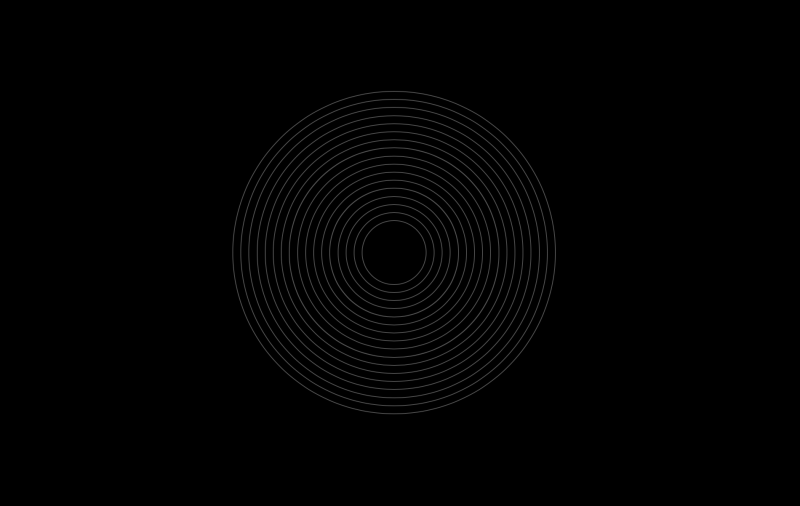
<main class="bg-black h-screen grid place-items-center text-white">
  <section class="w-96 h-96 relative grid place-items-center">
    <div class="rounded-full absolute w-full h-full border border-neutral-600"></div>
    <div class="rounded-full absolute w-[95%] h-[95%] border border-neutral-600"></div>
    <div class="rounded-full absolute w-[90%] h-[90%] border border-neutral-600"></div>
    <div class="rounded-full absolute w-[85%] h-[85%] border border-neutral-600"></div>
    <div class="rounded-full absolute w-[80%] h-[80%] border border-neutral-600"></div>
    <div class="rounded-full absolute w-[75%] h-[75%] border border-neutral-600"></div>
    <div class="rounded-full absolute w-[70%] h-[70%] border border-neutral-600"></div>
    <div class="rounded-full absolute w-[65%] h-[65%] border border-neutral-600"></div>
    <div class="rounded-full absolute w-[60%] h-[60%] border border-neutral-600"></div>
    <div class="rounded-full absolute w-[55%] h-[55%] border border-neutral-600"></div>
    <div class="rounded-full absolute w-[50%] h-[50%] border border-neutral-600"></div>
    <div class="rounded-full absolute w-[45%] h-[45%] border border-neutral-600"></div>
    <div class="rounded-full absolute w-[40%] h-[40%] border border-neutral-600"></div>
    <div class="rounded-full absolute w-[35%] h-[35%] border border-neutral-600"></div>
    <div class="rounded-full absolute w-[30%] h-[30%] border border-neutral-600"></div>
    <div class="rounded-full absolute w-[25%] h-[25%] border border-neutral-600"></div>
    <div class="rounded-full absolute w-[20%] h-[20%] border border-neutral-600"></div>
  </section>
</main>
With this setup, our scene will feature 17 circles, each stacked atop the other, and centrally aligned as follows:
Next, we’ll tackle the animation code. To grasp the underlying mechanics, let’s begin with a straightforward approach.
We will select all divs and move them up and down, as well as change their border color. The animation will be smoothed out using a sine easing function and we’ll set the repeat to -1 to have the animation loop and yoyo to basically reverse the animation once it ends.
gsap.to("div", {
  y: -40,
  borderColor: "#f87171",
  ease: "sine.inOut",
  repeat: -1,
  yoyo: true
});
This animation technique creates the illusion of 3D depth. When viewed from this perspective, it might initially seem unrealistic. To enhance the realism and add a subtle edge, we incorporate a staggered delay for each individual item. This approach ensures that each circle animates at a slightly different time, adding depth and a more dynamic, realistic effect to the overall animation.
gsap.to("div", {
  y: -40,
  borderColor: "#f87171",
  ease: "sine.inOut",
  stagger: { each: 0.05, from: "end" }
});
By implementing a stagger, we observe the emergence of a “wave” effect, as some elements delay their start times, waiting for their turn to be animated. This staggered timing creates a ripple-like motion across the set of elements, enhancing the visual complexity and appeal of the animation. The final step is to ensure that this animation, along with the stagger effect, loops continuously, creating an endless wave motion:
gsap.to("div", {
  y: -40,
  borderColor: "#f87171",
  ease: "sine.inOut",
  stagger: { each: 0.05, from: "end", repeat: -1, yoyo: true }
});
The 3D illusion is primarily achieved through the stagger effect, where it appears as if each circle is pushing its adjacent, larger circle up and down, with this motion cascading to the others. The increasing and decreasing gaps between the circles further enhance this effect, creating a dynamic visual that mimics 3D movement.
This concept is similar to drawing 3D objects on a flat sheet of paper. In code, the principle remains the same: we manipulate perspectives, positions, and the arrangement of elements within the viewport to create a sense of depth.
To finalize this illusion, we rotate our container, which in this case is the section. This can be accomplished easily with either CSS or Tailwind CSS. Ultimately, the rotation adds another layer of depth, making the 3D effect even more pronounced.
section {
  transform: rotateX(50deg);
}
And there we have it: the complete GSAP JellyFish optical illusion.
See the Pen GSAP Jellyfish by Nine (@ninecodes) on CodePen.
With these principles we are able to make more effects, if we utilize properties like scaling, translation and more:
See the Pen Drilling Motion by Nine (@ninecodes) on CodePen.
See the Pen GSAP Pendulum by Nine (@ninecodes) on CodePen.
See the Pen GSAP Pendant by Nine (@ninecodes) on CodePen.
See the Pen GSAP Pendant by Nine (@ninecodes) on CodePen.
And that’s it! Through the strategic manipulation of properties and animations, we can transform simple 2D elements into interesting 3D illusions.


