From our sponsor: Leverage AI for dynamic, custom website builds with ease.
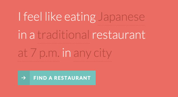
There is something really interesting about Natural Language UIs so we wanted to play around with NL forms and custom form elements. The idea is to turn a classic form into one that uses natural language to obtain information from the user. For that we’ll construct a sentence where some words and parts are select elements and text inputs. We’ll then transform the select elements so that we can customize them.
Natural language forms are quite suitable for some UI cases, not for all, of course. They have a couple of limitations but they can also be more engaging for users if used in the right place and in the right way. Anyway, we wanted to give this concept a try and we’ll show you how we did it.
The Markup
The HTML will be composed of a form with a sentence and some select and text input elements:
<form id="nl-form" class="nl-form">
	I feel like eating
	<select>
		<option value="1" selected>any food</option>
		<option value="2">Indian</option>
		<option value="3">French</option>
		<option value="4">Japanese</option>
		<option value="2">Italian</option>
	</select>
	<br />in a
	<select>
		<option value="1" selected>standard</option>
		<option value="2">fancy</option>
		<option value="3">hip</option>
		<option value="4">traditional</option>
		<option value="2">fine</option>
	</select>
	restaurant
	<select>
		<option value="1" selected>anytime</option>
	 	<option value="1">at 7 p.m.</option>
	 	<option value="2">at 8 p.m.</option>
	 	<option value="3">at 9 p.m.</option>
	</select>
	in <input type="text" value="" placeholder="any city" data-subline="For example: <em>Los Angeles</em> or <em>New York</em>"/>
	<div class="nl-submit-wrap">
		<button class="nl-submit" type="submit">Find a restaurant</button>
	</div>
	<div class="nl-overlay"></div>
</form>
We want to transform the select elements to a custom drop-down list, like this:
<div class="nl-field nl-dd">
	<a class="nl-field-toggle">any food</a>
	<ul>
		<li class="nl-dd-checked">any food</li>
		<li>Indian</li>
		<li>French</li>
		<li>Japanese</li>
		<li>Italian</li>
	</ul>
</div>
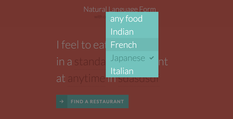
The toggle is the visual part in the sentence. We’ll hide the list and when we click on the toggle we want the list to appear with a nice transition. Once we click on one of the list items, we’ll replace the toggle value with the newly selected one.
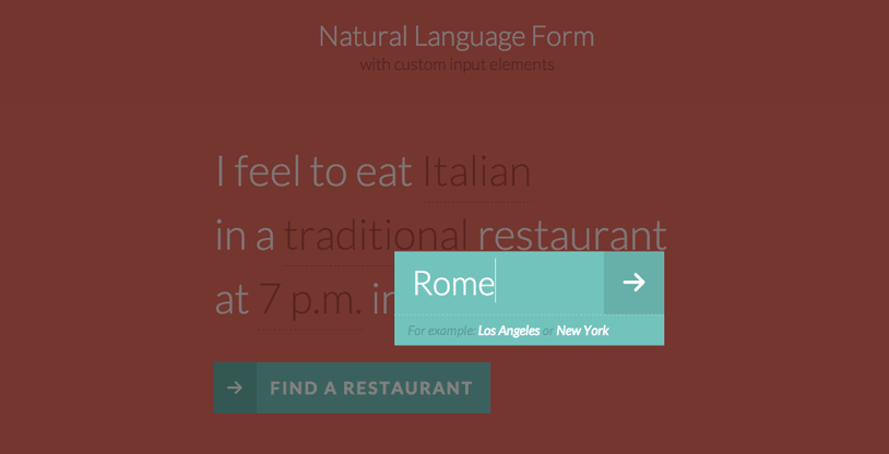
The text input will also be transformed into a similar element:
<div class="nl-field nl-ti-text">
	<a class="nl-field-toggle">any city</a>
	<ul>
		<li class="nl-ti-input">
			<input type="text" value="" placeholder="any city" />
			<button class="nl-field-go">Go</button>
		</li>
		<li class="nl-ti-example">For example: <em>Los Angeles</em> or <em>New York</em></li>
	</ul>
</div>
The CSS
Note that the CSS will not contain any vendor prefixes, but you will find them in the files. Some proprietary browser rules will be listed, though.
Let’s first add some icons (checkmark and arrow):
@font-face {
	font-family: 'nlicons';
	src:url('../fonts/nlicons/nlicons.eot');
	src:url('../fonts/nlicons/nlicons.eot?#iefix') format('embedded-opentype'),
		url('../fonts/nlicons/nlicons.woff') format('woff'),
		url('../fonts/nlicons/nlicons.ttf') format('truetype'),
		url('../fonts/nlicons/nlicons.svg#nlicons') format('svg');
	font-weight: normal;
	font-style: normal;
}
The form will have some general styles:
/* general style for the form */
.nl-form {
	width: 100%;
	margin: 0.3em auto 0 auto;
	font-size: 4em;
	line-height: 1.5;
}
Let’s remove the default styling for all the lists:
.nl-form ul {
	list-style: none;
	margin: 0;
	padding: 0;
}
And we’ll also normalize the form elements and make them look like everything else:
.nl-form input,
.nl-form select,
.nl-form button {
	border: none;
	background: transparent;
	font-family: inherit;
	font-size: inherit;
	color: inherit;
	font-weight: inherit;
	line-height: inherit;
	display: inline-block;
	padding: 0;
	margin: 0;
}
We don’t want any outline on a focussed element:
.nl-form input:focus {
	outline: none;
}
Now, let’s take care of the custom field element. Remember, this is the custom class that we give to the transformed drop-down list and the text input element:
.nl-field {
	display: inline-block;
	position: relative;
}
Using inline-block will keep the element in the flow of our sentence.
When we click on the toggle, we want the whole thing to open. For that we also need to set a high z-index to the custom field:
.nl-field.nl-field-open {
	z-index: 10000;
}
The toggle itself, which is the visible part in the sentence, will have the following style:
.nl-field-toggle,
.nl-form input,
.nl-form select  {
	line-height: inherit;
	display: inline-block;
	color: #b14943;
	cursor: pointer;
	border-bottom: 1px dashed #b14943;
}
The same style we’ll apply to the default form elements if JS is disabled.
The unordered list will be hidden and positioned absolutely. We will use the visibility transition trick to be able to transition the opacity properly. The trick is about setting a delay for the visibility transition by default (when it disappears) and no delay when the .nl-field-open class is applied to its parent (when it appears):
/* drop-down list / text element */
.nl-field ul {
	position: absolute;
	visibility: hidden;
	background: #76C3BD;
	left: -0.5em;
	top: 50%;
	font-size: 80%;
	opacity: 0;
	transform: translateY(-40%) scale(0.9);
	transition: visibility 0s 0.3s, opacity 0.3s, transform 0.3s;
}

.nl-field.nl-field-open ul {
	visibility: visible;
	opacity: 1;
	transform: translateY(-50%) scale(1);
	transition: visibility 0s 0s, opacity 0.3s, transform 0.3s;
}
The style for the list elements and specifically for the ones of the drop-down are the following:
.nl-field ul li {
	color: #fff;
	position: relative;
}

.nl-dd ul li {
	padding: 0 1.5em 0 0.5em;
	cursor: pointer;
	white-space: nowrap;
}

.nl-dd ul li.nl-dd-checked {
	color: #478982;
}

.no-touch .nl-dd ul li:hover {
	background: rgba(0,0,0,0.05);
}

.no-touch .nl-dd ul li:hover:active {
	color: #478982;
}
Let’s define the icons for some of our elements:
/* icons for some elements */
.nl-dd ul li.nl-dd-checked:before,
.nl-submit:before,
.nl-field-go:before {
	font-family: 'nlicons';
	speak: none;
	font-style: normal;
	font-weight: normal;
	font-variant: normal;
	text-transform: none;
	-webkit-font-smoothing: antialiased;
}

.nl-dd ul li.nl-dd-checked:before {
	content: "e000";
	position: absolute;
	right: 1em;
	font-size: 50%;
	line-height: 3;
}
The text input replacement field will have a minimum width:
.nl-ti-text ul {
	min-width: 8em;
}
The text input field, which we are still using but wrapped in our overlay field structure, will have the following style:
.nl-ti-text ul li.nl-ti-input input {
	width: 100%;
	padding: 0.2em 2em 0.2em 0.5em;
	border-bottom: none;
	color: #fff;
}
The arrow button will be positioned absolutely and we’ll out it on the right side:
.nl-form .nl-field-go {
	position: absolute;
	right: 0;
	top: 0;
	height: 100%;
	cursor: pointer;
	background: rgba(0,0,0,0.1);
	width: 1.8em;
	text-align: center;
	color: transparent;
}
The icon itself will have the following style:
.nl-field-go:before {
	content: "e001";
	font-size: 75%;
	color: #fff;
	width: 100%;
	line-height: 2.5;
	display: block;
}
Let’s change the placeholder text colors to fit into the color scheme:
/* custom placeholder color */
input::-webkit-input-placeholder {
	color: rgba(255,255,255,0.8);
}

input:active::-webkit-input-placeholder ,
input:focus::-webkit-input-placeholder {
	color: rgba(255,255,255,0.2);
}

input::-moz-placeholder {
	color: rgba(255,255,255,0.8);
}

input:active::-moz-placeholder,
input:focus::-moz-placeholder {
	color: rgba(255,255,255,0.2);
}

input:-ms-input-placeholder {
	color: rgba(255,255,255,0.8);
}

input:active::-ms-input-placeholder ,
input:focus::-ms-input-placeholder {
	color: rgba(255,255,255,0.2);
}
The description text item will have a smaller font size:
/* example field below text input */
.nl-ti-text ul li.nl-ti-example {
	font-size: 40%;
	font-style: italic;
	font-weight: 400;
	padding: 0.4em 1em;
	color: rgba(0,0,0,0.2);
	border-top: 1px dashed rgba(255,255,255,0.7);
}

.nl-ti-text ul li.nl-ti-example em {
	color: #fff
}
Let’s style the submit button and the icon:
.nl-submit-wrap {
	margin-top: 0.4em;
}

.nl-form .nl-submit {
	line-height: 3;
	text-transform: uppercase;
	cursor: pointer;
	position: relative;
	background: #76C3BD;
	color: #fff;
	padding: 0 1em 0 0;
	font-size: 40%;
	font-weight: bold;
	letter-spacing: 3px;
}

.nl-submit:before {
	content: "e001";
	color: #fff;
	float: left;
	padding: 0 0.7em;
	margin: 0 0.8em 0 0;
	background: #69B1A9;
}

.no-touch .nl-form .nl-submit:hover,
.no-touch .nl-form .nl-submit:active {
	background: #69B1A9;
}

.no-touch .nl-form .nl-submit:hover:before {
	background: #58a199;
}
The overlay will be a fixed element and we’ll show it when one of the field elements are opened using the general sibling selector:
.nl-overlay {
	position: fixed;
	top: 0;
	left: 0;
	width: 100%;
	height: 100%;
	background: rgba(0,0,0,0.5);
	opacity: 0;
	z-index: 9999;
	visibility: hidden;
	transition: visibility 0s 0.3s, opacity 0.3s;
}

.nl-field.nl-field-open ~ .nl-overlay {
	opacity: 1;
	visibility: visible;
	-webkit-transition-delay: 0s;
	-moz-transition-delay: 0s;
	transition-delay: 0s;
}
Last, but not least, let’s add some media queries for adjusting the size on smaller devices:
@media screen and (max-width: 45em) {
	.nl-form {
		font-size: 3em;
	}
}

@media screen and (max-width: 25em) {
	.nl-form {
		font-size: 2em;
	}
}
And that’s all the style. Now, let’s have a look at the JavaScript.
The JavaScript
Let’s start by defining the object representing the form element:
function NLForm( el ) {
	// the form element
	this.el = el;
	// the overlay
	this.overlay = this.el.querySelector( '.nl-overlay' );
	// array with all the possible custom fields
	this.fields = [];
	// counter for each custom field
	this.fldOpen = -1;
	this._init();
}
We will start by creating some custom structure by replacing all the select and input elements inside the form. We will define a object that represents each one of these custom fields – NLField.
NLForm.prototype = {
	_init : function() {
		var self = this;
		Array.prototype.slice.call( this.el.querySelectorAll( 'select' ) ).forEach( function( el, i ) {
			self.fldOpen++;
			self.fields.push( new NLField( self, el, 'dropdown', self.fldOpen ) );
		} );
		Array.prototype.slice.call( this.el.querySelectorAll( 'input' ) ).forEach( function( el, i ) {
			self.fldOpen++;
			self.fields.push( new NLField( self, el, 'input', self.fldOpen ) );
		} );
	},
	...
}

function NLField( form, el, type, idx ) {
	this.form = form;
	// the original HTML element
	this.elOriginal = el;
	this.pos = idx;
	this.type = type;
	this._create();
	this._initEvents();
}
NLField.prototype = {
	_create : function() {
		if( this.type === 'dropdown' ) {
			this._createDropDown();
		}
		else if( this.type === 'input' ) {
			this._createInput();
		}
	},
	...
}
The structure will be different depending if it’s a select box or an input field.
NLField.prototype = {
	...
	_createDropDown : function() {
		var self = this;
		this.fld = document.createElement( 'div' );
		this.fld.className = 'nl-field nl-dd';
		this.toggle = document.createElement( 'a' );
		this.toggle.innerHTML = this.elOriginal.options[ this.elOriginal.selectedIndex ].innerHTML;
		this.toggle.className = 'nl-field-toggle';
		this.optionsList = document.createElement( 'ul' );
		var ihtml = '';
		Array.prototype.slice.call( this.elOriginal.querySelectorAll( 'option' ) ).forEach( function( el, i ) {
ihtml += self.elOriginal.selectedIndex === i ? 'Finally we will bind some events to the custom fields. For the dropdown we want to update the form field with the value chosen from the list of options, and for the input the User will type the desired value and either press enter, the submit button or simply click the overlay to update the form value.
NLField.prototype = {
	...
	_initEvents : function() {
		var self = this;
		this.toggle.addEventListener( 'click', function( ev ) { ev.preventDefault(); ev.stopPropagation(); self._open(); } );
		this.toggle.addEventListener( 'touchstart', function( ev ) { ev.preventDefault(); ev.stopPropagation(); self._open(); } );

		if( this.type === 'dropdown' ) {
			var opts = Array.prototype.slice.call( this.optionsList.querySelectorAll( 'li' ) );
			opts.forEach( function( el, i ) {
				el.addEventListener( 'click', function( ev ) { ev.preventDefault(); self.close( el, opts.indexOf( el ) ); } );
				el.addEventListener( 'touchstart', function( ev ) { ev.preventDefault(); self.close( el, opts.indexOf( el ) ); } );
			} );
		}
		else if( this.type === 'input' ) {
			this.getinput.addEventListener( 'keydown', function( ev ) {
				if ( ev.keyCode == 13 ) {
					self.close();
				}
			} );
			this.inputsubmit.addEventListener( 'click', function( ev ) { ev.preventDefault(); self.close(); } );
			this.inputsubmit.addEventListener( 'touchstart', function( ev ) { ev.preventDefault(); self.close(); } );
		}

	},
	_open : function() {
		if( this.open ) {
			return false;
		}
		this.open = true;
		this.form.fldOpen = this.pos;
		var self = this;
		this.fld.className += ' nl-field-open';
	},
	close : function( opt, idx ) {
		if( !this.open ) {
			return false;
		}
		this.open = false;
		this.form.fldOpen = -1;
		this.fld.className = this.fld.className.replace(/b nl-field-openb/,'');

		if( this.type === 'dropdown' ) {
			if( opt ) {
				// remove class nl-dd-checked from previous option
				var selectedopt = this.optionsList.children[ this.selectedIdx ];
				selectedopt.className = '';

				opt.className = 'nl-dd-checked';
				this.toggle.innerHTML = opt.innerHTML;

				// update selected index value
				this.selectedIdx = idx;
				// update original select element´s value
				this.elOriginal.value = this.elOriginal.children[ this.selectedIdx ].value;
			}
		}
		else if( this.type === 'input' ) {
			this.getinput.blur();
			this.toggle.innerHTML = this.getinput.value.trim() !== '' ? this.getinput.value : this.getinput.placeholder;
			this.elOriginal.value = this.getinput.value;
		}
	}
	...
}
And that’s it! I hope you enjoyed this tutorial and find it inspiring!

This is great. I guess I would be a bit concerned if those ‘no-script’ people show up to my page. is there a way to make it fail to a select?