From our sponsor: Leverage AI for dynamic, custom website builds with ease.
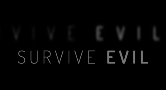
Today I want to show you how to create a fun little typography effect with CSS animations and text shadows. Maybe you know those eerie opening sequences of movie trailers where some text is being faded in on a dark background. After seeing Introducting Briefs (which is not a terror movie trailer but a preview for an interesting app) I got inspired for recreating the effect using CSS.
The idea is to blur text and make it appear with a rotation while animating the space between the letters. This can be achieved in a variety of ways using properties like the new CSS filters, animating padding or margin and more. Here we’ll simply use text shadows and letter-spacing to achieve the desired effect. Since we will need to control each letter, we’ll use Dave Rupert’s Lettering.js to wrap the words and letters into multiple spans.
So, let’s do it.
The idea is to have a couple of sentences fade in with the aforementioned effect, so we’ll want to wrap every appearing bit into an h2:
<div class="os-phrases">
	<h2>Sometimes it's better</h2>
	<h2>to hide</h2>
	<h2>in order to</h2>
	<h2>survive evil</h2>
	<h2>Thanatos</h2>
	<h2>This fall</h2>
	<h2>Prepare</h2>
	<h2>Refresh to replay</h2>
</div>
Remember, this is just a experimental effect; let’s not be too strict with markup best practices 🙂
Now that we have the pieces of the sentences in place, let’s apply lettering to wrap every word and letter into a span. We will actually need a letter to be wrapped into two spans because we want to use perspective on each single letter. So let’s go nuts and do this:
$("#os-phrases > h2").lettering('words').children("span").lettering().children("span").lettering();
This will created the following insane structure:
<div class="os-phrases" id="os-phrases">
	<h2>
		<span class="word1">
			<span class="char1">
				<span class="char1">
				  S
				</span>
			</span>
			<span class="char2">
				<span class="char1">
				  o
				</span>
			</span>
			<span class="char3">
				<span class="char1">
				  m
				</span>
			</span>
			<!-- ... -->
		</span> <!-- /word1 -->
		<!-- ... -->
	</h2>
	<h2>
		<!-- ... -->
	</h2>
	<!-- ... -->
</div>
We don’t really have to go that nuts but we want to be persnickety when it comes to the slight rotation: we want it to be in perspective. Rotating it without perspective will not differ too much but we want the real deal. If we are already using lettering.js we might as well go all the way.
Now that we’ve created a span wrapping hell, let’s make use of this mess and style the nested letters 🙂
Note that the CSS will not contain any vendor prefixes, but you will find them in the files.
Our heading will be placed blatantly on the screen, absolutely, occupying all space:
.os-phrases h2 {
	font-family: 'Dosis', 'Lato', sans-serif;
	font-size: 70px;
	font-weight: 200;
	height: 100%;
	width: 100%;
	overflow: hidden;
	text-transform: uppercase;
	padding: 0;
	margin: 0;
	position: absolute;
	top: 0;
	left: 0;
	letter-spacing: 14px;
	text-align: center;
}
We want our sentences not to wrap but we want them to be centered across the screen, vertically and horizontally. How do we do that? Yes, right, we’ll abuse flexbox for that:
.os-phrases h2,
.os-phrases h2 > span {
	height: 100%;
	/* Centering with flexbox */
    display: flex;
    flex-direction: row;
    justify-content: center;
    align-items: center;
}
Note that the default value for flex-wrap is nowrap which is exactly what we want, so no need to add it here.
This will center our sentence parts nicely.
Let’s add some space between words:
.os-phrases h2 > span {
	margin: 0 15px;
}
The first wrapper for a letter will have perspective:
.os-phrases h2 > span > span {
	display: inline-block;
	perspective: 1000px;
	transform-origin: 50% 50%;
}
The letters itself will be transparent and we’ll run an animation on them. The animation will take 5.2 seconds.
.os-phrases h2 > span > span > span {
	display: inline-block;
	color: hsla(0,0%,0%,0);
	transform-style: preserve-3d;
	transform: translate3d(0,0,0);
	animation: OpeningSequence 5.2s linear forwards;
}
Before we get into the animation, let’s already define the delays for the sentence parts. The 5th sentence part, the one that has our imaginary movie title “Thanatos”, will be a special one and we’ll make it take longer and appear a bit later. The 6th and 7th will follow each other more quickly.

.os-phrases h2:nth-child(2) > span > span > span {
	animation-delay: 5s;
}

.os-phrases h2:nth-child(3) > span > span > span {
	animation-delay: 10s;
}

.os-phrases h2:nth-child(4) > span > span > span {
	animation-delay: 15s;
}

.os-phrases h2:nth-child(5) > span > span > span {
	font-size: 150px;
	animation-delay: 21s;
	animation-duration: 8s;
}

.os-phrases h2:nth-child(6) > span > span > span {
	animation-delay: 30s;
}

.os-phrases h2:nth-child(7) > span > span > span {
	animation-delay: 34s;
}
And the last one? We’ll give that one a special animation, but let’s take a look at the main one first.
In this animation we first want the text-shadow to make the letters look very blurry. The letter spacing will be very large and the letters will be rotated on the Y-axis, so that we only see it as a slice. The opacity is 0.2.
Half-way through the animation, we’ll sharpen up the letters and reduce the letter spacing to 14px, increase opacity and rotate them to 0 so that we are looking right at them.

In the last step, we’ll fade the letters out and scale them up a bit, making them slightly blurry again:
@keyframes OpeningSequence {
	0% {
		text-shadow: 0 0 50px #fff;
		letter-spacing: 80px;
		opacity: 0.2;
		transform: rotateY(-90deg);
	}
	50% {
		text-shadow: 0 0 1px #fff;
		letter-spacing: 14px;
		opacity: 0.8;
		transform: rotateY(0deg);
	}
	85% {
		text-shadow: 0 0 1px #fff;
		opacity: 0.8;
		transform: rotateY(0deg) translateZ(100px);
	}
	100% {
		text-shadow: 0 0 10px #fff;
		opacity: 0;
		transform: translateZ(130px);
		pointer-events: none;
	}
}
Our last sentence part will have another animation, one that will simply fade it in and leave it standing there:
.os-phrases h2:nth-child(8) > span > span > span {
	font-size: 30px;
	animation: FadeIn 4s linear 40s forwards;
}

@keyframes FadeIn {
	0% {
		opacity: 0;
		text-shadow: 0 0 50px #fff;
	}
	100% {
		opacity: 0.8;
		text-shadow: 0 0 1px #fff;
	}
}
Last, but not least, we’ll add some emphasis on specific words by making them bold:
/* Bold words */
.os-phrases h2:first-child .word3,
.os-phrases h2:nth-child(2) .word2,
.os-phrases h2:nth-child(4) .word2 {
	font-weight: 600;
}
And that’s it! I hope this was fun and inspirational!