From our sponsor: Leverage AI for dynamic, custom website builds with ease.
Today I want to show you how to create a fun little typography effect with CSS animations and text shadows. Maybe you know those eerie opening sequences of movie trailers where some text is being faded in on a dark background. After seeing Introducting Briefs (which is not a terror movie trailer but a preview for an interesting app) I got inspired for recreating the effect using CSS.
The idea is to blur text and make it appear with a rotation while animating the space between the letters. This can be achieved in a variety of ways using properties like the new CSS filters, animating padding or margin and more. Here we’ll simply use text shadows and letter-spacing to achieve the desired effect. Since we will need to control each letter, we’ll use Dave Rupert’s Lettering.js to wrap the words and letters into multiple spans.
So, let’s do it.
The idea is to have a couple of sentences fade in with the aforementioned effect, so we’ll want to wrap every appearing bit into an h2:
<div class="os-phrases">
	<h2>Sometimes it's better</h2>
	<h2>to hide</h2>
	<h2>in order to</h2>
	<h2>survive evil</h2>
	<h2>Thanatos</h2>
	<h2>This fall</h2>
	<h2>Prepare</h2>
	<h2>Refresh to replay</h2>
</div>
Remember, this is just a experimental effect; let’s not be too strict with markup best practices 🙂
Now that we have the pieces of the sentences in place, let’s apply lettering to wrap every word and letter into a span. We will actually need a letter to be wrapped into two spans because we want to use perspective on each single letter. So let’s go nuts and do this:
$("#os-phrases > h2").lettering('words').children("span").lettering().children("span").lettering();
This will created the following insane structure:
<div class="os-phrases" id="os-phrases">
	<h2>
		<span class="word1">
			<span class="char1">
				<span class="char1">
				  S
				</span>
			</span>
			<span class="char2">
				<span class="char1">
				  o
				</span>
			</span>
			<span class="char3">
				<span class="char1">
				  m
				</span>
			</span>
			<!-- ... -->
		</span> <!-- /word1 -->
		<!-- ... -->
	</h2>
	<h2>
		<!-- ... -->
	</h2>
	<!-- ... -->
</div>
We don’t really have to go that nuts but we want to be persnickety when it comes to the slight rotation: we want it to be in perspective. Rotating it without perspective will not differ too much but we want the real deal. If we are already using lettering.js we might as well go all the way.
Now that we’ve created a span wrapping hell, let’s make use of this mess and style the nested letters 🙂
Note that the CSS will not contain any vendor prefixes, but you will find them in the files.
Our heading will be placed blatantly on the screen, absolutely, occupying all space:
.os-phrases h2 {
	font-family: 'Dosis', 'Lato', sans-serif;
	font-size: 70px;
	font-weight: 200;
	height: 100%;
	width: 100%;
	overflow: hidden;
	text-transform: uppercase;
	padding: 0;
	margin: 0;
	position: absolute;
	top: 0;
	left: 0;
	letter-spacing: 14px;
	text-align: center;
}
We want our sentences not to wrap but we want them to be centered across the screen, vertically and horizontally. How do we do that? Yes, right, we’ll abuse flexbox for that:
.os-phrases h2,
.os-phrases h2 > span {
	height: 100%;
	/* Centering with flexbox */
    display: flex;
    flex-direction: row;
    justify-content: center;
    align-items: center;
}
Note that the default value for flex-wrap is nowrap which is exactly what we want, so no need to add it here.
This will center our sentence parts nicely.
Let’s add some space between words:
.os-phrases h2 > span {
	margin: 0 15px;
}
The first wrapper for a letter will have perspective:
.os-phrases h2 > span > span {
	display: inline-block;
	perspective: 1000px;
	transform-origin: 50% 50%;
}
The letters itself will be transparent and we’ll run an animation on them. The animation will take 5.2 seconds.
.os-phrases h2 > span > span > span {
	display: inline-block;
	color: hsla(0,0%,0%,0);
	transform-style: preserve-3d;
	transform: translate3d(0,0,0);
	animation: OpeningSequence 5.2s linear forwards;
}
Before we get into the animation, let’s already define the delays for the sentence parts. The 5th sentence part, the one that has our imaginary movie title “Thanatos”, will be a special one and we’ll make it take longer and appear a bit later. The 6th and 7th will follow each other more quickly.

.os-phrases h2:nth-child(2) > span > span > span {
	animation-delay: 5s;
}

.os-phrases h2:nth-child(3) > span > span > span {
	animation-delay: 10s;
}

.os-phrases h2:nth-child(4) > span > span > span {
	animation-delay: 15s;
}

.os-phrases h2:nth-child(5) > span > span > span {
	font-size: 150px;
	animation-delay: 21s;
	animation-duration: 8s;
}

.os-phrases h2:nth-child(6) > span > span > span {
	animation-delay: 30s;
}

.os-phrases h2:nth-child(7) > span > span > span {
	animation-delay: 34s;
}
And the last one? We’ll give that one a special animation, but let’s take a look at the main one first.
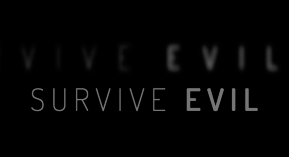
In this animation we first want the text-shadow to make the letters look very blurry. The letter spacing will be very large and the letters will be rotated on the Y-axis, so that we only see it as a slice. The opacity is 0.2.
Half-way through the animation, we’ll sharpen up the letters and reduce the letter spacing to 14px, increase opacity and rotate them to 0 so that we are looking right at them.

In the last step, we’ll fade the letters out and scale them up a bit, making them slightly blurry again:
@keyframes OpeningSequence {
	0% {
		text-shadow: 0 0 50px #fff;
		letter-spacing: 80px;
		opacity: 0.2;
		transform: rotateY(-90deg);
	}
	50% {
		text-shadow: 0 0 1px #fff;
		letter-spacing: 14px;
		opacity: 0.8;
		transform: rotateY(0deg);
	}
	85% {
		text-shadow: 0 0 1px #fff;
		opacity: 0.8;
		transform: rotateY(0deg) translateZ(100px);
	}
	100% {
		text-shadow: 0 0 10px #fff;
		opacity: 0;
		transform: translateZ(130px);
		pointer-events: none;
	}
}
Our last sentence part will have another animation, one that will simply fade it in and leave it standing there:
.os-phrases h2:nth-child(8) > span > span > span {
	font-size: 30px;
	animation: FadeIn 4s linear 40s forwards;
}

@keyframes FadeIn {
	0% {
		opacity: 0;
		text-shadow: 0 0 50px #fff;
	}
	100% {
		opacity: 0.8;
		text-shadow: 0 0 1px #fff;
	}
}
Last, but not least, we’ll add some emphasis on specific words by making them bold:
/* Bold words */
.os-phrases h2:first-child .word3,
.os-phrases h2:nth-child(2) .word2,
.os-phrases h2:nth-child(4) .word2 {
	font-weight: 600;
}
And that’s it! I hope this was fun and inspirational!


HOROR !!!
S P E L L I NG ! ! !
Okay, HORROR !!! 🙂
Great !
You are fantastic !
Great like always. And a big thanks for screenshots 🙂
Dear Mary;
I’m a single, semi-attractive male. I cook, I clean and am bare-footed in the kitchen for the most part when I’m not coding sites for clients. I could go on and on about traits that make me best suited for you but I’ll sum it to…WILL YOU MARRY ME?
WOW WOW WOW
You should probably use
user-select: none;to prevent users from selecting the hidden text 😉Good point. I noticed that too when watching the demo.
other than that: great stuff!
I’m in love with YOUr work…
You rock!
How to implement this effect in first load and then to switch to normal site look?
Do you know what “Thanatos” means? Thanatos is a greek word and it means “death”. And I am proud of you 🙂 Who needs FLASH anymore?
Yes, I picked that name because of its Greek meaning 😉
WoW 🙂
Awesome effect but only in Chome and Opera looks perfect. In Safari I only see “Refresh to replay” animation and in FF blur effect in far from perfection. BUT STILL IS F**KIN’ GREAT PIECE OF CODING. Hail for our Queen Mary of St.Code 🙂
Great tutorial,
I just recently re-designed my personal portfolio page doing something simliar using animation delay, durations, and keyframes with CSS3 – Take a look.
http://www.aaron-armstrong.com
Cheers.
Terrific!
Very nice! 🙂
it’s a great work you did…
Sweet jesus, it’s just AWESOME! Great job dude!
NOT working in latest version of Safari.
Simply awesome …
Mary, goddess of CSS! I know I should be leaving a constructive comment but I can’t think of any at the moment. I just thought this was awesome. I’ve always been in the learning process and never knew something like this, which is usually done in flash or video, is doable using CSS animation.
Mad props!
That’s really cool, but I’m curious as to why you use ? I’ve noticed it a in a few things you do, was just wondering! Ta
Opps! Seems my comment filterted out the HTML.
I meant to say why do you use the blank HTML comments
amazing :-D, love it
Does not work in IE10. (Tested on my Lumia 920)
Can you explain to me why it works when I look at the Demo in Safari, but when I upload the demo on my server/or look at it my computer in Safari it no longer works? Thank.
Same problem here and couldn’t figure out any effective solution yet. Any working suggestion anyone? Thanks a lot, in advance…
David
Replace the script in the index file with:
$(document).ready(function() { $("#os-phrases > h2").css('opacity',1).lettering('words').children("span").lettering().children("span").lettering(); })MANY thanks Tim! It is now working in Safari.
How many files are we supposed to have? Where does this section of code go into?
is it possible to make a loop ?
Mmmm,
very interesting code !
Thanks for sharing !
Ooopss:
Top icon of IE is on “question mark”,
last version of Safari in Windows work.
it does not work in any versions of IExplorer
She already pointed that.
It’s awesome, thanks for sharing again, Mary
Very Impressive!!! your genius!..
Is it possible to write multiline texts? Instead of just one line?
Great
greetings from Mexico.
is very clever.
Is it possible do the same with images???
After animation ,how to redirect somewhere?
“thanatos”? that’s greek word for death
GreenSock would make this REALLY easy. . . http://www.greensock.com/gsap-js/
So after the animation is done, how can I create a link with the last text frame?
I am trying to do the same thing. Would love some help on this! Jesse, I’ll let you know if I figure something out.
just try using a delay… something like :
in the section…but you have to put the exact animation time…
Tell me how to implement support for Cyrillic?
Very Nice!!!
I change de color but not work some one cam help me?
Is there a way to tell when the animation function is completed?
how do I put some HTML element, form etc at the end of animation ?? please someone help me
I want to use it but don’t know how to redirect to other page after sequence is completed. Can you please tell me. Help this poor student please. 😛
where content is time in seconds
Hi Mary Thanks for wonderful tutorial.
I have one question. Is it possible to redirect this animation to main website once it finish?
Have a wonderful day.
Regards,
The Rockstar
Thanks to provide this source.
Can anyone tell me how to repeat the text animation without refresh the page??
very very nice!!! but how change the font color?
Awesome!
IE 10 hidden text 🙁 , select screen ( black font color ) but chrome very good 🙂
Hi!
I try to add a backgound-image for body but it doesn’t work. Could you help me please?
I just add
body {
background-image: url(“../img/bg.jpg”);
}
to component.css. But it doesnt work. What’s wrong?
Thank you!
Because of
color: hsla(0,0%,0%,0);, it can’s display right in IE 10/11. But why with transparent property Chrome still show the text inopacity: 0.8;, IE obey the standards.Any chance on the last line of text to have a hyperlink to enter a website. Its a great intro!
Greetings Peter,
I Have Devised a method to implement your plan of making this tutorial an intro for your website…… but this requires some counting (precise , with a stopwatch….) In your Markup ‘ Head Section’ add this line
<meta http-equiv="refresh" content="58; url=code.htm">where ’58 seconds represent the time taken for your animation to complete . in the BODY section , change the last h2 tag to something like “please wait , loading” etc and then run your animation and note the total time taken for your animation with a Stopwatch and then add +2 to the time and replace ’58’ with it … 😀Mary , please tell how we can hyperlink text wrapped with lettring.js ?
Cheers,
Is that possible to make it restart animation without refresh the page?
This is a really sick design. Totally awesome for use. You’re awesome Mary
Hi? Nice animation you have there but i had a problem with viewing the animation on I.E .. As designers and developers, what solution can we come up with coz most clients tend to use I.E and not the advanced ones but version 7,6 and 5…
First of all, thank you so much for this article and tutorial. Second, let me ask you a question: I have this problem: when I use a ‘very long long text on the same line’ it is not splitted even if I use
<br/>to break the line.How can I fix it?
Many thanks in advance, have a nice day.
how can animate in loop
Hey Mary! Great job! Keep up!
Hello! is it possible to put any sound attached to animation?