From our sponsor: Leverage AI for dynamic, custom website builds with ease.
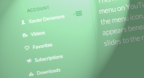
Today we’ll show you how to recreate the little menu effect that you can see in the left side-menu on YouTube when watching a video (where it says “Guide”). The menu is made of a little menu icon, a label and a list of menu items that appears when the label or menu icon is clicked. Once it’s clicked the menu icon slides to the right and the label moves up while the list items fade in sequentially. We’ll add some more style and effects to it in order to make it a bit more interesting.
So, let’s do it!
The Markup
For the HTML we will use a nav element and inside we’ll add a div that will contain the menu icon and the label. We’ll use an unordered list for the menu items:
<nav id="dr-menu" class="dr-menu">
	<div class="dr-trigger"><span class="dr-icon dr-icon-menu"></span><a class="dr-label">Account</a></div>
	<ul>
		<li><a class="dr-icon dr-icon-user" href="#">Xavier Densmore</a></li>
		<li><a class="dr-icon dr-icon-camera" href="#">Videos</a></li>
		<li><a class="dr-icon dr-icon-heart" href="#">Favorites</a></li>
		<li><a class="dr-icon dr-icon-bullhorn" href="#">Subscriptions</a></li>
		<li><a class="dr-icon dr-icon-download" href="#">Downloads</a></li>
		<li><a class="dr-icon dr-icon-settings" href="#">Settings</a></li>
		<li><a class="dr-icon dr-icon-switch" href="#">Logout</a></li>
	</ul>
</nav>
Each menu item will have a little icon, so we’ll give them all different classes for that. The icons that we’ll be using are from IcoMoon and we’ve created a custom icon set with their brilliant app.
Let’s take a look at the CSS.
The CSS
Note that the CSS will not contain any vendor prefixes, but you will find them in the files.
First, we will include our icon font:
@font-face {
	font-family: 'icomoon';
	src:url('../fonts/icomoon.eot');
	src:url('../fonts/icomoon.eot?#iefix') format('embedded-opentype'),
		url('../fonts/icomoon.woff') format('woff'),
		url('../fonts/icomoon.ttf') format('truetype'),
		url('../fonts/icomoon.svg#icomoon') format('svg');
	font-weight: normal;
	font-style: normal;
}
The main nav container will have some general styles, like font size, line-height, color and the dimensions. We want it to be flexible but we don’t want it to become too large or too small, so we’ll set a max-width and min-width:
.dr-menu {
	width: 100%;
	max-width: 400px;
	min-width: 300px;
	position: relative;
	font-size: 1.3em;
	line-height: 2.5;
	font-weight: 400;
	color: #fff;
	padding-top: 2em;
}
The division that contains the menu icon span and the label link will be positioned absolutely and we’ll set the cursor to “pointer”. It needs a high z-index to guarantee that the unordered list does not stay on top of it:
.dr-menu > div  {
	cursor: pointer;
	position: absolute;
	width: 100%;
	z-index: 100;
}
The menu icon span in our trigger division will also be positioned absolutely and we’ll give it a transition:
.dr-menu > div .dr-icon {
	top: 0;
	left: 0;
	position: absolute;
	font-size: 150%;
	line-height: 1.6;
	padding: 0 10px;
	transition: all 0.4s ease;
}
When we click on the trigger division, we will give a class called “dr-menu-open” to the nav. The menu icon will then slide to the left and we’ll also translate it for the maount of its own width so that it’s put back nicely into place without spilling over:
.dr-menu.dr-menu-open > div .dr-icon {
	color: #60a773;
	left: 100%;
	transform: translateX(-100%);
}
In the end of the CSS we will add our icon classes from IcoMoon. The icon in the span for the menu icon will be a bit different, and we’ll use the pseudo class :after to add the little triangle. So, let’s define that as follows:
.dr-menu > div .dr-icon:after {
	content: "e008";
	position: absolute;
	font-size: 50%;
	line-height: 3.25;
	left: -10%;
	opacity: 0;
}
The icon will be absolute and we’ll pull it into place by giving it a left of -10%. The initial opacity is set to 0 because we don’t want to see it initially when the menu is closed.
Once we open the menu, we will want it to become visible:
.dr-menu.dr-menu-open > div .dr-icon:after {
	opacity: 1;
}
The label, which is an anchor in our HTML, will get some general styling and we’ll give it a padding so that it’s next to the menu icon. We’ll also add a transition because we want to animate it up, once we open the menu, which we will do by translating it on the Y-axis:
.dr-menu > div .dr-label {
	padding-left: 3em;
	position: relative;
	display: block;
	color: #60a773;
	font-size: 0.9em;
	font-weight: 700;
	letter-spacing: 1px;
	text-transform: uppercase;
	line-height: 2.75;
	transition: all 0.2s ease-in;
}

.dr-menu.dr-menu-open > div .dr-label {
	transform: translateY(-90%);
}
The unordered list will initially be invisible by having a opacity of 0:
.dr-menu ul {
	padding: 0;
	margin: 0 3em 0 0;
	list-style: none;
	opacity: 0;
	position: relative;
	z-index: 0;
	pointer-events: none;
	transition: opacity 0s linear 205ms;
}
When we open the menu we want it to get visible and a high z-index so that the trigger div does not cover it:
.dr-menu.dr-menu-open ul {
	opacity: 1;
	z-index: 200;
	pointer-events: auto;
	transition: opacity 0s linear 0s;
}
The two transitions are for opening and closing the menu. When we open the menu, we want it to appear immediately without a delay and when we close it, i.e. remove the class, we want that it happens with a delay. That delay is defined by the delay of the last item in the list, as we will see shortly.
The list items will also be invisible and we’ll set a transition for the opacity:
.dr-menu ul li {
	display: block;
	margin: 0 0 5px 0;
	opacity: 0;
	transition: opacity 0.3s ease;
}

.dr-menu.dr-menu-open ul li {
	opacity: 1;
}
Now, each list item will appear with a different delay: the first item will fade in immediately and the last item will appear in the end:
.dr-menu.dr-menu-open ul li:nth-child(2) {
	transition-delay: 35ms;
}

.dr-menu.dr-menu-open ul li:nth-child(3) {
	transition-delay: 70ms;
}

.dr-menu.dr-menu-open ul li:nth-child(4) {
	transition-delay: 105ms;
}

.dr-menu.dr-menu-open ul li:nth-child(5) {
	transition-delay: 140ms;
}

.dr-menu.dr-menu-open ul li:nth-child(6) {
	transition-delay: 175ms;
}

.dr-menu.dr-menu-open ul li:nth-child(7) {
	transition-delay: 205ms;
}
The links will have some padding and we’ll set them as inline-blocks:
.dr-menu ul li a {
	display: inline-block;
	padding: 0 20px;
	color: #fff;
}
And we’ll change the color on hover:
.dr-menu ul li a:hover {
	color: #60a773;
}
Last, but not least, let’s define the icon pseudo-elements:
.dr-icon:before,
.dr-icon:after {
	position: relative;
	font-family: 'icomoon';
	speak: none;
	font-style: normal;
	font-weight: normal;
	font-variant: normal;
	text-transform: none;
	-webkit-font-smoothing: antialiased;
}

.dr-menu ul .dr-icon:before {
	margin-right: 15px;
}

.dr-icon-bullhorn:before {
	content: "e000";
}

.dr-icon-camera:before {
	content: "e002";
}

.dr-icon-heart:before {
	content: "e003";
}

.dr-icon-settings:before {
	content: "e004";
}

.dr-icon-switch:before {
	content: "e005";
}

.dr-icon-download:before {
	content: "e006";
}

.dr-icon-user:before {
	content: "e001";
}

.dr-icon-menu:before {
	content: "e007";
}
And that’s all the style. Let’s take a look at the JavaScript.
The JavaScript
We’ll create a small script that will take care of the menu functionality. When we click on the trigger division, we want the menu wrapper to get the class “dr-menu-open”. Since we will be animating the label out and the menu icon to the right, we want the closing to happen only when we click on the menu icon, just like in the YouTube menu:
var YTMenu = (function() {

	function init() {

		[].slice.call( document.querySelectorAll( '.dr-menu' ) ).forEach( function( el, i ) {

			var trigger = el.querySelector( 'div.dr-trigger' ),
				icon = trigger.querySelector( 'span.dr-icon-menu' ),
				open = false;

			trigger.addEventListener( 'click', function( event ) {
				if( !open ) {
					el.className += ' dr-menu-open';
					open = true;
				}
			}, false );

			icon.addEventListener( 'click', function( event ) {
				if( open ) {
					event.stopPropagation();
					open = false;
					el.className = el.className.replace(/bdr-menu-openb/,'');
					return false;
				}
			}, false );

		} );

	}

	init();

})();
And that’s it! I hope you enjoyed this tutorial and find it useful!


You Are Just Awesome Thank you
EXACTLY what I was looking for the last hour! Haha, thank you!!
The best tut website that ever I seen. Thanks for your great tutorials
I have a suggest. Please add a section after some coding like ” What we have so far “. I think this help more for amateurs like me. Thanks again
Better than the YouTube Version! 😉
this looks very helpful however i have tried to add this content to a site im building but im unable to, would you please be able to guide me through to how i can open the files correctly
Muy útil, gracias
Providing your subscribers/the world with this nifty menu is a huge favor to us all. Thank you. Just another reason people visit you all year long. Not only very useful, but educational as well.
merci
Awesome. Thank you Mary Lou!! (didn’t mean to rhyme, but I’m sure I’m not the first person to say that either.)
This is awesome! Thanks Mary. As André Köbel above said, this is even a lot better than Youtube’s.
great!!
i’m looking for this!!
Hi,
Always worth, visiting your site. Thanks a lot for your great tutorials.
Great YouTube menu effect, been looking to add something like this to some of my WordPress sites. Thanks Mary!
with so many wonderful ideas will indicate a: Manoela put a paypal donation button on each tutorial you created, I believe that people who have benefited from your tips will be happy to help you, because it is the least we can do for those who thank you for your time and dedication.
might look like this:
“If this article was useful to you, feel free to express their joy!” “paypal button”
what do you think?
Thank you
can you explain about { content=”\e001″} and what should I do to change icons. because i visit font site
http://www.entypo.com/characters/
and beside of \e001 for user icon they are using this codes U+1F464 👤 and when i changed code to this code nothing happen.
Your icon fonts are based off the icomoon.ttf. It is defined when you have a different font value. You can download and use different icon looks. You just need to know what the values are to make that icon show up.
Great Menu! Very helpful for theme makers. 😉 I have a question though… Can you put other links beneath or on top on that menu? Links that aren’t drop down, like that one.
Great Tut, ..I always keep my iPad with me while testing this over the IOS and my native firefox / chrome, Often times..the demos dont work over ipads as they do over chrome, in this case,..the content shifts over the vertical navigation menu and adds a margin of its own,..any fix ?
You may want to add a
-webkit-backface-visibility: hidden;to that demo to prevent webkit browsers from flashing… I put it on.sidevia the inspector and it’s much better. LinkThis looks really nice, thanks for the code. Just one question though if you have a second please… Is it possible to put multiple menus on top of each other? When I do, there is a big gap between them. The code is so neat I don’t want to hack around with it! Is there an easy way to change a couple of lines to make that possible please?
Anyone know how to have it fly out from the other side? I’d like to put it in the right hand corner?
This is great..
Can this be fixed on internet explorer 8 and above?
hi please how can I insert a different icon i’ve tried all i could
Hi, I love this site and the tutorials! For the people wondering how to change the icons, I just fond out: go to a site like IcoMoon and choose the icons you want from the site or by importing them. Afterwards you’ll be able to change the row in wich they should appear later on. Then you’ll need to download the zip file and in the zip file you’ll have a font file. Exchange this one with the one in the theme and reorganize the U+e00.. in the CSS file and you’re done! Hope it helped
I love your website. However, it lacks the browser compatibility
I would like to change the icons but how do u go about that like I know the icon are fonts but how do u place the icon font in the content content :/e003;?
Thanks for the great tutorial! Unfortunately, for some reason I can’t get to make the .dr-label move upwards, while I succeeded making the menu icon move and the ul appear. Is there something particular I should pay attention to?
How would I change the code to keep the menu open instead of closing back up when the user clicks on one of the list items (ie. videos)
Is this free?
If it’s not free then why is there a download button? Kinda makes the obvious..
Haw should I edit the javasript, if I want to hide menu with other buttons (Videos,Favorities,…)?
Nice, Creative…… I think it is more better when we click on the menu, right area become full width (With responsive feature)..
Thanks
Hi! Can you give me tips on how to make the drop down list scrollable (since I have a pretty long list)?
Thank you so much!!
Hi:
The menu is flawless, how I can add submenu items?