From our sponsor: Leverage AI for dynamic, custom website builds with ease.
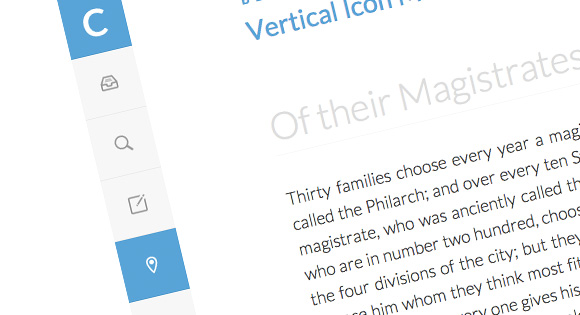
A very simple lateral icon menu with a hover transition. The fixed menu has an example for how to use media queries to adjust the size of the icons for smaller screens. There is also an example class for an active item.
The icon font was created with IcoMoon and the icons are by Matthew Skiles.
The HTML
<ul class="cbp-vimenu">
	<li><a href="#" class="icon-logo">Logo</a></li>
	<li><a href="#" class="icon-archive">Archive</a></li>
	<li><a href="#" class="icon-search">Search</a></li>
	<li class="cbp-vicurrent"><a href="#" class="icon-pencil">Pencil</a></li>
	<li><a href="#" class="icon-location">Location</a></li>
	<li><a href="#" class="icon-images">Images</a></li>
	<li><a href="#" class="icon-download">Download</a></li>
</ul>
The CSS
@font-face {
	font-family: 'ecoico';
	src:url('../fonts/ecoico.eot');
	src:url('../fonts/ecoico.eot?#iefix') format('embedded-opentype'),
		url('../fonts/ecoico.woff') format('woff'),
		url('../fonts/ecoico.ttf') format('truetype'),
		url('../fonts/ecoico.svg#ecoico') format('svg');
	font-weight: normal;
	font-style: normal;
}

.cbp-vimenu {
	position: fixed;
	overflow: hidden;
	top: 0;
	left: 0;
	height: 100%;
	list-style-type: none;
	margin: 0;
	padding: 0;
	background: #f7f7f7;
}

.cbp-vimenu li a {
	display: block;
	text-indent: -500em;
	height: 5em;
	width: 5em;
	line-height: 5em;
	text-align: center;
	color: #999;
	position: relative;
	border-bottom: 1px solid rgba(0,0,0,0.05);
	-webkit-transition: background 0.1s ease-in-out;
	-moz-transition: background 0.1s ease-in-out;
	transition: background 0.1s ease-in-out;
}

.cbp-vimenu li a:hover,
.cbp-vimenu li:first-child a{
	background: #47a3da;
	color: #fff;
}

/* class for current item */
.cbp-vimenu li.cbp-vicurrent a {
	background: #fff;
	color: #47a3da;
}

.cbp-vimenu li a:before {
	font-family: 'ecoico';
	speak: none;
	font-style: normal;
	font-weight: normal;
	text-indent: 0em;
	position: absolute;
	top: 0;
	left: 0;
	width: 100%;
	height: 100%;
	font-size: 1.4em;
	-webkit-font-smoothing: antialiased;
}

.cbp-vimenu li a.icon-logo:before {
	content: "C";
	font-weight: 700;
	font-size: 300%;
	font-family: 'Lato', Calibri, Arial, sans-serif;
}

.icon-search:before {
	content: "e004";
}

.icon-archive:before {
	content: "e005";
}

.icon-download:before {
	content: "e006";
}

.icon-location:before {
	content: "e007";
}

.icon-images:before {
	content: "e009";
}

.icon-pencil:before {
	content: "e008";
}

/* Example for media query (depends on total height of menu) */
@media screen and (max-height: 34.9375em) {

	.cbp-vimenu {
		font-size: 70%;
	}

}

nice and simple
Nice and simple, thanx
Nice. Thanks.
Thanks from Germany i always like reading your tutorials 🙂
hey guys, beautiful work.
how can i add my own icons to the nav?
not a font, but rather some .png’s or .ico’s.
thanks!
@javivo
Awesome article, oh and by the waythis article was mentioned by Adobe Edge animate’s Facebook Page
very nice, likes all your demos.
How can I change the icons??
Greetings and thanks!
Same question here. Definitely interested in using this on my site but how can I change the icons to what I want them to represent? And is there any insight into how to make this work with a WordPress navigation set up?
Thanks! Great stuff!
Stephen
Nice and clean. Plz tell me how can I put a slide out in the menu. I want to show the name of the icon in slid-out manner when mouse goes over it. Thank you
Can you please answer us with the same questions I got “how do we change the Icons using .jpg or png”
Thank you 🙂
Mary Lou typically uses icon fonts made with http://icomoon.io/ . The icons here were made byMatthew Skiles. You can always make your own icon font and switch out the icon in the html/css
awesome!
my fonts are useless to explorer 10, what can i do?
I have used this in one of my projects but it came with the same problem you guys that I had to change the icon.
So instead of using this specific font icon:
.icon-images:before {
content: “/e005”;
}
I deleted and added some css with png icon :
.icon-images:before {
content: “”;
background-image: url(‘/img/icon05.png’);
background-repeat: no-repeat;
margin-left: 22px;
margin-top: 22px;
}
That’s how it worked for me! By the way nice tutorial.
well in case you want only one icon more easy is:
content:url(‘/img/icon05.png’);
ok got it, the solution if you want to have icons (sprite) instead fonts is:
Delete lines :
@font-face {
font-family: ‘cbp-tmicons’;
src:url(‘../fonts/tmicons/cbp-tmicons.eot’);
src:url(‘../fonts/tmicons/cbp-tmicons.eot?#iefix’) format(’embedded-opentype’),
url(‘../fonts/tmicons/cbp-tmicons.woff’) format(‘woff’),
url(‘../fonts/tmicons/cbp-tmicons.ttf’) format(‘truetype’),
url(‘../fonts/tmicons/cbp-tmicons.svg#cbp-tmicons’) format(‘svg’);
font-weight: normal;
font-style: normal;
}
.cbp-tm-submenu li a:before,
.cbp-tm-menu > li > a:before {
// font-family: ‘cbp-tmicons’;
// speak: none;
// font-style: normal;
// font-weight: normal;
// font-variant: normal;
// text-transform: none;
line-height: 1;
vertical-align: middle;
margin-right: 0.6em;
// -webkit-font-smoothing: antialiased;
}
add:
[class^=”icon-“]:before, [class*=” icon-“]:before {
display: inline-block;
width: 1em;
height: 1em;
background-size: contain;
content: “”;
}
.icon-large:before {
width: 24px;
height: 24px;
}
a[class^=”icon-“]:before, a[class*=” icon-“]:before {
margin-right: 5px;
vertical-align: middle;
}
for every icon use:
.icon-email:before {
background:url(‘../my-icons.png’) no-repeat ;
background-position: 0px 0;
}
for hover li effect :
.icon-email:hover:before {
background:url(‘../my-icons_white.png’) no-repeat ;
}
and html code is:
<a href=”#” rel=”nofollow”>Email</a>
Very nice.
I’m making something similiar, but with submenus on click. I’m having some dificulty trying to find a way to make the submenu’s height 100% of the screen with CSS only. Is there a way?
Great post, this is exactly what i was looking for but wanted to do it with font awesome instead of the one you are using.