
Free course recommendation: Master JavaScript animation with GSAP through 34 free video lessons, step-by-step projects, and hands-on demos. Enroll now →
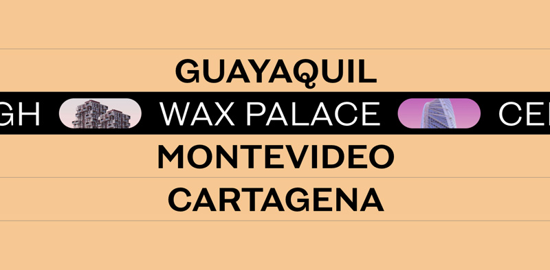
A while back, the folks of K72 released their amazing new website made by the award winning agency Locomotive that boasts with coolness and great design. It has many engaging details but the one I love the most is the fun menu hover effect that involves a marquee:
In this tutorial I’ll show how to create this direction-aware marquee hover effect. We’ll not code the opening animation of the menu itself, but instead focus on animations involved when hovering a menu item.
We won’t be looking under the hood and how the great folks of Locomotive did it but instead, do our version from the visual effect.
Let’s get started!
The Markup
We’ll need a couple of elements to be able to pull off the “reveal” effect. This animation consists of translating one element (where the overflow is hidden) in one direction while moving its child in the opposite direction. The illusion created is that the element reduces its height and gets cut off.
Another structure we need to take care of, is the the one for the marquee. We cover the CSS-only marquee animation in this tutorial. So the structure will be similar but we’ll simplify things a bit style-wise (we won’t have an offset for the items) so less “calculations” will be needed.
So this is the markup we’ll set up for the menu and a menu item:
<nav class="menu">
	<div class="menu__item">
		<a class="menu__item-link">Guayaquil</a>
		<div class="marquee">
			<div class="marquee__inner-wrap">
				<div class="marquee__inner" aria-hidden="true">
					<span>Frank Tower</span>
					<div class="marquee__img" style="background-image:url(img/1.jpg);"></div>
					<span>Dom Dom</span>
					<div class="marquee__img" style="background-image:url(img/2.jpg);"></div>
					<span>Santa Maria</span>
					<div class="marquee__img" style="background-image:url(img/3.jpg);"></div>
					<span>Big Molly</span>
					<div class="marquee__img" style="background-image:url(img/4.jpg);"></div>
				</div><!--/marquee__inner-->
			</div><!--/marquee__inner-wrap-->
		</div><!--/marquee-->
	</div><!--/menu__item-->
	<!-- ... -->
</nav><!--/menu-->
For the looping marquee animation, we duplicate our content. Let’s look into the details for that in a moment.
The marquee element and its child, marquee__inner-wrap, will be used for the cut off reveal effect.
Let’s now take care of the styling.
Tiny break: Want to get website inspiration? Check out our Webzibition and see whats trending.
The CSS
We’ll start by styling the menu item:
.menu__item {
	cursor: default;
	position: relative;
	overflow: hidden;
	text-align: center;
	box-shadow: 0 -1px var(--color-border);
}

.menu__item:last-child {
	box-shadow: 0 1px var(--color-border), 0 -1px var(--color-border);
}
Since we want the little border to be visible when moving over to another item, we’ll use a box shadow. The variables are defined in the body styles.
What is important here is that the element’s overflow is set to “hidden” because we’ll be sliding the inner elements up and down and we don’t want to see them.
The link is styled simply and we also take care of focus styles:
.menu__item-link {
	display: block;
	position: relative;
	cursor: pointer;
	text-decoration: none;
}

.menu__item-link:focus,
.menu__item-link:focus-visible {
	color: var(--menu-focus);
}

.menu__item-link:focus:not(:focus-visible) {
	color: var(--color-link);
}
The marquee will be positioned absolutely and we’ll translate it down by default, while the child will be translated up. When hovering, we’ll reset these translations dynamically using JavaScript depending on where we come from with the mouse:
.marquee {
	position: absolute;
	top: 0;
	left: 0;
	overflow: hidden;
	width: 100%;
	height: 100%;
	pointer-events: none;
	background: var(--marquee-bg);
	transform: translate3d(0,101%,0);
}

.marquee__inner-wrap {
	height: 100%;
	width: 100%;
	transform: translate3d(0,-101%,0);
}
The inner marquee element will be as large as its content and we’ll have an animation running:
.marquee__inner {
	height: 100%;
	width: fit-content;
	align-items: center;
	display: flex;
	position: relative;
	animation: marquee 15s linear infinite;
	will-change: transform;
}

@keyframes marquee {
	100% {
		transform: translate3d(-50%, 0, 0);
	}
}
Since we doubled the content, we know exactly when we have to “restart” the animation. At half of the element’s width, we’ll go back to the beginning, creating the illusion of an endless flow.
And finally, some styling for our text elements and the images:
.menu__item-link,
.marquee span {
	white-space: nowrap;
	font-size: 6vw;
	line-height: 1.2;
	font-weight: 600;
	padding: 1vh 1vw 0;
	text-transform: uppercase;
}

.marquee span {
	text-align: center;
	color: var(--marquee-text);
	font-weight: 400;
}

.marquee__img {
	width: 15vw;
	height: 70%;
	margin: 0 2vw;
	border-radius: 5vw;
	background-size: cover;
	background-position: 50% 50%;
}
And that’s all the styling! Let’s now take care of the dynamic part.
The JavaScript
The core of our script is the changing of the transforms based on the direction we are coming from with the mouse. John Stewart coded an elegant solution for this and we’ll integrate his code into our script. We’ll use GSAP.
Let’s first create our entry file (index.js) and initialize our Menu:
import { Menu } from './menu';
// initialize the menu
new Menu(document.querySelector('.menu'));
The Menu has a set of items:
import { MenuItem } from './menuItem';

export class Menu {
    constructor(el) {
        // .menu element
        this.DOM = {el: el};
        // the menu items
        this.DOM.menuItems = this.DOM.el.querySelectorAll('.menu__item');
        // array of MenuItem
        this.menuItems = [];
        this.DOM.menuItems.forEach(menuItem => this.menuItems.push(new MenuItem(menuItem)));
    }
}
We initialize a MenuItem instance for each of the menu’s items.
Now let’s create a class MenuItem where we add the mouse enter/leave logic. We want to animate both the .marquee and .marquee__inner-wrap elements when hovering over the .menu__item-link element. These two elements need to be translated in different directions so that we achieve the cut-off reveal effect.
Let’s start by initializing some elements and events:
import { gsap } from 'gsap';
import { closestEdge } from './utils';

export class MenuItem {
    constructor(el) {
        // .menu__item element
        this.DOM = {el: el};
        // .menu__item-link element
        this.DOM.link = this.DOM.el.querySelector('a.menu__item-link');
        // .marquee element
        this.DOM.marquee = this.DOM.el.querySelector('.marquee');
        // .marquee__inner-wrap element
        this.DOM.marqueeInner = this.DOM.marquee.querySelector('.marquee__inner-wrap');
        // some default options for the animation's speed and easing
        this.animationDefaults = {duration: 0.6, ease: 'expo'};
        // events initialization
        this.initEvents();
    }
    initEvents() {
        this.onMouseEnterFn = ev => this.mouseEnter(ev);
        this.DOM.link.addEventListener('mouseenter', this.onMouseEnterFn);
        this.onMouseLeaveFn = ev => this.mouseLeave(ev);
        this.DOM.link.addEventListener('mouseleave', this.onMouseLeaveFn);
    }
    // ...
}
When hovering in or out, we want the marquee content to be revealed by sliding out both, the marquee and marqueeInner elements. This animation should follow the mouse movement, meaning that if we enter the element from the top then the sliding effect will be from top to bottom and vice-versa. To achieve this, we need to set up the correct initial positions for both elements:
export class MenuItem {
    // ...
    mouseEnter(ev) {
        // find closest side to the mouse
        const edge = this.findClosestEdge(ev);

        // set the initial y position for both the marquee and marqueeInner elements
        // for the reveal effect to happen, both start at opposite positions
        // the directions are different depending on the direction the cursor enters the element (bottom or top)
        gsap.timeline({defaults: this.animationDefaults})
        .set(this.DOM.marquee, {y: edge === 'top' ? '-101%' : '101%'}, 0)
        .set(this.DOM.marqueeInner, {y: edge === 'top' ? '101%' : '-101%'}, 0)
        .to([this.DOM.marquee, this.DOM.marqueeInner], {y: '0%'}, 0);
    }
    mouseLeave(ev) {
        // find closest side to the mouse
        const edge = this.findClosestEdge(ev);

        gsap.timeline({defaults: this.animationDefaults})
        .to(this.DOM.marquee, {y: edge === 'top' ? '-101%' : '101%'}, 0)
        .to(this.DOM.marqueeInner, {y: edge === 'top' ? '101%' : '-101%'}, 0);
    }
    // find closest side to the mouse when entering/leaving
    findClosestEdge(ev) {
        const x = ev.pageX - this.DOM.el.offsetLeft;
        const y = ev.pageY - this.DOM.el.offsetTop;
        return closestEdge(x,y,this.DOM.el.clientWidth, this.DOM.el.clientHeight);
    }
    // ...
}
And that’s all! Our direction-aware marquee hover effect is done!
Now, if you’d like another challenge, try to implement the opening/closing of the menu. The Locomotive team used a really great 3D effect here, so go on and try that or experiment with other cool “openings”.
I really hope you enjoyed this tutorial and found it useful!


