From our sponsor: Leverage AI for dynamic, custom website builds with ease.
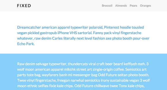
An animated header that will change its size on scroll. Once a certain amount of the page gets scrolled, the header will decrease its size and the inner elements will adjust their font-size/line height. There are example media queries for dealing with different screen sizes.
The HTML
<div class="cbp-af-header">
	<div class="cbp-af-inner">
		<h1>Fixed</h1>
		<nav>
			<a href="#">Broccoli</a>
			<a href="#">Almonds</a>
			<a href="#">Pears</a>
			<a href="#">Oranges</a>
		</nav>
	</div>
</div>
The CSS
.cbp-af-header {
	position: fixed;
	top: 0;
	left: 0;
	width: 100%;
	background: #f6f6f6;
	z-index: 10000;
	height: 230px;
	overflow: hidden;
	-webkit-transition: height 0.3s;
	-moz-transition: height 0.3s;
	transition: height 0.3s;
}

.cbp-af-header .cbp-af-inner {
	width: 90%;
	max-width: 69em;
	margin: 0 auto;
	padding: 0 1.875em;
}

.cbp-af-header h1,
.cbp-af-header nav {
	display: inline-block;
	position: relative;
}

 /* We just have one-lined elements, so we'll center the elements with the line-height set to the height of the header */
.cbp-af-header h1,
.cbp-af-header nav a {
	line-height: 230px;
}

.cbp-af-header h1 {
	text-transform: uppercase;
	color: #333;
	letter-spacing: 4px;
	font-size: 4em;
	margin: 0;
	float: left;
}

.cbp-af-header nav {
	float: right;
}

.cbp-af-header nav a {
	color: #aaa;
	font-weight: 700;
	margin: 0 0 0 20px;
	font-size: 1.4em;
}

.cbp-af-header nav a:hover {
	color: #333;
}

/* Transitions and class for reduced height */
.cbp-af-header h1,
.cbp-af-header nav a {
	-webkit-transition: all 0.3s;
	-moz-transition: all 0.3s;
	transition: all 0.3s;
}

.cbp-af-header.cbp-af-header-shrink {
	height: 90px;
}

.cbp-af-header.cbp-af-header-shrink h1,
.cbp-af-header.cbp-af-header-shrink nav a {
	line-height: 90px;
}

.cbp-af-header.cbp-af-header-shrink h1 {
	font-size: 2em;
}

/* Example Media Queries */
@media screen and (max-width: 55em) {

	.cbp-af-header .cbp-af-inner {
		width: 100%;
	}

	.cbp-af-header h1,
	.cbp-af-header nav {
		display: block;
		margin: 0 auto;
		text-align: center;
		float: none;
	}

	.cbp-af-header h1,
	.cbp-af-header nav a {
		line-height: 115px;
	}

	.cbp-af-header nav a {
		margin: 0 10px;
	}

	.cbp-af-header.cbp-af-header-shrink h1,
	.cbp-af-header.cbp-af-header-shrink nav a {
		line-height: 45px;
	}

	.cbp-af-header.cbp-af-header-shrink h1 {
		font-size: 2em;
	}

	.cbp-af-header.cbp-af-header-shrink nav a {
		font-size: 1em;
	}
}

@media screen and (max-width: 32.25em) {
	.cbp-af-header nav a {
		font-size: 1em;
	}
}

@media screen and (max-width: 24em) {
	.cbp-af-header nav a,
	.cbp-af-header.cbp-af-header-shrink nav a {
		line-height: 1;
	}
}
The JavaScript
var cbpAnimatedHeader = (function() {

	var docElem = document.documentElement,
		header = document.querySelector( '.cbp-af-header' ),
		didScroll = false,
		changeHeaderOn = 300;

	function init() {
		window.addEventListener( 'scroll', function( event ) {
			if( !didScroll ) {
				didScroll = true;
				setTimeout( scrollPage, 250 );
			}
		}, false );
	}

	function scrollPage() {
		var sy = scrollY();
		if ( sy >= changeHeaderOn ) {
			classie.add( header, 'cbp-af-header-shrink' );
		}
		else {
			classie.remove( header, 'cbp-af-header-shrink' );
		}
		didScroll = false;
	}

	function scrollY() {
		return window.pageYOffset || docElem.scrollTop;
	}

	init();

})();