From our sponsor: Leverage AI for dynamic, custom website builds with ease.
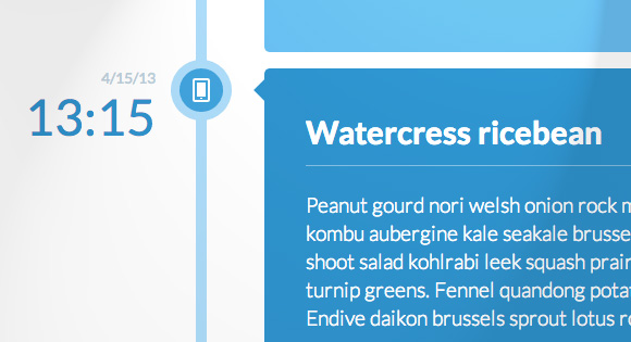
This is a simple responsive timeline with alternating colors for the labels. An icon font is used for the icons in the timeline waypoints and some example media queries show how to adjust the timeline for smaller screens. The main structure of the timeline is an unordered list.
The HTML
<ul class="cbp_tmtimeline">
	<li>
		<time class="cbp_tmtime" datetime="2013-04-10 18:30"><span>4/10/13</span> <span>18:30</span></time>
		<div class="cbp_tmicon cbp_tmicon-phone"></div>
		<div class="cbp_tmlabel">
			<h2>Ricebean black-eyed pea</h2>
			<p>Winter purslane...</p>
		</div>
	</li>
	<li>
		<time class="cbp_tmtime" datetime="2013-04-11T12:04"><span>4/11/13</span> <span>12:04</span></time>
		<div class="cbp_tmicon cbp_tmicon-screen"></div>
		<div class="cbp_tmlabel">
			<h2>Greens radish arugula</h2>
			<p>Caulie dandelion maize...</p>
		</div>
	</li>
	<li>
		<time class="cbp_tmtime" datetime="2013-04-13 05:36"><span>4/13/13</span> <span>05:36</span></time>
		<div class="cbp_tmicon cbp_tmicon-mail"></div>
		<div class="cbp_tmlabel">
			<h2>Sprout garlic kohlrabi</h2>
			<p>Parsnip lotus root...</p>
		</div>
	</li>
	<li>
		<time class="cbp_tmtime" datetime="2013-04-15 13:15"><span>4/15/13</span> <span>13:15</span></time>
		<div class="cbp_tmicon cbp_tmicon-phone"></div>
		<div class="cbp_tmlabel">
			<h2>Watercress ricebean</h2>
			<p>Peanut gourd nori...</p>
		</div>
	</li>
	<li>
		<time class="cbp_tmtime" datetime="2013-04-16 21:30"><span>4/16/13</span> <span>21:30</span></time>
		<div class="cbp_tmicon cbp_tmicon-earth"></div>
		<div class="cbp_tmlabel">
			<h2>Courgette daikon</h2>
			<p>Parsley amaranth tigernut...</p>
		</div>
	</li>
</ul>
The CSS
@font-face {
	font-family: 'ecoico';
	src:url('../fonts/timelineicons/ecoico.eot');
	src:url('../fonts/timelineicons/ecoico.eot?#iefix') format('embedded-opentype'),
		url('../fonts/timelineicons/ecoico.woff') format('woff'),
		url('../fonts/timelineicons/ecoico.ttf') format('truetype'),
		url('../fonts/timelineicons/ecoico.svg#ecoico') format('svg');
	font-weight: normal;
	font-style: normal;
} /* Made with http://icomoon.io/ */

.cbp_tmtimeline {
	margin: 30px 0 0 0;
	padding: 0;
	list-style: none;
	position: relative;
}

/* The line */
.cbp_tmtimeline:before {
	content: '';
	position: absolute;
	top: 0;
	bottom: 0;
	width: 10px;
	background: #afdcf8;
	left: 20%;
	margin-left: -10px;
}

.cbp_tmtimeline > li {
	position: relative;
}

/* The date/time */
.cbp_tmtimeline > li .cbp_tmtime {
	display: block;
	width: 25%;
	padding-right: 100px;
	position: absolute;
}

.cbp_tmtimeline > li .cbp_tmtime span {
	display: block;
	text-align: right;
}

.cbp_tmtimeline > li .cbp_tmtime span:first-child {
	font-size: 0.9em;
	color: #bdd0db;
}

.cbp_tmtimeline > li .cbp_tmtime span:last-child {
	font-size: 2.9em;
	color: #3594cb;
}

.cbp_tmtimeline > li:nth-child(odd) .cbp_tmtime span:last-child {
	color: #6cbfee;
}

/* Right content */
.cbp_tmtimeline > li .cbp_tmlabel {
	margin: 0 0 15px 25%;
	background: #3594cb;
	color: #fff;
	padding: 2em;
	font-size: 1.2em;
	font-weight: 300;
	line-height: 1.4;
	position: relative;
	border-radius: 5px;
}

.cbp_tmtimeline > li:nth-child(odd) .cbp_tmlabel {
	background: #6cbfee;
}

.cbp_tmtimeline > li .cbp_tmlabel h2 {
	margin-top: 0px;
	padding: 0 0 10px 0;
	border-bottom: 1px solid rgba(255,255,255,0.4);
}

/* The triangle */
.cbp_tmtimeline > li .cbp_tmlabel:after {
	right: 100%;
	border: solid transparent;
	content: " ";
	height: 0;
	width: 0;
	position: absolute;
	pointer-events: none;
	border-right-color: #3594cb;
	border-width: 10px;
	top: 10px;
}

.cbp_tmtimeline > li:nth-child(odd) .cbp_tmlabel:after {
	border-right-color: #6cbfee;
}

/* The icons */
.cbp_tmtimeline > li .cbp_tmicon {
	width: 40px;
	height: 40px;
	font-family: 'ecoico';
	speak: none;
	font-style: normal;
	font-weight: normal;
	font-variant: normal;
	text-transform: none;
	font-size: 1.4em;
	line-height: 40px;
	-webkit-font-smoothing: antialiased;
	position: absolute;
	color: #fff;
	background: #46a4da;
	border-radius: 50%;
	box-shadow: 0 0 0 8px #afdcf8;
	text-align: center;
	left: 20%;
	top: 0;
	margin: 0 0 0 -25px;
}

.cbp_tmicon-phone:before {
	content: "e000";
}

.cbp_tmicon-screen:before {
	content: "e001";
}

.cbp_tmicon-mail:before {
	content: "e002";
}

.cbp_tmicon-earth:before {
	content: "e003";
}

/* Example Media Queries */
@media screen and (max-width: 65.375em) {

	.cbp_tmtimeline > li .cbp_tmtime span:last-child {
		font-size: 1.5em;
	}
}

@media screen and (max-width: 47.2em) {
	.cbp_tmtimeline:before {
		display: none;
	}

	.cbp_tmtimeline > li .cbp_tmtime {
		width: 100%;
		position: relative;
		padding: 0 0 20px 0;
	}

	.cbp_tmtimeline > li .cbp_tmtime span {
		text-align: left;
	}

	.cbp_tmtimeline > li .cbp_tmlabel {
		margin: 0 0 30px 0;
		padding: 1em;
		font-weight: 400;
		font-size: 95%;
	}

	.cbp_tmtimeline > li .cbp_tmlabel:after {
		right: auto;
		left: 20px;
		border-right-color: transparent;
		border-bottom-color: #3594cb;
		top: -20px;
	}

	.cbp_tmtimeline > li:nth-child(odd) .cbp_tmlabel:after {
		border-right-color: transparent;
		border-bottom-color: #6cbfee;
	}

	.cbp_tmtimeline > li .cbp_tmicon {
		position: relative;
		float: right;
		left: auto;
		margin: -55px 5px 0 0px;
	}
}