The radial-gradient() function is used to create a <gradient>. A <gradient> is an <image> that is made of two or more colors that smoothly fade from one color to another.
In a radial gradient, rather than colors smoothly fading from one side of the element to the other as with linear gradients, they instead emerge from a single point and smoothly spread outward in a circular or elliptical shape.

Basics and Terminology
A gradient is drawn into a box with the dimensions of the concrete object size, referred to as the gradient box. However, the gradient itself has no intrinsic dimensions.
A radial gradient is defined by its center, ending shape, and color stops.
The center of a radial gradient determines where the center of the gradient is going to be inside the element. In other words, it determines the position of the point from which the gradient is going to emerge.
The ending shape determines whether the gradient has a circular shape or an elliptical shape. The size of the circle or ellipse is also determined in the gradient function.
The color stops determine the colors the gradient is made up of, and, optionally, where each color starts and/or ends. Color stops are given as a list, just as for linear-gradient(). Starting from the center and progressing towards (and potentially beyond) the ending shape, uniformly-scaled concentric circles/ellipses are drawn and colored according to the specified color stops.
Color stops are positioned on a virtual gradient ray similar to the gradient line of linear gradients. The gradient ray is anchored at the center of the gradient and extends horizontally towards the right. The 0% color stop location is at the start of the gradient ray, and the 100% color stop location is on the point where the gradient ray intersects the ending shape.

Creating Radial Gradients: Color Stops
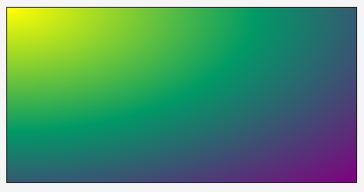
Suppose you have a simple gradient made up of three colors: yellow, #009966 which is a green color, and then purple. Without specifying any color stops, size, or ending shape, the gradient would look like the following image:

radial-gradient(yellow, #009966, purple);
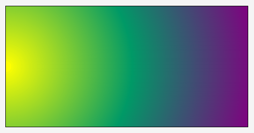
When no size or shape is specified, the gradient defaults to an ellipse gradient. You can change that into a circle by using the circle keyword:

radial-gradient(<strong>circle</strong>, yellow, #009966, purple);You can also change the size and position of the center of the gradient, as we mentioned earlier. We’ll get to that in the next section.
When three colors are specified, they are distributed along the gradient ray such that the starting point at 0% is pure yellow (in our example), the 50% point along the gradient line is pure #009966 (which is a green color), and the 100% point (ending point) is pure purple. The points lying between 0% and 50% are the intermediate colors you pass through when you’re moving from yellow to #009966. Similarly, the points between the 50% color stop and the 100% position, are the intermediate colors between #009966 and purple.
If you specify four colors, then the 0% color stop will be the first color, the ~33% color stop will be the second color, the ~66% stop will be the third color, and then the 100% will be the fourth color.
In addition to specifying the colors you want to have in your gradient, you can control where each color starts instead of leaving it to the browser to distribute the colors evenly.
If we were to go back to the above three-color example, and change the start position of the green color to be 20% instead of the default 50%, we would get:

radial-gradient(yellow, #009966 20%, purple);As you can see in the above image, the distance between pure yellow (0%) and pure #009966 decreases, because the line is pure #009966 at 20% instead of 50%.
Controlling where a color starts is useful, but what about creating “sharp” color transitions? For example, what if I want the line to be pure green for more than just one point on the line?
The key to getting complete sections of the same color is to specify the start position of a color at one point where we want that section to start, and then specify another color stop for the same color at the point where we want the section to end.
For example, suppose we want the green color #009966 to start at 20%, and we want the gradient line to remain green until 50%, instead of starting to fade into purple. The gradient function would look like the following:

radial-gradient(yellow, #009966 20%, #009966 50%, purple);The area between 0% and 20% fades from pure yellow to #009966 as it would by default. Then, the section between 20% and 80% maintains a #009966 color. After that, the color starts fading again to purple.
Using this concept, we can create “sharp” color stops. Suppose we have the following gradient function:
radial-gradient(yellow, yellow 20%, #009966 20%, #009966 50%, purple 50%, purple);
The result would look like so:

radial-gradient(yellow, yellow 20%, #009966 20%, #009966 50%, purple 50%, purple);Of course, you can add as many color stops and colors as you want, and decide whether or not you want a sharp transition between them or a smooth one.
Note that the color stop position can be set in percentages or absolute length values (like px, for example, or em), and that the color stop position must come after the color value. So, the following syntax is invalid:
radial-gradient(yellow, #009966 20%, 40% #009966, 40% purple, purple 100%);
The radial-gradient() function accepts any valid <color> value. This means that you can set the colors using any of the possible color functions like rgb() and hsl(), among others. See the <color> entry for more about possible values.
Accepting any <color> value also means that you can use a transparent color as well, using the transparent keyword.
Creating Radial Gradients: Positioning and Sizing Gradients
Back to our previous yellow-green-purple example, we’re going to go over positioning the center of the gradient. This can be done by using the at keyword followed by a position. The position is set similar to the way a background-position is set. The default position is center.
Using the same initial function with just three colors specified, let’s add at 0% 0% to the function before the list of color stops:
radial-gradient(at 0% 0%, yellow, #009966, purple);
The gradient will then be positioned so that the 0% starting point that the gradient emerges from is positioned at the top left corner of the gradient box:
radial-gradient(at 0% 0%, yellow, #009966, purple);
If you want it to be a circular gradient positioned at the center of the left edge, you can do that by using the circle keyword before the position:
radial-gradient(circle at 0% 50%, yellow, #009966, purple);
radial-gradient(circle at 0% 50%, yellow, #009966, purple);The same positioning scheme applies to an ellipse, of course.
You can specify the position of the center of the gradient using percentage values or absolute length values.
Now, suppose you want to change the size of the gradient. You can do that by using one of the possible <size> values mentioned in the Values section below. For more information about these possible values please read the Values section. Let’s see what happens when we apply a size to the circle in our simple example.
The size of the gradient is specified before the position. Its order is interchangeable with the ellipse shape, though, as long as it’s set before the position.
Applying a size of 100px to our circle results in the following:

radial-gradient(100px circle at 0% 50%, yellow, #009966, purple);
Notice how the last color expands to fill the entire gradient box area. If you want the color to stop at some point and then have the gradient repeat itself, you can use the repeating-radial-gradient() function.
The size can be specified using keywords as well. Please refer to the Values section below for more information. Note that percentages can only be used to specify the size of an elliptical gradient, not a circular one!
To apply a size to an ellipse, you will need to specify two size values: the first value represents the horizontal radius, the second the vertical radius. Percentages values are relative to the corresponding dimension of the gradient box.
For example, the following is an elliptical gradient positioned at 25% 50%, and has a size 200px 100px:

radial-gradient(200px 100px ellipse at 25% 50%, yellow, #009966, purple);Trivia & Notes
Note that, even though a gradient is made up of colors, it is not a <color> value, and therefore can’t be used as one.
Creating Patterns Using Radial Gradients
Gradients are images. They can be used as background images. And just like background images, they can be sized, positioned, and tiled as a background image. This allows us to create some really nice patterns. We can also use multiple linear gradients as multiple backgrounds on an element.
Because creating the actual patterns is outside the scope of this entry, we suggest you have a look at the following two gradient patterns galleries by Lea Verou and Bennett Feely, respectively:
- CSS3 Patterns Gallery
- New CSS3 Gradients Possibilities (makes use of the CSS
background-blend-modeproperty)
Both of these galleries allow you to view the code for each pattern. You can play with the code to see how the patterns are created and customize them to your will.
Animating Radial Gradients
Radial gradients are not animatable except in IE10+. All other browsers don’t allow you to animate a gradient.
Official Syntax
<radial-gradient> = radial-gradient(
  [ [ circle               || <length> ]                          [ at <position> ]? , |
    [ ellipse              || [ <length> | <percentage> ]{2} ]    [ at <position> ]? , |
    [ [ circle | ellipse ] || <extent-keyword> ]                  [ at <position> ]? , |
    at <position> ,
  ]?
  <color-stop> [ , <color-stop> ]+
)

/* where.. */
<extent-keyword> = closest-corner | closest-side | farthest-corner | farthest-side

/* and */
<color-stop> = <color> [ <percentage> | <length> ]?
Values
- <position>
-
A
<position>that is resolved and works the same way the value ofbackground-positiondoes. If this value is not specified, it defaults tocenter. - <ending-shape>
-
Can be either
circleorellipse; determines whether the gradient’s ending shape is a circle or an ellipse, respectively. If<ending-shape>is omitted, the ending shape defaults to a circle if the<size>is a single<length>, and to an ellipse otherwise. - <size>
-
Determines the size of the gradient’s ending shape. If omitted it defaults to
farthest-corner. It can be given explicitly or by keyword. For the purpose of the keyword definitions, consider the gradient box edges as extending infinitely in both directions, rather than being finite line segments.If the ending-shape is an ellipse, its axes are aligned with the horizontal and vertical axes of the element.
Both
circleandellipsegradients accept the following keywords as their<size>:-
closest-side: The ending shape is sized so that that it exactly meets the side of the gradient box closest to the gradient’s center. If the shape is an ellipse, it exactly meets the closest side in each dimension. -
farthest-side: Same asclosest-side, except the ending shape is sized based on the farthest side(s). -
closest-corner: The ending shape is sized so that that it passes through the corner of the gradient box closest to the gradient’s center. If the shape is an ellipse, the ending shape is given the same aspect-ratio it would have ifclosest-sidewere specified. -
farthest-corner: Same asclosest-corner, except the ending shape is sized based on the farthest corner. If the shape is an ellipse, the ending shape is given the same aspect ratio it would have iffarthest-sidewere specified.
If
<ending-shape>is specified ascircleor is omitted, the<size>may be given explicitly as:-
<length>: Gives the radius of the circle explicitly. Negative values are invalid.Note that percentages are not allowed here; they can only be used to specify the size of an elliptical gradient, not a circular one. This restriction exists because there is are multiple reasonable answers as to which dimension the percentage should be relative to. A future level of CSS may provide the ability to size circles with percentages, perhaps with more explicit controls over which dimension is used.
If
<ending-shape>is specified asellipseor is omitted,<size>may instead be given explicitly as:-
[<length> | <percentage>]{2}: Gives the size of the ellipse explicitly. The first value represents the horizontal radius, the second the vertical radius. Percentage values are relative to the corresponding dimension of the gradient box. Negative values are invalid.
-
- <color-stop>
-
A
<color>value followed by an optional color stop position. The color stop position can be set in percentage values or fixedlengthvalues such aspxorem, among others. Color stops are positioned along the gradient ray, and are used to specify the points along that line that colors start at.A color-stop can be placed at a negative location; though the negative region of the gradient ray is never directly consulted for rendering, color stops placed there can affect the color of non-negative locations on the gradient ray through interpolation or repetition (see repeating gradients). For example,
radial-gradient(red -50px, yellow 100px)produces an elliptical gradient that starts with a reddish-orange color in the center (specifically,#f50) and transitions to yellow. Locations greater than 100% simply specify a location with a correspondingly greater distance from the center of the gradient.
Notes
Some combinations of position, size, and shape will produce a circle or ellipse with a radius of 0. This will occur, for example, if the center is on a gradient box edge and closest-side or closest-corner is specified or if the size and shape are given explicitly and either of the radii is zero. In these degenerate cases, the user agent must render the gradient as follows:
- If the ending shape is a circle with zero radius: Render as if the ending shape was a circle whose radius was an arbitrary very small number greater than zero. This will make the gradient continue to look like a circle.
-
If the ending shape has zero width (regardless of the height): Render as if the ending shape was an ellipse whose height was an arbitrary very large number and whose width was an arbitrary very small number greater than zero. This will make the gradient look similar to a horizontal linear gradient that is mirrored across the center of the ellipse. It also means that all color-stop positions specified with a percentage resolve to
0px. - Otherwise, if the ending shape has zero height: Render as if the ending shape was an ellipse whose width was an arbitrary very large number and whose height was an arbitrary very small number greater than zero. This will make the gradient look like a solid-color image equal to the color of the last color-stop, or equal to the average color of the gradient if it’s repeating.
Examples
The following example demonstrates the use of closest-side. The two circle gradients are set to the same position. The one on the left has a fixed size specified, and the one on the right has its size set to closest-side. In the closest-side example, the radius of the circle expands till it reaches the closest side of the gradient box.

Gradient on the left: radial-gradient(50px circle at 75px 75px, yellow, #009966, purple);
Gradient on the right: radial-gradient(closest-side circle at 75px 75px, yellow, #009966, purple);
The following example is similar to the previous one, except it uses an ellipse as the ending shape. The first gradient on the left has a fixed horizontal and vertical radius size. The one on the right has its size set to closest-side, which means that its radii are going to expand to reach the closest side to the center in both dimensions.

Gradient on the left: radial-gradient(25px 50px ellipse at 100px 100px, yellow, #009966, purple);
Gradient on the right: radial-gradient(closest-side ellipse at 100px 100px, yellow, #009966, purple);
The following example demonstrates the closest-corner value on a circle and on an ellipse. The circle and ellipse are both positioned at the same center. In the case of the circle, it is sized so that it passes through the corner of the gradient box closest to the gradient’s center. In the case of the ellipse, the result is the same as if closest-side were specified.

Gradient on the left: radial-gradient(closest-corner circle at 100px 100px, yellow, #009966, purple);
Gradient on the right: radial-gradient(closest-corner ellipse at 100px 100px, yellow, #009966, purple);
You can experiment with the rest of the values and mix and match between them in the Live Demo section below.
Last, we’re going to create a simple polka-dot background using radial-gradient() for a background image and use the background-size property to change the size of the gradient image.
We’ll start by creating a simple white circle as a radial background image:
.element {
    /* ... */
    background-image: radial-gradient(circle, white, white 10px, black 10px, black);
}

background-image: radial-gradient(circle, white, white 10px, black 10px, black);Then, we’re going to size the background image so that it’s only 50px by 50px in size. For demonstration purposes, we’re not going to allow the background image to repeat itself.
.element {
    /* ... */
    background-image: background-image: radial-gradient(circle, white, white 10px, black 10px, black);
    background-size: 50px 50px;
    background-repeat: no-repeat;
}
The background image is sized and positioned at a default top left corner inside the element’s background positioning area:

Now, allowing the background image to repeat again, we get a simple polka-dot background pattern. The following is the live demo with the result of that:
View this demo on the Codrops PlaygroundPatterns like these and much more can be created using radial gradients. Check out the galleries mentioned before for more examples.
Live Demo
Play with the values of the radial-gradient() function in the following demo to see how the result changes. The gradient on the left is a circle, and the one on the right is an ellipse. Change the values/shapes/sizes/positions to your liking to see how the gradient changes.
Browser Support
CSS Gradients
Method of defining a linear or radial color gradient as a CSS image.
W3C Candidate Recommendation
Supported from the following versions:
Desktop
- 26
- 36
- 10
- 12
- 15
Mobile / Tablet
- 15
- 4.4
- No
- 134
- 136
