From our sponsor: Create unlimited Lottie animations completely free with SVGator, advanced features included.
Working with Gabriel on his new portfolio has been a great experience. He initiated the project with a minimalist yet well-conceived design, incorporating animation ideas and maintaining an open-minded approach. This flexibility fostered extensive experimentation throughout the development process, which, in my experience, yields the best outcomes.
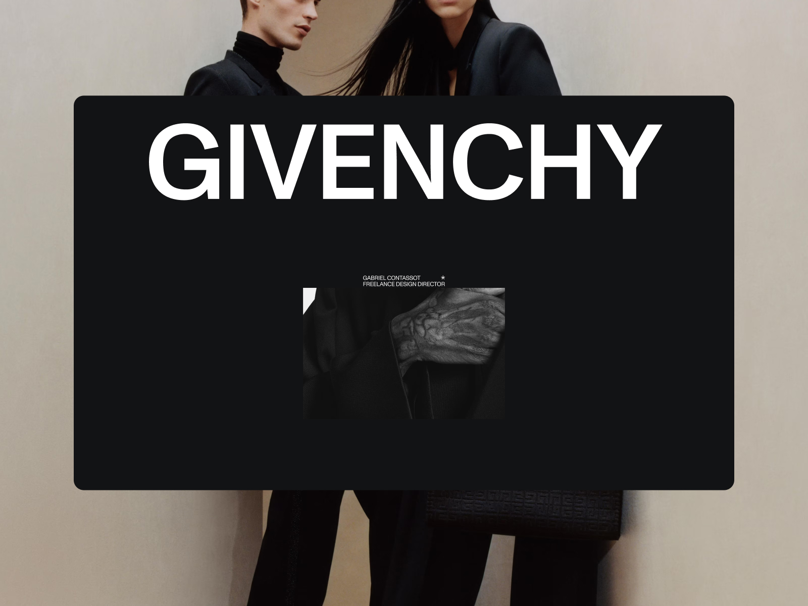
The core of the website features a two-page “loop,” transitioning from a main gallery on the homepage to a detailed project view. The objective was to ensure cohesive animations and provide striking, colorful transitions when navigating from the dark-themed homepage to the brighter case studies. As this is a portfolio, the primary focus was on showcasing the content effectively.
There’s a commented demo of the main effect at the end of this case study.
Structure / Stack
Whenever possible, I prefer to work with vanilla JavaScript and simple tools, and this project presented the perfect opportunity to utilize my current favorite stack. I used Astro for static page generation, Taxi to create a single-page-app-like experience with smooth page transitions, and Gsap Tweens for animation effects. Twgl provides WebGL helpers, while Lenis manage the scrolling.
All content is delivered through Sanity, with the sole exception of case study videos, which are hosted on Cloudflare and streamed using Hls.
The website is statically generated and deployed on Vercel, both via CI/CD and from Sanity to rebuild when the content updates.
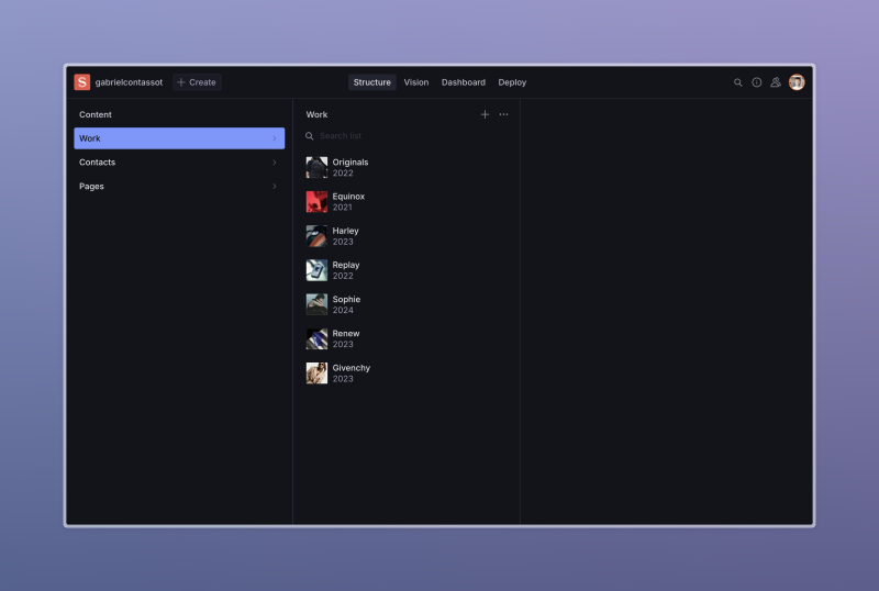
The CMS structure is quite simple, just a collection for the work, one for pages like /about, and a group for generic data (which in this case is only contact info). In this instance the website is pretty simple and this configuration is not really needed, but considering the headless nature of this setup this was the best way to ensure the content side of things could outlive the website, and for a next version we could (or whoever will work on it) potentially build on top.
The official integration for Astro/Sanity came right in the middle of the project, enhancing the interaction between the two. We’re also leveraging the Vercel Deploy plugin, so who uses the CMS can freely deploy a new version when needed.
The whole repo looks something like this:
/public
	(fonts and files)

/cms
	(sanity setup)

/src
	/pages
		home.astro
		[...work].astro

	/layouts
		PageLayout.astro

	/components
		[Website Components as .astro files]

	/js
		/modules (all the js)
		/gl (all the webgl)
        app.js (js entrypoint)
Astro + Sanity
In this case we’re using Astro at a 10% of it’s potential, just with.astro files (no frameworks). Basically as a templating language for static site generation. We’re mostly leveraging the component approach, that ends up being compiled into a single, statically generated html document.
As an example, the homepage looks like this. At the top, in between the --- there is what Astro calls frontmatter, which is simply the server side of things that in this case executes at build time since we’re not in SSR mode. Here you can see an example if this.
<!-- pages/Home.astro -->

---
import Item from "./Item.astro";
import ScrollToExp from "../ScrollToExp.astro";
import ScrollUp from "../ScrollUp.astro";

import { getWork } from "../content/sanity.js";

import Nav from "../Nav.astro";

const items = await getWork(true);
const sorted = items.sort((a, b) => a.props.order - b.props.order);
---

<Nav />

<div>
  <figure
    data-track="nav"
    class="h-[120vh] flex items-end justify-center pb-[20vh]"
  >
    <ScrollToExp />
  </figure>
  {sorted.map((item) => <Item data={item} />)}
  <figure
    data-track="nav2"
    class="h-[180vh] flex items-end justify-center pb-[3vh]"
  >
    <ScrollUp />
  </figure>
</div>
You can check out my starters here, where you’ll find both the Astro and Sanity starters that I used to spin up this project.
Code
I use a single entry point for all my javascript (app.js) at a layout level as a component, and the interesting part starts from there.
In my entry point I initialise all of the main components of of the app.
<!-- components/Canvas.js  -->

<canvas data-gl="c"></canvas>
<script>
  import "../js/app.js";
</script>- Pages — which is Taxi setup in a way so it returns promises. This way I can just await page animations and make my life a bit easier with keeping everything in sync (which I end up never doing properly and manually syncing values because I get messy and the delivery is coming up).
- Scroll — which is simply a small lenis wrapper. Pretty standard tbh, just some utilities and helper functions as well as the setup code. I also have the logic to subscribe and unsubscrube functions from other components that need the scroll, so I’m sure everything is always in sync.
- Dom — holds all the DOM related code, both functional and animation related.
- Gl — that holds all the WebGl things, in this case pretty simple as it’s just a full screen quad that I use to change the background colour with nice and smooth values
// app.js

class App {
  constructor() {

	// ...
	this.init()
  }

  init() {
    this.pages = new Pages();
    this.scroll = new Scroll();
    this.dom = new Dom();
    this.gl = new Gl();

    this.gl.initColorTrack();

    this.initEvents();
    this.render();

	// ...
  }

  // ...
In here there are my main (and only) resize() and render() functions.
This way I’m sure I only call requestAnimationFrame()once render loop and have a single source of truth for my time value, and that listening and firing a single event for handling resize.
Animations
The animation framework relies on two primary JavaScript classes: an Observer and a Track.
An Observer, constructed using the IntersectionObserver API, triggers whenever a DOM node becomes visible or hidden in the viewport. This class is designed to be flexible, allowing developers to easily extend it and add custom functionality as needed.
Meanwhile, the Track class builds upon the Observer. It automatically listens to scroll and resize events, calculating a value between 0 and 1 that reflects the on-screen position of an element. This class is configurable, allowing you to set the start and end points of the tracking—effectively functioning as a bespoke ScrollTrigger. One of its key features is that it only renders content when the element is in view, leveraging its foundational Observer architecture to optimize performance.
// observe.js

export class Observe {
  constructor({ element, config, addClass }) {
    this.element = element;
    this.config = {
      root: config?.root || null,
      margin: config?.margin || "10px",
      threshold: config?.threshold || 0,
    };

    if (addClass !== undefined) this.addClass = addClass;
    this.init();
    this.start();
  }

	// ....
}


// track.js

import { clientRect } from "./clientRect.js";
import { map, clamp, lerp, scale } from "./math.js";
import { Observe } from "./observe.js";

export class Track extends Observe {
	value = 0;
	inview = true;

	constructor({ element, config }) {
		super({ element, config })
		this.element = element;

		this.config = {
		  bounds: [0, 1],
		  top: "bottom",
		  bottom: "top",
		  ...config,
		};

	}

	// ...
}
A practical demonstration of how these classes function is evident on the case study pages.
In this setup, images and videos appear on the screen, activated by the Observer class. At the same time, the scaling effects applied to images at the top and bottom of the page are straightforward transformations driven by a Track on the parent element.
The page transition involves a simple element that changes color based on the links clicked. This element then wipes upwards and away, effectively signaling a change in the page.
Preloader
The preloader on our website is more of a stylistic feature than a functional one—it doesn’t actually monitor loading progress, primarily because there isn’t much content to load. We introduced it as a creative enhancement due to the simplicity of the site.
Functionally, it consists of a text block that displays changing numbers. This text block is animated across the screen using a transformX property. The movement is controlled by a setInterval function, which triggers at progressively shorter intervals to simulate the loading process.
// loader.js

import Tween from "gsap";

export class Loader {
  constructor({ element }) {
    this.el = element;
    this.number = this.el.children[0];
  }

  animate() {
    let count = 0;

    const totalDuration = 2.8;
    const values = [1, 2, 3, 4, 5, 6, 7, 8, 9, 10, 20, 23, 30, 50, 70, 80, 100];
    const splitDuration = totalDuration / values.length;

    return new Promise((resolve) => {
      const destroy = () => {
        Tween.to(this.el, {
          autoAlpha: 0,
          duration: 0.8,
          ease: "slow.in",
          onComplete: () => {
            setTimeout(() => {
              this.el.remove();
              resolve();
            }, 800);
          },
        });
      };

      let interval = setInterval(() => {
        this.step(values[count++]);
        if (values[count] === undefined) {
          clearInterval(interval);
          destroy();
        }
      }, splitDuration * 1000);
    });
  }

  step(val) {
    let v = val;
    if (v === 100 && window.mobileCheck()) {
      v = 95;
    }
    this.number.textContent = val;
    this.number.style.transform = `translateX(${v}%)`;
  }
}
Scrambled Text
The text animation feature is based on GSAP’s ScrambleText plugin, enhanced with additional utilities for better control and stability.
Initially, we attempted to recreate the functionality from scratch to minimize text movement—given the large size of the text—but this proved challenging. We managed to stabilize the scrambling effect somewhat by reusing the original characters of each word exclusively, minimizing variations during each shuffle.
We also refined the interactive elements, such as ensuring that the hover effect does not activate during an ongoing animation. This was particularly important as some unintended combinations generated inappropriate words in French during the scrambles.
For the homepage, we replaced the hover-trigger with an onload activation for the menu/navigation centerpiece. We hardcoded the durations to synchronize perfectly with the desired timing of the visual effects.
Additionally, we integrated CSS animations to manage the visibility of elements, setting {item}.style.animationDelay directly in JavaScript. A Track object was employed to dynamically adjust the scale of elements based on their scroll position, enhancing the interactive visual experience.
// nav.js

this.values = {
  duration: [1.2, 1.5, 0.4, 0.2, 1, 0.6, 0.6],
  del: [0, 0.4, 1.3, 1.4, 1.5, 1.6, 2.1],
  lined: [0, 0.3, 1.1, 1.5],
};

// ...

animateIn() {
    this.el.classList.add("anim");
    gsap.to(this.texts, { autoAlpha: 1, duration: 1 });

    this.texts.forEach((line, i) => {
      line.style.fontKerning = "none"; // probs doesnt do anything
      gsap.to(line, {
        duration: this.values.duration[i],
        delay: this.values.del[i],
        ease: "expo.out",
        scrambleText: {
          text: "{original}",
          chars: [
            "GABRELCONTASO",
            "FRELANCDSGNOR",
            "1824",
            "-_",
            "SELCTDWORK",
            "NFOI",
            "CONTA",
          ][i],
          revealDelay: this.values.duration[i] * 0.5,
          speed: 1,
        },
      });
    });
}
Homepage images effect
This is probably the most interesting piece of it, and I needed a couple of tries to understand how to make it work, before realising that are really just absolute positioned images with a clip-path inset combined with a Track to sync it with the scroll that also controls the scaling of the inner image.
// scrollImage.js

constructor() {
    // ...
    this.image.style.transform = `scale(1)`;
    this.imagWrap.style.clipPath = "inset(100% 0 0 0)";
    // ...
}

 render() {
    if (!this.inView) return;
    this.track?.render();

    this.image.style.transform = `scale(${1.2 + this.track.value*-0.2})`;

    this.imagWrap.style.clipPath = `
      inset(${this.track.value2 * 100}%
        0
        ${this.track.value1 * 100}%
        0)
    `;
  }
Color Change
It’s the only WebGl piece of this whole website.
Originally, the concept involved changing colors based on scroll interactions, but this was eventually moderated due to concerns about it becoming overly distracting. The implementation now involves a full-screen quad, constructed from a single triangle with remapped UV coordinates, which allows for a more flexible and responsive visual display.
The color values are dynamically retrieved from attributes specified in the DOM, which can be freely adjusted via the CMS. This setup involves converting color values from hexadecimal to vec3 format. Additionally, a couple of GSAP Tweens are employed to manage the animations for transitioning the colors in and out smoothly.
This use of WebGL ensures that the color transitions are not only smooth and visually appealing but also performant, avoiding the lag and choppiness that can occur with heavy CSS animations.
Demo
This is a minimal rebuild of the main homepage effect. Other than some CSS to make it functions, 90% of it happens in the track.js file, while everything is initialised from main.js.
The Track class is used as the base to create the ImageTransform one, which extends the functionality and transforms the image.
There’s a few helper functions to calculate the bounds on resize and to try and maximise performance it’s only called by lenis when a scroll is happening. Ideally should be wrapped by an Observer so it only calculates when is in view, but I kept it simpler for the demo.
Thanks!
It’s a simple website, but was a fun and interesting challenge for us nonetheless.
Hit me up on Twitter if you have any questions or want to know more!
👀