From our sponsor: Leverage AI for dynamic, custom website builds with ease.
How it started
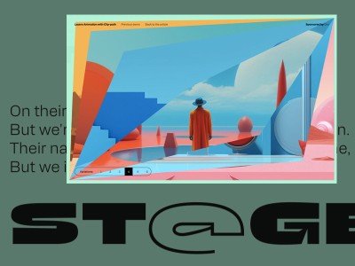
Anthony got in touch with me through Norman. He had a concept ready for his new portfolio and needed someone to bring it to life. After he showed me this video of the home slider, I was on board immediately.
My first thoughts
After agreeing to the collaboration, without actually having a clue how to do it, I thought it would be straightforward to start with the home slider and deal with the bending of the planes, since this effect would be used multiple times. Adding the necessary control points to bend the plane properly was easier said than done. But, if I could do that, the rest of the page wouldn’t be so hard anymore (a couple of page transitions, some hover effects, etc.). At least that’s what I thought.
In this article
I will try to give you some insights into the work I did with and for Anthony Goodwin, including some of my favorite features and animations. I can’t delve too deeply because it would make the article quite long, and I don’t think it would be very interesting, since most of it is just basic frontend stuff with a very unique motion concept and design that powers the whole experience.
The tech stack
Before starting, I wanted to define the tools and libraries to use for the website. It’s basically planes in 3D space with some vertex manipulation, requiring WebGL. Since we’re not importing any objects and all the geometry is limited to planes, we don’t really need ThreeJS or some other fancy (big) library. We can just write it from scratch, which saves bytes and potentially performance. Here’s the tooling I ended up with:
- Custom Static Site Generator with Deno
- Tailwindcss for CSS
- esbuild for building JS
- Cloudflare Pages for free Hosting
- Custom Tween library for animations
- Custom WebGL library for rendering via WebGL
- Custom Router for all the navigation and preloading
- Custom Scroller for the smoothness
The site doesn’t have a CMS, and the content is editable through JSON. The focus was definitely on the animation and the general feel of the page. Initially I planned on using PayloadCMS (self-hosted). Check it out if you don’t know it already. It’s one of the best open source CMS I came across in the recent years.
“Why not just use NextJS, ThreeJS and GSAP? It’s easy!”
That’s a valid question. It probably would’ve been faster, but part of the process for me is learning new things. I wasn’t really familiar with WebGL, GSAP, or the magic in NextJS (or Astro, for that matter). So, I decided to take the longer route to build this project. It was more about understanding the fundamentals and the inner workings of each tool than just getting the project out the door. Also, I wanted to improve my own “library” further. It’s been a challenging yet rewarding process.
Another point worth mentioning is that while these libraries are incredibly useful, but they are also quite large because they need to cover a wide range of edge cases. Even with “tree-shaking” to remove unused code, I would have used only about 10%, making it overkill for this project. So I wanted to go with something more lightweight.
Bending and curling planes
I’m bad at math. That’s just how it is. So I need visualizations to make all the functions tangible otherwise I wouldn’t be able to come up with anything. Using the Desmos Calculator, I was able to create a graph that allowed me to control the plane’s behavior the way I needed. It took me some time though. Here’s the result, which you can play around with.
- s = The size of the plane (or the length in this case)
- r1 = The radius of the curl
- k1 = The position of the curl
- u = Determines the direction
There’re probably easier and simpler ways to solve this. After I got the formula down I tried to apply it to the planes vertex shader. Here’s the result isolated:
And here is the vertex shader code for the curl:
vec2 curlPlane(float x, float s, float r, float k, bool flip) {
float v1 = flip ? s*k : s - s*k;
float n1 = s > 0.0 ? 1.0 : -1.0;
// Threshold before going into the circle coords, because
// if r is 0, it will return infinity, and causes a short
// flicker, so we prevent that by setting a small
// non-noticable threshold
float t1 = 0.01;
// Start and endpoints of the plane before or after the curl
float e1 = flip ? n1*v1 : n1*x;
float e2 = flip ? n1*x : n1*v1;
// Some older gpus have troubles with "logical or operators"
// in the shader so we split it into two conditions instead.
// More on that later in the article
if (r <= t1) {
return vec2(x, 0.0);
}
if (e1 <= e2) {
return vec2(x, 0.0);
}
float r2 = abs(s) / r;
float hp = 1.5707963;
// Transform the point on the plane to the point
// on the new arc connected to the plane
return vec2(
v1/r2 + cos(x/r2 - hp - v1/r2),
-sin(x/r2 + hp - v1/r2) + 1.0
) * r2;
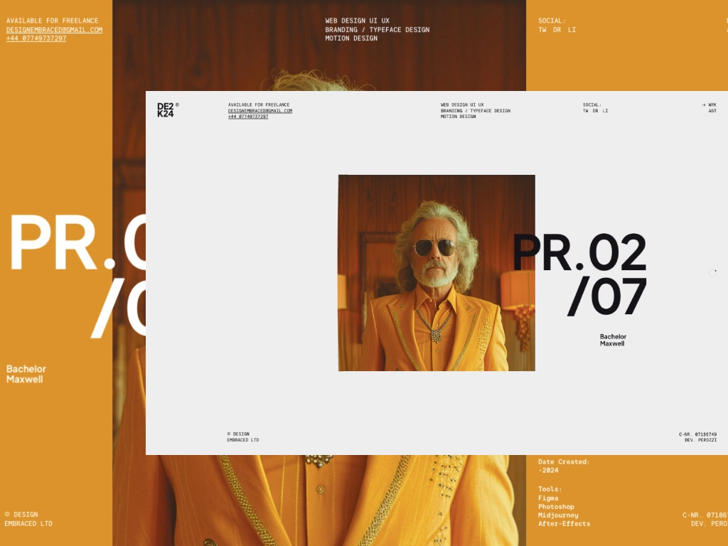
}Page Transitions
We aimed for seamless transitions between pages to minimize delay and maintain a slick, easy navigation feel. By preloading all the pages upfront, we traded initial load performance for a better user experience and brand identity. For page transitions, I added animation functionality to the router that works with the tween package.
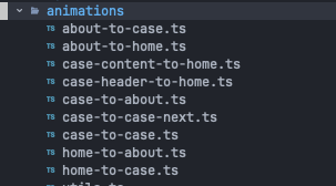
I wanted it to feel less like page navigation and more like one screen changing states. Optimizing all animations to be interruptible was the hardest part. This also required that every combination needed an animation, so I ended up with all these different animations to cover all cases:
To get it right with all the scrolling and the states was the hardest part of the portfolio to be honest. Maybe there are better ways to deal with this, but yeah creating multiple “sub-animations” as components made it pretty manageable in the end. Here’s how the transition from “case to about” looks:
import { RouterAnimation } from '@smoovy/router';
import { tween } from '@smoovy/tween';

import {
  AnimationProps, enableTheme, isRoutePathMatch, sliderLeave, viewEnter,
  viewLeave,
} from './utils';

export const caseToAbout = (props: AnimationProps) => ({
    name: 'caseToAbout',
    when: ({ fromRoute, toRoute }) => {
      return isRoutePathMatch(fromRoute, toRoute, '/case/', '/about');
    },
    enter: ({ toElement, fromElement }) => {
      return tween.timeline({
        onStart: () => enableTheme(props, toElement),
      })
        .add([
          viewLeave(props, fromElement),
          sliderLeave(props, fromElement)
        ])
        .add(viewEnter(props, toElement), { offset: -.9 });
    }
});
Without showing too much code here, a quick description what’s behind these functions:
viewEntersimply returns a timeline that triggers all the animations on the incoming page. Such as the text slide animation.viewLeavealso returns a timeline and triggers the “out” animation on all of these elements so that for example the text slide up and out of view again.sliderLeavethis hides the slider by curling the center image and moving it to the top, while also locking it and fading out all the other items.enableThemeactivates the colors found in the page its navigating to when the transition starts
Using animation util functions like sliderLeave and viewEnter allowed me to abstract some of the generic logic occurring on most pages, which made it easier to debug. You can test the page transitions. They’re not perfect, but it definitely feels more fluid than just having a fade-in fade-out transition. Here’s an example of me testing the interruptible transitions by quick navigation.
Moving from case-to-case
We also decided to try a seamless page transition for browsing the cases, running an animation and quickly hiding the old page.
To achieve this transition I’m tracking the scroll position from the start of the image this.observable.y - this.viewport.height * .5 to the end this.observable.y which is at the end of the screen. So when progress >= 1 and the transition hasn’t been triggered already, we navigate to the next project really quickly.
/**
 * this.observable.y is the position y of the next image
 * at the bottom relative to the active page.
 */
const end = this.observable.y;
const start = end - this.viewport.height * .5;
const progress = mapRange(scrollY, start, end, 0, 1);

/**
 * Move the timeline for all view animations (text etc.)
 * with the scroll, so we get a nice scroll tracking effect
 */
this.timeline.seek(progress * this.timeline.duration);

/**
 * These values are used to calculate the scaling of the 1:1 image
 * to the new header image of the next project. So we're just aligning
 * the size of the "next project image" with the target image of the
 * next project. We also pass along the progress value to the shader,
 * so we can do this flip with the bend formula from above!
 */
const scaleX = this.wrapper.width / this.imageTarget.width - 1;
const scaleY = this.viewport.height / this.imageTarget.height - 1;

for (const image of this.images) {
  image.scale({ x: 1 + scaleX * progress, y: 1 + scaleY * progress });
  image.uniforms.transition.value = progress;
  ...
}

/**
 * This simply triggers the router navigation when the progress is 1
 * and the user has reached the end of the site. We're then signaling
 * the page transition with the `next` flag, that we want to skip all
 * animations on the image and just switch instantenously. We also lock
 * the scroller of the current page so he can't scroll back after the
 * transition as been triggered.
 */
if (progress >= 1 && ! this.active && this.observable.visible) {
  this.active = true;

  this.scroller.lock();
  this.router.to(this.url, { flags: { next: true } });
}
My nemesis: Old GPU shader bug
I encountered a headache-inducing bug with the GPU in an older iMac, related to the use of an or-operator in a condition inside the shader. I had to adjust the shader code to work around this issue.
So this didn’t work:
if (r <= t1 || e1 <= e2) {
	return vec2(x, 0.0);
}
And had to be transformed to:
if (r <= t1) {
	return vec2(x, 0.0);
}

if (e1 <= e2) {
	return vec2(x, 0.0);
}
If someone has more information on this, please let me know, since I couldn’t really find anything useful online, just some old stackoverflow threads with similar issues but not if this is intended behavior or really a bug
The mobile page
We opted for a non-WebGL version for mobile to keep it lightweight and simplify development. Using WebGL on mobile would require a loader and it’s better in my opinion to make the mobile experience as fast as possible without much delay if possible. The mobile version replicates the home slider with CSS and JS, and page transitions are just simple fade-out and fade-in animations.
Making it accessible to keyboard-only usage
Ensuring accessibility for heavy-animation websites is challenging. Even harder when there’s a fixed budget and the main focus is the brand identity itself. For this portfolio, we’ve added keyboard navigation so users can tab through all links, the slider, and the cases. In order to mimic the default scrolling behaviour in browsers we added a “keyboard” behavior to the scroller:
Conclusion
Working with Anthony on his new portfolio taught me a lot. I mean, he really opened my eyes to a lot. The whole process was a combination of challenges, fun, learning, long nights and getting mad at some random GPU error. Collaborating with a creative powerhouse like him was something else. He’s an absolute beast, and if you haven’t checked out his portfolio by now (which I doubt), go and check out his work! The best part was pretty much bouncing ideas around and experimentation. Still fascinated with how fast Anthony is able to translate ideas in his head to After Effects. It saved us both a lot of back and forth!
From a tech perspective, many devs will get it when I say I’d do things differently in hindsight. But, finishing the project and seeing people engage with it has been rewarding. Can’t wait for what’s next!
If you have any questions, feel free to ask me on Twitter or LinkedIn or reach out via mail!
P.S.: We won SOTD on 18th March on Awwwards, very happy about that! 🎉