From our sponsor: Leverage AI for dynamic, custom website builds with ease.
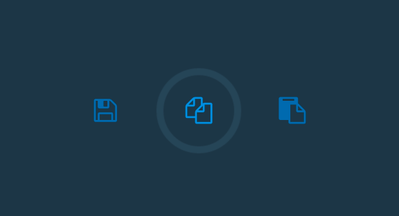
Recently, many cool interaction effects have been created that follow Google Material Design principles somehow. One of the great little effects seen around is the ripple click effect, also called click waves. While these effects are based on the place you click or touch, the whole idea of providing a subtle feedback effect is really interesting. Usually, subtle indicators are used in app showcases to visualize a tap on the mobile screen. But these kind of effects can actually be quite useful when applied to any click or touch interaction. The subtle feedback would indicate that the action element was actually hit, making the felt response time seem less if done appropriately.
Today we’d like to explore some of these click/touch effects, using different animations. While there are many kinds of animations that can be done to provide feedback, we’re particularly interested in the subtle “tap-like” effects.
Please note that some of the effects are highly experimental and therefore only work in modern browsers.
IE10 does not seem to support animationend on pseudo-elements, so you won’t see the effects working correctly there.
For the demo we are using icons by Font Awesome and we trigger the effect on a button:
<button class="cbutton cbutton--effect-boris">
	<i class="cbutton__icon fa fa-fw fa-play"></i>
	<span class="cbutton__text">Play</span>
</button>
The buttons have the following common style:
.cbutton {
	position: relative;
	display: inline-block;
	margin: 1em;
	padding: 0;
	border: none;
	background: none;
	color: #286aab;
	font-size: 1.4em;
	transition: color 0.7s;
}

.cbutton.cbutton--click,
.cbutton:focus {
	outline: none;
	color: #3c8ddc;
}

.cbutton__icon {
	display: block;
}

.cbutton__text {
	position: absolute;
	opacity: 0;
	pointer-events: none;
}

.cbutton::after {
	content: '';
	position: absolute;
	top: 50%;
	left: 50%;
	margin: -35px 0 0 -35px;
	width: 70px;
	height: 70px;
	border-radius: 50%;
	opacity: 0;
	pointer-events: none;
}
By adding a class with JavaScript we trigger the animation(s):
/* Effect Boris */

.cbutton--effect-boris::after {
	background: rgba(111,148,182,0.1);
}

.cbutton--effect-boris.cbutton--click::after {
	animation: anim-effect-boris 0.3s forwards;
}

@keyframes anim-effect-boris {
	0% {
		transform: scale3d(0.3, 0.3, 1);
	}
	25%, 50% {
		opacity: 1;
	}
	100% {
		opacity: 0;
		transform: scale3d(1.2, 1.2, 1);
	}
}
Here is a GIF of one of the effects:
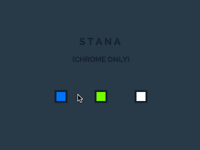
For the effect “Stana”, we use a transition on the SVG clipPath, something that only works in Chrome at this point. We basically scale a clipPath in the shape of a ring in order to reveal and hide the lines.
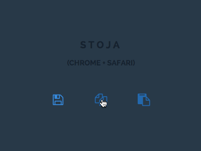
The CSS clip-path property that we use in the effect “Stoja” does not work in every browser. See the CanIUse support table for the CSS clip-path property for more details.
The technique for changing the color of the SVGs by using an identifier in the image source is based on the following gist by Lea Verou: Change an SVG file through the URL hash
This does not seem to work in mobile Safari, so you might not see the correct colors in effects “Azra” and “Dejan”.
We hope you enjoy these subtle effects and get inspired 🙂


This is *really* neat. Haha, so cool! Thanks for sharing.
Lovely and inspiring work, as always. I have a question: What’s the purpose of the invisible “.cbutton__text” span? I’m guessing accessibility (namely screen readers), but I’m not sure.
This is, like 99,94% :)) things you post, great. Thank you, Mary!
P.S. These names are extra cool. 😀
Mary lou, Add some share icons so I can share these cool things, you’re the best!
Shout-out to ‘Azra’.
Great, like using our names from ex-Yugoslavia 🙂
Amazing! You guys always do great work.
One Thing: You guys need a better comment system, something similar to what codyhouse is doing 🙂
Thank U! This inspiring work.
Zorka i Stana ne rade u FF 35.0.1
Github URL, I’m thinking about do a for and Pull Request 😀
Love it! Even more because of the ex-Yugoslavia names 🙂
Great ex-Yugo names ^_^
Great as usual!! Thanks a lot for sharing. Codrop + Mary Lou is the Best!
nice
bravo for naming 🙂
Awesome…. Love it
Awesome 🙂 ! Actually, it’s exactly what I search now ! Thanks !
Damn! That’s COOL!!!
Thanks for sharing 🙂
OMG .Awesome Awesome Awesome Awesome
Mary, stop creating this awesome stuff, i’m envious of you! hahahaha
This is as awesome as it gets! This article somehow doesn’t seem to appear on the <a href=”http://tympanus.net/codrops/category/playground/” title=”Playground Archives” rel=”nofollow”> hence discovered it a couple of hours late.
Milan is my favorite 😀 Great tutorial 🙂
its really awesome. useful in mobile apps thumbs Up from my http://www.mirchu.net/ design team
Hey! Thnak you for this ! I plan to use it in a personal project.
I have trouble with the “By adding a class with JavaScript we trigger the animation(s)”.
Can you explain this please ?
Because the only solution I found is not perfect at all. (add class on click, remove class after animation duration with timeout in js).
Thank you very much.
Great resource! Especially in the midst of a material design boom!
Hi, could somebody tell me how to make those smooth animated gifs? Any particular workflow?
Thanks
Love the effects, but I’m u sure on where I can fit this on my NY Giants Blog. Looks like I’ll have to figure this one out.
Best,
Marco
Hey,
Thanks for tutorial, i really appreciation with this article, cool effect and master of css
I was amazed when you used Serbian names for classes really cool. I love to read your post.
Samo nastavi!
Awesome effects, I urge all the members of this community should contribute.
it’s cool! 🙂
Excellent tutorial!
My name is 1st my twin sister’s second.
Just great! Thanks for sharing! 🙂
Hi I love this effect. Can this be applied to a button, which is rectangular in shape… and what will be the shape of the effect, circular or rectangular. Can you kindly show us example of that.
I like all effects. Thanks for awesome effects.
Just awesome!
well done my friend.. well done..
Awesome effects as usual. Thanks for sharing.
Stana (chrome only) does work in Safari 8.
Ha! I refuse to read as there isnt one named “Goran” :))
Hi’ May Lou, thanks for you ideas, amazing.!!
but, could you help me, how to change ‘click’ to ‘hover’ , so the effect will be running when we ‘hover’ not ‘clicked’
Best Regards
Made
There is a another special thingy for that. Just click here.
I really like them! Any idea how I can make the animation/effect repeat itself for a longer time duration?
thanks for your inspiration 🙂
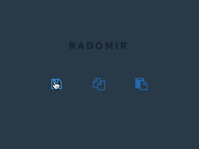
Ne verujem ! Stoja, Stana, Radomir !
Nice work Mary Lou. This little jQuery snippet may also be helpful for those that don’t want the JS/classie stuff..
$('.cbutton').click(function(){
    var $ele = $(this);
    $ele.addClass("cbutton--click");
    setTimeout(function(){
        $ele.removeClass("cbutton--click");
    }, 400);
});
Demo: http://www.codeply.com/go/poKWUEc3h9
Awesome effects. Wish I could be as good as you, real inspiration!
How to insert a icon into button like search button. I like SIMO animation. This really impressive