From our sponsor: Leverage AI for dynamic, custom website builds with ease.
Users have expectations — it’s surprising, I know. Users expect a button to perform an action: submit a form, open a new page or edit content. No discovery needed, this user expectation is pretty standard and not limited to the digital world only. As a designer, this user expectation is pretty simple to create. Have an action for the user to perform? Just add a button. Almost every user interface (UI) component has some kind of built-in user expectation and for the most part we all do a great job at matching overall UI components with their user goal and expectation.
However, the button itself is not the only item that can make or break what the user expects to happen. An improperly labeled button will not only create a question about what the button is (they may never even use it), but will also change what the user expects to happen when they do press it.
Labels Make a Difference
Labels make a huge difference in any user experience design. Properly labeled UI components make it easier for users to understand and predict what a design or interaction does. Bad labels will not only make it hard for users to understand and navigate content, they can also break trust with your design, and user trust is a hard thing to earn back. What a button says isn’t just something to glance over, it’s a crucial part of the overall user experience. Too often we worry about the overall design of the button:
- Does it look enough like a button?
- Will the user know it’s a button?
- Will the user know that it’s a link?
- Should I use a flat color or gradient?
- Where should I put the button?
Then, we forget about what the button says and how to correctly set the user’s expectation. Also, a poorly labeled button can negate your design work.
Setting an Expectation
Labels can also make or break those crucial first impressions. When a user first arrives at your design they will quickly scan around, size up the content and start building their expectations. To use a cheesy analogy, think of a restroom door. When a user first encounters a restroom door, the door itself (like a button) sets the expectation that they can walk through it to another room. The label describes the room behind the door, this sets the expectation of what the user will see or do once inside. If a building had a women’s restroom improperly labeled “Mens”, the user expectation and trust would be broken once a man entered the room.
This kind of mistake is very costly. Not only does it break trust, but it can create a very awkward situation making the user feel stupid. Managing user expectations, building a user’s trust and not making your user feel stupid can be accomplished with proper labels, but what exactly should labels say? A label should:
- Describe the behavior or action
- Provide insight into what content will be viewed
- Be simple, clear and direct
- Build trust, don’t break trust
Describe Behavior or Action
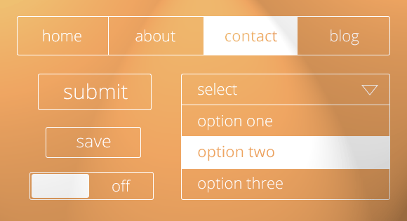
An attribute of a proper label is making sure that it accurately describes the behavior or action the user will experience — like on a button click. A simple, classic example of this is the difference between “save” and “submit” on a form. Example: On a form, “Submit” means that the data a user has entered will be submitted to something or somewhere. The user expects to be taken somewhere when they click submit, maybe a view showing them where they submitted it to or some sort of confirmation page. Where as the “Save” means that the info will be stored and the view will not change, it’s just an update.
It’s never a bad thing to let the user know what will happen once they click on something. Being descriptive doesn’t mean being overly detailed. You don’t need to detail out what the next view or interaction is. For example a drop down menu item or select component. A drop down that simply has the label “select” sets the expectation that a user action is required but it also describes the interaction — the user will be choosing something from a list — without being too detailed. In this case there is no need to say “select from a list of options” or even “select options”.

Provide Insight into What Content Will be Viewed
Going back to our restroom example, when a person walks through the door (labeled “restroom”) they generally see things that let them know they are in a restroom; sink, hand dryer, toilet, etc. This confirms the expectation set by the label on the door and now the person is confident they are in the right place. Just like the label “restroom” provides some insight into what the user will see once they enter, your label should provide some information about what the user will see next once they click the button or initiate an action.
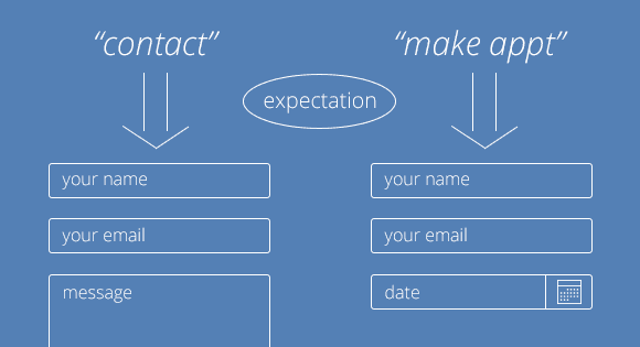
For example, a user on your website wants to get a hold of you and make a suggestion. They would expect that somewhere on your site they will find a phone number, email address or some kind of form to send you a message. You have a menu option labeled “contact” and the user expectation is now that the next view will contain a phone number, email address or some form to contact the site owner or business entity. If instead of saying “contact” you chose something like “make appointment”, the user would then expect to see a contact form for making an appointment only, not just a contact form or email for general questions concerning the product.
Be Simple and Clear
Like the contact example, keep your labels simple and clear. A great way to confuse, isolated and make users feel stupid is to label things with some slang term, cultural reference or just some cutesy, flowery words or phrases. For example, if you are designing an e-commerce site for model trains you might think it would be fun to name the contact page “Connection Junction” but while this may lend itself to the overall experience of the site, it will most likely be hard for someone to find the contact page quickly because they don’t have any idea what that means until they have clicked on it. If you think “contact” is too boring, rather then using the label itself to enhance the experience try another design tool to bring more life to the site.
Keeping it simple also means that you should avoid using long labels for things. While “Get a hold of me” or “This is the men’s bathroom” or “Are you sure you want to do this?” clearly set the user’s expectation, they aren’t the prettiest things to have squished on a button or a small door sign. Long labels are not just ugly; if they are too long they can be confusing and most people won’t read the entire thing. Not reading and understanding a label can be dangerous. If users do not read a label they could delete something they didn’t intend to or send something to someone unintentionally. Avoid long labels that can cause bad or unintentional consequences.
Build Trust, Don’t Break Trust
Proper labels will build trust. Using our previous restroom example, if your user “walks” through the wrong door by accident because the label was unclear, they are less likely to explore other areas of your application. You do not want your users to feel like they have been tricked or duped into something they didn’t fully understand. Trust is fostered when users can feel comfortable exploring and discovering the application, therefore accurate labels can be an easy win in the trust building game.
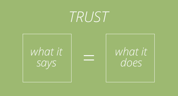
Your app should do what it says AND say what it does. Misrepresenting this will not only cause confusion, it will also set a negative perception of what your app can do. While your app may be awesome and designed to accomplish all the user’s goals, if the labels are setting up false expectations of the app, the user will think your app can’t or won’t help them accomplish their goal. Labels set the expectations and stage mental models; do not build up false expectations only to let the user down.
Harder to Fix Later
It’s not that hard to use the correct labels to describe features, interactions and content — well, at least in the beginning. It’s easier to NOT create a problem rather then fix it later. Since you’ve spent the time to design a great tool that will accomplish your users goals, take the time and make sure that button labels, links and other labels are setting the correct expectation, do not allow a simple ‘mistake’ like an improperly worded label to break trust with the user and hurt the user experience you’ve worked hard to accomplish.
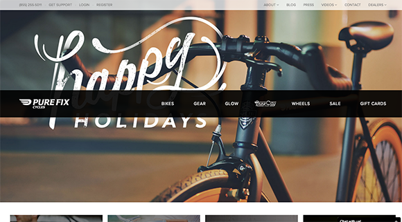
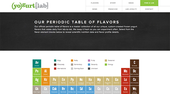
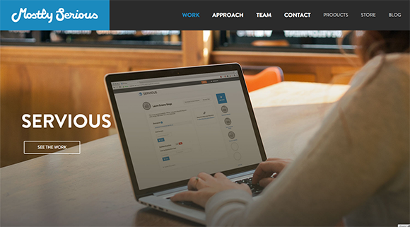
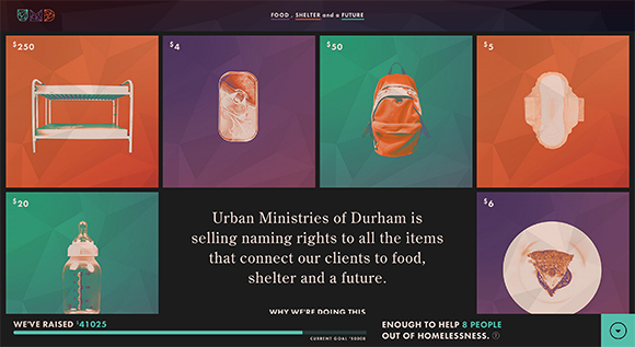
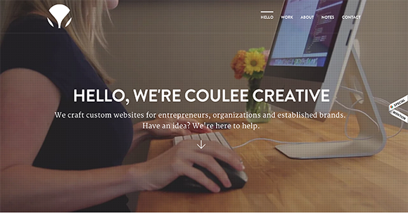
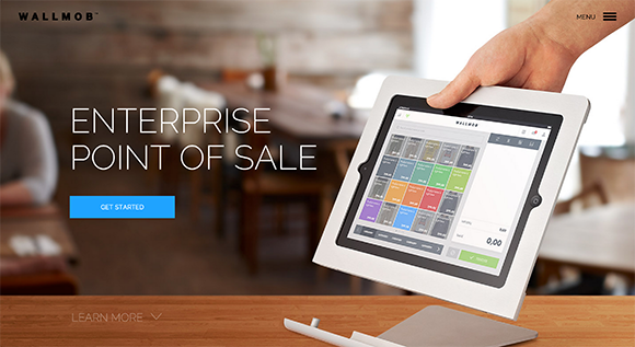
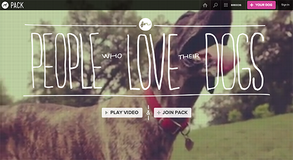
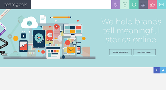
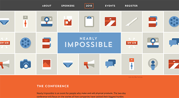
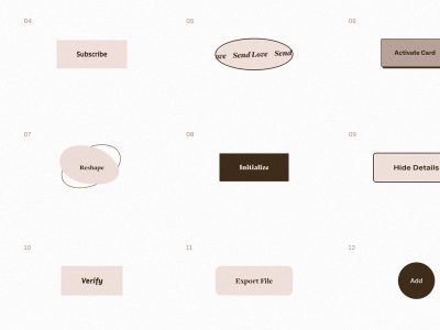
Here’s a few more examples with unique experiences that maintain proper, clear and simple labels:

Nice and detailed Article about Labels. Thanks for advices.
This all seems very obvious, but sometimes it’s important to state the obvious.
Also, I enjoyed the websites you referenced. 🙂
Good article , thanks man~!
Useful article, it’s obvious but necessary to talk about. Thx
That is a great and simple article. Thank you.
Thanks for sharing your thoughts, these are very useful.
was hoping to see a demo of that UI!
Why doesn’t Codrops have a share function for articles? I am baffled.
Copy URL; share however you’d like.
I actually find it refreshing that codrops lacks the horrible, intrusive “share widgets” that once seemed useful, but now just slow down my browsing experience all over the web.
There’s actually a Chrome extension to block them now.
Great article. Did you write it in the bathroom?
What do you think about the example content within an input field, which you can see on so many sites? In my view, its pretty annoying, because it fills up the site with even more text. The labels should be enough, therefore, clear and understandable.
Hi. Am I able to use this in my job work? I am a freelancer. If no, is there any way that I can contribute, or donate?
This is well thought out and put together, thank you! Love the examples. I think most people forget to be Simple and Clear when they create call to actions, sometimes they are over designed and lost, these labels are straight to the point so the user is not confused whats going to happen when the click the action submit button. Again, great read, I plan on sharing this with the other designers here.
Great article. I am a Front End Developer, but I feel the growing need of understanding User Experience principles. And I think properly labelling calls to action on an application is very important to gain users trust.
Good job and thank you.
I think you meant “insight”, not “incite”.
Thanks Mariah! Fixed!
Nice article. Labels are really required as they prove to be useful for the users.
Great share! This is such a good example of a clients user experience.