From our sponsor: Leverage AI for dynamic, custom website builds with ease.
In this tutorial I’m going to show you how to create circular navigations using CSS transforms. I’m going to take you through the steps for creating these styles one by one, and explain the math (yikes!) and simple logic behind them so you get a clear understanding of the technique.
Like I mentioned, there’s going to be some basic math involved, along with CSS transforms to create these styles. But don’t worry, the math is really very simple and I’ll be going through it step by step.
I also want to mention that credit for the original technique goes to Ana Tudor. I tweaked it to achieve the results that I wanted, which is also what I’m hoping you’ll be able to do by the end of this tutorial: have a deep and clear understanding of the technique so you can start fiddling around and creating your own styles.
So, without further ado, let’s get started!
The Markup
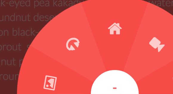
We’re going to be building a navigation, so we’ll start with a regular navigation structure. We’ll need a div to contain our unordered list of items, a button to trigger the opening and closing of the navigation, the list of items, and for the first demo we’ll need an extra overlay to cover the page when the navigation is open.
<button class="cn-button" id="cn-button">+</button>
<div class="cn-wrapper" id="cn-wrapper">
   <ul>
       <li><a href="#"><span class="icon-picture"></span></a></li>
       <li><a href="#"><span class="icon-headphones"></span></a></li>
       <li><a href="#"><span class="icon-home"></span></a></li>
       <li><a href="#"><span class="icon-facetime-video"></span></a></li>
       <li><a href="#"><span class="icon-envelope-alt"></span></a></li>
   </ul>
</div>
<div id="cn-overlay" class="cn-overlay"></div>
The icons we’re using in this demo are from Font Awesome.
The Math Behind the CSS Transforms
The best way to explain the math is to use a visual explanation instead of a written one. So I’ll start with the logic and we’ll apply the math as we go, and after we’re done with our explanation we’ll get to the coding part, at which point you’ll be able to know what each CSS rule exactly does.
First let’s go over what a “central angle” is. This is a visual representation followed by a simple explanation:
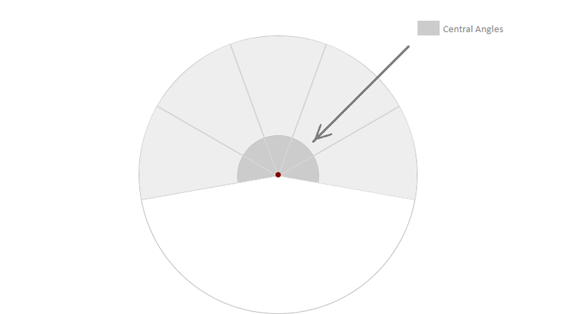
Suppose you want to distribute all navigation items on a semi-circle like the example we’re making here, and you have 6 items in your navigation list, then each angle would have a central angle of:
180deg / 6 = 30deg
If you want the items to take up a complete circle, and you have 6 items you want to have in this circle, the central angle for each item would be:
360deg / 6 = 60deg
And so on. So you calculate the value of the central angle you want, and from here on we’ll start applying some simple math to CSS transforms to actually create these angles.
To create an angle of value equal to our desired central angle value, we’ll have to skew the items (using the skew() CSS function) by:
90deg – x deg, where x is the value of the central angle we want.
Simple. But in this case, all the content inside the list items will also be skewed and the content will look distorted, which is not what we want, so we’ll “unskew” the anchors inside each item so that the content looks fine, but we’ll get to that in a moment.
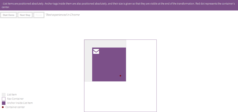
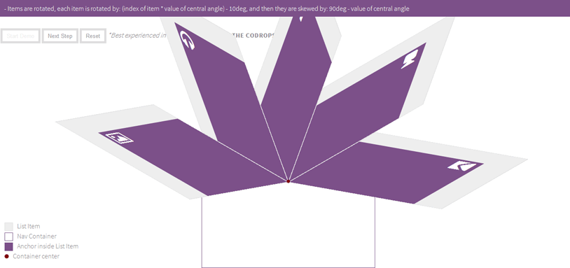
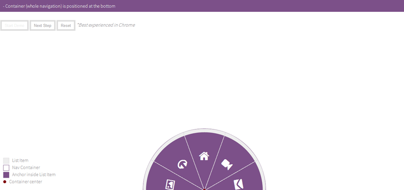
I’ve set up a live and interactive demo that will show you how the transforms are applied to the navigation items step by step so you get a clearer understanding of what we’ll be doing in the code. (Note that the walkthrough in the demo may differ slightly in order of steps from the steps we’ll be taking in the tutorial)
You might want to play the step-by-step demo at this point to get a clearer understanding of what we’ll be doing next. I’ve also added a walkthrough to the demo which explains what’s happening in each step, so take a minute to play the demo and try to gain a better understanding of what we’ll do. You can play the demo from start to finish using the Start Demo Button, or control moving from step to step using the Next Step Button, and you can reset it anytime using the Reset Button.
Here are screenshots of the steps you’re going to see in the demo:
Initial state:
Step 1:
Step 2:
Step 4:
Step 5:
Step 6:
Step 7
So let’s go over this again:
- we’ll need to position the items absolutely inside their container.
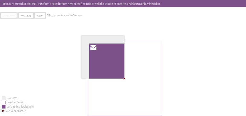
- We’ll set the transform-origin for each item to be the bottom right corner.
- We’ll then translate the items up and to the left just enough so that their transform origin coincides with their container’s center.
- We’ll then rotate the items clockwise into their positions using this formula: For each item of index i we rotate it by: i * x , where x is again the value of the central angle
- then skew them to get the central angle we want (using the formula we mentioned above)
In our example, we have 5 items, which means 5 central angles, that we want to cover only the upper half of the circle, so according to the math we explained above, every item would have a central angle of 36deg, but in our example I’ve set the central angle value to 40deg (because it provides a bigger clickable area), so the sum of all angles will be 5 * 40 = 200deg which is greater than 180deg. In this case, all we do is just rotate the items “back” counter-clockwise by (200-180)/2 deg to ensure they are balanced on both sides.
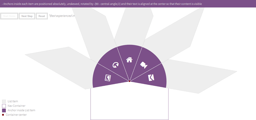
At this point we have created our central angles and positioned them. But skewing the list items has also caused their content (anchor tags) to skew too, and thus caused their content to be distorted, so the last mathematical rule we’ll be applying here (phew!) is one that will make sure the anchor tags aren’t distorted and their content be visible. The rule is:
You unskew the anchor tags, which means you skew them by the opposite value of that you used to skew the list items, and then you unrotate the anchors by a value of:
– [90 – (x/2) ] , with x being the value of the central angle
so, for a central angle value of 40deg, we have to skew the anchors by -40deg and rotate them by:
-[ 90 – (40/2) ] = -70 deg
The anchors are positioned absolutely inside their parents, and the overflow is set to hidden on the list items, which means that part of the anchors is cut off, so in order to make sure that the text/icon content of the anchors lies within their visible part, we’ll set their text to be aligned at the center.
And that’s all the math you need to create the slices inside the navigation! Phew, finally, right?
So let’s go over this one more time, quickly:
- Rotate the items into position by: angle y = i * x (where i = index of item, and x = value of central angle)
- Skew them by 90deg – x (where x is the value of central angle, again)
- Rotate items in the opposite direction if/when needed to balance (this step is actually merged with the previous one, you subtract the value by which you want to rotate the angles back from the value of the angle you rotate them by)
- “Unskew” and “unrotate” the anchors inside them (and set their text align to center”)
Of course I’ve skipped part where you move the list items so that their transform origin coincides with their container’s center (as shown in the demo). And that’s pretty much all you need to create the angles, but that’s not everything you need to create the whole navigation. A few simple steps remain, and they are pretty much just regular styling, so let’s start with the CSS and talk about these steps as we go!
The CSS
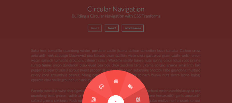
We’re first going to style the first demo.
We’re going to use Modernizr‘s classes applied to the body tag to target supporting and non-supporting browsers, and provide a very simple and basic fallback for older browsers that do not support CSS transforms.
Let’s start with the styles for the navigation wrapper. It will get a fixed position at the bottom center of the page, and will initially be scaled down, and when the open button is clicked it will open / scale up.
.csstransforms .cn-wrapper {
font-size:1em;
width: 26em;
height: 26em;
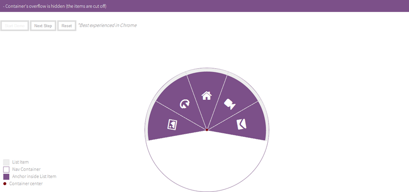
overflow: hidden;
position: fixed;
z-index: 10;
bottom: -13em;
left: 50%;
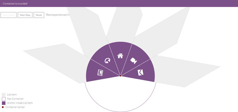
border-radius: 50%;
margin-left: -13em;
transform: scale(0.1);
transition: all .3s ease;
}
/* class applied to the container via JavaScript that will scale the navigation up */
.csstransforms .opened-nav {
border-radius: 50%;
transform: scale(1);
}
We’ll also style and position the button which will trigger the opening and closing of our navigation.
.cn-button {
  border:none;
  background:none;
  color: white;
  text-align: Center;
  font-size: 1.5em;
  padding-bottom: 1em;
  height: 3.5em;
  width: 3.5em;
  background-color: #111;
  position: fixed;
  left: 50%;
  margin-left: -1.75em;
  bottom: -1.75em;
  border-radius: 50%;
  cursor: pointer;
  z-index: 11
}
.cn-button:hover,
.cn-button:active,
.cn-button:focus{
  background-color: #222;
}
When the navigation is opened, an overlay covers the page. Here are the styles for the overlay.
.cn-overlay{
  width:100%
  height:100%;
  background-color: rgba(0,0,0,0.6);
  position:fixed;
  top:0;
  left:0;
  bottom:0;
  right:0;
  opacity:0;
  transition: all .3s ease;
  z-index:2;
  pointer-events:none;
}

/* Class added to the overlay via JavaScript to show it when navigation is open */
.cn-overlay.on-overlay{
  pointer-events:auto;
  opacity:1;
}
Now we’ll style the navigation items and their anchors, applying the logic and math-based transformed we explained earlier.
.csstransforms .cn-wrapper li {
  position: absolute;
  font-size: 1.5em;
  width: 10em;
  height: 10em;
  transform-origin: 100% 100%;
  overflow: hidden;
  left: 50%;
  top: 50%;
  margin-top: -1.3em;
  margin-left: -10em;
  transition: border .3s ease;
}

.csstransforms .cn-wrapper li a {
  display: block;
  font-size: 1.18em;
  height: 14.5em;
  width: 14.5em;
  position: absolute;
  bottom: -7.25em;
  right: -7.25em;
  border-radius: 50%;
  text-decoration: none;
  color: #fff;
  padding-top: 1.8em;
  text-align: center;
  transform: skew(-50deg) rotate(-70deg) scale(1);
  transition: opacity 0.3s, color 0.3s;
}

.csstransforms .cn-wrapper li a span {
  font-size: 1.1em;
  opacity: 0.7;
}
/* for a central angle x, the list items must be skewed by 90-x degrees
in our case x=40deg so skew angle is 50deg
items should be rotated by x, minus (sum of angles - 180)2s (for this demo) */

.csstransforms .cn-wrapper li:first-child {
  transform: rotate(-10deg) skew(50deg);
}

.csstransforms .cn-wrapper li:nth-child(2) {
  transform: rotate(30deg) skew(50deg);
}

.csstransforms .cn-wrapper li:nth-child(3) {
  transform: rotate(70deg) skew(50deg)
}

.csstransforms .cn-wrapper li:nth-child(4) {
  transform: rotate(110deg) skew(50deg);
}

.csstransforms .cn-wrapper li:nth-child(5) {
  transform: rotate(150deg) skew(50deg);
}

.csstransforms .cn-wrapper li:nth-child(odd) a {
  background-color: #a11313;
  background-color: hsla(0, 88%, 63%, 1);
}

.csstransforms .cn-wrapper li:nth-child(even) a {
  background-color: #a61414;
  background-color: hsla(0, 88%, 65%, 1);
}

/* active style */
.csstransforms .cn-wrapper li.active a {
  background-color: #b31515;
  background-color: hsla(0, 88%, 70%, 1);
}

/* hover style */
.csstransforms .cn-wrapper li:not(.active) a:hover,
.csstransforms .cn-wrapper li:not(.active) a:active,
.csstransforms .cn-wrapper li:not(.active) a:focus {
  background-color: #b31515;
  background-color: hsla(0, 88%, 70%, 1);
}
.csstransforms .cn-wrapper li:not(.active) a:focus {
  position: fixed; /* fix the "displacement" bug in webkit browsers when using tab key */
}
We’ll provide a simple and basic fallback for browsers that do not support CSS transforms.
.no-csstransforms .cn-wrapper{
  font-size:1em;
  height:5em;
  width:25.15em;
  bottom:0;
  margin-left: -12.5em;
  overflow: hidden;
  position: fixed;
  z-index: 10;
  left:50%;
  border:1px solid #ddd;
}

.no-csstransforms .cn-button{
  display:none;
}

.no-csstransforms .cn-wrapper li{
  position:static;
  float:left;
  font-size:1em;
  height:5em;
  width:5em;
  background-color: #eee;
  text-align:center;
  line-height:5em;
}

.no-csstransforms .cn-wrapper li a{
  display:block;
  width:100%;
  height:100%;
  text-decoration:none;
  color:inherit;
  font-size:1.3em;
  border-right: 1px solid #ddd;
}

.no-csstransforms .cn-wrapper li a:last-child{
  border:none;
}

.no-csstransforms .cn-wrapper li a:hover,
.no-csstransforms .cn-wrapper li a:active,
.no-csstransforms .cn-wrapper li a:focus{
  background-color: white;
}

.no-csstransforms .cn-wrapper li.active a {
  background-color: #6F325C;
  color: #fff;
}
Of course we want our navigation to be responsive, so it will shrink to fit smaller screens. Here are the responsive styles for both the circular and the simple styles.
@media screen and (max-width:480px){
  .csstransforms .cn-wrapper{
    font-size:.68em;
  }
  .cn-button{
    font-size:1em;
  }
  .csstransforms .cn-wrapper li {
    font-size:1.52em;
  }
}

@media screen and (max-width:320px){
  .no-csstransforms .cn-wrapper{
    width:15.15px;
    margin-left: -7.5em;
  }
  .no-csstransforms .cn-wrapper li{
    height:3em;
    width:3em;
  }
}
And that’s it for the first demo! Let’s move on to the next one.
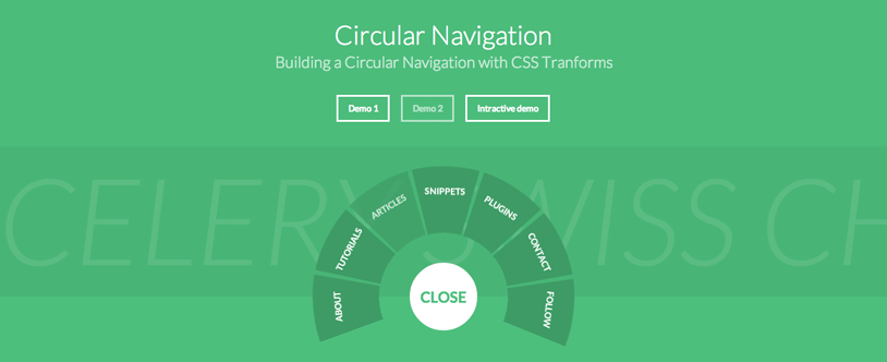
The second circular style is different from the first one, but all the math and logic and transforms needed to create this style is pretty much the same as the previous one, except for three differences. So we won’t be going over the same explanation again, we’ll only cover the three different steps needed for this style.
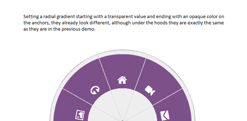
Let’s take the above example again, and change just a small simple CSS rule, and see what difference it makes to the shape of the items.
We’ll apply a radial gradient background to the anchors with a transparent background color. The result will look like this:
You can see where we’re headed from here. Next, we’re going to add space between the items, by changing the angle of rotation for each item a little bit. We’ll also remove the background colors of the list items and the container, and the borders used, and decrease the top padding of the anchor tags to pull the icons up a little bit to center them vertically. The result obtained looks like this:
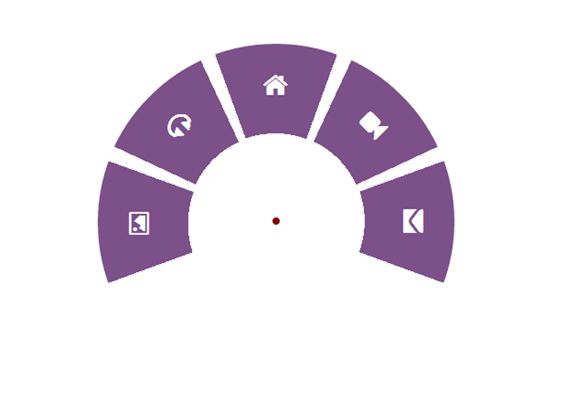
As you see the navigation is already starting to look different; we’re more than halfway through.
We still have one important thing to do. At the current state of this style, the clickable area of the anchors is still bigger than what we want. What we do want, is that only the colored part of the navigation shown in the image be clickable/hoverable. The image below shows the extra clickable area of the anchors.
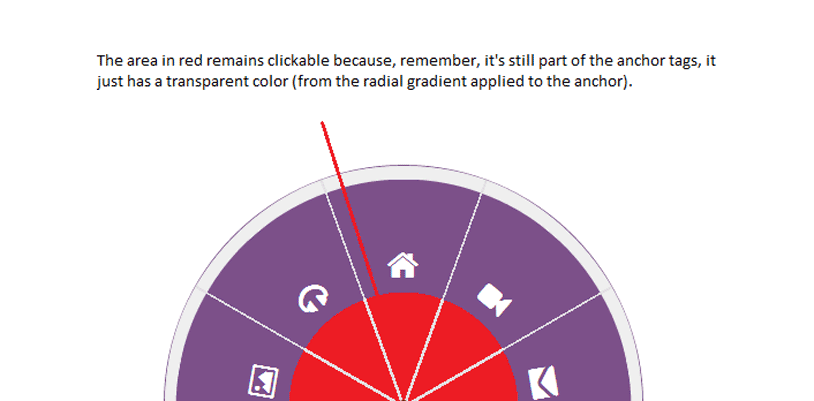
When you hover over the red area shown in the image, which is the lower part of the anchor tags, the hover state of the anchors is fired, which is the normal thing to happen, but because we want it to seem like the anchors are only the purple area, we need to prevent mouse events from firing on the lower part of the anchors. For this we’re going to use a “cover” which we’ll place over at the center of the navigation container, which will be a circular shape covering the lower parts of the anchors, and therefore blocking the mouse events on these parts. We’ll be using a pseudo-element for this to avoid adding additional empty tags to our markup.
So, applying these three steps to our CSS, and changing the overall styles (colors and size) of the navigation and navigation items to look like the preview image above, we end up with the following CSS:
.csstransforms .cn-wrapper {
  position: absolute;
  top: 100%;
  left: 50%;
  z-index: 10;
  margin-top: -13em;
  margin-left: -13.5em;
  width: 27em;
  height: 27em;
  border-radius: 50%;
  background: transparent;
  opacity: 0;
  transition: all .3s ease 0.3s;
  transform: scale(0.1);
  pointer-events: none;
  overflow: hidden;
}

/*cover to prevent extra space of anchors from being clickable*/
.csstransforms .cn-wrapper:after{
  color: transparent;
  content:".";
  display:block;
  font-size:2em;
  width:6.2em;
  height:6.2em;
  position: absolute;
  left: 50%;
  margin-left: -3.1em;
  top:50%;
  margin-top: -3.1em;
  border-radius: 50%;
  z-index:10;
}

.csstransforms .cn-wrapper li {
  position: absolute;
  top: 50%;
  left: 50%;
  overflow: hidden;
  margin-top: -1.3em;
  margin-left: -10em;
  width: 10em;
  height: 10em;
  font-size: 1.5em;
  transition: all .3s ease;
  transform: rotate(76deg) skew(60deg);
  transform-origin: 100% 100%;
  pointer-events: none;
}

.csstransforms .cn-wrapper li a {
  position: absolute;
  position: fixed; /* fix the "displacement" bug in webkit browsers when using tab key */
  right: -7.25em;
  bottom: -7.25em;
  display: block;
  width: 14.5em;
  height: 14.5em;
  border-radius: 50%;
  background: #429a67;
  background: radial-gradient(transparent 35%, #429a67 35%);
  color: #fff;
  text-align: center;
  text-decoration: none;
  font-size: 1.2em;
  line-height: 2;
  transition: all .3s ease;
  transform: skew(-60deg) rotate(-75deg) scale(1);
  pointer-events: auto;
}

.csstransforms .cn-wrapper li a span {
  position: relative;
  top: 1.8em;
  display: block;
  font-size: .5em;
  font-weight: 700;
  text-transform: uppercase;
}

.csstransforms .cn-wrapper li a:hover,
.csstransforms .cn-wrapper li a:active,
.csstransforms .cn-wrapper li a:focus {
	background: radial-gradient(transparent 35%, #449e6a 35%);
}
We want the navigation items in the second demo to spread out in a fan-like effect when the navigation is opened.
To achieve this effect, we have positioning the items in the same place and with the same rotation/skew of rotate(76deg) skew(60deg).
Using transition delays we allow the items to spread out after we scale the wrapper up. When the navigation gets closed, we’ll wait for the items to move back in, before we scale the wrapper down again.
When the open button is clicked we’re going to spread the items out by rotating each of them to their final position on the circle.
.csstransforms .opened-nav {
  border-radius: 50%;
  opacity: 1;
  transition: all .3s ease;
  transform: scale(1);
  pointer-events: auto;
}

.csstransforms .opened-nav li {
  transition: all .3s ease .3s;
}

.csstransforms .opened-nav li:first-child {
  transform: rotate(-20deg) skew(60deg);
}

.csstransforms .opened-nav li:nth-child(2) {
  transform: rotate(12deg) skew(60deg);
}

.csstransforms .opened-nav  li:nth-child(3) {
  transform: rotate(44deg) skew(60deg);
}

.csstransforms .opened-nav li:nth-child(4) {
  transform: rotate(76deg) skew(60deg);
}

.csstransforms .opened-nav li:nth-child(5) {
  transform: rotate(108deg) skew(60deg);
}

.csstransforms .opened-nav li:nth-child(6) {
  transform: rotate(140deg) skew(60deg);
}

.csstransforms .opened-nav li:nth-child(7) {
  transform: rotate(172deg) skew(60deg);
}
Of course, we’ll also provide a basic fallback for non-supporting browsers.
.no-csstransforms .cn-wrapper{
  margin:10em auto;
  overflow:hidden;
  text-align:center;
  padding:1em;
}
.no-csstransforms .cn-wrapper ul{
  display:inline-block;
}
.no-csstransforms li{
  font-size:1em;
  width:5em;
  height:5em;
  float:left;
  line-height:5em;
  text-align:center;
  background-color: #fff;
}
.no-csstransforms li a{
  display:block;
  height:100%;
  width:100%;
  text-decoration: none;
  color: inherit;
}
.no-csstransforms .cn-wrapper li a:hover,
.no-csstransforms .cn-wrapper li a:active,
.no-csstransforms .cn-wrapper li a:focus{
  background-color: #f8f8f8;
}
.no-csstransforms .cn-wrapper li.active a {
  background-color: #6F325C;
  color: #fff;
}
.no-csstransforms .cn-button{
  display:none;
}
And the navigation is also going to be responsive, so we’ll shrink it on smaller screens. Here are the responsive styles for both circular and simple styles.
@media only screen and (max-width: 620px) {
  .no-csstransforms li{
    width:4em;
    height:4em;
    line-height:4em;
  }
}
@media only screen and (max-width: 500px) {
  .no-ccstransforms .cn-wrapper{
    padding:.5em;
  }
  .no-csstransforms .cn-wrapper li{
    font-size:.9em;
    width:4em;
    height:4em;
    line-height:4em;
  }
}
@media only screen and (max-width: 480px) {
  .csstransforms .cn-wrapper{
    font-size: .68em;
  }
  .cn-button{
    font-size:1em;
  }
}
@media only screen and (max-width:420px){
  .no-csstransforms .cn-wrapper li{
    width:100%;
    height:3em;
    line-height:3em;
  }
}
And that’s pretty much all the CSS you need to create these styles!
The JavaScript
We won’t be using any JavaScript framework for these demos. I will be using David De Sandro’s Classie.js to add and remove classes. And finally for browsers that don’t support the addEventListener and removeEventListener we’ll use Jonathan Neal’s EventListener polyfill.
We’ll add an event handler to the button in each of the two demos. Clicking the button and/or focusing it will trigger opening/closing of the navigation.
Also, for the first demo, clicking anywhere outside the navigation when it’s open will also close it.
Let’s start with the JavaScript for the first demo.
(function(){

  var button = document.getElementById('cn-button'),
    wrapper = document.getElementById('cn-wrapper'),
    overlay = document.getElementById('cn-overlay');

  //open and close menu when the button is clicked
  var open = false;
  button.addEventListener('click', handler, false);
  button.addEventListener('focus', handler, false);
  wrapper.addEventListener('click', cnhandle, false);

  function cnhandle(e){
    e.stopPropagation();
  }

  function handler(e){
    if (!e) var e = window.event;
    e.stopPropagation();//so that it doesn't trigger click event on document

      if(!open){
        openNav();
      }
    else{
        closeNav();
      }
  }
  function openNav(){
    open = true;
      button.innerHTML = "-";
      classie.add(overlay, 'on-overlay');
      classie.add(wrapper, 'opened-nav');
  }
  function closeNav(){
    open = false;
    button.innerHTML = "+";
    classie.remove(overlay, 'on-overlay');
    classie.remove(wrapper, 'opened-nav');
  }
  document.addEventListener('click', closeNav);

})();
The JavaScript for the second demo is similar to the previous one, except that we customize it for this case:
(function(){

  var button = document.getElementById('cn-button'),
    wrapper = document.getElementById('cn-wrapper');

    //open and close menu when the button is clicked
  var open = false;
  button.addEventListener('click', handler, false);
  button.addEventListener('focus', handler, false);

  function handler(){
    if(!open){
      this.innerHTML = "Close";
      classie.add(wrapper, 'opened-nav');
    }
    else{
      this.innerHTML = "Menu";
    classie.remove(wrapper, 'opened-nav');
    }
    open = !open;
  }
  function closeWrapper(){
    classie.remove(wrapper, 'opened-nav');
  }

})();
And that’s pretty much it! I hope you liked this tutorial and found it useful!
Update: The demo has been updated based on a few of the reported bugs in the comments section below. The menu should now be fully functional in Chrome/Webkit.


why not work in androit?
Hello, I’m new to html and css3 and I really liked your tutorial but I have an issue when I implement a link works only access the others do not work I would like you to help me thanks
all options are directing to the same page in spite of different href in chrome.. while working properly in firefox??
How to put multiple on one page? Need to put in mobile application
Hi
is it possible to load menu second option by default without clicking, i mean on page load.
Please help me out
thanks for the excellent tutorial.
I want to make the circular navigation display on the left by by rotating the whole thing by 90 degrees, and positioning it with the left property instead of the bottom. However the graphics is not shown like the original design.
http://jsfiddle.net/rageprof/9p78rtv0/
anything else that I need to modify in order to show the graphics ?
thanks
andy
Hi Sara,
I am trying to place your demo 2 circular navigation on my site, and am having issues with the navigation disappearing when you click on it in Internet Explorer. I viewed your demo 2 version in IE right here on Tympanus.net, and I run into the same issue. Wondered if you have a fix for this, or if there is some code I can add to fix the issue.
Other than that though, this code is great. Thanks for sharing.
Thanks in advance
– Clay
Hi! Your work is amazing. I just want to experiment , how can you put a link inside the icons? 🙂 thanks 😉 your awesome <3
Is it just me? The markup is gone. It looks as if the browser read and spit out all the code instead of displaying the code.
I really like this navigation. I am using for a website. However, It has a little bug when running on Internet Explorer 11. I am sure you guys have noticed it. Have you found the solution yet ?.
Im sure it would help if you actually posted what that bug is. Dont assume people can read minds.
Thank you so much! This was an awesome tutorial!
hello, if I want to change the color wheel in the demo 1, how do I can do?
Great tutorial. One problem I’m running into is with a 4-item list that needs to take up the entire 360 degrees. The skews become too extreme and I lose the circular look. Any recommendations?
Hello,
This is a great menu. I am working with Demo 1 and I have been playing with it and would like to implement a tooltip, but it doesn’t seem to work inside the container:
I had to add it outside of the div in order for the tooltip to work, but that defeats the purpose of having a tooltip. Can someone please help?
Thanks for sharing! I implemented this in a project I’m working on and started to play with some of the parameters and got this cool pinwheel / flower effect:
http://mikeheavers.com/prototypes/extrapolation/circle-nav/
Any idea how to make or add a mobilecheck or click/touchstart function so the menu will close when touch on the mobile screen outside of the menu? It does close when click outside of the menu on browser using mouse, but not on a mobile touch screen. Any help is greatly appreciated.
need help to create best menus for my website …Pl Suggest
how to increase the width of each div on circulaor navigation
Thanks very much ! You are a good teacher
so generous of you to share your knowledge and this great navigation tab Thanks very much.
Is it ok to use it on my site? does it need a license?
This is a very nice article, thank you very much. I notice that you have another article regarding circular navigation, but using SVG instead. However, this technique is still very useful and worth reading. I was playing with it a bit but there seems to be so much “magic” behind, such as the margin top, left, width, height numbers. The article should explain more in details how those numbers should be calculated. I was trying to make the navigation circle smaller and closer to the center (demo2) but had lots of problems with that.
Hey. Great article overall. But your interactive explaination nailed it.
Really awesome stuff.
Has anyone tried adapting to Angular 4+ ? I have been struggling with the translation. For some reason some of the things are not taking effect.