From our sponsor: Leverage AI for dynamic, custom website builds with ease.
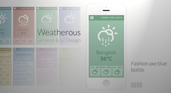
Today we will be creating a little app showcase with a neat effect. The idea is to show a mobile device with a screenshot of an app and when clicking on the device, a grid appears, showing some more screenshots. The effect is very subtle: the device moves back and the grid fades in and scales up. When clicking on another screenshot, the device image gets updated and the grid disappears again.
The beautiful iPhone mockup used in the demo is by Jakub Kejha
Let’s get started with the markup.
The Markup
The HTML will consist of a main wrapper that contains a heading, a division for the device and a division for the grid:
<div id="ac-wrapper" class="ac-wrapper">
	<h2>Weatherous <span>Concept & UI Design</span></h2>
	<div class="ac-device">
		<a href="#"><img src="images/screen1.jpg"/></a>
		<h3 class="ac-title">Gentrify small batch umami retro vegan</h3>
	</div>
	<div class="ac-grid">
		<a href="#"><img src="images/screen1.jpg"/><span>Gentrify small batch umami retro vegan</span></a>
		<a href="#"><img src="images/screen2.jpg"/><span>Chambray squid semiotics</span></a>
		<a href="#"><img src="images/screen3.jpg"/><span>Fashion axe blue bottle</span></a>
		<a href="#"><img src="images/screen4.jpg"/><span>Photo booth single-origin coffee</span></a>
		<a href="#"><img src="images/screen5.jpg"/><span>Flexitarian synth keytar blog master</span></a>
		<a href="#"><img src="images/screen6.jpg"/><span>Next level retro flexitarian freegan</span></a>
		<a href="#"><img src="images/screen7.jpg"/><span>Pour-over superious meggings terry</span></a>
		<a href="#"><img src="images/screen8.jpg"/><span>Seitan william vinyl chillwave</span></a>
	</div>
</div>
Once we click on a grid item, we will update the content of the device container. We will also make the span for each grid item appear on hover.
Let’s style everything.
The CSS
Note that the CSS will not contain any vendor prefixes, but you will find them in the files.
In this tutorial we will be going through the style of demo 1.
So let’s start with the main wrapper. This will be the container that will have perspective. The origin will not be in the center but a bit more up:
.ac-wrapper {
	width: 100%;
	position: relative;
	perspective: 1000px;
	perspective-origin: 50% 25%;
}
The heading will be positioned absolutely on the left side of the device:
.ac-wrapper h2 {
	top: 20%;
	width: 50%;
	position: absolute;
	font-weight: 300;
	font-size: 4em;
	text-align: right;
	padding: 0 180px 0 50px;
}
Let’s give a slightly different look to the span:
.ac-wrapper h2 span {
	display: block;
	font-size: 60%;
	color: #c0c0c0;
}
The device will have the iPhone mockup as a background image and we will set the right dimensions. This container will need to preserve the 3D transforms and we’ll add a transition to it. Later, we’ll define a “transition classes” that will contain the properties for the altered states.
.ac-device {
	background: url(../images/iPhone.png) no-repeat;
	width: 288px;
	height: 611px;
	margin: 0 auto;
	position: relative;
	transition: all 0.3s ease;
	transform-style: preserve-3d;
}
The screenshot will be inside of an anchor and we’ll set the dimensions here and position it to fit into the mockup:
.ac-device a {
	height: 440px;
	width: 249px;
	display: inline-block;
	margin: 85px 0 0 20px;
}

.ac-device a img {
	display: block;
}
The title for each screenshot once it’s in the mockup view will be positioned absolutely on the right side of the device:
.ac-device h3 {
	position: absolute;
	font-size: 2.5em;
	left: 100%;
	width: 100%;
	top: 60%;
	margin-left: 30px;
	font-weight: 300;
	color: #888;
}
Now, let’s style the grid. We want to display a total of eight items so a row will have four items. Let’s set a fitting width, make it absolute and center it by setting a negative left margin (half of its width) and a left value of 50%. The initial opacity is 0 and since the grid is displayed and covering the device, we’ll set the pointer events to none so that we can’t click on it when it’s invisible. We’ll also add a transition and translate it -350px on the Z axis:
.ac-grid {
	position: absolute;
	width: 620px;
	left: 50%;
	margin-left: -310px;
	height: 100%;
	z-index: 1000;
	top: 0;
	opacity: 0;
	pointer-events: none;
	transform-style: preserve-3d;
	transition: all 0.3s ease;
	transform: translateZ(-350px);
}
The anchors in the grid will be floated left and the images inside will be set to 100% width. This will come in handy later on when we apply some media queries:
.ac-grid a {
	width: 145px;
	display: block;
	position: relative;
	float: left;
	margin: 10px 5px;
	cursor: pointer;
}

.ac-grid a img {
	display: block;
	width: 100%;
}
The span for the description will be positioned absolutely on top of the anchor and we’ll fade it in and move it a bit on hover:
.ac-grid a span {
	position: absolute;
	height: 100%;
	width: 100%;
	left: 0;
	top: 0;
	text-transform: uppercase;
	padding: 3em 1em 0;
	z-index: 100;
	color: #ddd;
	background: rgba(0,0,0,0.4);
	font-weight: 700;
	opacity: 0;
	transform: translateY(-5px);
	transition: all 0.2s ease;
}

.ac-grid a:hover span {
	opacity: 1;
	transform: translateY(0);
}
Next, we’ll define the “transition classes”. When we click on the device, we’ll apply a class to the wrapper which will trigger the fading in and scaling up of the grid and the moving back of the device:
.ac-wrapper.ac-gridview .ac-device {
	transform: translateZ(-350px);
	opacity: 0.6;
}

.ac-wrapper.ac-gridview .ac-grid {
	transform: translateZ(0px);
	opacity: 1;
	pointer-events: auto;
}
Once the grid is there, we also set the pointer-events to auto again.
Our layout has some absolutely positioned elements and we’ll need to take care of them on smaller screens. The idea is that we will switch the main heading to the right side first and then center everything once the screen is very small. The second media query takes care of the grid structure. Here we will set a fluid width for both, the grid and the anchors:
@media screen and (max-width: 63.875em) {
	.ac-wrapper {
		font-size: 60%;
		width: 100%;
		padding: 0 20px;
	}

	.ac-device {
		margin: 0;
		width: 100%;
	}

	.ac-device h3 {
		width: 50%;
		left: 290px;
	}

	.ac-wrapper h2 {
		left: 308px;
		padding: 0;
		text-align: left;
		margin-left: 30px;
	}
}

@media screen and (max-width: 39.8125em) {
	.ac-grid {
		width: 90%;
		left: 5%;
		margin-left: 0;
		padding-top: 150px;
	}

	.ac-grid a {
		width: 22%;
	}
}

@media screen and (max-width: 35.6875em) {
	.ac-wrapper {
		padding: 0 20px 100px;
	}

	.ac-wrapper h2 {
		width: 100%;
		text-align: center;
		margin: 0 0 1em;
		top: 0;
		left: auto;
		position: relative;
	}

	.ac-device {
		margin: 0 auto;
		width: 288px;
	}

	.ac-device h3 {
		position: relative;
		margin: 0;
		left: auto;
		width: 100%;
		top: 100px;
		display: block;
		text-align: center;
	}
}
And that’s all the style! Let’s take a look at the JavaScript.
The JavaScript
Let’s start by caching some elements and initialize some variables:
	var $el = $( '#ac-wrapper' ),
		// device element
		$device = $el.find( '.ac-device' ),
		// the device image wrapper
		$trigger = $device.children( 'a:first' ),
		// the screens
		$screens = $el.find( '.ac-grid > a' ),
		// the device screen image
		$screenImg = $device.find( 'img' ),
		// the device screen title
		$screenTitle = $device.find( '.ac-title' ),
		// HTML Body element
		$body = $( 'body' );
We will bind the events to the device’s image wrapper (anchor) and to the screen elements.
	function init() {
		// show grid
		$trigger.on( 'click', showGrid );
		// when a grid´s screen is clicked, show the respective image on the device
		$screens.on( 'click', function() {
			showScreen( $( this ) );
			return false;
		} );
	}
When the device’s image is clicked, the grid is shown. For this to happen the class “ac-gridview” has to be added to the ac-wrapper element:
	function showGrid() {
		$el.addClass( 'ac-gridview' );
		// clicking somewhere else on the page closes the grid view
		$body.off( 'click' ).on( 'click', function() { showScreen(); } );
		return false;
	}
When a screen element is clicked we remove the “ac-gridview” class from the ac-wrapper element, and update both, image source and title on the respective elements:
	function showScreen( $screen ) {
		$el.removeClass( 'ac-gridview' );
		if( $screen ) {
			// update image and title on the device
			$screenImg.attr( 'src', $screen.find( 'img' ).attr( 'src' ) );
			$screenTitle.text( $screen.find( 'span' ).text() );
		}
	}
For the third demo we also want to offer the possibility to navigate through the screenshots without having to open the grid. Depending to the direction we are navigating, the next screen will either scale up / fade in (navigating to the next screen) or move up / fade in (navigating to the previous screen). The same logic applies to the current screenshot. In order for this to work, we need to add the next/previous screen’s image to the DOM right before the current screen’s image (both images being absolute). When the transition ends we remove the old one:
function navigate( direction ) {
// if currently animating return
if( animating ) {
return false;
}
animating = true;
// update current
if( direction === 'next' ) {
current = current < screensCount - 1 ? ++current : 0;
}
else if( direction === 'prev' ) {
current = current > 0 ? --current : screensCount - 1;
}
// next screen to show
var $nextScreen = $screens.eq( current );
// if css transitions support:
if( support ) {
// append new image to the device and set the transition and initial style
var $nextScreenImg = $( '.attr( 'src' ) + ') ' ).css( {
transition : 'all 0.5s ease',
opacity : 0,
transform : direction === 'next' ? 'scale(0.9)' : 'translateY(100px)'
} ).insertBefore( $screenImg );
// update title
$screenTitle.text( $nextScreen.find( 'span' ).text() );
setTimeout( function() {
// current image fades out / new image fades in
$screenImg.css( {
opacity : 0,
transform : direction === 'next' ? 'translateY(100px)' : 'scale(0.9)'
} ).on( transEndEventName, function() { $( this ).remove(); } );
$nextScreenImg.css( {
opacity : 1,
transform : direction === 'next' ? 'scale(1)' : 'translateY(0px)'
} ).on( transEndEventName, function() {
$screenImg = $( this ).off( transEndEventName );
animating = false;
} );
}, 25 );
}
else {
// update image and title on the device
$screenImg.attr( 'src', $nextScreen.find( 'img' ).attr( 'src' ) );
$screenTitle.text( $nextScreen.find( 'span' ).text() );
animating = false;
}
}
' ).css( {
transition : 'all 0.5s ease',
opacity : 0,
transform : direction === 'next' ? 'scale(0.9)' : 'translateY(100px)'
} ).insertBefore( $screenImg );
// update title
$screenTitle.text( $nextScreen.find( 'span' ).text() );
setTimeout( function() {
// current image fades out / new image fades in
$screenImg.css( {
opacity : 0,
transform : direction === 'next' ? 'translateY(100px)' : 'scale(0.9)'
} ).on( transEndEventName, function() { $( this ).remove(); } );
$nextScreenImg.css( {
opacity : 1,
transform : direction === 'next' ? 'scale(1)' : 'translateY(0px)'
} ).on( transEndEventName, function() {
$screenImg = $( this ).off( transEndEventName );
animating = false;
} );
}, 25 );
}
else {
// update image and title on the device
$screenImg.attr( 'src', $nextScreen.find( 'img' ).attr( 'src' ) );
$screenTitle.text( $nextScreen.find( 'span' ).text() );
animating = false;
}
}
This navigation concept was introduced by Evan You and you can check it out here, or watch the video.
And that’s all! We hope you enjoyed this tutorial and find it inspiring!


Wow! I love the looks of this, seems like a super-great way to showcase an application. Bookmarking this one 🙂
Always awesome tuts, Thanks Mary Lou 🙂
WOW!!!
I’m going to try it now!
Thanks for sharing !
Awesome!!! Demo 2 is really coooool. Thanks
Beautiful transition effect! Mary how could you apply this to levels? For instance it has a two level depth now, is it possible to take it three or four levels down?
Excellent article as always! 🙂 Thank you, Mary Lou
Very cool 🙂
Is it possible to build in an auto-slideshow ?
Awesome, as always!
Impressive article!
Would be awesome if some links or content could be added in the ac-title h3
Thanks
Very nice Mary. As always! I like the third.
Last code block in the article seems garbled.
Thanks for the nice article for my upcoming app,
Thanks! It’s fixed now 🙂 Cheers, ML
Wow gr8 work… Demo 2 is really awesome…
kkk IE always left out
They should just drop this shit already xD
Hey Mary great work, but I tried testing this on IE10, doesn’t seem to work as it should. Seems like IE10 doesn’t remove the grid. It’s like an invisible grid on default.
Hi Mary Lou,
Beautiful work! The only matter is I can’t seem to make two ac-devices with it. I examined the Javascript, and found that based on the order I have of link Javascripts, the first link for a grid will always work, while the following javascript links will not work. How can I use 2 ac-devices for this?
Thank you,
Adam
Would be great if there were a settings component to this.
Very Cool!
Awesome as always! 🙂
I have an idea in my to-do list that’s a bit similar to this, but not exactly the same 🙂
Ohhh, talented mary lou
really, really love you
your work is so tasty
but we ´ll soon see a nasty
copy of this in codecanyon
🙂
Just my opinion
😉
hi, can i use this freely?. I would like to use the jquery of this article, and build my own css styles and names using this jquery. Ofcourse I won’t be changing the js names. Is that allowed? Kinda new here 🙂
Please have a look at: http://tympanus.net/codrops/licensing/ Cheers, ML
Great tut i will defenetely use it in one of my next projects:)
Hey Mary! I just wanted to let you know that someone is selling this “as-is” on codecanyon: http://goo.gl/EyFL6
Nice tutorial by the way 🙂
Hi Mary,
thanks for this tutorial! I’m very new to javascript and was trying to add a button underneath the title for each respective element with a button/image that says get in the app store, and opens new window with a link to the app store. I would really appreciate if you could guide me where I would add this code because I am a little confused with the javascript I would need. I’m assuming it would go at the end of, function showScreen
great job.
But I would add a few dots instead of the prev and next, I wonder if you could help me a bit?
Amazing… great job guys!!!
hey, love the tutorial. I’m always coming back to your site to see awesome examples of UI. I’m new to JS and i was wondering if you would be able to make another tutorial, only this time how to use the same animation for a menu. Basically have a couple rows, each with 4-5 such boxes, each with their own grids.
Thanks,
Rex
Hi there,
Great little code here. I was just wondering what would be the easiest way to reverse the order of script so the grid is shown first and the reveal is the individual screens?
Any info would be greatly appreciated.
Cheers
I too would like to do that. If anyone has any tips that would be awesome!
Hi Mary Lou,
You are AWESOME!!!!!! Is there a way to use more than 1 ac-device / showcase in the same page?