From our sponsor: Leverage AI for dynamic, custom website builds with ease.
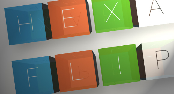
Today I’d like to share my process for creating a flexible JavaScript UI plugin I’ve dubbed HexaFlip.
Lately I’ve taken to building simple experimental UI plugins that manipulate elements with a combination of JavaScript and modern CSS techniques (e.g. oriDomi and Maskew). As Codrops is known for featuring some progressive techniques in browser-based UI design, HexaFlip should fit in nicely.
I originally developed a simpler version of HexaFlip for an iPhone app I built called ChainCal where it served as a time-picker interface for setting alarms. Most mobile time-picker widgets are fashioned after a dial, but I reasoned that rotating cubes would serve for a more unique and memorable experience. As we all know, a cube has six (i.e. “hexa”) faces, but when rotating it around a single axis, we only have four to work with (front, top, back, and bottom). Thus if we built a cube interface using CSS alone, our interface would be limited to four options per choice. HexaFlip solves this issue and playfully challenges the user’s expectations by allowing the cube to cycle over a list of any length.
The Markup
Since HexaFlip is designed to be used as a plugin, it generates its own markup based on the options given to it. For each demo, we only require a single element:
<div id="hexaflip-demo1" class="demo"></div>
The id and class are for convenience, should we want to add specific styles to our instance.
The CSS
(Note: For brevity, the following snippets don’t use any vendor prefixes, though the included source does.)
Inside every element passed to a HexaFlip instance, HexaFlip automatically builds markup for cubes (classed with hexaflip-cube) based on the number of option sets supplied to it.
.hexaflip-cube {
  font-family: 'Helvetica Neue', Arial, Helvetica, sans-serif;
  text-rendering: optimizeLegibility;
  font-smoothing: antialiased;
  cursor: move;
  cursor: grab;
  display: inline-block;
  position: relative;
  transform-style: preserve-3d;
  transition: transform 0.4s;
}
To prompt the user to manipulate the cube with the mouse, we set a cursor property on it. The reason both move and grab are set is because grab is currently vendor-specific and we need a fallback. display is set to inline-block so the cubes sit next to each other and we set position: relative to allow the JS to later set the z-index. transform-style is especially important for the use case of a cube because each of the six faces are independently manipulated in their own 3D space. Without setting preserve-3d, the cubes would appear flat. Finally we set a transition property on cubes so their rotations can be tweened.
Next we have a class called no-tween that is automatically toggled on the cubes by the JS when the user moves over a face with either a mouse button or finger down.
.hexaflip-cube.no-tween {
  transition-duration: 0;
}
This class simply disables tweening in that context so movement is immediate during interaction.
Each cube’s faces are simply nested divs so we use an immediate child selector (>) to style them.
.hexaflip-cube > div {
  width: 100%;
  overflow: hidden;
  height: 100.5%;
  position: absolute;
  user-select: none;
  background-size: cover;
  text-align: center;
  background-color: #333;
  color: #fff;
  font-weight: 100;
  text-shadow: 0 -2px 0 rgba(0,0,0,0.3);
  line-height: 1.5;
}
You may notice that the height is set to 100.5%. This is done to add some extra “bleed” to the size of each face to mitigate a common issue seen during 3D CSS transforms where edges don’t match up perfectly and “cracks” appear in the object. Each face is given absolute positioning so they stack on top of each other before they’re transformed in 3D space. We also give them user-select: none so the text of the face isn’t accidentally selected when dragging the mouse to rotate the cube. background-size: cover is applied so that if the user wants to display images on the cube, they fill the entire face without distorting either dimension. The rest of the CSS properties are simply stylistic and can be overridden if you’d like to customize your HexaFlip instance.
These classes refer to the side faces that aren’t displayed directly toward the user. They’re given a gray color by default:
.hexaflip-left, .hexaflip-right {
  background-color: #555 !important;
}
True to its roots, HexaFlip can still be used as a time-picker and when used in this mode, a specific class is applied. This final CSS definition simply colors alternating faces red (as they originally appeared in ChainCal) using the :nth-child(odd) pseudo-class.
.hexaflip-timepicker .hexaflip-cube:last-child > div:nth-child(odd) {
  background-color: #ff575b;
}
The JavaScript
(Note: HexaFlip was originally written in CoffeeScript and the original source is included in the download. For the purposes of this article I’ll be walking through the generated JavaScript.)
We start by defining an immediately invoked function to create a new scope context so that we don’t touch the global environment. This is especially good practice when building a plugin designed for integration into other developers’ projects.
(function() {
	//...
}).call(this);
After defining some variables, we must tackle the issue of detecting CSS feature support and which vendor prefix to use for properties. The following section defines a function to cycle through the major vendor prefixes to find a compatible match. If no match is found, the function returns false to denote the browser’s lack of support for that property.
prefixList = ['webkit', 'Moz', 'O', 'ms'];

prefixProp = function(prop) {
var prefix, prefixed, _i, _len;
if (document.body.style[prop.toLowerCase()] != null) {
  return prop.toLowerCase();
}
for (_i = 0, _len = prefixList.length; _i < _len; _i++) {
  prefix = prefixList[_i];
  prefixed = prefix + prop;
  if (document.body.style[prefixed] != null) {
    return prefixed;
  }
}
return false;
For our purposes we need to test two specific CSS3 properties (transform and perspective) and store them in an object literal simply called css:
css = {};

_ref = ['Transform', 'Perspective'];
for (_i = 0, _len = _ref.length; _i < _len; _i++) {
  prop = _ref[_i];
  css[prop.toLowerCase()] = prefixProp(prop);
}
Next we have a set of default options for new HexaFlip instances. When a user doesn't supply a specific option when creating a new HexaFlip instance, the default value in this object is used:
defaults = {
  size: 280,
  margin: 10,
  fontSize: 185,
  perspective: 1000,
  touchSensitivity: 1
};
Additionally we define some static properties that apply to all instances of HexaFlip:
cssClass = baseName.toLowerCase();

faceNames = ['front', 'bottom', 'back', 'top', 'left', 'right'];

faceSequence = faceNames.slice(0, 4);

urlRx = /^((((https?)|(file)):)?//)|(data:)|(..?/)/i;
urlRx is a simple regular expression that we'll later use to test if a value is a URL. If the string begins with http, https, file, data:, //, ./, or ../, HexaFlip assumes it's a URL and loads its image on the cube face.
Once we have that bootstrapping out of the way, we can define HexaFlip's behavior via its constructor and prototype. If you're not familiar with this pattern, we're going to create a function that builds every instance of HexaFlip. By attaching properties to this function's prototype object, we define pieces of functionality for every instance that's created in the future. Underscore-prefixed properties denote that the property is only meant to be used internally by HexaFlip, and the user typically shouldn't need to access them.
The constructor itself accepts three arguments: the target DOM element, an object literal containing sets to display, and an optional object literal of customizations to override the defaults map. These arguments are attached to the instance itself (this):
function HexaFlip(el, sets, options) {
  var cube, cubeFragment, i, image, key, midPoint, option, set, setsKeys, setsLength, val, value, z, _j, _len1, _ref1, _ref2;
  this.el = el;
  this.sets = sets;
  this.options = options != null ? options : {};
For every key in sets, a new cube will be created. The value of each key should be an array of values to be displayed on the cube faces.
Before continuing, the constructor checks to see if CSS transforms are supported and if an element was passed. If either test fails, the constructor immediately returns.
  if (!(css.transform && this.el)) {
    return;
  }
This block fills in any missing options with the defaults we defined earlier:
for (option in defaults) {
    value = defaults[option];
    this[option] = (_ref1 = this.options[option]) != null ? _ref1 : defaults[option];
  }
  if (typeof this.fontSize === 'number') {
    this.fontSize += 'px';
  }
If the user doesn't pass any sets, we will continue with setting up this instance as a time-picker. The following block contains some simple loops that populate the sets with hours and minutes in intervals of ten:
if (!this.sets) {
  this.el.classList.add(cssClass + '-timepicker');
  this.sets = {
    hour: (function() {
      var _j, _results;
      _results = [];
      for (i = _j = 1; _j <= 12; i = ++_j) {
        _results.push(i + '');
      }
      return _results;
    })(),
    minute: (function() {
      var _j, _results;
      _results = [];
      for (i = _j = 0; _j <= 5; i = ++_j) {
        _results.push(i + '0');
      }
      return _results;
    })(),
    meridian: ['am', 'pm']
  };
}
Next, we loop over the sets and perform a number of operations. For the primary task, we create an object for each cube using _createCube (which will be explained momentarily) and append their elements to a document fragment. Using the total number of given sets, we give the cube elements a sequence of z indexes so they stack properly. By splitting the sets length in half, we increment the indexes for the first half of the set and decrement them passing the midpoint. Due to 3D perspective, the view of the cubes is only straight ahead toward the center of the container element, and towards the edges, the cubes' sides are visible. If we didn't perform this stacking manipulation, the cubes in the latter half of the sets would sit on top of each other incorrectly and the illusion would be thrown off.
setsKeys = Object.keys(this.sets);
setsLength = setsKeys.length;
cubeFragment = document.createDocumentFragment();
i = z = 0;
midPoint = setsLength / 2 + 1;
this.cubes = {};
_ref2 = this.sets;
for (key in _ref2) {
  set = _ref2[key];
  cube = this.cubes[key] = this._createCube(key);
  if (++i < midPoint) {
    z++;
  } else {
    z--;
  }
  cube.el.style.zIndex = z;
  this._setContent(cube.front, set[0]);
  cubeFragment.appendChild(cube.el);
  for (_j = 0, _len1 = set.length; _j < _len1; _j++) {
    val = set[_j];
    if (urlRx.test(val)) {
      image = new Image;
      image.src = val;
    }
  }
}
In the conclusion of that loop you'll notice another loop that iterates over the values in a set and uses the regular expression defined earlier to check for URLs. If there's a match, we can assume the user has passed an image and we construct a new image object in memory to force the browser to preload it. The goal is that images aren't loaded on demand when the end user spins the cube as that would degrade the experience.
The constructor concludes its work by setting a correct height, width, and perspective for the container element and appends the cubes.
this.cubes[setsKeys[0]].el.style.marginLeft = '0';
this.cubes[setsKeys[setsKeys.length - 1]].el.style.marginRight = '0';
this.el.classList.add(cssClass);
this.el.style.height = this.size + 'px';
this.el.style.width = ((this.size + this.margin * 2) * setsLength) - this.margin * 2 + 'px';
this.el.style[css.perspective] = this.perspective + 'px';
this.el.appendChild(cubeFragment);
Next, let's look at our first method, previously used in the constructor:
HexaFlip.prototype._createCube = function(set) {
  var cube, eString, eventPair, eventPairs, rotate3d, side, _fn, _j, _k, _l, _len1, _len2, _len3,
    _this = this;
  cube = {
    set: set,
    offset: 0,
    y1: 0,
    yDelta: 0,
    yLast: 0,
    el: document.createElement('div')
  };
  cube.el.className = "" + cssClass + "-cube " + cssClass + "-cube-" + set;
  cube.el.style.margin = "0 " + this.margin + "px";
  cube.el.style.width = cube.el.style.height = this.size + 'px';
  cube.el.style[css.transform] = this._getTransform(0);
Each cube is just an object literal that holds properties including a DOM element. To create a three dimensional cube from six flat divs, we loop through the faces and apply a specific style setting for rotational axis and angle based on the face name:
for (_j = 0, _len1 = faceNames.length; _j < _len1; _j++) {
  side = faceNames[_j];
  cube[side] = document.createElement('div');
  cube[side].className = cssClass + '-' + side;
  rotate3d = (function() {
    switch (side) {
      case 'front':
        return '0, 0, 0, 0deg';
      case 'back':
        return '1, 0, 0, 180deg';
      case 'top':
        return '1, 0, 0, 90deg';
      case 'bottom':
        return '1, 0, 0, -90deg';
      case 'left':
        return '0, 1, 0, -90deg';
      case 'right':
        return '0, 1, 0, 90deg';
    }
  })();
  cube[side].style[css.transform] = "rotate3d(" + rotate3d + ") translate3d(0, 0, " + (this.size / 2) + "px)";
  cube[side].style.fontSize = this.fontSize;
  cube.el.appendChild(cube[side]);
}
Finally, _createCube attaches event listeners for both, mouse and touch interaction and returns the cube object:
eventPairs = [['TouchStart', 'MouseDown'], ['TouchMove', 'MouseMove'], ['TouchEnd', 'MouseUp'], ['TouchLeave', 'MouseLeave']];
  mouseLeaveSupport = 'onmouseleave' in window;
  for (_k = 0, _len2 = eventPairs.length; _k < _len2; _k++) {
    eventPair = eventPairs[_k];
    _fn = function(fn, cube) {
      if (!((eString === 'TouchLeave' || eString === 'MouseLeave') && !mouseLeaveSupport)) {
        return cube.el.addEventListener(eString.toLowerCase(), (function(e) {
          return _this[fn](e, cube);
        }), true);
      } else {
        return cube.el.addEventListener('mouseout', (function(e) {
          return _this._onMouseOut(e, cube);
        }), true);
      }
    };
    for (_l = 0, _len3 = eventPair.length; _l < _len3; _l++) {
      eString = eventPair[_l];
      _fn('_on' + eventPair[0], cube);
    }
  }
  this._setSides(cube);
  return cube;
};
The next method is relied on by a few other methods and performs some simple string concatenation for creating CSS transform values:
HexaFlip.prototype._getTransform = function(deg) {
  return "translateZ(-" + (this.size / 2) + "px) rotateX(" + deg + "deg)";
};
The reason we set a negative Z value for the translate operation is because the front face is extended toward the user in 3D space and its texture would appear somewhat blurry otherwise.
Next we have _setContent which accepts a cube face element and a value to display on the face:
HexaFlip.prototype._setContent = function(el, content) {
  var key, style, val, value;
  if (!(el && content)) {
    return;
  }
  if (typeof content === 'object') {
    style = content.style, value = content.value;
    for (key in style) {
      val = style[key];
      el.style[key] = val;
    }
  } else {
    value = content;
  }
  if (urlRx.test(value)) {
    el.innerHTML = '';
    return el.style.backgroundImage = "url(" + value + ")";
  } else {
    return el.innerHTML = value;
  }
};
For the sake of flexibility, HexaFlip allows the user to pass objects within set arrays so any value can have a specific styling. When a value is an object (rather than a string or number), we loop through the style property's pairs of CSS keys and values and apply them to the face. This means you could supply a set like this
[
	'hello',
 	{
 		value: 'i am green',
 		style: {
 			backgroundColor: '#00ff00'
 		}
 	}
]
where the first element (displaying "hello") would have default styling, but the second would always appear with a green background.
Finally _setContent checks for a URL value and sets the background image accordingly.
_setSides is the most important method in HexaFlip as it maps the values in a set to the four active faces of a cube:
HexaFlip.prototype._setSides = function(cube) {
  var bottomAdj, faceOffset, offset, set, setLength, setOffset, topAdj;
  cube.el.style[css.transform] = this._getTransform(cube.yDelta);
  cube.offset = offset = Math.floor(cube.yDelta / 90);
  if (offset === cube.lastOffset) {
    return;
  }
  cube.lastOffset = faceOffset = setOffset = offset;
  set = this.sets[cube.set];
  setLength = set.length;
  if (offset < 0) {
    faceOffset = setOffset = ++offset;
    if (offset < 0) {
      if (-offset > setLength) {
        setOffset = setLength - -offset % setLength;
        if (setOffset === setLength) {
          setOffset = 0;
        }
      } else {
        setOffset = setLength + offset;
      }
      if (-offset > 4) {
        faceOffset = 4 - -offset % 4;
        if (faceOffset === 4) {
          faceOffset = 0;
        }
      } else {
        faceOffset = 4 + offset;
      }
    }
  }
  if (setOffset >= setLength) {
    setOffset %= setLength;
  }
  if (faceOffset >= 4) {
    faceOffset %= 4;
  }
  topAdj = faceOffset - 1;
  bottomAdj = faceOffset + 1;
  if (topAdj === -1) {
    topAdj = 3;
  }
  if (bottomAdj === 4) {
    bottomAdj = 0;
  }
  this._setContent(cube[faceSequence[topAdj]], set[setOffset - 1] || set[setLength - 1]);
  return this._setContent(cube[faceSequence[bottomAdj]], set[setOffset + 1] || set[0]);
};
In a nutshell, this method calculates the number of times a cube has been rotated from its initial state (zero degrees) and transposes that number to a position in that cube's array. This method handles a number of cases such as if the number of values in the set exceeds the number of faces, if the number of rotations exceeds the length of the set, and backwards rotations as well. The key to the illusion of showing more than four values as the user rotates lies in deriving the current topAdj and bottomAdj or top and bottom adjacent sides. These sides are relative to the side currently facing the user and since they aren't visible at the moment they sit at the top and bottom, their content can be immediately swapped without tipping off the user to our trick. With this strategy in mind, our code can make sure the adjacent top and bottom sides will always be the previous and next values in the array.
Next, we have a collection of methods that handle mouse and touch interaction. _onTouchStart is called during a click (or touch) and sets a property (touchStarted) on the target cube to note that the mouse button is currently active. The method then immediately disables the tweening provided by CSS transitions by adding the .no-tween class. This is done so the cube rotates fluidly with mouse movement in our next method. Finally, the starting position of the mouse (or touch) is recorded so we can later calculate how far it has moved:
HexaFlip.prototype._onTouchStart = function(e, cube) {
  e.preventDefault();
  cube.touchStarted = true;
  e.currentTarget.classList.add('no-tween');
  if (e.type === 'mousedown') {
    return cube.y1 = e.pageY;
  } else {
    return cube.y1 = e.touches[0].pageY;
  }
};
Movement immediately followed by the click is handled by _onTouchMove:
HexaFlip.prototype._onTouchMove = function(e, cube) {
  if (!cube.touchStarted) {
    return;
  }
  e.preventDefault();
  cube.diff = (e.pageY - cube.y1) * this.touchSensitivity;
  cube.yDelta = cube.yLast - cube.diff;
  return this._setSides(cube);
};
This method is called many times in succession as the user rotates the cube and constantly calculates the distance in pixels moved since we originally recorded y1 in the last method. The cube's yDelta is the current distance travelled plus all previous rotations in the past. By calling _setSides, the cube's faces update and display the correct cycle of values. _setSides also applies the total yDelta to the cube's DOM element's transform style and the result is that the cube appears to rotate analogous to the user's movements.
When the mouse button is released, _onTouchEnd is called:
HexaFlip.prototype._onTouchEnd = function(e, cube) {
  var mod;
  cube.touchStarted = false;
  mod = cube.yDelta % 90;
  if (mod < 45) {
    cube.yLast = cube.yDelta + mod;
  } else {
    if (cube.yDelta > 0) {
      cube.yLast = cube.yDelta + mod;
    } else {
      cube.yLast = cube.yDelta - (90 - mod);
    }
  }
  if (cube.yLast % 90 !== 0) {
    cube.yLast -= cube.yLast % 90;
  }
  cube.el.classList.remove('no-tween');
  return cube.el.style[css.transform] = this._getTransform(cube.yLast);
};
In most cases, the user will release the mouse button while the cube is somewhat askew (at an angle that isn't a multiple of ninety). Rather than leaving the cube rotated in a haphazard way, this method calculates the remainder between the current rotation and ninety, and finds the nearest clean value. Before applying this rotation transform, the no-tween class is removed and the result is a smooth snapping behavior, where the cubes always drift back into a proper position.
Finally we have two simple interaction-related methods which handle when the user's mouse/finger leave the cube. The latter is a necessary polyfill for browsers that don't support the mouseleave event:
HexaFlip.prototype._onTouchLeave = function(e, cube) {
  if (!cube.touchStarted) {
    return;
  }
  return this._onTouchEnd(e, cube);
};

HexaFlip.prototype._onMouseOut = function(e, cube) {
  if (!cube.touchStarted) {
    return;
  }
  if (e.toElement && !cube.el.contains(e.toElement)) {
    return this._onTouchEnd(e, cube);
  }
};
Next, we have two methods designed for use by other developers. The utility of our cube interfaces would be quite limited if the values of their current positions couldn't be read or manipulated externally. To programmatically change which faces are displayed on the cubes, we have a method called setValue that accepts an object literal with a key for every cube set, with a corresponding value to display:
HexaFlip.prototype.setValue = function(settings) {
  var cube, index, key, value, _results;
  _results = [];
  for (key in settings) {
    value = settings[key];
    if (!(this.sets[key] && !this.cubes[key].touchStarted)) {
      continue;
    }
    value = value.toString();
    cube = this.cubes[key];
    index = this.sets[key].indexOf(value);
    cube.yDelta = cube.yLast = 90 * index;
    this._setSides(cube);
    _results.push(this._setContent(cube[faceSequence[index % 4]], value));
  }
  return _results;
};
The logic is simple: we get the value's position in the array with indexOf and rotate the cube ninety degrees for every offset from zero.
getValue performs the opposite task and retrieves the current values of the cubes. While it may be obvious to the user via simply looking, external code needs a way of knowing which cube faces and corresponding values are facing the user:
HexaFlip.prototype.getValue = function() {
  var cube, offset, set, setLength, _ref1, _results;
  _ref1 = this.cubes;
  _results = [];
  for (set in _ref1) {
    cube = _ref1[set];
    set = this.sets[set];
    setLength = set.length;
    offset = cube.yLast / 90;
    if (offset < 0) {
      if (-offset > setLength) {
        offset = setLength - -offset % setLength;
        if (offset === setLength) {
          offset = 0;
        }
      } else {
        offset = setLength + offset;
      }
    }
    if (offset >= setLength) {
      offset %= setLength;
    }
    if (typeof set[offset] === 'object') {
      _results.push(set[offset].value);
    } else {
      _results.push(set[offset]);
    }
  }
  return _results;
};
Above, we loop through the cubes and determine what position in the array they are each showing based on their count of ninety degree rotations. The result is an array with a value for each cube.
Finally, we have two convenience methods, flip and flipBack. These methods advance all of the cubes forward or backwards by one ninety degree rotation, respectively. While this behavior is entirely possible by using setValue, it would be tedious as the developer would have to get the current values with getValue and then refer to the original set arrays and determine their successive values. flip accepts an argument that reverses the rotation so flipBack simply piggybacks off its functionality.
HexaFlip.prototype.flip = function(back) {
  var cube, delta, set, _ref1, _results;
  delta = back ? -90 : 90;
  _ref1 = this.cubes;
  _results = [];
  for (set in _ref1) {
    cube = _ref1[set];
    if (cube.touchStarted) {
      continue;
    }
    cube.yDelta = cube.yLast += delta;
    _results.push(this._setSides(cube));
  }
  return _results;
};

HexaFlip.prototype.flipBack = function() {
  return this.flip(true);
};
As with setValue, we'll ignore any cube if the user is currently manipulating it.
That's it! Hopefully you've gained some insight into the thought process and best practices regarding flexible UI plugins.
Demos
- Default: Try dragging some cubes with your mouse.
- Time Picker: Drag the cubes or use the select menus to set a time.
- Image Cycle: Notice that the number of images exceeds the four cube faces.
- Visual Password Experiment: The password is “red yellow blue green.” See if you can get it.
The third demo features illustrations by Jason Custer.
If you find any bugs or have some improvements to contribute, submit them to the GitHub repository.


Wow! You Rock!
Nice effect. It can be handy in some situations.
Awesome plugin!
It doesn’t works well in Chrome
It works perfectly.
:O damn
So cool! Thanks for sharing–I know exactly where I’m gonna use this plugin.
Wow! you rock ! this is one of the best CSS3 effect i’ve seen so far.
This is wicked cool! Wish i had a project i could use this in now.
Thanks again. I continued to be floored by this site’s CSS examples.
Thanks for this useful example. Very sweet and very nice. Good works..
Wow, it looks great!
Let me suggest some keyboard controls (maybe a check with focus and tabindex), and it would be awesome!
it’s owsum
Mr Positive!
Ha John,
If you don’t like it. Why are you visiting this site?
Thijs
I don’t really see the usefulness of it…ok, it’s fun, but what is the purpose? what do we learn? I prefered when there was some useful, nice and clean plugins/tuts from codrops…
and the minimum is to propose something that works on all browsers, that’s the job of a professional designer/developer!
I love codrops so much that I’m a little bit disappointed when I look at the last tuts which are not codrops at all…to bad…good thins never last…
I believe the demo’s here are to give inspiration not give you out of the box solutions for your work. For example I was thinking the password demo from this tutorial could be tweaked to create a pretty cool Captcha form element.
There is more power in creation than there is in copying.
wash!
one word…Superbbb!!!
The majority of traffic (In my products case) is Chrome/FF/Safari. The measily few IE users can bugger off.
Couldn’t a decent developer create an alternate view for IE users if it was required?
Just because IE is slow to play catch up it doesn’t mean developers should just wait to experiment.
You’re obviously missing the entire point of this [and every other] article on this website.
Seems to me as though this is an “experiment”, and it was published so that people can learn some neat new things. Plus, how the hell are we supposed to convince the developers of your beloved IE browser to make a better and more standards-compliant product if we don’t push the envelope of what’s possible with raw code?
Your comment is completely unfounded and childish. “Unbelievable”, as you so eloquently put it.
That second sentence was supposed to be wrapped in quotes. Whoops.
Hey, is it just me, or does demo 4 look like it could translate to a nice captcha alternative?
Nice!
Thanks 4 this useful example. very nice. Good works….
It is great!! And yeah, it doesn’t work in IE, like most things we see lately. We cannot wait for Microsoft to update their tremendously outdated browser, because we wouldn’t improve at all.
Is it possible to change the cube faces color with CSS? I can’t get it to work!
Thanks!
Incredibly awsome!!!!!
It’s amazing, but. Why not work in other browsers? How Maxthon
In case anyone’s looking for a full screen, responsive version of the clock demo, here’s one on GitHub! Feedback & contributors appreciated 😉
Awesomaniac. Thumbs up (y). Very creative approach.
awesome, really, how can i change the speed of the transition?
nvm, i see where is it. in the css the transform value. thx anyway xD
It’s very beautiful. I can see some nice uses for this but it’s not working even on IE9 which is a huge downfall to this and many other great scripts on this site.
Actually, its working on IE9 and on on its compatibility modes for IE8 and IE7….
nice, wish it can be view perfectly on other browsers.
Amazing!!
Good job!
I really regret it doesn´t work with Internet Explorer 🙁
Incredible, got a magical result with this work :O
Thanks for sharing your knowledge 😉
in demo 1 once it spells out the correct word, how can you make the animation stop and not continue to reverse and randomize the letters 😉
Awesome!!!! I’m just wondering if it’s possible to make the images clickable.
Great Cube…!
But, How to call another .html (my website) after “password correct”, i use Demo 4…
help me please… 🙁
Hi,
awsome work!
simple question:
how can i get the value of the current front-side on touch end?
i’am trying to change demo4 so its checks values not on click, but on touch end.
Sorry question is not clear:
How can i get the value of the side facing me on touch end.
I got it, its the e.toElement
how to put many correct passwords?
I can’t quite tell…is it possible to put an iframe on each face of the cube? Should be, how could I do so?
I want to insert an image in place of the backgroundColor on the cube faces.
i tried changing the backgroundColor to backgroundImage in the code snippet below, but it didn’t work.
“{
value: ‘i am green’,
style: {
backgroundColor: ‘#00ff00’
}
}”
how can i achieve the same? but all cube faces shall have different images.
please need a reply to this query asap, as i need to show mockup to my customer. Can the developer or someone else help me?
I know the color can be changed to image, i tried editing it using the firebug extension.
thanks in advance.
Hello, thank for this buetifull script.
Can you help to set same leters for every side of 1 cube.
I need only change color of cubes instead of letters to.
Let me know how to slideLeft, slideRight, not to up or down , please~~!! X(
Thank you!! its a great job!
Nice job!!!
how do you change the size of the cubes?