From our sponsor: Leverage AI for dynamic, custom website builds with ease.
In the last few years, we’ve seen a lot of single page websites lying around the internet, most of them using JavaScript for some transitions effect. Well, now I’m gonna teach you how you can have your own, but instead I’ll be using CSS Transitions and the :target property to do all the magic.
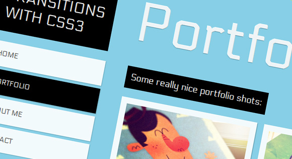
The Dribbble shots used in the demos are by Matt Kaufenberg. Check out his Dribbble profile or visit his An Illustration-a-Day Blog.
Markup
The HTML will contain five main divisions: a header and the four content sections. Each of the content sections is going to have an ID and the class panel. Moreover, we will add another division inside which will have the class content. The first content section which is #home will only have the content class and will not require an extra division:
<!-- Home -->
<div id="home" class="content">
	<h2>Home</h2>
	<p>Some content</p>
	<!-- ... -->
</div>
<!-- /Home -->

<!-- Portfolio -->
<div id="portfolio" class="panel">
	<div class="content">
		<h2>Portfolio</h2>
		<p>Some content</p>
		<!-- ... -->
	</div>
</div>
<!-- /Portfolio -->

<!-- About -->
<div id="about" class="panel">
	<div class="content">
		<h2>About</h2>
		<p>Some content</p>
		<!-- ... -->
	</div>
</div>
<!-- /About -->

<!-- Contact -->
<div id="contact" class="panel">
	<div class="content">
		<h2>Contact</h2>
		<p>Some content</p>
		<!-- ... -->
	</div>
</div>
<!-- /Contact -->
In the header we will have the main heading and the navigation:
<!-- Header with Navigation -->
<div id="header">
	<h1>Page Transitions with CSS3</h1>
	<ul id="navigation">
		<li><a id="link-home" href="#home">Home</a></li>
		<li><a id="link-portfolio" href="#portfolio">Portfolio</a></li>
		<li><a id="link-about" href="#about">About Me</a></li>
		<li><a id="link-contact" href="#contact">Contact</a></li>
	</ul>
</div>
The reason for having such an “unordered” structure by adding the header to the end, is that we make the navigation “reachable” using the general sibling selector (~), so that we can color the respective items differently.
Now, the main idea is to use the pseudo-class :target in order to add a transition to the current section. In this example, we will be sliding up and down our sections.
CSS
First we will give style to our header and the navigation. We want to keep these on the same spot at all the time, even though everything else will be moving.
#header{
	position: absolute;
	z-index: 2000;
	width: 235px;
	top: 50px;
}
#header h1{
	font-size: 30px;
	font-weight: 400;
	text-transform: uppercase;
	color: rgba(255,255,255,0.9);
	text-shadow: 0px 1px 1px rgba(0,0,0,0.3);
	padding: 20px;
	background: #000;
}
#navigation {
	margin-top: 20px;
	width: 235px;
	display:block;
	list-style:none;
	z-index:3;
}
#navigation a{
	color: #444;
	display: block;
	background: #fff;
	background: rgba(255,255,255,0.9);
	line-height: 50px;
	padding: 0px 20px;
	text-transform: uppercase;
	margin-bottom: 6px;
	box-shadow: 1px 1px 2px rgba(0,0,0,0.2);
	font-size: 14px;
}
#navigation a:hover {
	background: #ddd;
}
All the sections except #home have the panel class. Here we will be using the transition whenever an element with this class gets “targeted”. The trick is to use a negative margin in the “normal” class and no margin at all in the :target pseudo-class. Adding a transitions will make the panel slide from the top whenever one is “selected”:
.panel{
	min-width: 100%;
	height: 98%;
	overflow-y: auto;
	overflow-x: hidden;
	margin-top: -150%;
	position: absolute;
	background: #000;
	box-shadow: 0px 4px 7px rgba(0,0,0,0.6);
	z-index: 2;
	-webkit-transition: all .8s ease-in-out;
	-moz-transition: all .8s ease-in-out;
	-o-transition: all .8s ease-in-out;
	transition: all .8s ease-in-out;
}
.panel:target{
	margin-top: 0%;
	background-color: #ffcb00;
}
Next, let’s style the content class that all our sections have:
.content{
	right: 40px;
	left: 280px;
	top: 0px;
	position: absolute;
	padding-bottom: 30px;
}
.content h2{
	font-size: 110px;
	padding: 10px 0px 20px 0px;
	margin-top: 52px;
	color: #fff;
	color: rgba(255,255,255,0.9);
	text-shadow: 0px 1px 1px rgba(0,0,0,0.3);
}
.content p{
	font-size: 18px;
	padding: 10px;
	line-height: 24px;
	color: #fff;
	display: inline-block;
	background: black;
	padding: 10px;
	margin: 3px 0px;
}
In order to change the color of the current item in the navigation, we’ll use the :target pseudo-class with the general sibling selector to “get to” the respective navigation item:
#home:target ~ #header #navigation #link-home,
#portfolio:target ~ #header #navigation #link-portfolio,
#about:target ~ #header #navigation #link-about,
#contact:target ~ #header #navigation #link-contact{
	background: #000;
	color: #fff;
}
And that’s all you need. Check out the demos and you’ll see other examples of how you can do this.
Hope you liked this tutorial and maybe you can experiment with your own effects.
¡Hasta la próxima!


I saw it and fell in love! Can I use it as Base for my new page?
Good stuff! Easy to understand, and I love the effect!
in ie9 transictions do not work..
im from brazil, how’r u?
bye
but nice tutorial..
css is great and a powerfull ‘plataform’, if we can say so…
nj
Nic for personal pages and hotsites, very useful
i can’t believe it how adding a couple of lines of css3 can make such a difference. amazing work! keep them coming Sergio.
Sergio, está muy padre tu tutorial, gracias por compartirlo.
Fíjate que estoy haciendo algo parecido pero me encuentro con un problema, lo que quiero hacer es lo siguiente:
Cuando #about:target { haga esto } .home { hace otra cosa } sólo que .home no pertenece a ningún elemento dentro de #about
Se puede hacer pero sólo con elementos dentro del mismo #about pero no puedo mover los elementos que están afuera.
Puedes echarme la mano con esto?
La verdad hasta ahora no encuentro como poder solucionarlo.
Gracias.
This is awesome but I just tested it on my iPhone and it does not work properly, each internal page only shows about 50% of the way any tips on that?
Is it possible to slide those panel from right to left? I’m trying it by doing a margin-right: -120% in .panel and margin-right: 0% in .panel:target and it doesn’t seem to work out properly! 🙁
it is really great but doesn’t work any IE.
why?
Hello, can anybody please tell me how can make this effect work using a horizontal navigation bar? Do I have to add float left property in the navigation?
Please help me, thank you!
Great article! I think I might use it for my own website! I’ll post a link when/if it’s online. 😀
That’s great and I love it, and everybody who’s seen it loves it, except for the people using explorer 8 or less… they can’t see the transitions, so they can only go into de home, and can’t see any content in the web… F@#¬ Explorer, yes… but is there something I can do?
I put this at the bottom of the page to get the #home page if no hash is specified:
if(window.location.hash == ''){
  window.location = $("#link-home").attr('href');
}
Also, in the css, I changed the #navigation to z-index:4;
and added a z-index:3; to .panel:target.
This allowed me to use multiple galleria.js galleries in the different panels.
OK, i see a lot of people telling it doesnt work on IE, wich is true. because IE sucks.
but i managed to get it working on IE simply by using the csspie script.
for those who don’t know it, all you have to do is download this on css3pie.com/
and add a “behavior: url(PIE.htc)”; on each of the .css strings that use the transitions and box shadows
and rounded corners and all that stuff that IE doesn’t suport. especially .panel and .content.
it says on csspie website that it has problems with z-index. i was able to make it work without any tweaks what so ever.
PS: sorry for the bad english, its not my native language
i just realized it doesn’t really does the transitions.
but at least the links work.
so it didn’t work ? its what you are saying ?
I’m using this teplate for a friend website and internet explorer 8 its driving me crazy… please tell me if you make it work
cheers
Who to fix for IE? I try to change but not successful, thanks.
thank you very much!
hipnopedia: the links work. but it doesnt make the “cool effects”.
get it ?
I’m trying desperately to get the panels to slide from right to left, but I cannot seem to do it.
I have tried changing the ‘margin-left’ to ‘margin-right’, as well as reversing the value of ‘margin-left’ from ‘-102%’ to ‘102%’ but nothing seems to be working..
Any ideas would be greatly appreciated 🙂 Thanks.
you need to make the margin-left greater than 100% (read: NOT -100%) then in the target psuedo class set the margin-left to 0%. It should slide from the right .
did you ever get the transition to slide from right to left?
Does anybody know how to modify this to use media queries so this will work on mobile devices like the iphone?
If you remove the viewport meta tag, it works really well on iphone.
But still problems with long worded things and the background color won’t change to gray on iphone for some reason. I got it to change on desktop and ipad, but for some reason on iphone it is still black. Help would be much appreciated.
Okay last one. After a lot of tweaking, I got it working properly, and everything formatted how I want it. Thanks so much for this, it is really awesome and really a step forward in web design.
has anyone gotten this to transition from bottom to top of right to left? I’ve tried switching margin-top to margin-bottom and margin-left to margin-right, but to no avail. I’ve also replaced the negative values with positive ones.
hhhheeeeeeelllp
I also tried it without success. I wanted the panels to slide diagonally from each of the corners of the screen, but it only worked with the top left one. Anyways, this tutorial is great and I still used it to make my website.
I have problems with IE 8 and older versions. I added in my css references to PIC.htc but I have not resolved anything. Someone can give me some help?
U can use selectivizr.js for imitate css attributes that IE 8 do not support 🙂 i did this here on my website http://emcd.info/
One question. How do i stop it from reseting the page position to the top of the content div instead of the top of the page. My nav system is positioned above my content position and pressing the links sets the default position scrolled on the page to the top of the content div instad of the top of the page. it is the only bug i see at all. this is a beautiful navigation system. great work!
WOW…fantastic
when i put all the div inside a div wrapper, the current link cannot work…some1 can help me to solve this problem pls. anyways great css
Awesome tutorial….just a question,how do I redirect http://www.mydomain.com to http://www.mydomain.com/index.html#home ?
The #home seems to be a problem.
I cant seem to make the same effects on the links. I have the same code.
Html:
<a href=”#home” rel=”nofollow”>Home</a>
<a href=”#portfolio” rel=”nofollow”>Portfolio</a>
<a href=”#about” rel=”nofollow”>About Me</a>
<a href=”#contact” rel=”nofollow”>Contact</a>
<a href=”#webbdesign” rel=”nofollow”>Webbdesign</a>
<a href=”#grafisk-design” rel=”nofollow”>Grafisk Design</a>
and then the css:
#home:target ~ #header #navigation #link-home,
#portfolio:target ~ #header #navigation #link-portfolio,
#about:target ~ #header #navigation #link-about,
#contact:target ~ #header #navigation #link-contact,
#webbdesign:target ~ #header #navigation #link-webbdesign,
#grafisk-design:target ~ #header #navigation #link-grafisk-design{
background: #000;
color: #fff;
}