From our sponsor: Leverage AI for dynamic, custom website builds with ease.
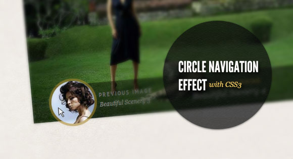
Today we want to show you how to create a beautiful hover effect for an image navigation using CSS3. The idea is to expand a circular navigation with an arrow and make a bubble with a thumbnail appear. In our example we will be showing the thumbnail of the next and previous slider image on hovering the arrows. The effect is done with CSS3 transitions.
The beautiful images are by Andrey & Lili and they are licensed under the CC BY-NC 3.0 License.
The Markup
For this little CSS3 effect we will have a navigation structure that looks like the following:
<div class="cn-nav">
	<a href="#" class="cn-nav-prev">
		<span>Previous</span>
		<div style="background-image:url(../images/thumbs/1.jpg);"></div>
	</a>
	<a href="#" class="cn-nav-next">
		<span>Next</span>
		<div style="background-image:url(../images/thumbs/3.jpg);"></div>
	</a>
</div>
In our demo we will make a jQuery template out of this and dynamically add the thumbnails for the previous and next images of the slider. But to show you how the expanding circle effect is done, we will only show you this part.
The CSS
Let’s see now, how to add the style for this navigation.
Assuming that we have some relative surrounding container, we will set the link elements’ position to absolute. The height and width will be 70 pixels so that we have a not too small area for the hover effect:
.cn-nav > a{
    position: absolute;
    top: 0px;
    height: 70px;
    width: 70px;
}
a.cn-nav-prev{
    left: 0px;
}
a.cn-nav-next{
    right: 0px;
}
The span element, which will contain the arrows as a background image will have an initial height and width of 46 pixel. In order to make it look like a circle, we need to set the border radius to half of its width/height. With the 50% and negative margin trick, we set it into the center of the link element. Then we define the transition which will take all properties into account with a duration of 400ms and with ease as the easing function:
.cn-nav a span{
    width: 46px;
    height: 46px;
    display: block;
    text-indent: -9000px;
    -moz-border-radius: 23px;
    -webkit-border-radius: 23px;
    border-radius: 23px;
    cursor: pointer;
    opacity: 0.9;
    position: absolute;
    top: 50%;
    left: 50%;
    background-size: 17px 25px;
    margin: -23px 0 0 -23px;
    -webkit-transition: all 0.4s ease;
	-moz-transition: all 0.4s ease;
	-o-transition: all 0.4s ease;
	-ms-transition: all 0.4s ease;
	transition: all 0.4s ease;
}
The spans’ background image (righ and left arrow):
.cn-nav a.cn-nav-prev span{
    background: #666 url(../images/prev.png) no-repeat center center;
}
.cn-nav a.cn-nav-next span{
    background: #666 url(../images/next.png) no-repeat center center;
}
The div with the thumbnail as background image is initially going to have a height and width of 0 pixel. It’s going to be absolute and also positioned in the center of the link element. Border radius and margins are going to be 0 initially. The background image will fill all the element, hence we will give the background-size of 100% width and height. The transition for this element will be for all properties with a duration of 200ms and with the ease-out easing function:
.cn-nav a div{
    width: 0px;
    height: 0px;
    position: absolute;
    top: 50%;
    left: 50%;
    overflow: hidden;
    background-size: 100% 100%;
    background-position: center center;
    background-repeat: no-repeat;
    margin: 0px;
    -moz-border-radius: 0px;
    -webkit-border-radius: 0px;
    border-radius: 0px;
    -webkit-transition: all 0.2s ease-out;
	-moz-transition: all 0.2s ease-out;
	-o-transition: all 0.2s ease-out;
	-ms-transition: all 0.2s ease-out;
	transition: all 0.2s ease-out;
}
Now, let’s define what the elements will look like on hover.
The span will increase to 100 pixels in width and height and accordingly, we will set the negative margins and the border radius to half of that. We’ll increase the size of the background image a little bit. Additionally, we’ll change the background color and the opacity:
.cn-nav a:hover span{
    width: 100px;
    height: 100px;
    -moz-border-radius: 50px;
    -webkit-border-radius: 50px;
    border-radius: 50px;
    opacity: 0.6;
    margin: -50px 0 0 -50px;
    background-size: 22px 32px;
    background-color:#a8872d;
}
And finally, the little thumbnail div element will expand to 90 pixels, so that we can still see the span element around, appearing as a border to the thumb. We’ll also increase the background size a bit and set the negative margins and the border radius to half of the element’s width:
.cn-nav a:hover div{
    width: 90px;
    height: 90px;
    background-size: 120% 120%;
    margin: -45px 0 0 -45px;
    -moz-border-radius: 45px;
    -webkit-border-radius: 45px;
    border-radius: 45px;
}
And that’s it! A slick effect with CSS3 only! Check out the demo to see how it looks integrated in a slider with showing the previous and next thumbail (with a modern browser, sorry IE9 is not included)! I hope you enjoyed this little tutorial and find it useful.


I forget the IMG atribute:
The LINK is like a HREF in
is posible make a automatic slider effects…?
slider automatic….
I love all of your work 🙂
Very good work. I’m want to set autoplay and timeout slider but I’m not found about it. Please help me, thanks…
SIMPLY TERRIFIC …
This is amazing! I highly encourage you to put your code/posts up on github so you can not only more easily share them, but get feedback and update them with new fixes and discoveries.
For those who asked for the AutoPlay, just add the following code to the “jquery.slideshow.js” file:
/******************************************************************* * * Code for Auto Play * *******************************************************************/ var $j = jQuery.noConflict(); var theInt = null; var curclicked = 0; var stop = 0; theInterval = function(cur){ clearInterval(theInt); theInt = setInterval(function(){ $j("a.cn-nav-next").eq(curclicked).trigger('click'); curclicked++; if( 10 == curclicked ) curclicked = 0; $j("#stop").click( function(){ if (stop==0){ clearInterval(theInt); stop=1;} }); }, 750); $j("#stop").click( function(){ stop=0; theInterval(); } ); }; $j(function(){ $j("#cn-slideshow").prepend(''); $j("#cn-slideshow").slideshow(); theInterval(); });Why buble right arrow not on the right, but double with the left one on the left side?
Sorry, on IE 6, any solution?
I love the gallery. It’s a shame that it does not work in IE (*curses Microsoft*) but it looks splendidly aesthetic in Chrome.
I did have one question, is there a way to create a list of different galleries within the gallery itself, and display it as a list?
Thank aalayan.
For those who asked for the AutoPlay, just add the following code to the “jquery.slideshow.js” file:
/*******************************************************************
*
* Code for Auto Play
*
*******************************************************************/
var $j = jQuery.noConflict();
var theInt = null;
var curclicked = 0;
var stop = 0;
theInterval = function(cur){
clearInterval(theInt);
theInt = setInterval(function(){
$j(“a.cn-nav-next”).eq(curclicked).trigger(‘click’);
curclicked++;
if( 10 == curclicked )
curclicked = 0;
$j(“#stop”).click(
function(){
if (stop==0){
clearInterval(theInt);
stop=1;}
});
}, 750);
$j(“#stop”).click(
function(){
stop=0;
theInterval();
}
);
};
$j(function(){
$j(“#cn-slideshow”).prepend(”);
$j(“#cn-slideshow”).slideshow();
theInterval();
});
Hello.
Thanks for this wonderful tutorial.
I have a question for a specific use : I want to reach a specific image from the slideshow via a link (which is not on the slideshow). Basically I have a grid of thumbs and you click on one thumb it opens the slideshow at the selected image.
Is there a way to do that ?
Thanks.
How can I make the big image a link to another page?
Thanks
very nice idea ! thx fof share
Thanks for sharing this!
i tried to add more slide photos and it’s not working working.
is it limited to four images only?
How to add a link on Currently Viewing Title or The big image? please help me.