From our sponsor: Leverage AI for dynamic, custom website builds with ease.
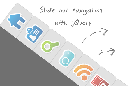
Today I want to show you how to create an amazing slide out menu or navigation for your website. The navigation will be almost hidden – the items only slide out when the user hovers over the area next to them. This gives a beautiful effect and using this technique can spare you some space on your website. The items will be semi-transparent which means that content under them will not be completely hidden.
The icons that we will be using are from the Colorful Sticker Icon Sets 1, 2, 3 and 4 by DryIcons. (It is not allowed to redistribute them under the free license, so I cannot include them in ZIP file of this tutorial.)
Ok, let’s get to work.
1. The HTML Structure
The only thing we will need for the navigation is a simple unordered list with links inside of the list elements:
<ul id="navigation">
 <li class="home"><a title="Home"></a></li>
 <li class="about"><a title="About"></a></li>
 <li class="search"><a title="Search"></a></li>
 <li class="photos"><a title="Photos"></a></li>
 <li class="rssfeed"><a title="Rss Feed"></a></li>
 <li class="podcasts"><a title="Podcasts"></a></li>
 <li class="contact"><a title="Contact"></a></li>
</ul>
The list is getting an ID because we want to refer to it later in the JavaScript. With jQuery, we will make the link items slide out whenever we hover over the li elements of the list.
2. The CSS
First, we define the CSS properties for the list:
ul#navigation {
    position: fixed;
    margin: 0px;
    padding: 0px;
    top: 10px;
    left: 0px;
    list-style: none;
    z-index:9999;
}
The navigation should always be accessible for the user, even if he scrolls down the page. So, the position should be fixed. Margin and padding are explicitly set to 0, since the unordered list has default values for them. The navigation should also be on top of all other elements on the page. That’s why we set the z-index very high.
Now, let’s look at the list element properties:
ul#navigation li {
    width: 100px;
}
For the links in the list elements, we define the following CSS properties:
ul#navigation li a {
    display: block;
    margin-left: -85px;
    width: 100px;
    height: 70px;
    background-color:#CFCFCF;
    background-repeat:no-repeat;
    background-position:center center;
    border:1px solid #AFAFAF;
}
The margin-left is set to a negative value because we want to hide most of the icon and only reveal it when we hover over the list items. Basically, we are pushing the link element to the left, outside of the visual area of the page:

In the JavaScript part we will define a function that makes the elements slide out. But let’s first add some rounded borders to them (they don’t work in Internet Explorer, though):
ul#navigation li a {
    display: block;
    margin-left: -85px;
    width: 100px;
    height: 70px;
    background-color:#CFCFCF;
    background-repeat:no-repeat;
    background-position:center center;
    border:1px solid #AFAFAF;
    -moz-border-radius:0px 10px 10px 0px;
    -webkit-border-bottom-right-radius: 10px;
    -webkit-border-top-right-radius: 10px;
    -khtml-border-bottom-right-radius: 10px;
    -khtml-border-top-right-radius: 10px;
}
To make them really neat, we add some opacity, so that the content underneath is visible:
ul#navigation li a {
    display: block;
    margin-left: -85px;
    width: 100px;
    height: 70px;
    background-color:#CFCFCF;
    background-repeat:no-repeat;
    background-position:center center;
    border:1px solid #AFAFAF;
    -moz-border-radius:0px 10px 10px 0px;
    -webkit-border-bottom-right-radius: 10px;
    -webkit-border-top-right-radius: 10px;
    -khtml-border-bottom-right-radius: 10px;
    -khtml-border-top-right-radius: 10px;
    opacity: 0.6;
    filter:progid:DXImageTransform.Microsoft.Alpha(opacity=60);
}
The last filter property will make this work for Internet Explorer as well.
These were the common properties of all the link elements in the list. Now we will define the background image for the links in the specific list items:
ul#navigation .home a{
    background-image: url(../images/home.png);
}
ul#navigation .about a      {
    background-image: url(../images/id_card.png);
}
ul#navigation .search a      {
    background-image: url(../images/search.png);
}
ul#navigation .podcasts a      {
    background-image: url(../images/ipod.png);
}
ul#navigation .rssfeed a   {
    background-image: url(../images/rss.png);
}
ul#navigation .photos a     {
    background-image: url(../images/camera.png);
}
ul#navigation .contact a    {
    background-image: url(../images/mail.png);
}
And that was the CSS part. Now, let’s take a look at the few lines of JavaScript that will give some life to the navigation.
The JavaScript
Using jQuery, we will make the icons appear whenever we hover over one of the list items. Remember, the list item itself is 100 pixel wide, only the link element is being pushed outside of the page to the left, so that it is not visible.
We define the following function (before the end of the body tag) that get’s executed whenever we hover over a li:
$(function() {
 $('#navigation > li').hover(
  function () {
   $('a',$(this)).stop().animate({'marginLeft':'-2px'},200);
  },
  function () {
   $('a',$(this)).stop().animate({'marginLeft':'-85px'},200);
  }
 );
});
So, when hovering, we want the specific link element to get a left margin of -2 pixels, and that nicely animated, and not too slow (200 milliseconds). Moving the mouse out shall put the link element back to it’s old position (-85 pixels). The stop() function “stops all the currently running animations on all the specified elements” which gives the beautiful effect when, for example, hovering over all elements very quickly.
What would be really nice now, is to make the user aware that there is such an amazing navigation on your web page. Like it is now, the user will merely see some grey borders sticking out from the left side of the page. What could be better for showing the menu than actually showing the navigation shortly when the page loads. So, here we go.
So, we will initially let the navigation be visible. For that we change the left margin of the link elements:
ul#navigation li a {
    display: block;
    margin-left: -2px;
    width: 100px;
    height: 70px;
    background-color:#CFCFCF;
    background-repeat:no-repeat;
    background-position:center center;
    border:1px solid #AFAFAF;
    -moz-border-radius:0px 10px 10px 0px;
    -webkit-border-bottom-right-radius: 10px;
    -webkit-border-top-right-radius: 10px;
    -khtml-border-bottom-right-radius: 10px;
    -khtml-border-top-right-radius: 10px;
    opacity: 0.6;
    filter:progid:DXImageTransform.Microsoft.Alpha(opacity=60);
}
And we add the following line at the beginning of the JavaScript function:
$(function() {

 $('#navigation a').stop().animate({'marginLeft':'-85px'},1000);

 $('#navigation > li').hover(
  function () {
   $('a',$(this)).stop().animate({'marginLeft':'-2px'},200);
  },
  function () {
   $('a',$(this)).stop().animate({'marginLeft':'-85px'},200);
  }
 );
});
With that line we defined that it should take 1 second to give a left margin of -85 pixels to all the link elements in the list. Through the margin that we set we will show the navigation to the user and with the JavaScript we will then hide it.
And that’s it!
If you are a shadow-freak (like me), you can also add these lines to the CSS of the link element:
ul#navigation li a {
    display: block;
    margin-left: -2px;
    width: 100px;
    height: 70px;
    background-color:#CFCFCF;
    background-repeat:no-repeat;
    background-position:center center;
    border:1px solid #AFAFAF;
    -moz-border-radius:0px 10px 10px 0px;
    -webkit-border-bottom-right-radius: 10px;
    -webkit-border-top-right-radius: 10px;
    -khtml-border-bottom-right-radius: 10px;
    -khtml-border-top-right-radius: 10px;
    -moz-box-shadow: 0px 4px 3px #000;
    -webkit-box-shadow: 0px 4px 3px #000;
}
Adding the box shadow and removing opacity, will give the navigation items a 3D look. Leaving the opacity makes them look cool, too, try it out and enjoy!
Note: Check out an alternative version of this tutorial here