From our sponsor: Leverage AI for dynamic, custom website builds with ease.
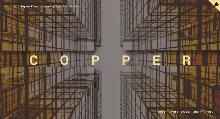
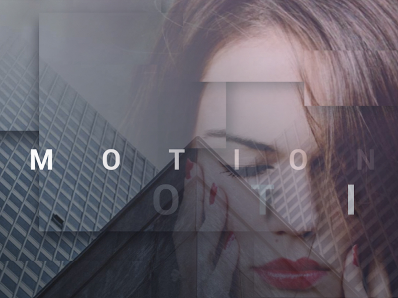
Today we’d like to share a little decorative effect with you that we’ve encountered on Filippo Bello’s Portfolio, maybe you’ve seen it. It’s a really neat way to add some jazz to background images. The idea is to replicate boxes from a background with the same background image and make these boxes move in perspective towards the viewer. Adding a fitting shadow and some parallax makes all this look quite interesting. Furthermore, we’re employing anime.js, the easy-to-use JavaScript animation library by Julian Garnier.
Have a look at the effect seen on Filippo’s portfolio:
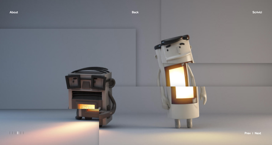

The technique that we use for this effect is based on the CSS clip-path property. Although the technique seen on Filippo’s portfolio uses a different approach (background-size: cover combined with background-attachment: fixed), we found that Firefox does not seem to like that combination.
Update: After first using just the CSS clip property, we’ve updated the script to use clip-path when supported. CSS clip is deprecated but still works as a great fallback for clip-path (rectangular shapes). Thanks to Larry for pointing that out in the comments!
The Segment Effect
The script that we’ve built takes care of the basic functioning of the segment effect which includes a couple of adjustable options.
For the markup we simply need a division and a background image:
<div class="segmenter" style="background-image: url(img/3.jpg)"></div>The script turns this into the following structure:
<div class="segmenter">
    <div class="segmenter__background" style="background-image: url(img/3.jpg);"></div>
    <div class="segmenter__pieces">
        <div class="segmenter__piece-wrap">
            <div class="segmenter__shadow" style="top: 80%; left: 10%; width: 30%; height: 20%"></div>
            <div class="segmenter__piece" style="background-image: url(img/3.jpg); -webkit-clip-path: polygon(10% 80%, 40% 80%, 40% 100%, 10% 100%); clip-path: polygon(10% 80%, 40% 80%, 40% 100%, 10% 100%)"></div>
        </div>
        <div class="segmenter__piece-wrap">
            <div class="segmenter__shadow" style="top: 2%; left: 2%; width: 40%; height: 40%"></div>
            <div class="segmenter__piece" style="background-image: url(img/3.jpg); -webkit-clip-path: polygon(2% 2%, 42% 2%, 42% 42%, 2% 42%); clip-path: polygon(2% 2%, 42% 2%, 42% 42%, 2% 42%)"></div>
        </div>
        <div class="segmenter__piece-wrap">
            <div class="segmenter__shadow" style="top: 30%; left: 60%; width: 30%; height: 60%"></div>
            <div class="segmenter__piece" style="background-image: url(img/3.jpg); -webkit-clip-path: polygon(60% 30%, 90% 30%, 90% 90%, 60% 90%); clip-path: polygon(60% 30%, 90% 30%, 90% 90%, 60% 90%)"></div>
        </div>
        <div class="segmenter__piece-wrap">
            <div class="segmenter__shadow" style="top: 10%; left: 20%; width: 50%; height: 60%"></div>
            <div class="segmenter__piece" style="background-image: url(img/3.jpg); -webkit-clip-path: polygon(20% 10%, 70% 10%, 70% 70%, 20% 70%); clip-path: polygon(20% 10%, 70% 10%, 70% 70%, 20% 70%)"></div>
        </div>
    </div>
</div>
As you can see, the images becomes a division with a background image and all pieces are wrapped into the segmenter__pieces div. Each piece consists of an element for the shadow (if set) and an element for the image piece that has a clip-path (clip: rect(), if not supported) defined based on the options input we define.

The styles needed for this to work are the following (vendor prefixes omitted):
.segmenter {
	width: 100vw;
	height: 100vh;
	position: relative;
	overflow: hidden;
}

.segmenter__background,
.segmenter__pieces,
.segmenter__piece-wrap,
.segmenter__piece-parallax,
.segmenter__piece {
	position: absolute;
	width: 100%;
	height: 100%;
	top: 0;
	left: 0;
	transform-style: preserve-3d;
}

.segmenter__piece-parallax {
	transition: transform 0.2s ease-out;
}

.segmenter__pieces {
	perspective: 400px;
}

.segmenter__background,
.segmenter__piece,
.segmenter {
	background-size: cover;
	background-repeat: no-repeat;
	background-position: 50% 50%;
}

.segmenter__shadow {
	position: absolute;
	opacity: 0;
	box-shadow: 0px 2px 15px rgba(0,0,0,0.7);
}
Note how the pieces all have the size of the full wrapper; it’s the clip-path that cuts them to the correct size and position. This element is hence a bit restricted as to what styles we can apply to it, i.e. we can’t just add a box shadow because the element is clipped.
Let’s have a look at the default options:
Segmenter.prototype.options = {
	// Number of pieces.
	pieces: 4,
	// Show pieces already styled.
	renderOnLoad: false,
	// Add an element for the shadow.
	shadows: true,
	// Animations for the shadow (valid properties: opacity, translateX, translateY).
	shadowsAnimation: {
		opacity: 1,
		// translateX: 20,
		// translateY: 20
	},
	// Parallax effect for the pieces.
	parallax: false,
	// Movements for the parallax effect.
	parallaxMovement: {min: 10, max: 40},
	// Animation for the pieces (valid properties: duration, easing, delay, opacity, translate[XYZ]).
	animation: {
		duration: 1500,
		easing: 'easeOutQuad',
		delay: 0, // Delay increment per piece.
		// opacity: 0.5,
		translateZ: {min: 10, max: 65}, // We can also use an integer for a specific value.
		// translateX: {min: -100, max: 100}, // We can also use an integer for a specific value.
		// translateY: {min: -100, max: 100} // We can also use an integer for a specific value.
	},
	// Callbacks
	onAnimationComplete: function() { return false; },
	onAnimationStart: function() { return false; },
	// The positions of the pieces in percentage values.
	// We can also use random values by setting options.positions to "random".
	positions: [
	{
		top: 80, left: 10, width: 30, height: 20
	},
	{
		top: 2, left: 2, width: 40, height: 40
	},
	{
		top: 30, left: 60, width: 30, height: 60
	},
	{
		top: 10, left: 20, width: 50, height: 60
	}]
};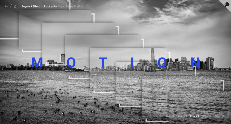
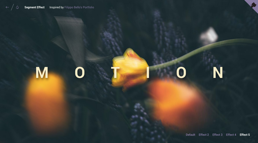
The options allow for a variety of looks, including the extreme abuse of the parallax effect to a psychedelic absurdum (in combination with several same-sized pieces):
We hope you enjoy this little effect and find it useful!
References and Credits
- Inspired by the effect seen on Filippo Bello’s Portfolio
- Animations powered by anime.js, the easy-to-use JavaScript animation library by Julian Garnier.
- We’re using imagesLoaded by Dave DeSandro.
- The images used in the demos are from Unsplash.com
Note, that we’ve updated the script after publication to use clip-path (and clip as fallback only). Don’t forget to download the new version.
Browser Support:- ChromeSupported
- FirefoxSupported
- Internet ExplorerSupported from version 11
- SafariSupported
- OperaSupported





Crazy parallax on effect 5 ! wow…
Liked your experimentations around Filippo’s idea! You enhanced a lot the effect, beautiful!
I totally agree about the clip tecniche approach! For Filippo’s website I’ve used the fixed/covered tecnique, but if I had to do it back I’ll probably go for your approach!
Nice job ????
Hi Alessandro 🙂 Your fixed/covered technique is way nicer, really a pity that FF does not play along! Thanks a lot for your feedback and really awesome work! Cheers, ML
You guys are so amazing! Great work 🙂
Wow…Awesome, awesome. Effect no 2,5 super like.
You guys are so amazing! Great project
Wow, the psychedelic effect is amazing. Reminds me of Like a Rolling Stone video, with Patricia Arquette LOL
Wow!!!)
Very nice…
Would you still recommend using the clip property since it has been deprecated? https://developer.mozilla.org/en-US/docs/Web/CSS/clip
It seems like you could use the new clip-path property that is in candidate recommendation. https://developer.mozilla.org/en-US/docs/Web/CSS/clip-path
Awesome tutorial, great effect!
Thanks!
Hi Larry,
good catch, we were so focused on making this effect work that we totally missed that! Of course, clip-path should be used instead when supported. We’ve updated the script with that new feature. Thanks a bunch again and cheers, ML
I don’t know what to say. You are developing ideas faster than I can find words to describe how amazing your demos are. So a simple, understated thank you will have to do.
Parabéns!!! Belo e simples como todo bom trabalho deve ser… 🙂
Mary Lou, you’r the best! Thank u, that’s cool ))
amazing so inspired 😀
Great!
for some reason im having trouble making this happen onload rather than onclick of trigger. what am i doing wrong?
i’m also having problems to trigger the animation onload. can anyone help?
whats wrong with this code?
onReady: function() { segmenter.animate(); }
Thanks for pointing that out guys. There was a small bug which is now fixed. Could you please try again? Cheers.
Manoela: Sweetheart, this is a fantastic effect. I have very limited knowledge of coding, but I was able to manage make them work. However, after I made them work I thought the way they are presented is useless. Again, with my limited knowledge I did not know how to get out. I fire an effect, it plays but then what would I do for the next step? Bellos site has this as an autoplay slider so it has some use.
But, I do love you though!
OH BTW: I did use two of your ‘Effects’ in http://www.facialzen.com. Testimonial effect is from Claudia. (I am so happy. This was my first (and only) paying customer)
A lot of thanks ´Cause with you incredible work and knowledge you are changing the visual assets in websites around all internet. Thanks again!
Is this effect possible with a shape other then a square or circle ? Something like a hexagon or custom .svg shape ? I was inspired by this demo to experiment with an – but ran into some issues with the shadow effect and image positioning.
I wanted to learn this, do you have any resources for the beginner.
hello ! could you please tell me how to launch this effect right after the page finished to load ?
thanks you very much =D
hello ! could you please tell me how to launch this effect right after the page finished to load ?
thank you………!
This is really cool stuff
This is amazing! incredible project.
Wow…. really amazing backgrounds. Thank you for sharing.
Great post. Thank you for sharing with us.
Hi Lou,
This is great! I am currently designing a website and I really do need a additional ideas on custom effects. Thank you. #convertbetter
Hy Abegail
seems we both got the same interests.
I want to talk with you.
Hope to hear from you.
mail: odoijoshua55@gmail.com
Facebook: Ataa Odoi
Wow This is amazing
Amazing work as always. Very impressive. Wondering could you explain the formula you use for the mouse
movement – the parallax effect. Its the part with transX = t/(self.dimensions.width)*ev.clientX – t/2. Can’t wrap my head around it.
Cool.
Hi Tom,
that is the formula of a line equation between two points: y = mx + b : http://www.coolmath.com/algebra/08-lines/12-finding-equation-two-points-01
Let’s see the case for the translateX value:
t -> maximum value to translate. If t is 20, then we want the element to be able to translate from -10 to 10.
self.dimensions.width -> the width of the main element (the screen’s width in this case).
ev.clientX -> mouse position (x-axis)
We want to translate the element as we move the mouse over the screen. For the translateX we will just take the mouse movement on the x-axis in consideration. If the mouse is on 0px then we want the element to translate -t/2, and if the mouse is on self.dimensions.width then the translation should be t/2. OK, so we have our two points:
P1(0,-t/2)
P2(self.dimensions.width,t/2)
And the equation:
y = (y2-y1)/(x2-x1) * ev.clientX + b <=>
y = (t/2 – (-t/2))/(self.dimensions.width – 0) * ev.clientX + b <=>
y = (2t/2)/self.dimensions.width * ev.clientX + (-t/2) <=> // b = -t/2 (y-axis intersection)
y = t/self.dimensions.width * ev.clientX – t/2
Hope this makes sense.
Cheers.
Good one! Amazing collection 🙂
Awesome effect but is there away to trigger the effect without having to click the “Show effect button” i.e When the page loads?
Do you find the answer ?
bind the segmenter animate function to any event handler you want to
This is amazing. I want to try this idea for my website. Thanks for sharing this. Is there a way to show the effect when the page loads?
I made a tutorial of this effect using React. Check it out here: https://www.youtube.com/watch?v=Xs9atSUVc8w
I can’t believe my eyes. Wonderfull!
Fantastic Job and Effects
Simply Amazed !!!
I am trying to code a href in the trigger headline, but it disables the effect.
Any Ideas ?
Thank You All and Keep the Spirit