From our sponsor: Leverage AI for dynamic, custom website builds with ease.
Form inputs offer a great opportunity to add some subtle and interesting effects to a web page. They are elements that your user will interact with at some point and making them fun to use can enhance the experience. We are used to the default form resembling its paper counterpart but in the digital world we can be more creative. Today we want to share some experimental styles and effects for text inputs with you. Andrej Radisic has done some great work on Dribbble, like the Jawbreaker input field, which we’ve based one of the effects on. Most of the effects use CSS transitions together with pseudo-elements.
Please note that this is for inspiration only and that we use CSS properties which only work in modern browsers.
For the markup we use a span as a wrapper for the input and its label. For the effects to work, we are putting the label after the input which usually should only be done when using checkboxes and radio inputs. This is not necessary if you rely entirely on dynamically adding a class that will trigger what we do on focus. For the purpose of this demo, we are going to rely on the CSS :focus pseudo-class as well to show its potential in combination with the adjacent sibling selector. But you can use a more semantic order together with the trigger class we also use in order to keep the inputs open that get filled (and can’t be closed due to the label position). Note that not all effects have the trigger class (input–filled) defined in the CSS.
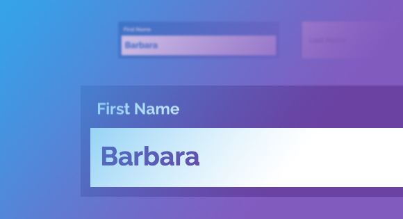
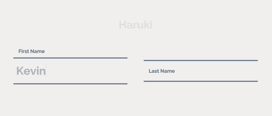
<span class="input input--haruki">
	<input class="input__field input__field--haruki" type="text" id="input-1" />
	<label class="input__label input__label--haruki" for="input-1">
		<span class="input__label-content input__label-content--haruki">First Name</span>
	</label>
</span>
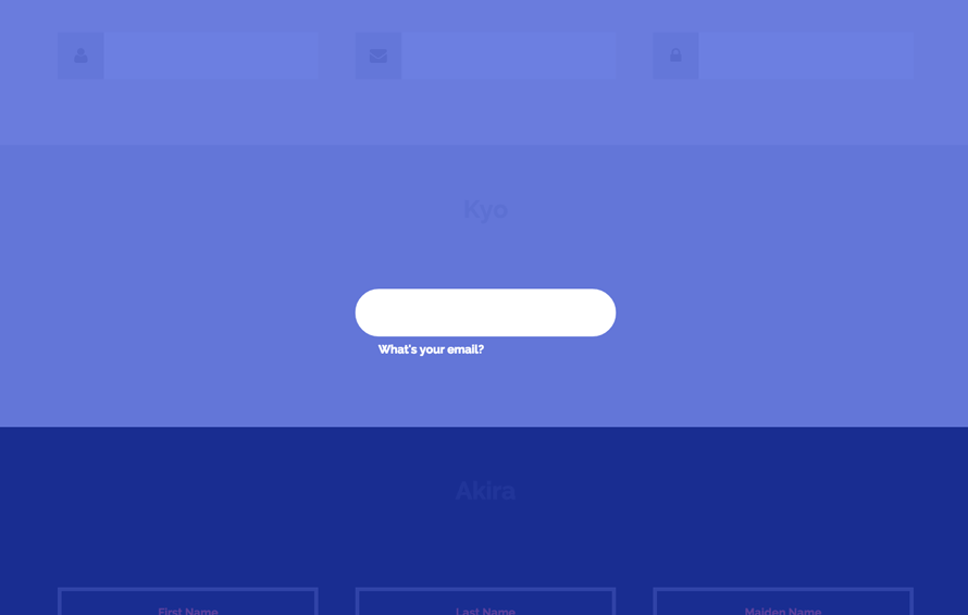
The label is our powerful element here. We can use the pseudo-classes :before and :after for defining ornaments like borders and backgrounds that we can then move around and play with — ideally only using the properties that we can animate cheaply. We can even create an overlay like we do in the effect called “Kyo”:
The first effect, “Haruki”, might look like as if we animate the height of something that has borders, but we actually animate the two pseudo elements of the label, each resembling a border (vendor-prefixed properties left out):
.input--haruki {
	margin: 4em 1em 1em;
}

.input__field--haruki {
	padding: 0.4em 0.25em;
	width: 100%;
	background: transparent;
	color: #AFB5BB;
	font-size: 1.55em;
}

.input__label--haruki {
	position: absolute;
	width: 100%;
	text-align: left;
	pointer-events: none;
}

.input__label-content--haruki {
	transition: transform 0.3s;
}

.input__label--haruki::before,
.input__label--haruki::after {
	content: '';
	position: absolute;
	left: 0;
	z-index: -1;
	width: 100%;
	height: 4px;
	background: #6a7989;
	transition: transform 0.3s;
}

.input__label--haruki::before {
	top: 0;
}

.input__label--haruki::after {
	bottom: 0;
}

.input__field--haruki:focus + .input__label--haruki .input__label-content--haruki,
.input--filled .input__label-content--haruki {
	transform: translate3d(0, -90%, 0);
}

.input__field--haruki:focus + .input__label--haruki::before,
.input--filled .input__label--haruki::before {
	transform: translate3d(0, -0.5em, 0);
}

.input__field--haruki:focus + .input__label--haruki::after,
.input--filled .input__label--haruki::after {
	transform: translate3d(0, 0.5em, 0);
}
Note that we have some default styles defined initially for the input wrapper, the input and its label.
The label is on top of the input and when focusing the input, we will animate its content span up while translating the two pseudo elements up and down.
In Firefox (on Mac) the text-rendering is not very nice so you might see some “crisping up” of blurred text in the end of transitions. But blurry text is not only an issue on Firefox. It’s really sad that fonts don’t render nicely in Chrome either when something is transitioned. Some font-sizes work well when for example, scaling an element, but then others don’t.
Note that the SVG stroke animation of effect “Madoka” does not work in Internet Explorer (we are using a transition on the stroke-dashoffset).When you do your own effects, keep in mind that animating the text input itself might be a bad idea due to some bugs on iOS and Internet Explorer (the cursor of the input won’t move until you actually type).
We hope you enjoyed these effects and get inspired!