From our sponsor: Leverage AI for dynamic, custom website builds with ease.
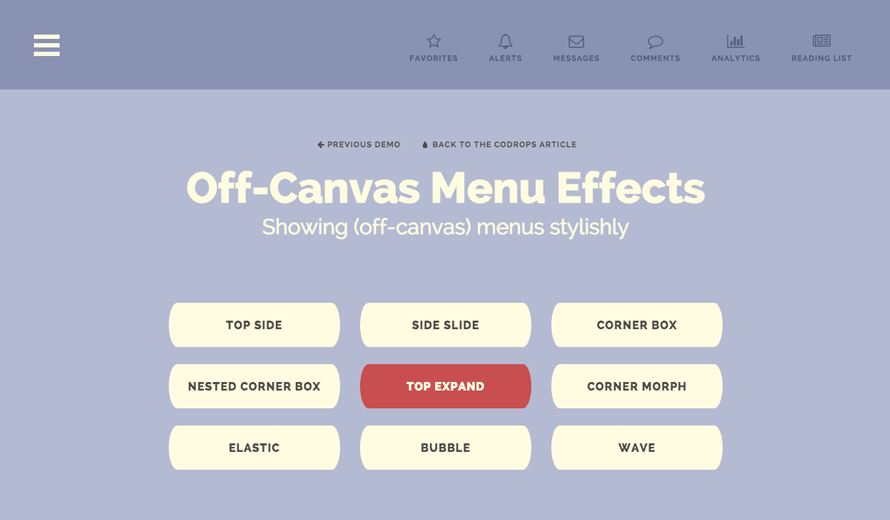
Today we’d like to share a couple of styles and effects for off-canvas menus. The off-canvas sidebar is widely used and we have already created some effect inspiration before. Like with everything, style evolves and today we want to show a new set of modern effects for your inspiration. Different layouts and synced transitions of the menu and the page can make everything look more interesting and we can make use of the available space for side-menus and controls. SVG allows us to play with organic shapes and add some unexpected and stylish moves to a design.
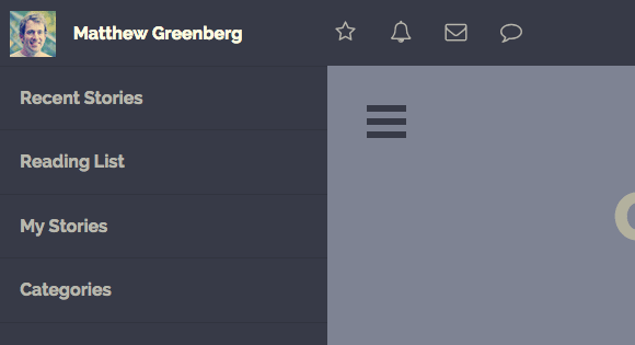
We use CSS transitions, CSS animations created with bounce.js and animated SVGs with the help of Snap.svg. We also use Font Awesome and the profile picture is from the Random User Generator.
Please note that the effects serve as inspiration and will work (best) in modern browsers.
Let’s take a look at some of the styles.
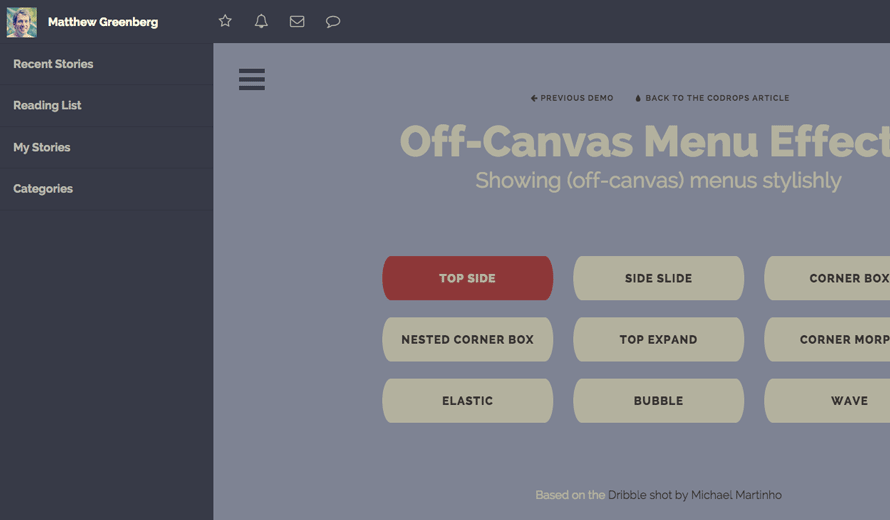
This first demo is inspired by the Dribbble shot Old Designspiration Menu Concept One by Michael Martinho.
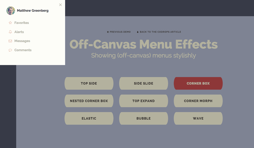
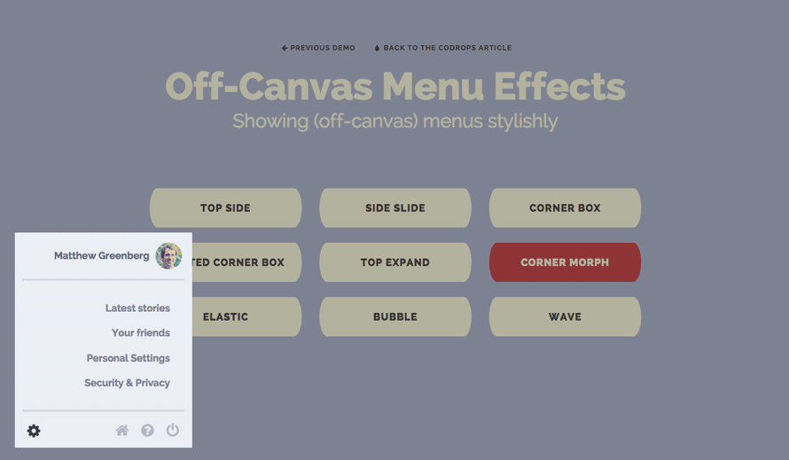
The idea behind the corner box effect is to translate an off-canvas box into the viewport while moving the content to the opposite corner, too, creating a window-like effect.
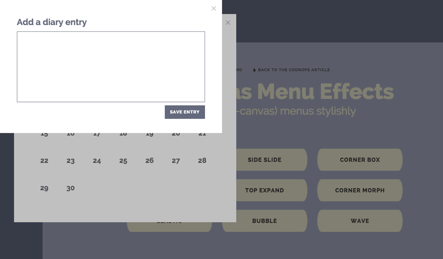
Following the simple corner box, we can think of another “layer” that will move on top of the previous box and that will make the content translate another “step”.
This menu expands from the menu button itself, taking up a space that was revealed by pushing down the content of the page. You might have seen this effect on a sidebar in one of our Morphing Buttons demos.
This menu is not an off-canvas one, but more like an expanding box with a content overlay. Here we use a jelly-like animation created with bounce.js.
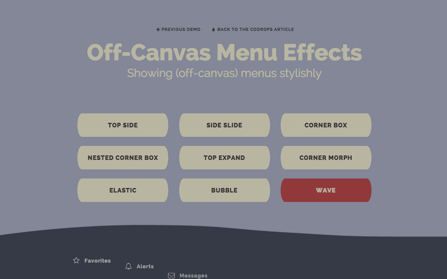
This demo is using Snap.svg for animating SVG paths. Using a combination of a morphing wave with delayed menu item appearances, an organic feel is created.
We hope you enjoyed the effects and get inspired!


Nice examples as usual – although I’m not a fan of the nested example pushing the main body over. Bit of an unnecessary indulgence!!
really great !!! thanks for sharing
As usual, All the cooooool stuff comes from this amazing website.
Very nice effects. Nicely done.
As always, sleek!
PS: Corner Morph, Wave have no visual menu icon to click on. I can see the dark footer bar… but not the trigger?! (Safari 6.1.x)
Checked again. Everything is smooth in Safari6.1 🙂
I really like it… it cool
These are definitely cool – I like the Corner Morph especially!
My only critique – having the closing button in a very different location from the opening button doesn’t seem ideal – I’d rather be able to close the menu with my cursor in the same place. It’s a small thing that doesn’t make these any less cool otherwise!
Elastic effect is the coolest one. I’m gonna try to do it without svg (border-radius). Wish me luck 😀
WOW…complete \m/
Very nice! This gives me all sorts of ideas for my next project. 🙂
Mozzzzaaaa…
This is amazing as always!!! Congratulations and thank you Manoela!!!
Awesome work guys, as usual. A lot of UX consideration going into these posts, ini’t. +1 🙂
Thanks for share!
Nice looks pretty good. THX
Cool. Did you change something? Now, CornerMorph + Wave are working fine in Safari6.1.x 🙂
Wow! this is awesome! Thanks!
Very Nice and Can Be Used For Different Different Positions and Pages.
You are able to surprise me every time, and I always try to take as much as possible from you. Thanks for your effort!
Just WOW !!
Extraordinary!
Always awesome tutorials..thats what makes me come back every day 😀
Wow, Really nice tutorial.
Very Nice! Thanks for the share.
These are great! Is there a simple solution to have ‘side slide’ slide in from the right as opposed to the left?
Trying the same with no effort, can’t find the code to change direction // Have you found the solution?
AWESOME Tutorial as always Mary Lou! Thanks & cheers (:
awesome 🙂 thank you
awesome tutorial ,
Thank you
Awesomeness as always 🙂
“Bubble” is just excellent !
Interesting to see … thank you it’s well done 🙂
Superb!!!
Elastic effect it’s pure awesomeness
Very Good 🙂 Thank you ..
superb !
Love that stuff 🙂 I added a custom CSS lightbox and when It opens, the menu should close.. can somebody pleaaase help me?
<a href=”mycourse.php#settings onClick:toggleMenu()” rel=”nofollow”> i thought that this should do it but it didnt 🙁 #settings is the id for opening the lightbox!
sorry forgot that a href works 😉
a href=”mycourse.php#settings onClick:toggleMenu() .. so the id settings is for opening the lightbox but then the nav should close!
Hello..(http://tympanus.net/codrops/2014/09/16/off-canvas-menu-effects) .. this tutorial is good and working really well on desktop browser .. but i encountered some issues on iPad mini all browsers and desktop safari browser when i tried this in my practice.. the pop up opens before the page gets load this happens only in iPad and safari browser. In android its working fine.
Hi
How do I enter the menu on the right and change the direction of ‘internal animation?
tnx
That’s Awsome ! Thanks
Awesome tutorial. Thanks a lot!
Its Working In Internet Explorer If I View Demo From Codrop But When I Download and view in internet explorer It does’nt work. Please Help
Amazing amazing!!! so much style
This is awesome but it doesnt work on phones. how to make it work?
Really inspirational but what if i want to use in working website, might be difficult to make mobile compatible!
Cool..
Is there an option to have this menu on both sides? I would like to use this.
Hi team…
Why don’t working this on mobiles???
You’re the best! Thanks ^_^
Hi, great article and demos! I used and tweaked one of your demos on my website (top expand example). I’ve noticed in demos that the page scrolls right back to the top of the page, after refresh. I see you’re using
overflow-y: scroll;for .content-wrap… I tried few ways of fixing, so the page stays at the same point after refresh, but nothing works. Do you have any ideas for a quick fix? I don’t want to use JS for this. Thank you!Hi there, it looks awesome, exactly what i was looking for 🙂
I encountered a few problems though, hopefully someone can help me out. Bear with me, i’m still learning css 😉
1. I would like to have a centered div where I put the contents of the website (1200px for example) (div class ‘content’ in demo) but then the overlay is only working on that div. I want it to cover everything but the menu itself and a fixed header.
2. I added a jquery plugin (http://manos.malihu.gr/jquery-custom-content-scroller/) because my menu is pretty long and on a phone you would have to scroll, but somehow it messes up everything. I noticed I could scroll the content itself but saw no scrollbar. I tried several things but I couldn’t work it out.
3. I couldn’t get the ‘x’ (to close) to hover in a certain color.
Thanks in advance!
I was looking for this. Thank you 😀