From our sponsor: Leverage AI for dynamic, custom website builds with ease.
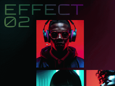
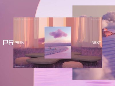
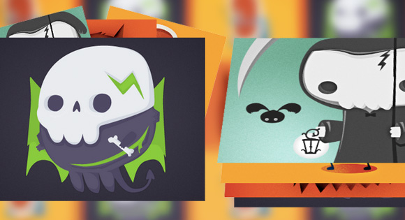
Today we’d like to share some inspiration for simple stack effects with you. You have certainly seen these kind of effects, mostly used in image galleries, but also on single items on a page: one item is shown initially and then, with some trigger, more items are revealed, normally as decoration. One can imagine a couple of triggers for these effects: item hover, on load, on scroll and on click effects. When using some subtle, but creative moves, we can make some interesting effects that elevate a static design.
Note that for some of the effects we use perspective and 3D transforms so they will only work in modern browsers.
The beautiful illustrations are by Isaac Montemayor. Check out his Dribbble profile, he’s an awesome illustrator.
The markup is the following:
<figure class="stack stack-sidegrid">
	<img src="img/1.png" alt="img01"/>
	<img src="img/3.png" alt="img03"/>
	<img src="img/4.png" alt="img04"/>
	<img src="img/2.png" alt="img02"/>
</figure>
We use a figure with three or four images.
All images, except for the last one, will be absolute:
.stack {
	margin: 20px auto;
	width: 400px;
	padding: 0;
	position: relative;
	max-width: 100%;
}

.stack img {
	max-width: 100%;
	position: absolute;
	top: 0;
	left: 0;
	transition: all 0.3s;
}

.stack img:last-child {
	position: relative;
}
Setting one of the images to position relative will give our parent figure a height.
An example effect is the following:
/* Bouncy Grid */
.stack-bouncygrid.active img {
	transform: scale(0.48);
}

.stack-bouncygrid.active img:nth-child(4) {
	transform-origin: 0 0;
}

.stack-bouncygrid.active img:nth-child(3) {
	transform-origin: 100% 0;
}

.stack-bouncygrid.active img:nth-child(2) {
	transform-origin: 0 100%;
}

.stack-bouncygrid.active img:first-child {
	transform-origin: 100% 100%;
}
This effect moves the items to the corners and scales them down.
Note that for some of the examples (grids), we simply set the width of the images to something smaller. You’d of course use a accordingly sized image.
I hope you enjoy these little effects and find them inspiring!