From our sponsor: Leverage AI for dynamic, custom website builds with ease.
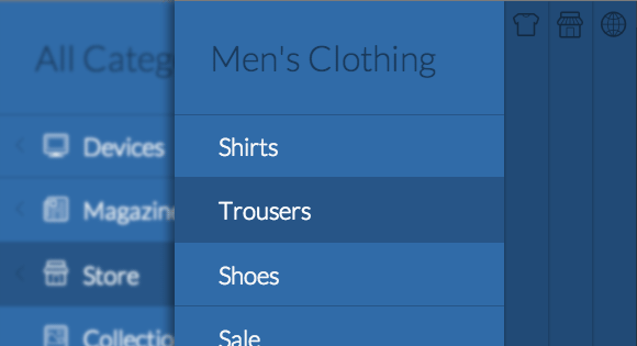
Today we want to share another menu experiment with you. For sure you are familiar with the off-canvas navigation on mobile apps and the implementations for responsive websites like the one by David Bushell. We tried to explore the possibility of creating a nested multi-level menu, something that could be quite useful for menus with lots of content (like navigations of online stores). The result is a “push” menu that can (theoretically) contain infinite nested sub-menus. When opening a sub-level, the whole navigation pushes the content more, allowing a slice of the parent menu to be visible. Optionally, this slice can be visible or not, in which case the sub-menu will simply cover its parent.
Working with nested structures is quite tricky because when we, for example, move the parent then all children will of course move as well. So we are using a couple of tricks that will maintain the right 3D translates for the sub-menus and their children. The main idea is to increment the value for the translate so that we guarantee that the sub-levels are not shown once we push everything a bit more for showing the slices of the parents. This is of course not necessary in the case where the sub-menu is covering the parent menu.
Please note that we are using 3D Transforms which only work in modern browsers. You will find a fallback example for non-supporting browsers in the end of the component.css file where we simply show the first level menu. The same we do for the no JS case.
We are using the following nested structure for the menu:
<!-- mp-menu -->
<nav id="mp-menu" class="mp-menu">
	<div class="mp-level">
		<h2 class="icon icon-world">All Categories</h2>
		<ul>
			<li class="icon icon-arrow-left">
				<a class="icon icon-display" href="#">Devices</a>

				<div class="mp-level">
					<h2 class="icon icon-display">Devices</h2>
					<ul>
						<li class="icon icon-arrow-left">
							<a class="icon icon-phone" href="#">Mobile Phones</a>

							<div class="mp-level">
								<h2>Mobile Phones</h2>
								<ul>
									<li><a href="#">Super Smart Phone</a></li>
									<li><a href="#">Thin Magic Mobile</a></li>
									<li><a href="#">Performance Crusher</a></li>
									<li><a href="#">Futuristic Experience</a></li>
								</ul>
							</div>

						</li>
						<li class="icon icon-arrow-left">
							<!-- ... -->
						</li>
						<li class="icon icon-arrow-left">
							<!-- ... -->
						</li>
					</ul>
				</div>
			</li>
			<li><!-- ... --></li>
			<!-- ... -->
		</ul>
	</div>
</nav>
<!-- /mp-menu -->
…where each level is wrapped into a division with the class mp-level.
Normally, we would have used fixed positioning for a menu of this kind but since there is quite an peculiar “problem” with that (transforms will make it behave like an absolute positioned element), we’ll have to use absolute positioning which will leave us with some unwanted behavior of the site (scrolling of menu and dependence of document height). So we’ve used a little trick to avoid the menu being scrollable or to be cut off if the site’s content is too short by using the following page structure:
<div class="container">
	<!-- Push Wrapper -->
	<div class="mp-pusher" id="mp-pusher">

		<!-- mp-menu -->
		<nav id="mp-menu" class="mp-menu">
			<!-- ... -->
		</nav>
		<!-- /mp-menu -->

		<div class="scroller"><!-- this is for emulating position fixed of the nav -->
			<div class="scroller-inner">
				<!-- site content goes here -->
			</div><!-- /scroller-inner -->
		</div><!-- /scroller -->

	</div><!-- /pusher -->
</div><!-- /container -->
Where we set the following styles for the elements:
html,
body,
.container,
.scroller {
	height: 100%;
}

.scroller {
	overflow-y: scroll;
}

.scroller,
.scroller-inner {
	position: relative;
}

.container {
	position: relative;
	overflow: hidden;
	background: #34495e;
}
This will allow the content to be scrolled when the menu is closed and it will also make the menu being 100% of the window height. Basically, we are emulating what fixed positioning would do here.
This is how the plugin can be called:
new mlPushMenu( document.getElementById( 'mp-menu' ), document.getElementById( 'trigger' ) );
Or, if the submenus should cover the previous levels:
new mlPushMenu( document.getElementById( 'mp-menu' ), document.getElementById( 'trigger' ), {
	type : 'cover'
} );
For the demos we are using the beautiful Linicons iconfont by Sergey Shmidt created with the help of the IcoMoon app.
We hope you enjoy this menu and find it useful.

Cool looking nav.
28.0.1500.71 chrome fail
since this have a problem with older browser is there a possibility that we can create multi level push menu into jquery? Using animate function for 2 divs moving to right? Those 2 divs are menu and content? for ex $(‘.menu’).click(function(){ $(this, ‘#content’).animate({left:’250px’});}); ?? then add effects like easeIn,etc
Is there one extra div in the second HTML segment or it’s just me?
pretty awesome?! how can idea come up like that?
compatibility with internet explorer?
very nice indeed!
I was wondering if there is a way to have 2 push menu on the same page. So you can trigger each menu separately.
I duplicated the script as follow:
new mlPushMenu( document.getElementById( ‘mp-menu’ ), document.getElementById( ‘trigger’ ), {
type : ‘cover’
} );
new mlPushMenu( document.getElementById( ‘mp-menu2’ ), document.getElementById( ‘trigger2’ ), {
type : ‘cover’
} );
and i duplicated the nav and changed the id to have a nav with id mp-mennu2 and a trigger with if trigger2.
but only the second trigger is working. If i click on the first trigger, it still opens mp-menu2.
Does anybody have an idea on how to get that result.
thks
Did u figure it out? Trying to do the same actually.
Is there a way that on ex.3 the nav bar can always visible and then the layers can push over it. I am wanting it to be a fixed side nav always visible rather than having to click the “menu” button to reveal the nav bar.
Getting this error when I click on the icon to expand the menu. Using FF.
TypeError: el is null
el.style.WebkitTransform = val;
mlpushmenu.js line 221
Any suggestions?
Figured it out. User error. 🙂
What if the menu (ul) had a lot of items (li), how can I make it scroll?
Is there an easy way to have this function the same way, but open on the right side of the screen?
Is it me or can’t I visit the “Television” page? All it seems to do is load the children.
While it looks nice and has it’s merits, it seems quite useless if I can’t get to the “television” page from the menu.
How can I open on the right side of the screen?
Look at my latest comment. When using the idea with the sidr plugin you can have the navigation also on the right side of the screen.
cheers
Cant get Open/Close Menu to work in IE all flavours under Win 7
Would love to use it ….
Using Developer tools get …
CSS3111: @font-face encountered unknown error.
zLhfkPOm_5ykmdm-wXaiuw.eot
Looks like a font error, maybe the particular font-face you’re using is protected.
Hi,
I had the problem that this navigation doesnt work for larger menus and on the internet explorer below 9. I found this idea really neat so I tried out a complete new approach making the navigation work in older browsers (without css3 animations). I used a combination of the jquery sidr plugin, some jquery click-events and css3 transitions. The result: less html-code for the navigation itself (it’s now a simple ul-list), less css classes, less js struggle.
But anyway, thanks a lot for the inspiration!!!
Cheers
Can you share your optimized code? Would love to see what you came up with. Thanks!
Yes please, would be awesome if your could share the code with us!
Same boat as Adam and Thomas. Would really love to see your solution to this. I’m having the same issues.
Please share your code
Hi Dietmar,
please could you share your optimized code?
It would be a great help, thanks in advance!
I know it’s been a while since this have been posted, but I’m currently working on implementing this awesome menu. However, I’m struggling quite a bit with IE8 & 9. So would really love to hear a little more about your experiences with optimizing the plugin for IE. Thanks in advance.
/Aske
Menu does not close when I tap the body
This is a really elegant solution for large navigations.
Don’t forget
-webkit-overflow-scrolling: touch;to apply smooth, elastic scrolling to the scroller wrapper on iOS.Also instead of height: 100% try
min-height:100%. That will allow the menu to scroll vertically for long menus.This is awesome!
Is it possible to have an always visible menu?
Thanks in advance 😉
Do you have already an answer on this? At the moment I’m stuck with the same problem… I would love to use it for my internal app – so there is no need to open/close the main menu…
Thanks
Oli
Hello Mary. Interesting menu here. I’ve a question. On mobile devices, does this support swipe feature just like apps menus do? Facebook Youtube etc. I wanna be able to open/close it not just by touching the hamburger icon, but also to swipe left/right. Please reply. Thanks.
Great stuff !!
Has anyone tried any functionality for active links? For instance, a person is on a page that is linked from this menu and when they go to the menu the section with the link is open and the link is highlighted.
I love your designs!!
You´re the best… 🙂
To make it scroll I added:
.mp-level { overflow-y: hidden; } .mp-level-open { overflow-y: auto; } .mp-level-overlay { overflow-y: inherit; } .mp-menu ul { overflow-y: hidden; }Perfect, thanks for the help mate.
I added this to make the menu scroll:
.mp-level.mp-level-open:not(.mp-level-overlay) > ul { height: 100%; overflow-y: scroll; -webkit-overflow-scrolling:touch; }This causes a white block to appear left of the menu when hitting the back button in Chrome, IE and Firefox. I didn’t try it on any mobile browsers. It only happens for a fraction of a second, but it’s distracting and causes the whole menu to lag a bit. (But, sorry, I haven’t found a better solution).
Also, lei cao’s solution won’t scroll to all content if there is a back button or heading above the ul because the 100% height will be the full height of the window while the menu will not start at 0 (it will instead start after the heading and back button).. Adding padding to the bottom works in Chrome, but not IE or Firefox. Again, I haven’t found a better solution just yet. I’ll let you know if I do..
Thanks, I was having problems with that
Hi, I had the same situation. Needed to scroll the menu, but with
.mp-level { overflow: scroll; }
Had a blank bar in the left.
This code made the scroll works, but in android has some weird reactions that makes all menus appear and disappear. And, in iOS and Android the first menu returns to top when open submenus.
However, this is the best solution to scrolling menu that have found, thanks a lot.
How can I have the first level of the menu always showing?
How would one use jquery as a fallback so this would work in slightly older (IE9) browers?
How can I use this with sencha touch? Is there any way to combine it with the framework?
Thanks for this amazing idea. Btw how can I add triggers to open/close the menu with keys? Like M to open and ESC to close.
I’ve loving this push menu – thank you!
One question, is there an easy way to have the first mp-level of the menu visible at page load without needing to use the open/close menu trigger?
Hi Ryan,
For having the menu load automatically I did something like this:
mainMenu = new mlPushMenu( document.getElementById( 'mp-menu' ), document.getElementById( 'trigger' ), {
					type : 'cover'});
mainMenu._openMenu();
And that should sort it for you.
Hi Jon. You code works perfectly. I tried it on something I am working on. However what I am trying to do is when I click on links to other pages it still reverts back to the top level of the menu. It doesn’t show where you are exactly inside the menu even if you are on a different page. Do you perhaps know how this can be done?
I have tried using classes with the <a> tags to see if it will work but no luck….Help will really be great.
And to Mary Lou…Great work. Very impressive 🙂
Hi Crispian,
Sorry for the late reply, I have actually just solved this using jQuery. You may need to do some adjusting, but this solution works for me.
jQuery(document).ready(function(){ jQuery("#mp-menu .menu-item a").each(function(){ if(jQuery(this).attr('href') == window.location.href ){ jQuery(this).parents('.mp-level').toggleClass('mp-level-open'); jQuery('#mp-menu > .mp-level').toggleClass('mp-level-open'); } }); });Hy Jon!
Can you put a link (http://jsfiddle.net) with example of what you did, or a example that has a button that when clicked, automatically opens the menu in a specific category?
Example: “Button – Go to Devices / Televisions”
Because I need control the levels of the menu, example, if I´m on Televisions page, when i click on menu, the menu open in the Televisions Category.
Thank you very much.
Hope you can help 😉
I just noticed an issue…not sure if anyone else is having the same issue. But…when I attempt to go to a page anchor via a menu option with sublevels, it doesn’t go to the anchor. So below…the page won’t go to the ‘THISONE!!!!’ anchor. Why won’t it?
All Categories
Devices
Devices
@jDub: I am having the exact same issue. Everytime I click on a link of a sub menu. It goes to the page but it does not show or display where you are in the menu or basically the heading of the menu does not stay.
Hi,
I love the ease and design of your menu 🙂 but wondered what I would need to “fire” to get the menu to close once you have selected a menu option?
Thank you for your help in advance and great menu 🙂 (again).
Mark
Actually I just realised I could use “variabe”.resetMenu() on the click function of the – Doh
Thank you anyway 🙂
I have it working really well with Backbone Marionette 🙂
Thank you again…
Hi,
How did you implement your solution ?
eMoh
Incredible!!
as I leave the menu always visible?
look at mlPushMenu prototype…
//…
_init : function() {
// if menu is open or not
this.open = false; // just change it to true
it looks great on firefox ,but I’m afraid this is useless if you ignore one of the most popular browser today,chrome. Anyway good job!
I’m afraid you ain’t right pama, it works like a charm in chrome too.
Works perfectly. I use it for Drupal, now!.
Hi Paul, can you show me how to use this with Drupal? Regards
how to make it work in Chrome? :s
Hello,
first very nice work, but i have question :
how i can set the menu perma open, also without a Initiator to open/Close,
because i Need use it in Frame, 🙁
thx for help
Great work…
It does not work with IE 8 ? Thanks for your help
The fallback options aren’t working for browsers that don’t have 3d transforms. Has anyone come up with a fix?
There is an implementation on GitHub based on jQuery animation. It’s inspired by Codrops, but not using CSS 3D Transforms.
jquery.multilevelpushmenu at GitHub
Hi there. Does anyone perhaps know how I can keep the state of the link clicked to show where I am in the menu levels. I need to be able to store the state of the menu as it is clicked because it keeps going to the top level when I click a link inside the menu. I tried disabling the self._resetMenu(); in mlpushmenu.js but it did not work as I figured that might be what to disable in the code.
When a link is clicked it should just show the category title of links you are on because I will be using a breadcrumb to display the depth of the levels.
Help will be awesome 🙂
Hi!
This is an amazing menu. I’m currently attempting to implement into a WordPress Theme I have going. At current I’ve managed to get it implemented fine. There were issues with the Linecons Icons so they were replaced with Font-Awesome Icons instead (matching the Theme) and have resolved that issue.
The main issue is that upon first opening the website you are unable to click links / scroll the page down at all until you have clicked the menu icon to trigger the menu and then close it again. It appears as if the ‘overlay’ is preventing anything from happening. Some research seemed to indicate it was due to a bug with the version of jQuery being called which using the Fix has not worked.
The site in question is http://www.korthcore.com as well as http://www.theoverindulgence.com (same issue, different sites, same theme).
If there are any pointers that would be great! 🙂
Chris
Did you managed the WordPress solution with multiple WordPress Menus or did you only used one?
Thanks for the reply 🙂
First, I would like to congratulate with Mary Lou for this awesome menu, and I want to ask you all, if it’s possible to close it each time I click on a menu item.
I don’t like to:
> open the menu
>> click on the XPAGE anchor
>>> and then click again on the body (or on the close icon) in order to see the XPAGE content.
I’d like to:
> open the menu
>> click on the XPAGE anchor
>>> see the menu closing by itself and showing the XPAGE content.
Any help would be appreciated.
Thank You in advance,
J.
Hi all….Still having a problem with the push-menu not being able to keep the state of where the push menu is without it resetting itself to the top level of the menu. If the following code can be used to keep the menu open at all times:
var mainMenu = new mlPushMenu( document.getElementById( ‘mp-menu’ ), document.getElementById( ‘trigger’ ) );
mainMenu._openMenu();
is it not possible to do something similar like this to keep a sub-level open even when a link is clicked? but obvoiusly changing the id tags accordingly?
var subMenu = new mlPushMenu( document.getElementById( ‘mp-menu’ ), document.getElementById( ‘trigger’ ) );
mainMenu._openMenu();
Crispian, Did you ever get this figured out? Some info would be great
cheers
+ Any idea if this menu can be implemented horizontally?
Go to the plugin file:
_resetMenu : function() {
			this._setTransform('translate3d(0,0,0)');
			this.level = 0;
			// remove class mp-pushed from main wrapper
			classie.remove( this.wrapper, 'mp-pushed' );
			this._toggleLevels();
			this.open = false;
		},
Comment the line
this._toggleLevels();this way when you close the menu, the state of the menu will be keeped , no matter what level you where before closing.Using this, combined with the modification by @csanchezriballo (on comment page three) jsfidlle you can add a "mp-close class" dynamically to your links when you click on them, and close the menu without reseting the menu state.
hope that helps!
How can I open menu on the right side of the screen? Can you please share sample code
The same !!! I need this fantastic integration on right side.
Is not working in chrome :/
Great code again very nice looking.
Any chance of this working horizontally instead of vertical?
And how do I keep the menu displayed and as Crispian was asking is there anyway to maintain the menu location once a submenu item is activated?
Cheers
Oof… I loved the look, loved the smoothness of the menu and how it flowed and was multilayered… But alas my dreams were broken because the actual content of the page you’re looking at on a mobile device gets significantly choppy scrolling, and my phone is new and powerful! That’s it, my constructive criticism. Also, should add that it seems the component.css is the culprit.
Hello!
Very nice style and awesome interaction.
Thanks for shared it!
How would I open the menu with a submenu initially opened?
Easy and nice menu experiment 😉 . How can we change the position from left to right display? HELP!!!!!!!! ;'(
Running the menu on a site, and it gets really slow and choppy scrolling. (tested on iphone 4s, 5 and 5s and samsung galaxy tab)
Has anyone figured out a solution for it?
-webkit-overflow-scrolling: touch;doesn’t seem to do the job.Thanks in advance
Renato
I’m hoping someone can help me with issues on a site that does require scrolling. Has anyone used this successfully or made any changes that allowed for smoother scrolling of the site?