From our sponsor: Leverage AI for dynamic, custom website builds with ease.
Today we’d like to share some experimental and creative link effects with you. The idea is to use pseudo-elements and animate them to create a subtle and modern effect. In the examples we are using hover transitions, but you could also imagine these effects on click or as an initial animation.
In most cases the HTML is simply a nav with some anchors:
<nav class="cl-effect-13">
	<a href="#">Beleaguer</a>
	<a href="#">Lassitude</a>
	<a href="#">Murmurous</a>
	<a href="#">Palimpsest</a>
	<a href="#">Assemblage</a>
</nav>
But for some special effects we might use a data attribute for repeating the link text in the pseudo-element:
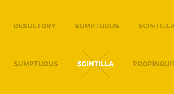
<nav class="cl-effect-11">
	<a href="#" data-hover="Desultory">Desultory</a>
	<a href="#" data-hover="Sumptuous">Sumptuous</a>
	<a href="#" data-hover="Scintilla">Scintilla</a>
	<a href="#" data-hover="Propinquity">Propinquity</a>
	<a href="#" data-hover="Harbinger">Harbinger</a>
</nav>
We might also use a span in some cases because we want to add perspective to each item or achieve another effect.
<nav class="cl-effect-10">
	<a href="#" data-hover="Seraglio"><span>Seraglio</span></a>
	<a href="#" data-hover="Sumptuous"><span>Sumptuous</span></a>
	<a href="#" data-hover="Scintilla"><span>Scintilla</span></a>
	<a href="#" data-hover="Palimpsest"><span>Palimpsest</span></a>
	<a href="#" data-hover="Assemblage"><span>Assemblage</span></a>
</nav>
An example for an effect is the following style. It positions a pseudo-element on top of the actual link text and on hover, we’ll make the pseudo-element disappear by scaling it down and making it fade out (structure as in the second html block):
/* Effect 15: scale down, reveal */
.cl-effect-15 a {
	color: rgba(0,0,0,0.2);
	font-weight: 700;
	text-shadow: none;
}

.cl-effect-15 a::before {
	color: #fff;
	content: attr(data-hover);
	position: absolute;
	transition: transform 0.3s, opacity 0.3s;
}

.cl-effect-15 a:hover::before,
.cl-effect-15 a:focus::before {
	transform: scale(0.9);
	opacity: 0;
}
We hope this collection gives you some inspiration for creating some nice effects.
Please note that IE10 doesn’t support transform-style: preserve-3d, a property that is used in some of the examples. Since we can’t test for it yet using Modernizr you can try to use one of the suggested solutions for detecting IE10.
I hope you enjoyed these link effects and find them inspiring!


Some wonderful ideas. Thanks a lot for the inspiration 🙂
MARY LOU ROX Awesome! I love this……. Thank you for the great stuff
As usual, really impressive work !
Awesome ..!!
lovely, lovely collection. It`s really inspiring.
Interesting! Thanks 😀
Great Job !
Wow, awesome tricks . I can create element with pseudo-class . By the way , that pseudo-class is CSS3 only? Thanks , i hope you answer it =))
Subtle and nice effect, however some effect isn’t working well on IE 10
Seems..You are the teacher for every web designer/developers in this World! Thank you a lot. Great stuff!!
Wow, awesome!
Always amazing 🙂
Awesome, many great !deas 🙂
Nice work. I really loved the idea of special effects in link. Keep it up! 🙂
Great!
Will you marry me ?
LOVE these! I slightly modified the last example to shift the lines sideways, from the right and left:
/* Effect 21: borders slight translate */ .cl-effect-21 a { padding: 10px; color: #237546; font-weight: 700; text-shadow: none; -webkit-transition: color 0.3s; -moz-transition: color 0.3s; transition: color 0.3s; } .cl-effect-21 a::before, .cl-effect-21 a::after { position: absolute; left: 0; width: 100%; height: 2px; background: #fff; content: ''; opacity: 0; -webkit-transition: opacity 0.3s, -webkit-transform 0.3s; -moz-transition: opacity 0.3s, -moz-transform 0.3s; transition: opacity 0.3s, transform 0.3s; -webkit-transform: translateX(-10px); -moz-transform: translateX(-10px); transform: translateX(-10px); } .cl-effect-21 a::before { top: 0; -webkit-transform: translateX(10px); -moz-transform: translateX(10px); transform: translateX(10px); } .cl-effect-21 a::after { bottom: 0; -webkit-transform: translateX(-10px); -moz-transform: translateX(-10px); transform: translateX(-10px); } .cl-effect-21 a:hover, .cl-effect-21 a:focus { color: #fff; } .cl-effect-21 a:hover::before, .cl-effect-21 a:focus::before, .cl-effect-21 a:hover::after, .cl-effect-21 a:focus::after { opacity: 1; -webkit-transform: translateX(0px); -moz-transform: translateX(0px); transform: translateX(0px); }Amazing! I love you work!
This is just another incredible work from you! Thank you, you give a lot of inspiration to me.
A must bookmark link….
could you tell me please how can i change the width or the height for any of these links
Wooooow. I want to use these links on all my websites!
I used another slightly different effect:
a {
  margin-top: 2px;
  border-radius: 3px;
  box-shadow: 0 1px 0 #505050;
  color: #505050;
  text-decoration: none;
  -webkit-transition: all .5s ease;
  -o-transition: all .5s ease;
  transition: all .5s ease;
}
a:hover {
  box-shadow: 0 1px transparent;
  color: #000;
}
It’s quite simple, but looks nice.
Very nice. Beautiful and very usable.
awesome ^_^ ,, thank you Mary.
Ugh, looks too “flashy” for my taste.
Thanks Mary. I’m always surprised how you make usual things to be cool.
Brilliant.
Like always Awesome stuff !! Thanks 😉
Clean and elegant like all your works… thanks
awsome……………….
Great effects, is amazing!!! =D
Do you have a list of supported browsers for each effects?
Also, what kind of fallbacks do you have in place for those browsers that can’t handle the awesomeness?
Every time i read your articles i feel tempted to start using all styles in my sites =D
Thanks for share!
Wow Miss Illic. Just wow
Very good 🙂
I love it? pretty cool !
doesn’t work in Safari … :/
awesome.. as usual..
I used “cl-effect-9”. When I make it link to a page. I want that specific page to have the very same link you click on, stay as the mouseover look. Is there a simple way to achieve that? I can’t wrap my head around creating a .selected class.
Fantastic job… Mary Lou you are awesome as always…
Hi, I guess the above effects does not work on IE8. What is the fallback mechanism for IE browsers. Please let me know.
Thanks in advance.
Dude, we don’t talk about IE around here.
I would recommend a fallback CSS for IE. It’s the best option I can think of. You’ll lose that flair, but you’ll make it accessible.
This is by far the most awsome site Ive found ever.. Your Demos amaze me 🙂 Please know I love you for sharing and letting med download, such awsome, jquery and css effects and functions..:)
You are so cool mary Lou
This is a great way to add effects to the navigation, thank you for this tutorial for some reason
my daughter loves the smell of fresh peppercorn too. 🙂
These are great! I’m trying to copy and paste the html in Muse, then edit the menu but can’t get the html to paste correctly. Help!!! I love these animations! Any suggestions?
Great stuff.. Thanks..
Thanks!! 🙂
What’s the problem in using two words in the data-hover of cl-effect-5? Only the first one appears…
Holy fck this is amazing
The links without underlines or outlines don’t look like links until you hover over them. That sucks because:
1. It requires you to randomly hover over things in hope of finding a link.
2. You can’t hover on a touch screen.
Repeat after me: You’re a designer. You are not an artist.
This is a juvenile and absurd comment. First of all, this is simply a demonstration intended to serve as inspiration for your own projects.
1. It would require you to randomly hover over things if you had a cluttered and poorly designed UX. For something like a simple and traditional menu for example, this works wonderfully. Again, this is intended for inspiration – there are plenty of creative applications this could be applied to. Your comment is very short sighted.
2. Obviously you can’t hover on a touch screen. Guess what? You wouldn’t use this in a touch screen environment then. Shocking!
You’re a designer. You are not an artist. And you, are absolutely uninspiring and brought nothing of value to this conversation.
Hello,
Thank you for your work it’s very nice! But I’ve a problem, I m working for my portfolio and I ve two navigations (one on right and one on left) because of the centred logo.
The code works on the first nav (left) but not on the second(right). Can you help me? :s
Thank you!