From our sponsor: Leverage AI for dynamic, custom website builds with ease.
Today we’d like to share an experimental responsive layout with you. Initially, the layout shows four flexible boxes. When clicking on a box, it will expand to fullscreen and the others will scale down and fade out. When closing the current view, it will move back to the intial position while the other boxes come back up again. Another type of page transition can be seen on the works section where we will show a portfolio item by sliding in a panel from the bottom. The current view gets scaled down and disappears in the back.
All effects are done with CSS transitions and controled by applying classes with JavaScript. The whole layout is flexible and some media queries are added to size down things for smaller screens.
The beautiful illustrations used in the works section of the demo are by talented Isaac Montemayor.
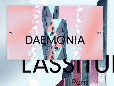
Let’s take a look at some screenshots:
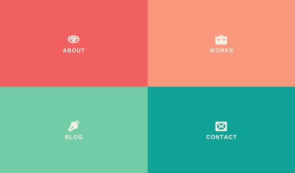
The initial screen has the four flexible boxes. Resize the browser window to see them adapting fluidly.
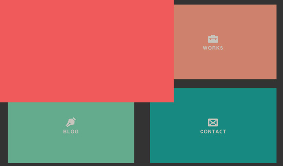
When clicking on a box, it get’s expanded to fullscreen.
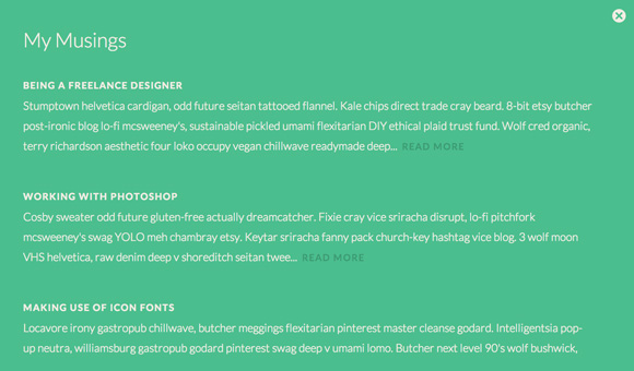
The view of a box that is expanded. A content are is revealed and we add a scroll to it when needed.
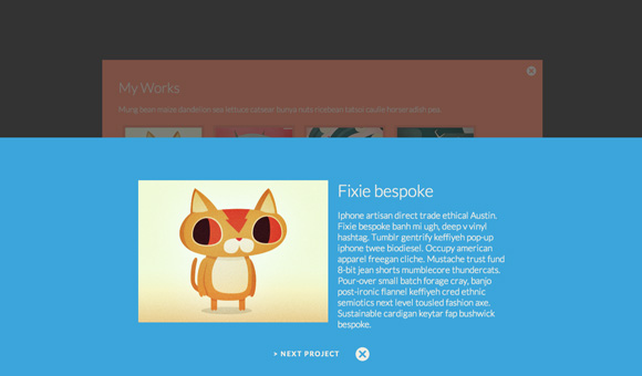
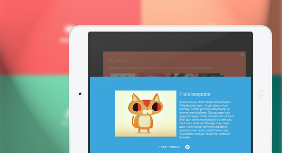
In the works section, we add a thumbnail grid which will reveal a details panel once we click on an item. The page transition here is the new item sliding in from the bottom and the old view scaling down and disappearing in the back.
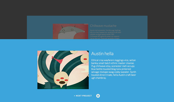
The navigation through the items has the same page transition. When we close the item view, it will transition back down and the works view will scale back up again.
We hope you like this little experiment and find it inspiring!

As always your demo are amazing!
Nice one!
It is beautiful!
I remember visiting a site which had a similar sort of layout. It was a London based site and got featured a lot of late.
It had 2 panels at the home page – Contact and Blog.
Might have been http://www.jointlondon.com/ – excellent and well-done idea 🙂
And btw….Mary Lou – amazing work, once again 🙂
Every single of your projects makes me crazy! Every single! Keep amazing guys!
Oww… awesome… tks for sharing. Congratulations!!!!
As usual –> awesome ML 🙂
I love you Mary Lou !
hahaha you fall in love with her ? 😀
Amazing work!!…a small issue is the scroll bar in blog, and lower widths.
The “works” page looks a bit buggy on Safari for iOS 6.1 🙁
I just can say “cooool”!!! Greetings from Mexico.
Just wow. I am looking for inspiration everyday and these blogs are just amazing. If this had support for more browsers it would have even more awesome.
-webkit-overflow-scrolling: touch
fucking nice !
How can we handle PostBack (Insert a button for redirection)?
I LOVE IT 😀
Absolutely love it. Implemented it, but is it possible something in the JS blocks the opening of the links / <a> tags?
Mary Lou this is awesome and i will use this for my next project..
awesome!!
Would be great to use hashes to add support of browser’s Back button
Absolutely great. Thanx a lot, Mary Lou
Great demo! I have one suggestion. Since clicking anywhere on a large box makes it larger, it makes sense to me to click anywhere on the larger box should make it smaller (toggle), rather than having to aim for the little “x” in the upper right corner.
That would make it impossible to scroll through, say, blog posts.
But if you remove the close button code, change
find( 'span.sh-icon-close' )to$section, and remove theevent.targetline (I think, I’m working off heavily modified code for reference here). That should do it, apologies if I’ve missed anything; I suspect there’ll be a little more tweaking of the JS needed.love this site, love your work thank you
Very nice and smooth.. thank you Mary.. 🙂
I have no word about that’s creativity . This website challenging me to what i have worked in past is just zero . I love this website because it helped me to improve the skills.
You always inspire me with your creativity and talent. Keep it up!
Fantastic work Mary Lou!
wow …fantastic 🙂 i like very much
Thanks so much for this code and demo. The works page could be improved indeed, I think the close button on a details page should be in the upper-right corner.
Wow amazing!
So smooth to, not sure about when you go really small looks like it would be go to add a small bar underneat with contact information on mobile? With a button like call me now?
Really neat! Noob question… can you add any content to the large boxes? Say woo-commerce???
This is quite inspiring, and paired with the History API it would make for quite an intuitive and fluid site. Great work!
It looks gorgeous, as always!
I’m a little disappointed.
Because I’m working on the same concept for my portfolio, and your solution ” JavaScript assist” is definitely better than mine (my java sucks).
Next step for me: adapt this to WP.
Brilliant demonstration, nicely done.
Congratulations.
Brilliant example design. Btw, anyway to include keyboard shortcut ‘esc’ to trigger the “X” close panel?
You could add a keydown function to the jquery. The close for the close icon is bl-icon-close, so try:
$(document).on(‘keydown’, function(e){
if (e.keyCode === 27){
$(‘span.bl-icon-close’).click(); }
});
leon, where exactly do i add the keydown function?
First of all, I absolutely love this way of re-thinking webdesign! I’m a student and need a portfolio website to show off my work to search for an internship and was wondering if I could use this code as the base for my website? I will be editing parts of it to my needs if it’s okay with you. Again, great work!
Really nice!
Gorgeous! Only downside is that I’d like to use the back button.
This is brilliant. Truly inspiring.
great!
Really inspiring and impressive, thanks for sharing !
how do i change the color of the background when the page expands? for example, when you click on about, it expands with more content and the background color is red…how do i change the red?
in component.css
/*LINE 61 these four have the un-expanded background colors*/ .bl-main > section:first-child { top: 0; left: 0; background: #000000; } .bl-main > section:nth-child(2) { top: 0; left: 50%; background: #FA987D; } .bl-main > section:nth-child(3) { top: 50%; left: 0; background: #72CCA7; } .bl-main > section:nth-child(4) { top: 50%; left: 50%; background: #10A296; } /*LINE 374 these four have the expanded background colors*/ .bl-main > section:first-child.bl-expand { background: #EE4444; } .bl-main > section:nth-child(2).bl-expand { background: #F98262; } .bl-main > section:nth-child(3).bl-expand { background: #4BBE8E; } .bl-main > section:nth-child(4).bl-expand { background: #0D8278; }You can add the following menu (http://tympanus.net/Tutorials/YouTubeLeftSideMenu/) for this project? Anyone know this?
Tks
Love it! Now to find a reason to use it 🙂
As usual : AWESOME. Thanks for sharing !
I will comb the source tonight. Inspiring stuff.
I cant wait to use it. awesome stuff. sure i will following this from today.. thankyou Manoela
Woow this is brilliant and inspiring. This goes with my philosophy of Less is More. Is there permission to convert this into WP?
This is super fantastic! Thanks for creating a new way of looking at a site.
Very creative, at the first glance looks like windows 8 😉
Excellent work!