From our sponsor: Leverage AI for dynamic, custom website builds with ease.
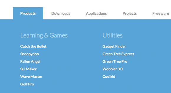
This large horizontal drop-down menu simply shows the sub-menu when an item gets clicked. It’s inspired by the Microsoft.com drop-down menu. Some example media queries show how to adjust the menu for smaller screens.
The HTML
<nav id="cbp-hrmenu" class="cbp-hrmenu">
	<ul>
		<li>
			<a href="#">Products</a>
			<div class="cbp-hrsub">
				<div class="cbp-hrsub-inner">
					<div>
						<h4>Learning & Games</h4>
						<ul>
							<li><a href="#">Catch the Bullet</a></li>
							<li><a href="#">Snoopydoo</a></li>
							<!-- ... -->
						</ul>
					</div>
					<div>
						<h4>Utilities</h4>
						<ul>
							<li><a href="#">Gadget Finder</a></li>
							<li><a href="#">Green Tree Express</a></li>
							<li><a href="#">Green Tree Pro</a></li>
							<li><a href="#">Wobbler 3.0</a></li>
							<li><a href="#">Coolkid</a></li>
						</ul>
					</div>
					<div>
						<!-- ... -->
					</div>
				</div><!-- /cbp-hrsub-inner -->
			</div><!-- /cbp-hrsub -->
		</li>
		<li><!-- ... --></li>
		<li><!-- ... --></li>
		<!-- ... -->
	</ul>
</nav>
The CSS
.cbp-hrmenu {
	width: 100%;
	margin-top: 2em;
	border-bottom: 4px solid #47a3da;
}

/* general ul style */
.cbp-hrmenu ul {
	margin: 0;
	padding: 0;
	list-style-type: none;
}

/* first level ul style */
.cbp-hrmenu > ul,
.cbp-hrmenu .cbp-hrsub-inner {
	width: 90%;
	max-width: 70em;
	margin: 0 auto;
	padding: 0 1.875em;
}

.cbp-hrmenu > ul > li {
	display: inline-block;
}

.cbp-hrmenu > ul > li > a {
	font-weight: 700;
	padding: 1em 2em;
	color: #999;
	display: inline-block;
}

.cbp-hrmenu > ul > li > a:hover {
	color: #47a3da;
}

.cbp-hrmenu > ul > li.cbp-hropen a,
.cbp-hrmenu > ul > li.cbp-hropen > a:hover {
	color: #fff;
	background: #47a3da;
}

/* sub-menu */
.cbp-hrmenu .cbp-hrsub {
	display: none;
	position: absolute;
	background: #47a3da;
	width: 100%;
	left: 0;
}

.cbp-hropen .cbp-hrsub {
	display: block;
	padding-bottom: 3em;
}

.cbp-hrmenu .cbp-hrsub-inner > div {
	width: 33%;
	float: left;
	padding: 0 2em 0;
}

.cbp-hrmenu .cbp-hrsub-inner:before,
.cbp-hrmenu .cbp-hrsub-inner:after {
	content: " ";
	display: table;
}

.cbp-hrmenu .cbp-hrsub-inner:after {
	clear: both;
}

.cbp-hrmenu .cbp-hrsub-inner > div a {
	line-height: 2em;
}

.cbp-hrsub h4 {
	color: #afdefa;
	padding: 2em 0 0.6em;
	margin: 0;
	font-size: 160%;
	font-weight: 300;
}

/* Examples for media queries */

@media screen and (max-width: 52.75em) {

	.cbp-hrmenu {
		font-size: 80%;
	}

}

@media screen and (max-width: 43em) {

	.cbp-hrmenu {
		font-size: 120%;
		border: none;
	}

	.cbp-hrmenu > ul,
	.cbp-hrmenu .cbp-hrsub-inner {
		width: 100%;
		padding: 0;
	}

	.cbp-hrmenu .cbp-hrsub-inner {
		padding: 0 2em;
		font-size: 75%;
	}

	.cbp-hrmenu > ul > li {
		display: block;
		border-bottom: 4px solid #47a3da;
	}

	.cbp-hrmenu > ul > li > a {
		display: block;
		padding: 1em 3em;
	}

	.cbp-hrmenu .cbp-hrsub {
		position: relative;
	}

	.cbp-hrsub h4 {
		padding-top: 0.6em;
	}

}

@media screen and (max-width: 36em) {
	.cbp-hrmenu .cbp-hrsub-inner > div {
		width: 100%;
		float: none;
		padding: 0 2em;
	}
}
The JavaScript
var cbpHorizontalMenu = (function() {

	var $listItems = $( '#cbp-hrmenu > ul > li' ),
		$menuItems = $listItems.children( 'a' ),
		$body = $( 'body' ),
		current = -1;

	function init() {
		$menuItems.on( 'click', open );
		$listItems.on( 'click', function( event ) { event.stopPropagation(); } );
	}

	function open( event ) {

		if( current !== -1 ) {
			$listItems.eq( current ).removeClass( 'cbp-hropen' );
		}

		var $item = $( event.currentTarget ).parent( 'li' ),
			idx = $item.index();

		if( current === idx ) {
			$item.removeClass( 'cbp-hropen' );
			current = -1;
		}
		else {
			$item.addClass( 'cbp-hropen' );
			current = idx;
			$body.off( 'click' ).on( 'click', close );
		}

		return false;

	}

	function close( event ) {
		$listItems.eq( current ).removeClass( 'cbp-hropen' );
		current = -1;
	}

	return { init : init };

})();