From our sponsor: Leverage AI for dynamic, custom website builds with ease.
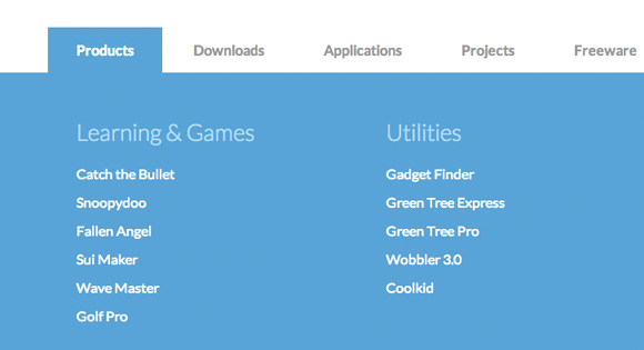
This large horizontal drop-down menu simply shows the sub-menu when an item gets clicked. It’s inspired by the Microsoft.com drop-down menu. Some example media queries show how to adjust the menu for smaller screens.
The HTML
<nav id="cbp-hrmenu" class="cbp-hrmenu">
	<ul>
		<li>
			<a href="#">Products</a>
			<div class="cbp-hrsub">
				<div class="cbp-hrsub-inner">
					<div>
						<h4>Learning & Games</h4>
						<ul>
							<li><a href="#">Catch the Bullet</a></li>
							<li><a href="#">Snoopydoo</a></li>
							<!-- ... -->
						</ul>
					</div>
					<div>
						<h4>Utilities</h4>
						<ul>
							<li><a href="#">Gadget Finder</a></li>
							<li><a href="#">Green Tree Express</a></li>
							<li><a href="#">Green Tree Pro</a></li>
							<li><a href="#">Wobbler 3.0</a></li>
							<li><a href="#">Coolkid</a></li>
						</ul>
					</div>
					<div>
						<!-- ... -->
					</div>
				</div><!-- /cbp-hrsub-inner -->
			</div><!-- /cbp-hrsub -->
		</li>
		<li><!-- ... --></li>
		<li><!-- ... --></li>
		<!-- ... -->
	</ul>
</nav>
The CSS
.cbp-hrmenu {
	width: 100%;
	margin-top: 2em;
	border-bottom: 4px solid #47a3da;
}

/* general ul style */
.cbp-hrmenu ul {
	margin: 0;
	padding: 0;
	list-style-type: none;
}

/* first level ul style */
.cbp-hrmenu > ul,
.cbp-hrmenu .cbp-hrsub-inner {
	width: 90%;
	max-width: 70em;
	margin: 0 auto;
	padding: 0 1.875em;
}

.cbp-hrmenu > ul > li {
	display: inline-block;
}

.cbp-hrmenu > ul > li > a {
	font-weight: 700;
	padding: 1em 2em;
	color: #999;
	display: inline-block;
}

.cbp-hrmenu > ul > li > a:hover {
	color: #47a3da;
}

.cbp-hrmenu > ul > li.cbp-hropen a,
.cbp-hrmenu > ul > li.cbp-hropen > a:hover {
	color: #fff;
	background: #47a3da;
}

/* sub-menu */
.cbp-hrmenu .cbp-hrsub {
	display: none;
	position: absolute;
	background: #47a3da;
	width: 100%;
	left: 0;
}

.cbp-hropen .cbp-hrsub {
	display: block;
	padding-bottom: 3em;
}

.cbp-hrmenu .cbp-hrsub-inner > div {
	width: 33%;
	float: left;
	padding: 0 2em 0;
}

.cbp-hrmenu .cbp-hrsub-inner:before,
.cbp-hrmenu .cbp-hrsub-inner:after {
	content: " ";
	display: table;
}

.cbp-hrmenu .cbp-hrsub-inner:after {
	clear: both;
}

.cbp-hrmenu .cbp-hrsub-inner > div a {
	line-height: 2em;
}

.cbp-hrsub h4 {
	color: #afdefa;
	padding: 2em 0 0.6em;
	margin: 0;
	font-size: 160%;
	font-weight: 300;
}

/* Examples for media queries */

@media screen and (max-width: 52.75em) {

	.cbp-hrmenu {
		font-size: 80%;
	}

}

@media screen and (max-width: 43em) {

	.cbp-hrmenu {
		font-size: 120%;
		border: none;
	}

	.cbp-hrmenu > ul,
	.cbp-hrmenu .cbp-hrsub-inner {
		width: 100%;
		padding: 0;
	}

	.cbp-hrmenu .cbp-hrsub-inner {
		padding: 0 2em;
		font-size: 75%;
	}

	.cbp-hrmenu > ul > li {
		display: block;
		border-bottom: 4px solid #47a3da;
	}

	.cbp-hrmenu > ul > li > a {
		display: block;
		padding: 1em 3em;
	}

	.cbp-hrmenu .cbp-hrsub {
		position: relative;
	}

	.cbp-hrsub h4 {
		padding-top: 0.6em;
	}

}

@media screen and (max-width: 36em) {
	.cbp-hrmenu .cbp-hrsub-inner > div {
		width: 100%;
		float: none;
		padding: 0 2em;
	}
}
The JavaScript
var cbpHorizontalMenu = (function() {

	var $listItems = $( '#cbp-hrmenu > ul > li' ),
		$menuItems = $listItems.children( 'a' ),
		$body = $( 'body' ),
		current = -1;

	function init() {
		$menuItems.on( 'click', open );
		$listItems.on( 'click', function( event ) { event.stopPropagation(); } );
	}

	function open( event ) {

		if( current !== -1 ) {
			$listItems.eq( current ).removeClass( 'cbp-hropen' );
		}

		var $item = $( event.currentTarget ).parent( 'li' ),
			idx = $item.index();

		if( current === idx ) {
			$item.removeClass( 'cbp-hropen' );
			current = -1;
		}
		else {
			$item.addClass( 'cbp-hropen' );
			current = idx;
			$body.off( 'click' ).on( 'click', close );
		}

		return false;

	}

	function close( event ) {
		$listItems.eq( current ).removeClass( 'cbp-hropen' );
		current = -1;
	}

	return { init : init };

})();


I am using this for the main navigation on a site and it works great but i need the main tab and the sub nav activated for the page they are on. And they do, but can someone help me so that they can activate a different tab still from that page? You can see what I mean here: http://build4.edgemarketingdesign.com
Hi, just FYI, for a tiny delay on mouse over use code below. I also added a delay while closing to make it less flickering. Oh, and you need to give each menu an id=”whatever”. Why I did this? I made the menu to open on hover, but sometimes you want to move the mouse to the top of the page without opening the menu. While moving you accidentally touch the menu and you get the huge menu div, you need than to move your mouse out of the div to hide the menu. This code adds a small delay 😉 ps, love this site, keep up the good work!
var cbpHorizontalMenu = (function () {
var $listItems = $(‘#cbp-hrmenu > ul > li’),
$menuItems = $listItems.children(‘a’),
$body = $(‘body’),
current = -1;
function init() {
$menuItems.on(‘click’, open);
$listItems.on(‘click’, function (event) { event.stopPropagation(); });
}
var timeoutId;
$(‘#cbp-hrmenu > ul > li’).hover(function () {
var id = $(this).attr(‘id’);
if (!timeoutId) {
timeoutId = window.setTimeout(function () {
timeoutId = null;
$(‘#’ + id).addClass(‘cbp-hropen’);
}, 100);
}
},
function () {
var id = $(this).attr(‘id’);
if (timeoutId) {
window.clearTimeout(timeoutId);
timeoutId = null;
}
else {
timeoutId = window.setTimeout(function () {
$(‘#’ + id).removeClass(‘cbp-hropen’);
}, 100);
timeoutId = null;
}
}
);
function open(event) {
if (current !== -1) {
$listItems.eq(current).removeClass(‘cbp-hropen’);
}
var $item = $(event.currentTarget).parent(‘li’),
idx = $item.index();
if (current === idx) {
$item.removeClass(‘cbp-hropen’);
current = -1;
}
else {
$item.addClass(‘cbp-hropen’);
current = idx;
$body.off(‘click’).on(‘click’, close);
}
return false;
}
function close(event) {
$listItems.eq(current).removeClass(‘cbp-hropen’);
current = -1;
}
return { init: init };
})();
Shame your code addons don’t work for me!
I got the errors :
SyntaxError: illegal character var $listItems = $(‘#cbp-hrmenu > ul > li’), societ...nu_3.js (ligne 12) ReferenceError: cbpHorizontalMenu is not defined cbpHorizontalMenu.init();The demo doesn’t work now! It’s has error, says:
Hi Robert, works fine here.. what exactly doesn’t work for you?
Anyone have a fix for ie8? Seems that the demo works just fine, but nothing shows up on my site when I click an item. Potential conflict? Thanks.
Have you try to include the META TAG Validation after which is as following?
—
—
—
—-
Comparing to the Drop-Down in .NET, yours are still very good.
Thanks for this!
Did anyone successfully apply a slide transition to the menu? I’ve been trying jQuery’s .slideDown() but can’t get it working.
Conor, I have the same problem… Can someone help???
Nice drop down menu. Is it possible to close menu when user clicks somewhere outside of the nav menu area?
Many Thanks
First of all, I love the menu! I’ve been looking for something like this for a while now. I wanted the menu to be static so that it always sits at the top of the page. I accomplished this with position:fixed in the CSS. I want the logo to also stay static at the top above the menu but when I set position:static, the image completely disappears. If I remove the position tag, the logo appears where I want it but it scrolls with the rest of the content. How can I keep the image on the page when scrolling?
How make mouseover on the button?
I like to use animation fade or something use this code on mouseover
$(‘#cbp-hrmenu > ul > li’).hover(
function(){
$(this).addClass(‘cbp-hropen’);
},function(){
$(this).removeClass(‘cbp-hropen’);
}
);
but i like to know what is the best practice to use the animation on CSS or jquery?
Hi, The menu works fine, but when I click an item sub ??menus are displayed below the pictures of the following section of the website.
Thank you.
How can I integrate this menu in wordpress? I have a template that I use for one of my clients and the default menu it`s not enough for what I need.
Can you point me in the right direction?
Hello, I’m from Brazil I wonder how do I let the first link of this fantastic menu already activated?
Sorry for my bad english
If I want ta have a simple link (without submenu) : is it possible ?
Thank you
nice work … keep it up..thanks
Hi !
i did that change in the js file to make links without submenus work :
$listItems = $( ‘#cbp-hrmenu > ul > li’ ).has( ‘.cbp-hrsub’ )
it’s working well, but a little bug appears :
when a submenu is open, if i click another item with submenu, it opens without closing the old one…
Does anybody has a fix ?
thanks !
This problem can be solved changing the filter of the anchor elements instead of the list elements filter
e.g.
// cbpHorizontalMenu.js
var $menuItems = $listItems.children(‘a.dropdown’);
Has dropdown menu
Has dropdown menu
Hi, thank you for this menu!
I have changed the onclic event into onmouseover and now I would set up a delay like css3 transition in the code.
I saw all comments with informations but they aren’t working.
I hope someone can help me 😉
Hi, I’d like to know if I could add two subnavs to it so as when you hover over the top navigation a sub nav appears below then when that has been hovered over that the sections appears, is this possible to do?