From our sponsor: Leverage AI for dynamic, custom website builds with ease.
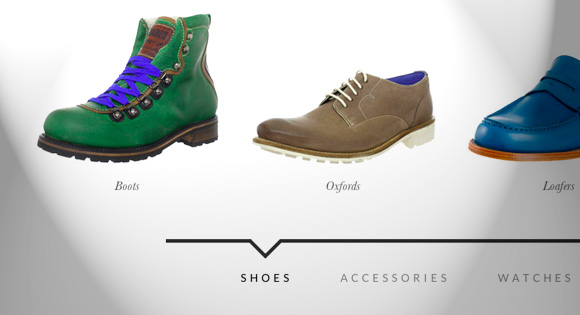
For today’s tutorial we want to show you how to create a simple item slider with CSS animations and some jQuery. The idea was inspired by the Aplle product slider where several little items fly in with a bouncing animation. We wanted to translate this concept to a modern-looking alternative for a minimal online store design where the items represent different categories. Categories as use-case fit quite well because of the limited nature of this type of slider. For more items to be shown, this is certainly a far-from-optimal solution. If the amount of items is limited this might give an interesting little touch to the experience.
So, let’s get started with this last tutorial of 2012!
The Markup
For the HTML we will use a division that wraps some unordered lists that will contain the items and a navigation with the category links. Each list item will have a link that contains an image and a h4 heading.
<div id="mi-slider" class="mi-slider">
	<ul>
		<li><a href="#"><img src="images/1.jpg" alt="img01"><h4>Boots</h4></a></li>
		<li><a href="#"><img src="images/2.jpg" alt="img02"><h4>Oxfords</h4></a></li>
		<li><a href="#"><img src="images/3.jpg" alt="img03"><h4>Loafers</h4></a></li>
		<li><a href="#"><img src="images/4.jpg" alt="img04"><h4>Sneakers</h4></a></li>
	</ul>
	<ul>
		<li><a href="#"><img src="images/5.jpg" alt="img05"><h4>Belts</h4></a></li>
		<li><a href="#"><img src="images/6.jpg" alt="img06"><h4>Hats & Caps</h4></a></li>
		<li><a href="#"><img src="images/7.jpg" alt="img07"><h4>Sunglasses</h4></a></li>
		<li><a href="#"><img src="images/8.jpg" alt="img08"><h4>Scarves</h4></a></li>
	</ul>
	<ul>
		<li><a href="#"><img src="images/9.jpg" alt="img09"><h4>Casual</h4></a></li>
		<li><a href="#"><img src="images/10.jpg" alt="img10"><h4>Luxury</h4></a></li>
		<li><a href="#"><img src="images/11.jpg" alt="img11"><h4>Sport</h4></a></li>
	</ul>
	<ul>
		<li><a href="#"><img src="images/12.jpg" alt="img12"><h4>Carry-Ons</h4></a></li>
		<li><a href="#"><img src="images/13.jpg" alt="img13"><h4>Duffel Bags</h4></a></li>
		<li><a href="#"><img src="images/14.jpg" alt="img14"><h4>Laptop Bags</h4></a></li>
		<li><a href="#"><img src="images/15.jpg" alt="img15"><h4>Briefcases</h4></a></li>
	</ul>
	<nav>
		<a href="#">Shoes</a>
		<a href="#">Accessories</a>
		<a href="#">Watches</a>
		<a href="#">Bags</a>
	</nav>
</div>
Let’s take a look at the style.
The CSS
Note that the CSS will not contain any vendor prefixes, but you will find them in the files.
What we want to do is the following: initially we just want the first item list to show while all the other lis will be translated to the right, outside of the viewport. When we click on a navigation link the items will either slide in from the right or from the left, depending on which current position we are at and what the newly selected category is.
Let’s first style the wrapper, which is the division with the class mi-slider. It will have a predefined height which we need in order to set the position of the uls correctly:
.mi-slider {
	position: relative;
	margin-top: 30px;
	height: 490px;
}
The ul will be positioned absolutely which means that all the lists will be on top of each other. Remember, we only want to translate the list items, not the lists themselves. We set the pointer-events to none because we want to be able to click on the current list’s links:
.mi-slider ul {
	list-style-type: none;
	position: absolute;
	width: 100%;
	left: 0;
	bottom: 140px;
	overflow: hidden;
	text-align: center;
	pointer-events: none;
}
The pointer events of the current list should be reset, so that the containing links are clickable:
.mi-slider ul.mi-current {
	pointer-events: auto;
}
When JavaScript is disabled, we don’t want anything to look broken (we use Modernizr):
.no-js .mi-slider ul {
	position: relative;
	left: auto;
	bottom: auto;
	margin: 0;
	overflow: visible;
}
In order to center all the list items, we have given the ul a text-align of center and now we’ll give the list items an inline-block display with a width of 20%. This width makes sure that our items fit into the list and keeps it fluid.
By default, all the list items will be translated to the right. We use 600% here because it’s a large enought value to move them out of the viewport. We’ll also add a little transition for the opacity:
.mi-slider ul li {
	display: inline-block;
	padding: 20px;
	width: 20%;
	max-width: 300px;
	transform: translateX(600%);
	transition: opacity 0.2s linear;
}
Whithout JS we don’t want them to translate:
.no-js .mi-slider ul li {
	transform: translateX(0);
}
Let’s style the content of the list items. Note how we set the max-width of the images to 100%. This will ensure that the layout does not break but the images will resize according to their wrapper which is our li with a percentage-based width:
.mi-slider ul li a,
.mi-slider ul li img {
	display: block;
	margin: 0 auto;
}

.mi-slider ul li a {
	outline: none;
	cursor: pointer;
}

.mi-slider ul li img {
	max-width: 100%;
	border: none;
}

.mi-slider ul li h4 {
	display: inline-block;
	font-family: Baskerville, "Baskerville Old Face", "Hoefler Text", Garamond, "Times New Roman", serif;
	font-style: italic;
	font-weight: 400;
	font-size: 18px;
	padding: 20px 10px 0;
}
On hover, we’ll animate the opacity of the list item:
.mi-slider ul li:hover {
	opacity: 0.7;
}
The navigation needs to have a top value because the lists are positioned absolutely. We’ll center the navigation by giving lateral auto margins and we’ll set a maximum width of 800px:
.mi-slider nav {
	position: relative;
	top: 400px;
	text-align: center;
	max-width: 800px;
	margin: 0 auto;
	border-top: 5px solid #333;
}
We don’t want to show the navigation at all when there is no JavaScript enabled:
.no-js nav {
	display: none;
}
The navigation links will have a generous padding and we’ll give them a transition for hover:
.mi-slider nav a {
	display: inline-block;
	text-transform: uppercase;
	letter-spacing: 5px;
	padding: 40px 30px 30px 34px;
	position: relative;
	color: #888;
	outline: none;
	transition: color 0.2s linear;
}

.mi-slider nav a:hover,
.mi-slider nav a.mi-selected {
	color: #000;
}
The mi-selected class, just like the mi-current class for the lists, we’ll set using JavaScript.
Now, let’s add that little arrow on the top. We’ll use the pseudo-classes :before and :after to create two triangles with borders:
.mi-slider nav a.mi-selected:after,
.mi-slider nav a.mi-selected:before {
	content: '';
	position: absolute;
	top: -5px;
	border: solid transparent;
	height: 0;
	width: 0;
	position: absolute;
	pointer-events: none;
}

.mi-slider nav a.mi-selected:after {
	border-color: transparent;
	border-top-color: #fff;
	border-width: 20px;
	left: 50%;
	margin-left: -20px;
}

.mi-slider nav a.mi-selected:before {
	border-color: transparent;
	border-top-color: #333;
	border-width: 27px;
	left: 50%;
	margin-left: -27px;
}
Let get to the juicy bits, the animations. The first animation that we want to happen, is the scaling up of the items of the first list. The scaleUp animation will also include the items being translated to 0 because we want them to be in the viewport:
.mi-slider ul:first-child li,
.no-js .mi-slider ul li {
	animation: scaleUp 350ms ease-in-out both;
}

@keyframes scaleUp {
	0% { transform: translateX(0) scale(0); }
	100% { transform: translateX(0) scale(1); }
}
Let’s add a different delay to each list item so that they appear sequentially:
.mi-slider ul:first-child li:first-child {
	animation-delay: 90ms;
}

.mi-slider ul:first-child li:nth-child(2) {
	animation-delay: 180ms;
}

.mi-slider ul:first-child li:nth-child(3) {
	animation-delay: 270ms;
}

.mi-slider ul:first-child li:nth-child(4) {
	animation-delay: 360ms;
}
For our example we will just have a maximum of four items, so we’ll only define four delays. If we would have more items, we would include more delays.
For the sliding animations we will have four cases: two for the sliding in of new items and two for the sliding out of the current items, depending on the direction. So we’ll define four classes for the lists which we will add with JavaScript:
/* moveFromRight */

.mi-slider ul.mi-moveFromRight li {
	animation: moveFromRight 350ms ease-in-out both;
}

/* moveFromLeft */

.mi-slider ul.mi-moveFromLeft li {
	animation: moveFromLeft 350ms ease-in-out both;
}

/* moveToRight */

.mi-slider ul.mi-moveToRight li {
	animation: moveToRight 350ms ease-in-out both;
}

/* moveToLeft */

.mi-slider ul.mi-moveToLeft li {
	animation: moveToLeft 350ms ease-in-out both;
}
Now we need to set the according animation delays which will also depend on the direction. For example, the first item will slide in with no delay if it’s coming form the right side and also when it slides out to the left. The same will be true for the last item:
.mi-slider ul.mi-moveToLeft li:first-child,
.mi-slider ul.mi-moveFromRight li:first-child,
.mi-slider ul.mi-moveToRight li:nth-child(4),
.mi-slider ul.mi-moveFromLeft li:nth-child(4) {
	animation-delay: 0ms;
}
The increased delays will be set accordingly:
.mi-slider ul.mi-moveToLeft li:nth-child(2),
.mi-slider ul.mi-moveFromRight li:nth-child(2),
.mi-slider ul.mi-moveToRight li:nth-child(3),
.mi-slider ul.mi-moveFromLeft li:nth-child(3) {
	-webkit-animation-delay: 90ms;
	animation-delay: 90ms;
}

.mi-slider ul.mi-moveToLeft li:nth-child(3),
.mi-slider ul.mi-moveFromRight li:nth-child(3),
.mi-slider ul.mi-moveToRight li:nth-child(2),
.mi-slider ul.mi-moveFromLeft li:nth-child(2) {
	-webkit-animation-delay: 180ms;
	animation-delay: 180ms;
}

.mi-slider ul.mi-moveToLeft li:nth-child(4),
.mi-slider ul.mi-moveFromRight li:nth-child(4),
.mi-slider ul.mi-moveToRight li:first-child,
.mi-slider ul.mi-moveFromLeft li:first-child  {
	-webkit-animation-delay: 270ms;
	animation-delay: 270ms;
}
And now let’s define the animations itself. For example, moving from the right will mean that we will set the translateX value to 600% and move to 0. Moving from the left, we’ll set the initial position to -600% so that the items are on the left side outside of the viewport. And so on:
@keyframes moveFromRight {
	0% { transform: translateX(600%); }
	100% { transform: translateX(0); }
}

@keyframes moveFromLeft {
	0% { transform: translateX(-600%); }
	100% { transform: translateX(0); }
}

@keyframes moveToRight {
	0% { transform: translateX(0%); }
	100% { transform: translateX(600%); }
}

@keyframes moveToLeft {
	0% { transform: translateX(0%); }
	100% { transform: translateX(-600%); }
}
Last, but not least, let’s use some media queries to adjust the slider content for smaller screens.
We’ll start with adjusting the navigation so that it does not break when the screen is too small:
@media screen and (max-width: 910px){
	.mi-slider nav {
		max-width: 90%;
	}

	.mi-slider nav a {
		font-size: 12px;
		padding: 40px 10px 30px 14px;
	}
}
Since we set a fixed height to the slider, we want to make sure it adapts:
@media screen and (max-width: 740px){
	.mi-slider {
		height: 300px;
	}

	.mi-slider nav {
		top: 220px;
	}
}
For really small screens, we don’t simply want to make everything super tiny, but instead we want to make the navigation easy for touch devices. So we’ll simply show all the categories. We’ll set all the styles in a way that nothing is hidden and all the lists are displayed under each other:
@media screen and (max-width: 490px){
	.mi-slider {
		text-align: center;
		height: auto;
	}

	.mi-slider ul {
		position: relative;
		display: inline;
		bottom: auto;
		pointer-events: auto;
	}

	.mi-slider ul li {
		animation: none !important;
		transform: translateX(0) !important;
		padding: 10px 3px;
		min-width: 140px;
	}

	.mi-slider nav {
		display: none;
	}
}
And that’s all the style. Now let’s control some things with jQuery.
The JavaScript
Let’s create a simple jQuery plugin for our slider. Most of the work is done in the CSS where we have defined all the animations. The plugin will mainly focus on adding and removing classes and control the current category being shown. For browsers that don’t support animations we will fall back to a simple show/hide approach.
Let’s start by caching some elements and initialize some variables:
_init : function( options ) {

	// the categories (ul)
	this.$categories = this.$el.children( 'ul' );
	// the navigation
	this.$navcategories = this.$el.find( 'nav > a' );
	var animEndEventNames = {
		'WebkitAnimation' : 'webkitAnimationEnd',
		'OAnimation' : 'oAnimationEnd',
		'msAnimation' : 'MSAnimationEnd',
		'animation' : 'animationend'
	};
	// animation end event name
	this.animEndEventName = animEndEventNames[ Modernizr.prefixed( 'animation' ) ];
	// animations and transforms support
	this.support = Modernizr.csstransforms && Modernizr.cssanimations;
	// if currently animating
	this.isAnimating = false;
	// current category
	this.current = 0;
	var $currcat = this.$categories.eq( 0 );
	if( !this.support ) {
		this.$categories.hide();
		$currcat.show();
	}
	else {
		$currcat.addClass( 'mi-current' );
	}
	// current nav category
	this.$navcategories.eq( 0 ).addClass( 'mi-selected' );
	// initialize the events
	this._initEvents();

}
We will bind the click event to the navigation category links under the slider. We assume that the index of each one corresponds to the index of the respective category (the ul). When a category link is clicked the items of the current category fly out, and the ones of the new category fly in one by one (remember, we defined the animation delays in the CSS).
_initEvents : function() {

	var self = this;
	this.$navcategories.on( 'click.catslider', function() {
		self.showCategory( $( this ).index() );
		return false;
	} );

	// reset on window resize..
	$( window ).on( 'resize', function() {
		self.$categories.removeClass().eq( 0 ).addClass( 'mi-current' );
		self.$navcategories.eq( self.current ).removeClass( 'mi-selected' ).end().eq( 0 ).addClass( 'mi-selected' );
		self.current = 0;
	} );

}

showCategory : function( catidx ) {

	if( catidx === this.current || this.isAnimating ) {
		return false;
	}
	this.isAnimating = true;
	// update selected navigation
	this.$navcategories.eq( this.current ).removeClass( 'mi-selected' ).end().eq( catidx ).addClass( 'mi-selected' );

	var dir = catidx > this.current ? 'right' : 'left',
		toClass = dir === 'right' ? 'mi-moveToLeft' : 'mi-moveToRight',
		fromClass = dir === 'right' ? 'mi-moveFromRight' : 'mi-moveFromLeft',
		// current category
		$currcat = this.$categories.eq( this.current ),
		// new category
		$newcat = this.$categories.eq( catidx ),
		$newcatchild = $newcat.children(),
		lastEnter = dir === 'right' ? $newcatchild.length - 1 : 0,
		self = this;

	if( this.support ) {

		$currcat.removeClass().addClass( toClass );

		setTimeout( function() {

			$newcat.removeClass().addClass( fromClass );
			$newcatchild.eq( lastEnter ).on( self.animEndEventName, function() {

				$( this ).off( self.animEndEventName );
				$newcat.addClass( 'mi-current' );
				self.current = catidx;
				var $this = $( this );
				// solve chrome bug
				self.forceRedraw( $this.get(0) );
				self.isAnimating = false;

			} );

		}, $newcatchild.length * 90 );

	}
	else {

		$currcat.hide();
		$newcat.show();
		this.current = catidx;
		this.isAnimating = false;

	}

}
And that’s it! I hope you enjoyed this tutorial and find it useful and inspiring!
We wish you a happy new year!


niiiiiiiiiiiiiiiiiiiiiiiiiiiiiiiiiiiiiiiice!!!!!!!!!!!!!
firefox does not work ?
I tested it in the latest version and it seems to work fine. Which version are you using? What happens? Thanks. ML
Yeah, Firefox 15 at least is not working. I know is not the latest version but come on it should work, right?
We did not add the prefixes for older FF versions… Adding -moz- prefixes should do the trick! Thanks
I’ve added the -moz- prefixes… Let me know if it works now. Thanks
It does, thanks!
Actually, almost hehe. It works for the first item I click but then the others don’t work. You almost have it 🙂
Niiiice! This is very snazzy looking!
AWESOME!!! and THANKS!!! oh yeah, though, it’s not working in IE 10…
HAPPY HOLIDAYS!!!
It works fine on Internet Explorer 10 for me.
Wow, you are really one of the masters of trade ! I learned so much from your articles and even helped me to earn some 😉 . Svaka ?ast, crna curo ! 🙂
Excellent slider.
I’m using it on my personal site that i’m developing right now.
Could you also integrate auto-slide?
Regards
I would also love to make this auto sliding. Did you solve this yet I would love to know what you did.
Happy New Year ML!
Fantastic tutorial, i’ve been asked to build a very similar carousel and using your code has more than cut my dev time in half.
Thank you
Really nice!!
Thanks for good explanation!!
This is the coolest! Thanks for the awesome tutorial. 🙂
This is a very good tutorial! Thanks for share!!!
Super stuff 🙂
happy new year ML !
Lovely
Nice one I always respect your articles.
Really awesome. Thanks for sharing.
No Words !!!!
!!!!!!!!!!!!!!!!!Just Awesome!!!!!!!!!!!!!!!!!!!!!!!!
It doesnt fully work in Firefox. When you first load the page, and click on one of the options, the slide happens only once. When you try to open another section, nothing happens…. Any idea what would be causing that?
Pure Beauty!
Thanks for sharing such a great tutorial!
very nice tutorial.
quick question on responsive nature of the slider. is it desired behavior that the slider jumps back to the first category any time the browser window gets resized? so for example if I click on ‘watches’ and then i resize my browser, the slider jumps back to the first one.
Gorgeous !
works on ; firefox 17.0.1, Safarie 5.1.7 , Chrom 23.0.1271.97m
even on IE 8 (except “moveToRight – moveFromLeft”)
all tested on pc.
Thanks Mary Lou
Bonne Anneé – ?yi Y?llar – Happy New Year
Great!
thanks for these explanations
Great tutorial!
Unfortunately I’ve recognized a font flickering of the list captions after completion of any animation or after hovering a particular list item. This happens only on Firefox (Mac and PC) but not on any Webkit browser. Basically I’ve seen such issues in the past in Safari (for CSS animations) and the workaround was to apply a higher z-index of the animated object. In this case the caption itself is part of the animation and I’ve no clue how to get rid of the problem.
Any ideas how for a solution? Thanks in advance for any feedback on that.
Happy New Year ML!
Hi,
Happy New Year to all! Super like this tut. Just one issue i found, when we click from category to another only one click works, then it stop working? Anyway thanks a ton for your nice effort sharing.
Love this, thanks! Any thoughts on why it wouldn’t work in a Firefox/Linux situation? The demo works for one click, then just kinda locks up. I’m testing in Ubuntu with FF 15.0.1, but I’ve also heard the same from a Red Hat FF user, too.
…and forcing an update of my distro brought Firefox up to 17.0.1 and it works like a champ. *le sigh*
Thank You! this is a Beautiful display.
I would like to know what is the easy way that we can use in WordPress. Thanks in advace for your time and help.
Dont work IE8
Hi there, firstly beautiful work, thank you for sharing. Just wondering as I wanted to add 7 items, how would I do this please as I can not get it to display in 2 rows. Thank you in advance! 🙂
I am also trying to add a second row to this item slider. Have you found out how to do this? I would love to find a solution to this.
Thanks so much for this inspiring tutorial … I already started to modify it to include some parts of this slider into my wordpress theme … Thanks!
Did you have any luck incorporating it into wordpress. I have enqued all the scripts but can’t get it to work.
Wonderful scripts, Mary Lou – thank you!
Has anyone else been having any issues using this with Foundation?? I get an error saying that “Error: TypeError: $(…).catslider is not a function”
Please help, thanks!
Hi Mary,
Nice effect … works on IE 8 and above …
If I am to use this for a project what will be the license type.
Since there is no mention of any thing in the JS file, can i use it as it is or modify it if i need it.
Please let me know and again thanks for the awesome tutorial
This is what I’m looking for! Thanks!
I just want to know whether can we use this with single for the whole slider with 4 items per row. I need to construct dynamically. So Its not feasible to construct .. .. like this. Do you have any idea regarding this?
When I use this with your full screen slitslider the modernizer script conflicts each other and slit slider effects not working. Even If I use any one of modernizer js, other one is not working.
Hi,
I was hoping that I could get some more information on implementing the Jquery plugin into my website. If someone could help (spare no details, I’m completely new at using javascript) I’m using wordpress for my site at the moment. I have added the HTML and the CSS to my stylesheet. I have also saved the catslider.js file to my root directory and thats about as far as I have gotten with that part of things. I’ve been looking around the internet for resources everywhere to help me, with no luck. Any help would be much appreciated as I am just getting in to design and I love all your work it’s just I can only implement the CSS stuff unfortunately 🙁
Does this work on Cell phones? It is not working for me they way I thought it would.
So nice! 🙂 Thank you.
But it’s not working on IE9 here. Any ideas? 🙁
Hey. good stuff.
Got one question – i need help about to set which of ul will be shown first (on reload) I don’t wonna to changing a order in defining ul’s in html.
Think that will be best to give an ul class=”mi-current” and then jquery display this first…
I got a little stuck there and broke code few times – but not go… So any suggestion or help will be useful….
TNX
OK- i find a way.. No needs to comment.
Hey would you be able to let us know how you solved it?
I’m having the same problem over here.
Having the same problem others have reported.
First click works, then the slider fails from that point on.
This looks great, but it’s not really semantic or 508 compliant. There is no relation from the nav to the items that slide in.
Beautiful slider! Am I missing something, or is there a way to get it to work in Firefox?
T
yea…just upgrade firefox, which by the way is the only thing holding me back from using this in my site -_-
Still, awesome slider…
Anyone able to get this working with two rows??
When I try to use this slider with more than four items it breaks the stylesheet and displays everything overlapping.. Any ideas??
Thanks!
Hello.
Very nice effects! But I’m just having problem when it loads on my div. See I’ve put the slider at the middle of my page and you will just see the slider when you scroll down. However, when you scroll down, you dont see the items (products) unless you press the navigation, then you start seeing the items as it would normally.
In other words, it doesn’t work as it suppose to when its inside a page that is not in the viewport as soon as the page loads.
My question is how do I change the css or js so that when I scroll down to the slider, I immediately see the items without having to do anything. I would like remove the animation when it scales from small to big at the beginning of the page load or at least does that animation when I scroll down to that viewport. I’m doing a one page layout and the slider is in the middle of the page.
Regards,
mark
Great! I’ve been looking for a simple and nice slider these days, and this one is really clean and beautiful.
Just a question: is there any way of making it work with a kind of “timer” to automatically change the category shown on the slider?
Thanks
anyway to flip the navbar and content?????
Great nice and easy slider… perfect for me needs
I managed to incorporate it in my site.
One thing that caused me a bit of time was the need for the below line otherwise it causes problems in IE8.
re above: the html line in reference to X-UA-Compatible