From our sponsor: Leverage AI for dynamic, custom website builds with ease.
We have received a couple of requests on how to use the BookBlock plugin in fullscreen. So, we decided to create a fullscreen layout, apply BookBlock to it and add a sidebar menu. We’ll show you how to customize BookBlock and use some available options for navigating the content.
The idea is to navigate the pages using the arrows or swiping the pages, and to slide out the menu when clicking on the menu button. The sidebar menu will contain links to different pages, i.e. the table of contents. When clicking on a table of contents entry, we’ll jump to the respective page.
We’ll also use jScrollPane by Kevin Luck to add a custom scrollbar for the content when needed.
The demo contains excerpts form the hilarious “The Funny Side of Physic” by A. D. Crabtre from Project Gutenberg.
The following libraries and jQuery plugins will be used:
- BookBlock by Pedro Botelho
- Custom jQuery++ by Bitovi
- jScrollPane by Kevin Luck
- jQuery Mouse Wheel Plugin by Brandon Aaron
- Custom Modernizr (peek inside to see what this build includes)
So, let’s get started!
The Markup
Let’s have a main container for all our elements. Inside, we’ll add a division for the sidebar menu which we’ll give the class “menu-panel”, and the wrapper for the BookBlock with the class “bb-custom-wrapper”. The BookBlock will contain the wrapper (that we’ll apply the plugin to) and the structure that the plugin needs. Inside of each item, we’ll add a content wrapper with a division that we’ll need for the custom scroll functionality:
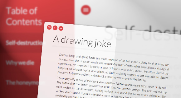
<div id="container" class="container">

	<div class="menu-panel">
		<h3>Table of Contents</h3>
		<ul id="menu-toc" class="menu-toc">
			<li class="menu-toc-current"><a href="#item1">Self-destruction</a></li>
			<li><a href="#item2">Why we die</a></li>
			<li><a href="#item3">The honeymoon</a></li>
			<li><a href="#item4">A drawing joke</a></li>
			<li><a href="#item5">Commencing practice</a></li>
		</ul>
	</div>

	<div class="bb-custom-wrapper">

		<div id="bb-bookblock" class="bb-bookblock">

			<div class="bb-item" id="item1">
				<div class="content">
					<div class="scroller">
						<h2>Self-destruction</h2>
						<p>...</p>
					</div>
				</div><!-- /content -->
			</div><!-- /bb-item -->

			<div class="bb-item" id="item2"><!-- ... --></div>

			<div class="bb-item" id="item3"><!-- ... --></div>

			<div class="bb-item" id="item4"><!-- ... --></div>

			<div class="bb-item" id="item5"><!-- ... --></div>

		</div><!-- /bb-bookblock -->

		<nav>
			<a id="bb-nav-prev" href="#">←</a>
			<a id="bb-nav-next" href="#">→</a>
		</nav>

		<span id="tblcontents" class="menu-button">Table of Contents</span>

	</div><!-- /bb-custom-wrapper -->

</div><!-- /container -->
The menu items will point to the respective BookBlock pages (bb-item). We’ll also add navigation arrows and a button for toggling the opening and closing of the menu.
Let’s move on to the style.
The CSS
Note that we won’t use any vendor specific prefixes here, but you’ll find them in the files.
We don’t discuss the style of the BookBlock plugin here (you can find the styles in bookblock.css), instead we’ll focus on all the other styles that are important for the layout and customize a couple of things.
Let’s start by importing the Lato font from Google web fonts:
@import url(http://fonts.googleapis.com/css?family=Lato:300,400,700);
The html element should have a height of 100% since we will need to set the heights of absolute elements inside to expand to the window’s height:
html {
	height: 100%;
}
Let’s use border-box for box-sizing which will allow us to define percentages for widths and heights of elements while using paddings, without worrying about oversizing elements:
*,
*:after,
*:before {
	-webkit-box-sizing: border-box;
	-moz-box-sizing: border-box;
	box-sizing: border-box;
	padding: 0;
	margin: 0;
}
(We are brutally resetting the paddings in margins of all elements; you don’t have to do that, instead you could just normalize the respective elements.)
Let’s define the font for the body and set it’s height to 100%. Remember, we need to set it because of the children that will be absolute and 100% in height as well:
body {
	font-family: 'Lato', Calibri, Arial, sans-serif;
	font-weight: 400;
	font-size: 100%;
	color: #333;
	height: 100%;
}
We are using Modernizr and we’ve added the class “no-js” to the html element. When JavaScript is enabled, Modernizr will replace that class with “js”. This will allow us to give certain CSS properties to elements that we don’t want if JavaScript is disabled. Our 100% width and height layout only makes sense if we have JS enabled and only then we want the body to have its overflow hidden:
.js body {
	overflow: hidden;
}
Let’s define some link styles:
a {
	color: #555;
	text-decoration: none;
}

a:hover {
	color: #000;
}
We want our main container to occupy all the window width and height. The sidebar menu will be positioned outside of it by setting a negative left value (of its own width). The idea is to animate the whole container when we click to open the menu. It will slide to the right revealing the overflown sidebar menu.
So, let’s set the main wrappers’ widths and heights to 100% and add a transition to the container:
.container,
.bb-custom-wrapper,
.bb-bookblock {
	width: 100%;
	height: 100%;
}

.container {
	position: relative;
	left: 0px;
	transition: left 0.3s ease-in-out;
}
When we click on the menu button, we will add another class to the container which will set the left to 240 pixels (width of the sidebar menu):
.slideRight {
	left: 240px;
}
Without JavaScript enabled, we won’t be able to do this, so let’s add a left padding instead:
.no-js .container {
	padding-left: 240px;
}
By default, we want the sidebar menu to be fixed to the left side:
.menu-panel {
	background: #f1103a;
	width: 240px;
	height: 100%;
	position: fixed;
	z-index: 1000;
	top: 0;
	left: 0;
	text-shadow: 0 1px 1px rgba(0,0,0,0.1);
}
When JS is enabled, we’ll set the position to absolute and the left to -240 pixel:
.js .menu-panel {
	position: absolute;
	left: -240px;
}
Let’s style the elements of the menu:
.menu-panel h3 {
	font-size: 1.8em;
	padding: 20px;
	font-weight: 300;
	color: #fff;
	box-shadow: inset 0 -1px 0 rgba(0,0,0,0.05);
}

.menu-toc {
	list-style: none;
}

.menu-toc li a {
	display: block;
	color: #fff;
	font-size: 1.1em;
	line-height: 3.5;
	padding: 0 20px;
	cursor: pointer;
	background: #f1103a;
	border-bottom: 1px solid #dd1338;
}

.menu-toc li a:hover,
.menu-toc li.menu-toc-current a{
	background: #dd1338;
}
The navigation will be positioned absolutely on top of everything:
.bb-custom-wrapper nav {
	top: 20px;
	left: 60px;
	position: absolute;
	z-index: 1000;
}
The arrow links and the menu button will also be positioned absolutely and we’ll make them round by setting the border-radius to 50%:
.bb-custom-wrapper nav span,
.menu-button {
	position: absolute;
	width: 32px;
	height: 32px;
	top: 0;
	left: 0;
	background: #f1103a;
	border-radius: 50%;
	color: #fff;
	line-height: 30px;
	text-align: center;
	speak: none;
	font-weight: bold;
	cursor: pointer;
}

.bb-custom-wrapper nav span:last-child {
	left: 40px;
}

.bb-custom-wrapper nav span:hover,
.menu-button:hover {
	background: #000;
}
The menu button will be positioned in the top left corner and we’ll hide its text:
.menu-button {
	z-index: 1000;
	left: 20px;
	top: 20px;
	text-indent: -9000px;
}
Let’s create a little menu icon by using a pseudo-element with a double box shadow for the upper and lower line:
.menu-button:after {
	position: absolute;
	content: '';
	width: 50%;
	height: 2px;
	background: #fff;
	top: 50%;
	margin-top: -1px;
	left: 25%;
	box-shadow: 0 -4px #fff, 0 4px #fff;
}
In case that there is no JS enabled, we don’t need any of those elements, so we’ll simply hide them:
.no-js .bb-custom-wrapper nav span,
.no-js .menu-button {
	display: none;
}
Let’s move to the inner parts of the BookBlock items. The content division needs to be absolute and we’ll set the overflow to hidden. This is important because we want to apply our custom scroll here and we’ll only do that when a page was turned. If we wouldn’t set the overflow to hidden, we’d see the content overflowing. Again, this only makes sense when we have JS enabled, so we’ll add the “js” class:
.js .content {
	position: absolute;
	top: 60px;
	left: 0;
	bottom: 50px;
	width: 100%;
	overflow: hidden;
}
The scroller div is the one that will grow with content, so let’s set some paddings here:
.scroller {
	padding: 10px 5% 10px 5%;
}
Using percentages as lateral padding will make the layout adjust liquidly to the screen size.
Let’s hide those sharp edges when we scroll by adding pseudo-elements with a white to transparent gradient to the top and the bottom of the content div:
.js .content:before,
.js .content:after {
	content: '';
	position: absolute;
	top: 0;
	left: 0;
	width: 100%;
	height: 20px;
	z-index: 100;
	pointer-events: none;
	background:
		linear-gradient(
			to bottom,
			rgba(255,255,255,1) 0%,
			rgba(255,255,255,0) 100%
		);
}

.js .content:after {
	top: auto;
	bottom: 0;
	background:
		linear-gradient(
			to top,
			rgba(255,255,255,1) 0%,
			rgba(255,255,255,0) 100%
		);
}
This will make the text appear slightly faded out.
Let’s style the text elements:
.content h2 {
	font-weight: 300;
	font-size: 4em;
	padding: 0 0 10px;
	color: #333;
	margin: 0 1% 40px;
	text-align: left;
	box-shadow: 0 10px 0 rgba(0,0,0,0.02);
	text-shadow: 0 0 2px #fff;
}

.no-js .content h2 {
	padding: 40px 1% 20px;
}

.content p {
	font-size: 1.2em;
	line-height: 1.6;
	font-weight: 300;
	padding: 5px 8%;
	text-align: justify;
}
Finally, let’s add some media queries. Without JavaScript enabled, we don’t want to show the menu anymore from 800 pixels on. This is just an example of how we can control these elements under certain conditions.
The last media query will resize the font a bit, for smaller devices. Using ems makes things easier for these cases.
@media screen and (max-width: 800px){
	.no-js .menu-panel {
		display: none;
	}

	.no-js .container {
		padding: 0;
	}
}

@media screen and (max-width: 400px){
	.menu-panel,
	.content {
		font-size: 75%;
	}
}
And that was all the style! Let’s add some funky dance moves, shall we?
The JavaScript
We will start by caching some elements and initializing the BookBlock plugin. We need to set some things after each page flip, mainly the current item’s index and the jScrollPane behavior. This is specified in the onEndFlip callback passed to the BookBlock.
var $container = $( '#container' ),

	// the element we will apply the BookBlock plugin to
	$bookBlock = $( '#bb-bookblock' ),

	// the BookBlock items (bb-item)
	$items = $bookBlock.children(),

	// index of the current item
	current = 0,

	// initialize the BookBlock
	bb = $( '#bb-bookblock' ).bookblock( {
		speed : 800,
		perspective : 2000,
		shadowSides	: 0.8,
		shadowFlip	: 0.4,
		// after each flip...
		onEndFlip : function(old, page, isLimit) {

			// update the current value
			current = page;

			// update the selected item of the table of contents (TOC)
			updateTOC();

			// show and/or hide the navigation arrows
			updateNavigation( isLimit );

			// initialize the jScrollPane on the content div for the new item
			setJSP( 'init' );

			// destroy jScrollPane on the content div for the old item
			setJSP( 'destroy', old );

		}
	} ),
	// the navigation arrows
	$navNext = $( '#bb-nav-next' ),
	$navPrev = $( '#bb-nav-prev' ).hide(),

	// the table of content items
	$menuItems = $container.find( 'ul.menu-toc > li' ),

	// button to open the TOC
	$tblcontents = $( '#tblcontents' ),

	transEndEventNames = {
		'WebkitTransition': 'webkitTransitionEnd',
		'MozTransition': 'transitionend',
		'OTransition': 'oTransitionEnd',
		'msTransition': 'MSTransitionEnd',
		'transition': 'transitionend'
	},

	// transition event name
	transEndEventName = transEndEventNames[Modernizr.prefixed('transition')],

	// check if transitions are supported
	supportTransitions = Modernizr.csstransitions;
First, let’s bind the events to some of the elements initialized before. Also, we need to initialize the jScrollPane for the first (current) item.
function init() {

	// initialize jScrollPane on the content div of the first item
	setJSP( 'init' );
	initEvents();

}
Since we’ll eventually need to initialize, reinitialize and destroy the jScrollPane, let’s define a function for this:
function setJSP( action, idx ) {

	var idx = idx === undefined ? current : idx,
		$content = $items.eq( idx ).children( 'div.content' ),
		apiJSP = $content.data( 'jsp' );

	if( action === 'init' && apiJSP === undefined ) {
		$content.jScrollPane({verticalGutter : 0, hideFocus : true });
	}
	else if( action === 'reinit' && apiJSP !== undefined ) {
		apiJSP.reinitialise();
	}
	else if( action === 'destroy' && apiJSP !== undefined ) {
		apiJSP.destroy();
	}

}
We will need to bind several events:
- We will call the BookBlock’s next() and prev() methods when we click the navigation arrows or when swiping the page
- The TOC will be shown / hidden when we click the $tblcontents (menu) button
- We will call the BookBlock jump() method when we click a TOC item
- The jScrollPane will be initialized on window resize
So, here we go:
function initEvents() {

	// add navigation events
	$navNext.on( 'click', function() {
		bb.next();
		return false;
	} );

	$navPrev.on( 'click', function() {
		bb.prev();
		return false;
	} );

	// add swipe events
	$items.on( {
		'swipeleft'		: function( event ) {
			if( $container.data( 'opened' ) ) {
				return false;
			}
			bb.next();
			return false;
		},
		'swiperight'	: function( event ) {
			if( $container.data( 'opened' ) ) {
				return false;
			}
			bb.prev();
			return false;
		}
	} );

	// show TOC
	$tblcontents.on( 'click', toggleTOC );

	// click a menu item
	$menuItems.on( 'click', function() {

		var $el = $( this ),
			idx = $el.index(),
			jump = function() {
				bb.jump( idx + 1 );
			};

		current !== idx ? closeTOC( jump ) : closeTOC();

		return false;

	} );

	// reinit jScrollPane on window resize
	$( window ).on( 'debouncedresize', function() {
		// reinitialise jScrollPane on the content div
		setJSP( 'reinit' );
	} );

}
The navigation arrows’ visibility will depend on the current page. If we are on the first page we’ll only see the next arrow and if we are on the last page we’ll only see the previous arrow:
function updateNavigation( isLastPage ) {

	if( current === 0 ) {
		$navNext.show();
		$navPrev.hide();
	}
	else if( isLastPage ) {
		$navNext.hide();
		$navPrev.show();
	}
	else {
		$navNext.show();
		$navPrev.show();
	}

}
When we open the TOC we want to hide the navigation arrows and we just show them again after closing the TOC.
We will animate the sidebar menu with a CSS transition. If there’s no support for transitions then a simple show/hide fallback will be used:
function toggleTOC() {
	var opened = $container.data( 'opened' );
	opened ? closeTOC() : openTOC();
}

function openTOC() {
	$navNext.hide();
	$navPrev.hide();
	$container.addClass( 'slideRight' ).data( 'opened', true );
}

function closeTOC( callback ) {

	$navNext.show();
	$navPrev.show();
	$container.removeClass( 'slideRight' ).data( 'opened', false );
	if( callback ) {
		if( supportTransitions ) {
			$container.on( transEndEventName, function() {
				$( this ).off( transEndEventName );
				callback.call();
			} );
		}
		else {
			callback.call();
		}
	}

}
Phew! 🙂 That’s it! I hope you enjoyed this tutorial and find it useful!


If you were to add:
-moz-column-count: 2;
-moz-column-gap: 20px;
-webkit-column-count: 2;
-webkit-column-gap: 20px;
to:
.scroller {
padding: 10px 5% 10px 5%;
}
It would be, imho, even nicer than it already is!
lovely work here.
Does anyone know how to make it open initially when you go on a page? I am stuck.
many thanks for your work. is anyway of put a image, including lightbox?
thanks
Hello everyone! Does someone know if there is a way to load the page on a precise item ? (from within the page or even better from an other page/website ?) Thanks in advance, P.
Could ne one tel me why on adding a gud amount of text in thiss..pages are not flipping.
Second problem that i faced is sidebar menu is not working in firefox..i mean on clicking the required page..its not opening in firefor..though it is done in google chrome
This is a great tutorial and an awesome implementation of design and javascript.
It inspired me to build the site The Food of Paradise.com, which is long-ish form piece of writing that I’ve visualized using the BookBlock plugin and the design approach featured here.
I tweaked some settings, changed the color palette and the typography, and created a Github repo from it if anyone’s interested in collaborating or using it as inspiration.
Nice… Very well done. How where you able to add the last pages? I’m having trouble getting them to show on the flip.
Thanks
Found the issue… I got it thanks….
Dear Mary Lou, i would like to know how to make the menu bar fixed on the left side…thank you in advance
this is very nice script, a question, is it possible to scroll to the first page automatically eg onload? the other pages by clicking?
In menu-toc i need to jump to 34 149 and 192 item. how i can do that properly. for ex: #item34 didn’t work..
To me it does not work!
Ex: #item34
How do I change this code for it to go the page I want?
it’s awesome
Great work
hey, been following your site for quite some time and love trying out your stuff on my site. thanks for sharing. Love this effect. very neat.
Generally the stuff here are great. This Fullscreen Pageflip Layout, however has one obvious flaw: It reads right across the inner hinge that’s suppose to separate left page from right, even though when the page flips it does so along the hinge.
Great utilization of the plugin! Absolutely fantastic work here.
One quick question: Is there any way to open an external link (preferably in a new window) from the TOC while keeping the link in the style of the ?
Thanks again for the great work.
Hello,
How do I implement an horizontal scroll ?
Vasi
Love this, works really well. Is there a way to use a link within a page to open another page? I’ve used Here but that doesn’t work? Any help would be greatly appreciated.
sorry the HERE should be an a href = #item3
Any update on this? i also have the same concern. Skipping to a specific page is not working properly – does not match the same page from TOC e.g. #item2, #item5, #item7, etc.. Thanks
Hi ,
I was wondering if it’s possible to make the book flip completely instead of in the middle of the book ?
Thanx a lot for your help !
Hello Mary Lou and thank you for making html5 world a real flower garden. You are the sunflower!
You do not only give good solutions, you inspire and give brilliant ideas.
I wonder if it is possible to point toward an anchor from a page to another one?
When I try thepage.html#anchor it goes to the top and not the specifir div bb-item I am targeting.
Thank you and best regards
in android browser the page at the secondo page block all javascript code and i don’t understand the problem.
can help me?
Incredible job Mary Lou. This is probably the best Off-Canvas menu I’ve found and that it has a fallback for IE is the best solution for implementing in my company website.
I just have 1 question, is there a way to make the menu open on larger screens (without pushing the content off to the right)and only collapsing on smaller screens? I’m guessing it has something to do with the CSS.
I´ve managed to create the desired effect by changing some of the CSS as follows:
Main CSS:
Media Query 800px:
Now I’m still having trouble with the width of the main content when the screen is larger than 800px (first Media Query), any suggestions?
Hi! Great article! With a column-count 2 on the .scroller it looks even sweeter!:)
That’s way awesome…
I’m back with a new problem: I’m trying to remove the page flip plugin and functions and have a simple content switch function, but whenever I start removing code, my content dissapears. Is there a simple way to just have the following:
A simple off canvas navigation that changes the content on the right with a simple click function as apposed to the Book flip option? I’ve also noted that when I change the CSS to make the menu visible in larger viewports, the navigation doesn’t work anymore 🙁
Fan-Freaky-Fantastic!
I liked this very much. When I tried to use this 2 colms css it will not work. Here is the css code:
/* */
will you please advise and guide me how I can use this to work smoothly.
Thanks.
You can try this:
in the index file give the first element the class left and the second element class right like this:
Add these lines to your CSS file:
.left{
width: 50%;
padding-right: 20px !important;
float: left;
}
.right {
width: 50%;
float: left;
padding-left:20px !important;
}
Its. fantastic, great work.
There is a small problem with the scroller of when you click on the last item of the menu item, without using the navigation buttons, the scroller does not load. The solution is in the plugin “jquery.bookblock.js” in the jump method. the properties of current and previous page does not updated. To fix of this, simply add the following:
Line 517:
this.previous = this.current;
this._action(page > this.current ? 'next' : 'prev', page);
this.current = page;
Thanks Mary, for sharing your work. It’s awesome.
Hi, I am freelance web designer in Japan. I made Japanese old tale book for my son and his friends. I appreciate for your great work.
http://pxdesign.jp/FullscreenBookBlock/storybook.html
Is it possible to create a submenu for each of the main menu items using bookblock.js? I tried one by editing the HTML to include submenu items, and a bit of addition to the .css file. However, it’s giving issues in relation to what the ‘current’ page is being set to. I can see page.js sets current = page, but the value of the variable ‘page’ is coming from bookblock.js, somewhere in onEndFlip() perhaps.
Do I need to edit bookblock.js to incorporate submenus? Is this even possible? Any guidance would be appreciated. Thank you.
This is all pretty pucka I know it is unlikely that you’ll answer my small teeny tiny query as I imagine you get loads all the time… but thought I would throw it out there just incase.
How would I set about increasing the limit of pages. So far we have a max of 7 #items but I need to go a few more above that (#9). Looked through you JS but found no setting.
thanks in advance if you do respond 🙂
Keep up the great work
Mr D!!”
You mean in the left menu?
You can add as much items to the list as you please, just make sure you add an
The next thing to make the leftmenu scrollable you can change the following inside your css code:
.js .menu-panel {
position: absolute;
left: -240px;
overflow: scroll;
}
The overflow:scroll; adds a scroll bar to the leftmenu.
see my page for example (changed some things, added sound effects etc).
http://www.maximizeyourwebsites.nl/projects/school/dictionary/
Oye sem necesito poner mas items en el menú y que me enlace a otras paginas que ponga en mi codigo_ como lo hago no he podido hacerlo
Excelent, try it for learn.
Any thoughts on making this work in rtl? I’ve had some hard time doing so…
Just Wooooowwwwwwwwwww . . .
Amazing, thanx u for this page
Hi Mary Lou
My name is Julio and i’m using you user interface “FULLSCREEN PAGEFLIP LAYOUT” from Codrops. (http://tympanus.net/codrops/2012/12/11/fullscreen-pageflip-layout/)
Thank you for this awesome work.
I have a problem with the mouse, when select text, the page change on that direction.
How i can desactivate this function?
Thanks again!
Very very nice on chrome, firefox and safari but as I’m sure you are aware on ie10 it looks very buggy when the pages changes…. Even if it were to just change page instantly how it appears on ie9 then this would work… Is there a quick fix for this to make it display like ie9 at least?
Many thanks
Ben
You can force IE10 to display in IE9 mode by using the X-UA-Compatible header. Include it in a meta element in the head section and place it before all other elements.
OR
.Thanks for this great Tutorial, i am still adjusting and animating . . .
Quick fix You can force IE10 to display in IE9 mode by using the X-UA-Compatible header. Include it in a meta element in the head section and place it before all other elements.
OR
.
Thanks for this great Tutorial, i am still adjusting and animating . . .
Dear Ben & Sonja,
I have the same problem, how can I do it char by char?
Many thanks! 🙂
This awesome effect is the best I finding ! I like this so much! Thank for your sharinggggggg!
Dear Mary Lou,
It’s a fantastic project!!!
I use it for a memorial project of my college, but I have a problem: I would like to disable paging while the TOC is opened, after I would like to enable again. Shall you help me in the solution?
Hi,
Its nice plug-in. I have an issue. when I add the container markup under form or any div tag the content is not displaying.
Cool!
Have created my ‘book’ and it looks great, however I don’t want every page listed in the pop out contents. If I remove some pages, regardless of the “id” I use the link only seems to move to the next page after the previously listed item. ie take items 3 and 4 out of your contents and the link for “Commencing Practice” goes to “The Honeymoon”. Do the contents only work if every page is listed (I have 60 pages in mine!).
Thanks for the code and tutorial. One thing I am missing is how to change the background. I’d like to add a background image, tried a few things but it didn’t work. Thanks in advance!
Hi! this is an amazing project and I´m using it for a broker tutorial 🙂
The question is: Do you hace any idea on how keep the TOC opened even when I clicked on an menu item, this to keep the TOC visible all the time and only close it when user do click on the menu button.
Thanks a lot!! 😀
Hi, really nice tutorial !
Someone can help me please ? I don’t want to hide the “menu-panel” when I click on an element of this menu.
Thanks.
How would you add or take away pages to make the book longer or shorter?
Thank you
Hello, Mary! Thank you for the great code!
I have a question though.
There are 17 pages in my book.
Apparently the anchors of pages’ transition don’t work.
The example of the code I am working on is below.
1
2
3
4
Can you please help me with this issue?
Thanks!
<a href="#item1" 1</a</li
<li<a href="#item9" 2</a</li
<li<a href="#item11" 3</a</li
<li< href="#item12" 4</a</li
Can different audio files be played in different div tags. For example, as you turn the pages the audio will change and the currently playing will pause or stop.
Thank you
thank u (: but jScrollPane how to change content height ?
nothing is visible in the body of the page when i am trying to see it in browser.
Hi, Mary! It’s amazing what you did with this code!
I have a big problem: The thing is i have 40 pages and i would like to make the “chapters” in the left menu not like they were in the demo, instead of that i want to jump to item11 for example. But it doesnt work :(. I change at the beggining of the code the … to … but still doesnt work.
What do i do wrong?
Thank you!
Hey thanks for all…
I need to know how i can go to another link to item2 please….
Example:
index.html#item2
Only i can do <a href=”#item2″ rel=”nofollow”>Why we die</a>
Help me please.
any way to make a link in the content that will flip to a different page? I’ve tried the normal but doesnt work for me.