From our sponsor: Leverage AI for dynamic, custom website builds with ease.
Let’s face it, people scan websites before they digest the content. You know you do it, every time you hit a new website you quickly scan around, maybe even scroll to the bottom of the page to see how much info is on it before you go back to the top and start from the beginning. So what makes you stop then and dig deeper into what the website has to offer? Well, it’s simple, the design does. Something in the design must catch your attention, something must jump out at you.
There is a lot that goes into a web site design that will get the reader to stop and stick around for a bit. But there is one foundational principle before you dive into “call-to-actions” or visual hierarchy and that is shape. This article is going to be focused on shape and how shape can be used to improve your overall site design – hopefully getting people to scan the design and find something they want to dive into.
It’s Pretty Simple
It’s a pretty simple design principle: people recognize the outline of a shape quicker than they recognize the content within it. Which means that differing shapes used in design can quickly add interest, separate content and break the scan path so that while people scan they are visually forced to stop at some point and become interested.
While sometimes you want to use a differing shape to grab attention, you may also want to use repeating shapes with large amount of content so that your user can scan faster and hold their attention. This is the case of Pinterest where the repeating rectangle shapes allow the user to scan a large image collection and let the images grab their attention. Shape is simply just a great way to either grab or hold your users attention. Selecting shapes and shape patterns will depend on what the content is, what your user goals are and how much content you have.

Shapes are Awesome
Shape is a simple design tool in building a visually appealing and ‘moving’ experience. But before we talk about using shape to pave the way for your user, let’s back up and take a look at what kind of shapes you can use in your site design:
- Geometric Shapes: The basic shapes like squares, circles, triangles and rectangles. These are the shapes you’ll be working with.
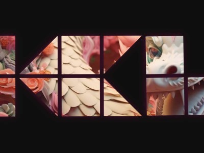
- Organic Shapes: Pretty much the opposite of geometric shapes. These types of shapes don’t have any ‘regular’ look to them. Think about shapes that are found in nature like rain drops, leaves, blades of grass – or even just spill your soda on the ground – that is an organic shape.
- Abstract Shape: These shapes are not ‘real’. Abstract shapes are just that – abstractions from regular things/shapes or just simple representations of things/shapes. The best web example of an abstract shape is a typographic glyph or even icons.

For the most part you’ll be dealing with geometric and abstract shapes when it comes to web design, mainly because these are the shapes that create content and layout or make up icons and fonts. Organic shapes are more used in the visual design of the site or within the inline images or background images that are being used in the site. In most cases, geometric and abstract shapes will frame or outline the organic shapes created by photography or graphic design. Sometimes you’ll want to use these shapes to guide the user to view a particular photograph or just simply display the more organic design elements in a scannable form.
Grabbing Attention
Shape is an excellent way to grab your user’s attention, it’s a great tool for creating visual hierarchy. We talk a lot about creating a strong and clear call-to-action and while color, messaging, header and downright attention-grabbing content can build a good call-to-action, shape can be a quick and easy way to grab the user’s attention.
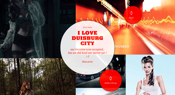
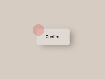
- Shapes: Just like using a bright color to grab the user’s attention, using a random or contrasting shape in your design can also grab the users attention. If your site generally consists of square or rectangular shapes, an injection of a circular shape can really grab the user’s attention. As the user scans the page they will quickly be able to see that one of the shapes is not like the other and that will catch their eye.
- Sizes: Proportion is another great way to grab the user’s attention with shape and create contrast. Proportion is essentially the size and scale relationship of two or more shapes on the page. Say, most of your site content is in small rectangular shaped paragraphs. If one of the those paragraphs is much larger than it’s surrounding smaller paragraphs, that large paragraph will jump out – if only just out of curiosity. A large hero image will stand out more in comparison to many thumbnails around it.

Comfortable Content
Sometimes all you really want to do is let the site design stand back and let the more organic shaped content stand out. In this case you probably want to do the opposite of contrast and focus more of creating a smooth scanning surface by using repeating shapes and sizes. This may seem pretty boring at first thought – it’s basically just creating a grid. But this “shape assembly line” is a great device for allowing your user to scan large qualities of content and allowing them to find what they want versus force them to a specific focal point.
Repeating shapes throughout a design can create comfort and predictability as well. Sometimes your content doesn’t demand a glaring call-to-action but rather a more easy going mood. A blog or magazine is a great example of this. Blogs and magazine layouts are pretty predictable and shapes are almost overly repeated, but this repeating shape and size allows users to more easily scan and read the content because there isn’t a bunch of other objects begging for attention.

Get Negative
Negative shapes are shapes too and these shapes and spaces can also play critical roles to grabbing the user’s attention or creating comfortable and scannable design. Jagged content edges and random shapes that are created in the space between the positive shapes can be just as equally eye catching. You may want to watch your negative shapes as they may distract the user. If you’re really good, consider using these negative shapes to your advantage by adding subtle guidance or references to the their positive counterparts. Or just hide secret messages in your negative shapes and spaces.

Just Visually Appealing
It’s a pretty simple design principle: people recognize the outline of a shape quicker than they recognize the content within it – this also makes shapes just simply more visually appealing than content. The way elements come together to create new shape outlines, the way smaller shapes comprise larger shapes and the way shapes react or balance off each other can just simply be interesting. We see this all the time in really well designed fonts where each glyph compliments and builds upon another to create an even more interesting shape.
Whether you are aiming for an attention-grabbing path or just a smooth and scannable surface, shape can be interesting whether it’s obnoxious or subtle. Take advantage of shape and play around with new shapes in your designs to create a more visual appealing experience for your user.

Amazing tips. I use circles in lots of my designs to grab attention.
Thx for the interesting stuff and the great examples… <3 codrops
When I think about the use of shapes to convey comfort, Pinterest pops into my mind. Its masonry-style layout arranges rectangular images with accommodation for various vertical heights, giving the page a puzzle-piece tightness that projects comfort, tidiness, and delight for the user. This lends itself to Pinterest’s wild success as a content-sharing platform; you can throw just about anything up on a Pinterest page and it will look interesting. The masonry-style layout facilitates “taste making” online.
Great article, thank you!
Sarah Bauer
Navigator Multimedia
the luxury class ~_~’
a really refreshing article. I love it, it just makes so much sense!