From our sponsor: Leverage AI for dynamic, custom website builds with ease.
Today we are going to create some fancy block quote styles. Using textures, circles, and pseudo-elements, we can put some life into quotations and testimonials.
We will omit vendor prefixes in this tutorial. But you’ll of course find them in the files.
The Markup
The markup for the blockquotes will be as followed:
<div class="mb-wrap mb-style-1">
	<div class="mb-thumb"></div>
	<blockquote cite="http://www.gutenberg.org/ebooks/1257">
		<p>Never fear quarrels, but seek hazardous adventures.</p>
	</blockquote>
	<div class="mb-attribution">
		<p class="mb-author">Alexandre Dumas</p>
		<cite><a href="http://www.gutenberg.org/ebooks/1257">The Three Musketeers</a></cite>
	</div>
</div>
The division with the class mb-thumb will not be present in all the examples. In example 3 we will actually add it as a child to the division with the class mb-attribution.
The CSS
Let’s first define some common styles:
@font-face {
	font-family: 'icons';
	src: url("font/icons.eot");
	src:
		url("font/icons.eot?#iefix") format('embedded-opentype'),
		url("font/icons.woff") format('woff'),
		url("font/icons.ttf") format('truetype'),
		url("font/icons.svg#icons") format('svg');
	font-weight: normal;
	font-style: normal;
}

/* Let's set and reset some common styles */
.mb-wrap {
	width: 300px;
	margin: 20px auto;
	padding: 20px;
	position: relative;
}

.mb-wrap p{
	margin: 0;
	padding: 0;
}

.mb-wrap blockquote {
	margin: 0;
	padding: 0;
	position: relative;
}

.mb-wrap cite {
	font-style: normal;
}
We are adding an icon font that we’ll use in some examples. We are also setting some default styles for the quote wrapper and the inner elements. Note, that there are some default styles for some of the elements, so we want to reset them.
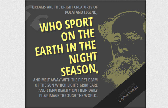
Example 1
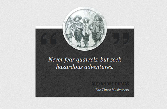
The first example will have a leather background and a round thumbnail for decoration.
So, let’s style the whole wrapper first. We’ll give it the background texture and redefine the width:
.mb-style-1 {
	background: #363738 url(../images/dark_leather.jpg) repeat top left;
	margin-top: 100px;
	padding-top: 100px;
	width: 400px;
	color: #fff;
	box-shadow: 1px 1px 3px rgba(0,0,0,0.3);
	border-top: 10px solid #fff;
}
The round thumbnail will be pulled up by using a negative top value. With a semi-transparent border, we will add some flair:
.mb-style-1 .mb-thumb {
	display: block;
	width: 180px;
	height: 180px;
	border: 10px solid rgba(255,255,255,0.5);
	border-radius: 50%;
	background: url(../images/Dartagnan-musketeers.jpg) no-repeat center center;
	position: absolute;
	left: 50%;
	top: -90px;
	margin: 0 0 0 -90px;
	box-shadow:
		inset 1px 1px 4px rgba(0,0,0,0.5),
		0 2px 3px rgba(0,0,0,0.6);
}
For adding the quotation marks, we will use the icon font that we have included before and the pseudo-classes :before and :after. The will have an engraved style since we are setting a dark color with a light text shadow:
.mb-style-1 blockquote:before,
.mb-style-1 blockquote:after {
	font-family: 'icons';
	position: absolute;
	font-size: 70px;
	top: -95px;
	color: #242526;
	text-shadow: 0 1px 1px rgba(255,255,255,0.1);
}

.mb-style-1 blockquote:before{
	content: '275d';
}

.mb-style-1 blockquote:after{
	right: 0px;
	content: 'e800';
}
The styles for the text elements will be as follows:
.mb-style-1 blockquote p {
	font-family: Cambria, Georgia, serif;
	font-style: italic;
	font-size: 25px;
	border-bottom: 1px solid rgba(0,0,0,0.5);
	box-shadow: 0 1px 0 rgba(255,255,255,0.1);
	padding: 10px 10px 20px 10px;
	text-align: center;
	margin: 0 0 20px 0;
	text-shadow: 1px 1px 2px rgba(0,0,0,0.6);
}

.mb-style-1 .mb-attribution {
	text-align: right;
}

.mb-style-1 .mb-author{
	text-transform: uppercase;
	font-size: 20px;
	font-weight: bold;
	color: #1b1c1d;
	text-shadow: 0 1px 1px rgba(255,255,255,0.1);
}

.mb-style-1 cite a{
	color: #f0f0f0;
	font-style: italic;
	font-family: Cambria, Georgia, serif;
	text-shadow: 1px 1px 1px rgba(0,0,0,0.7)
}

.mb-style-1 cite a:hover{
	text-shadow: 2px 2px 3px rgba(0,0,0,0.9)
}
And that was example one! Let’s check out the next one.
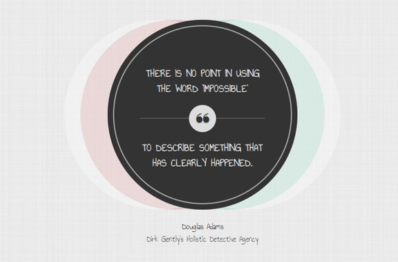
Example 2
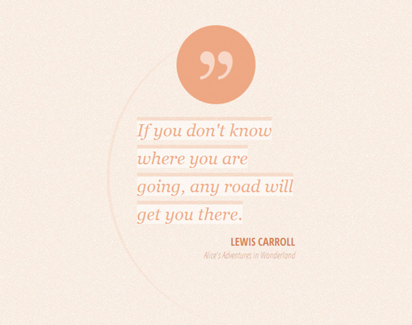
Example 2 will have a fancy asymmetrical style with a rounded element on its left side. On the top we want to show a circle with a quotation mark. So let’s first add some padding to the blockquote to push it down:
.mb-style-2 blockquote{
	padding-top: 150px;
}
The circular pseudo-element has the following style:
.mb-style-2 blockquote:after {
	font-family: 'icons';
	background: rgba(235,150,108,0.8);
	width: 130px;
	height: 130px;
	border-radius: 50%;
	content: '275e';
	position: absolute;
	font-size: 70px;
	line-height: 130px;
	text-align: center;
	top: 0px;
	left: 50%;
	margin-left: -65px;
	color: rgba(255,255,255,0.5);
	text-shadow: 0 1px 1px rgba(255,255,255,0.1);
}
We are centering it horizontally by setting the left to 50% and giving a negative left margin of half of its width.
Now, let’s add that partial circle by using another pseud-element. We give it a width and height of 500px, a border radius of 50% and just a left border. This will create the shape:
.mb-style-2 blockquote:before{
	content: '';
	width: 500px;
	height: 500px;
	border-radius: 50%;
	border-left: 5px solid rgba(235,150,108,0.1);
	position: absolute;
	top: 0px;
	left: -50px;
	z-index: -1;
}
The paragraph of the blockquote will be set to inline because we want to separate the lines:
.mb-style-2 blockquote p {
	font-family: Baskerville, Georgia, serif;
	font-size: 28px;
	font-style: italic;
	background: rgba(255,255,255,0.5);
	display: inline;
	color: rgba(235,150,108,0.8);
	text-shadow: 0 1px 1px rgba(255,255,255,0.5);
	line-height: 46px;
	box-shadow: 0 -6px 0 rgba(235,150,108,0.2);
}
And finally, let’s define the style for the resting text elements:
.mb-style-2 .mb-attribution {
	text-align: right;
}

.mb-style-2 .mb-author{
	text-transform: uppercase;
	font-size: 18px;
	padding-top: 10px;
	font-weight: bold;
	color: #d48158;
	text-shadow: 0 1px 1px rgba(255,255,255,0.1);
}

.mb-style-2 cite a{
	color: #d7aa94;
	font-style: italic;
}

.mb-style-2 cite a:hover{
	color: #d48158;
}
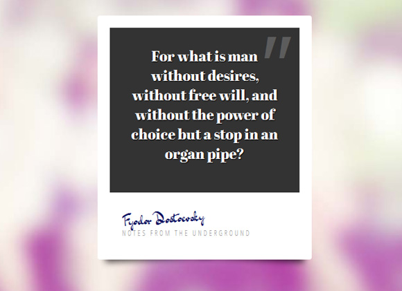
Example 3
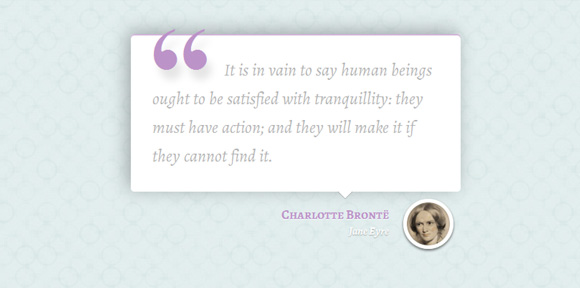
For the third style, we want to enlarge the wrapper and set a box shadow for the blockquote:
.mb-style-3 {
	width: 500px;
}

.mb-style-3 blockquote{
	background: #fff;
	padding: 30px;
	border-radius: 5px;
	box-shadow:
		inset 0 2px 0 rgba(188, 147, 200, 0.7),
		-5px -4px 25px rgba(0, 0, 0, 0.3);
}
We will add a little arrow to point down using the technique offered at CSS Arrow Please!:
.mb-style-3 blockquote:after,
.mb-style-3 blockquote:before  {
	top: 100%;
	border: solid transparent;
	content: " ";
	height: 0;
	width: 0;
	position: absolute;
	pointer-events: none;
}

.mb-style-3 blockquote:after  {
	border-top-color: #ffffff;
	border-width: 10px;
	left: 65%;
	margin-left: -10px;
}

.mb-style-3 blockquote:before {
	border-top-color: rgba(0,0,0,0.01);
	border-width: 11px;
	left: 65%;
	margin-left: -11px;
}
The paragraph will have the following style:
.mb-style-3 blockquote p {
	font-family: 'Alegreya', serif;
	font-size: 24px;
	color: #b4b4b4;
	font-weight: 400;
	line-height: 40px;
	font-style: italic;
	text-indent: 100px;
	position: relative;
}
Now, we will add a quotation mark to the left with the help of the pseudo-element :before:
.mb-style-3 blockquote p:before{
	content: '201C';
	font-family: serif;
	font-style: normal;
	font-weight: 700;
	position: absolute;
	font-size: 175px;
	top: 0px;
	left: -105px;
	color: rgba(188, 147, 200, 1);
	text-shadow: 7px 14px 10px rgba(0, 0, 0, 0.1);
}
The part with the link and the author will have a bigger right padding because of the thumb that we will add:
.mb-style-3 .mb-attribution {
	text-align: right;
	padding: 20px 100px 20px 20px;
	position: relative;
}
The thumbnail division will be a little circle with the author’s picture as background:
.mb-style-3 .mb-thumb {
	display: block;
	width: 70px;
	height: 70px;
	border: 5px solid #fff;
	border-radius: 50%;
	background: url(../images/bronte.jpg) no-repeat center center;
	position: absolute;
	right: 10px;
	bottom: 5px;
	box-shadow:
		inset 1px 1px 4px rgba(0,0,0,0.5),
		0 2px 3px rgba(0,0,0,0.6);
}
And the resting text-styles are as followed:
.mb-style-3 .mb-author{
	font-family: 'Alegreya SC', serif;
	font-weight: 700;
	font-size: 18px;
	color: rgba(188, 147, 200, 1);
	text-shadow: 0 1px 1px rgba(255,255,255,0.7);
}

.mb-style-3 cite a{
	font-family: 'Alegreya', serif;
	font-weight: 700;
	font-style: italic;
	color: #fff;
	text-shadow: 0 1px 1px rgba(0,0,0,0.3);
}

.mb-style-3 cite a:hover{
	color: rgba(188, 147, 200, 1);
	text-shadow: 0 1px 1px rgba(255,255,255,0.7);
}
Example 4
This example is a bit bolder. We’ll create a dark large box with a big sized quotation. The image of the author will be set as background to the whole thing:
.mb-style-4 {
	width: 600px;
	padding: 20px 240px 50px 20px;
	background: #444 url(../images/dickens.jpg) no-repeat 140% 25%;
	overflow: hidden;
	box-shadow: inset 0 0 10px rgba(0,0,0,0.6);
}
The paragraph of the blockquote will have an RGBA value for its color. This let’s us define an opacity value:
.mb-style-4 blockquote p {
	color: rgba(255,255,255,0.95);
	font-size: 21px;
	line-height: 26px;
	text-align: right;
	color: #999;
	text-transform: uppercase;
	font-weight: bold;
}
The span is going to have a special style. We’ll rotate it a bit and give it a larger text size and a different color:
.mb-style-4 blockquote p span {
	font-weight: 700;
	color: #fcf779;
	font-size: 58px;
	line-height: 58px;
	display: block;
	padding: 10px;
	text-shadow: 7px 7px 2px rgba(0,0,0,0.2);
	transform: rotate(-7deg) translateY(10px);
}
Let’s add a quotation mark from our icon set with the help of the before: pseudo-class:
.mb-style-4 blockquote p span:before {
	font-family: 'icons';
	content: '275d';
	font-weight: normal;
	opacity: 0.1;
	font-size: 136px;
	position: absolute;
	color: #fff;
	top: -50px;
	left: -25px;
	transform: rotate(45deg);
}
The opacity will be very low and we’ll rotate it in a 45 degrees angle.
The attribution division will be rotated in such a way that we can only see a triangle in the right corner:
.mb-style-4 .mb-attribution {
	text-align: right;
	text-transform: uppercase;
	font-weight: bold;
	background: #222;
	position: absolute;
	width: 100%;
	left: 0px;
	bottom: 0px;
	text-align: center;
	padding: 30px;
	transform: rotate(-40deg) translate(175px, 110px);
}
Let’s add a dash to the author element:
.mb-style-4 .mb-author:before {
	content: '2014';
	padding-right: 4px;
}

.mb-style-4 .mb-attribution cite a{
	color: #777;
}

.mb-style-4 .mb-attribution cite a:hover{
	color: #fcf779;
}
Example 5
The fifth example will appear as a set of circles. We are going to use multiple box shadows for the blockquote element in order to achieve that:
.mb-style-5 {
	width: 390px;
}

.mb-style-5 blockquote {
	text-align: center;
	background: #333;
	width: 350px;
	height: 350px;
	padding: 60px;
	border-radius: 50%;
	box-shadow:
		inset 0 0 0 10px #333,
		inset 0 0 0 12px rgba(255,255,255,0.6),
		80px 0 0 rgba(255,255,255,0.3),
		-80px 0 0 rgba(255,255,255,0.3),
		50px 0 0 rgba(60,185,145,0.2),
		-50px 0 0 rgba(185,60,60,0.2);
}
Let’s style the paragraph:
.mb-style-5 blockquote p {
	color: #fff;
	font-size: 20px;
	font-weight: 400;
	padding-top: 25px;
	text-transform: uppercase;
	text-shadow: 0 0 1px #fff, 0 1px 1px #000;
	font-family: 'Annie Use Your Telescope', cursive;
}
In order to separate the quote, we will put the last part of it into a span and give it some top margin and padding:
.mb-style-5 blockquote p span {
	display: block;
	position: relative;
	padding-top: 40px;
	margin-top: 40px;
	border-top: 1px solid rgba(255,255,255,0.3);
}
Let’s add the little circle with the quotation mark:
.mb-style-5 blockquote p span:before {
	position: absolute;
	width: 50px;
	height: 50px;
	background: #ddd;
	content: "275d";
	font-size: 40px;
	color: #333;
	top: 0px;
	left: 50%;
	margin: -25px 0 0 -25px;
	border-radius: 50%;
}
And finally, some styling for the other text elements:
.mb-style-5 .mb-attribution {
	text-align: center;
	font-family: 'Annie Use Your Telescope', cursive;
	padding: 20px;
	font-size: 16px;
}
.mb-style-5 cite a:hover{
	color: #000;
}
Example 6
The last example will look like a Polaroid, except that we won’t use an image but a quote. Let’s style the wrapper first:
.mb-style-6 {
	width: 350px;
	height: 400px;
	background: #fff;
	border-radius: 4px;
}
Let’s add some nice shadows with this great technique by Nicolas Gallagher:
/* Shadow style from Nicolas Gallagher: http://nicolasgallagher.com/css-drop-shadows-without-images/demo/ */
.mb-style-6:before,
.mb-style-6:after {
	content: "";
    position: absolute;
    z-index: -2;
	transform: rotate(-3deg);
    bottom: 15px;
    box-shadow: 0 15px 10px rgba(0, 0, 0, 0.7);
    height: 20%;
    left: 10px;
    max-height: 100px;
    max-width: 300px;
    width: 50%;
}
.mb-style-6:after {
	transform: rotate(3deg);
    left: auto;
    right: 10px;
}
The blockquote will have a dark background:
.mb-style-6 blockquote{
	background: #333;
	height: 75%;
	padding: 30px;
	text-align: center;
}
And we’ll add a quotation mark to the right side:
.mb-style-6 blockquote:before{
color: rgba(255,255,255,0.2);
position: absolute;
content: '�022';
font-size: 150px;
line-height: 130px;
font-style: italic;
top: 0px;
right: 20px;
font-family: Cambria, Georgia, serif;
}
The paragraph will have the following style:
.mb-style-6 blockquote p {
	color: #fff;
	font-family: 'Abril Fatface', sans-serif;
	font-size: 24px;
	text-shadow: 1px 1px 1px #000;
}
Let’s add some padding to the attribution division:
.mb-style-6 .mb-attribution {
	padding: 20px;
}
The author element will be slightly rotated and we’ll use a handwritten font to make it look like a signature:
.mb-style-6 .mb-author {
	font-size: 24px;
	font-family: 'Dr Sugiyama', cursive;
	-moz-transform: rotate(-4deg);
	color: #070d5f;
}
And last, but not least, the cite link:
.mb-style-6 cite a{
	color: #999;
	text-transform: uppercase;
	letter-spacing: 3px;
	font-size: 12px;
}
.mb-style-6 cite a:hover{
	color: #000;
}
Hope you enjoyed these styles and find them inspiring!


very nice again !!
404 Error on download page.
Parabéns Mary, seus trabalhos são simplesmente maravilhosos.
Você poderia me dizer o nome da(s) ferramenta(s) que você usa para escrever seus códigos?
Forte abraço e tudo de bom.
As brilliant and creative as ever. Keep up the amazing work!
DOWNLOAD ERROR 404!!
So sorry about the download link! It works now!! Thanks a lot for your feedback! Cheers, ML
Always awesome as usual, Thank you Mary 🙂
I’ve always wondered how to best use the large quotation icons. Previously I just did a PNG and placed it, but the pseudo classes ::before and ::after are much cleaner.
Do you have any recommended tools/methods/websites you use for finding the Unicode version of special characters?
Also, what is your rule of thumb on the HTML5 <cite> tag? Titles but not authors? Is there any semantic tag for authors?
Hi Ren, thanks for your feedback! I found this site to be super-useful for conversions: Entity Conversion Calculator.
A good reference for the HTML5 tags involved in quoting is Quoting and citing with <blockquote>, <q>, <cite>, and the cite attribute on HTML5 Doctor.
Cheers, ML
so great,I love it!
Many thanks for the wonderful styles Mary Lou!
number third is good, number four is funky, and all is modern stylish blockquote 😀
Simply awesome. I noted one little mistake in the Example 1. At the blockquote, the correct “after” sign should be “\275e”.
Thanks for your inspiration;)
Hi Michel, thanks for your comment. The content of the :after pseudo-element is the one listed in the icon font I’ve generated with fontello.com (and not the real character as it might seem, since the first quotation mark has that symbol) . It’s simply the symbol that got assigned to it. Here are all the icons:
.icon-star:before { content: '\2605'; } /* '★' */ .icon-heart-empty:before { content: '\2661'; } /* '♡' */ .icon-heart:before { content: '\2665'; } /* '♥' */ .icon-quote-left-alt:before { content: '\275b'; } /* 'â›' */ .icon-quote-right-alt:before { content: '\275c'; } /* 'âœ' */ .icon-quote-left:before { content: '\275d'; } /* 'â' */ .icon-quote-right-1:before { content: '\e800'; } /* 'î €' */ .icon-quote-right:before { content: '\275e'; } /* 'âž' */ .icon-right-thin:before { content: '\27a1'; } /* 'âž¡' */ .icon-comment-3:before { content: '\e803'; } /* 'î ƒ' */ .icon-comment:before { content: '\e718'; } /* '' */ .icon-comment-1:before { content: '\e801'; } /* 'î ' */ .icon-comment-2:before { content: '\e802'; } /* 'î ‚' */ .icon-twitter-bird:before { content: '\f303'; } /* '' */ .icon-user:before { content: '👤'; } /* '\1f464' */ .icon-attach:before { content: '📎'; } /* '\1f4ce' */ .icon-link-1:before { content: '\e804'; } /* 'î „' */ .icon-link:before { content: '🔗'; } /* '\1f517' */There was another quotation mark that got assigned the value you mention… It’s an automatic assignment but I should have edited the values to make more sense 🙂
You can see all of them here: Icon List
Mary Lou,
Brilliant job – very creative!
Any advice on how to get the quotation to properly align in IE 9? Or should I even bother 🙂
Sorry I forgot to reference the example:
http://tympanus.net/Tutorials/ModernBlockQuoteStyles/index3.html
Examples 2 and 3 were the best. Simplicity wins in my book.
Thanks.
Really, really nice designs… and a Dirk Gently quote ftw!
So many great options. I was scrolling down and down for a while trying to reach the bottom. Great examples for a variety of projects/themes.
Really fantastic design!
Thank you very much all the beautiful styles
Amazing!
amazing blockquote,, very nice
These are great and I definitely learned a lot reading through the tutorial.
Is there any way to have block quotes transition like a slideshow where just the text changes instead of having to use individual images of each quote in an image slideshow?
These are simply amazing! It just goes to show how ones creativity has no limits.. Keep up the good work.
Cheers!
woww it’s great 🙂
Really cool formatting. I love #1 and tweaked it so that the image is pulled from the HTML using an attribute on the .mb-thumb and a bit of jQuery instead of hard coding the image into the CSS. You can see the changes I made to the code here: http://www.sophrosynelife.com/
Excellent work!
….and I should have included the permalink: http://www.sophrosynelife.com/2012/10/customize-your-blockquotes/
Hi there Mary, thanks for this post. I now use the style #1 on my blog. Is there any way to make it responsive?
they who openned my blog from mobile devices complained that they only could read a half part of the blockquote. My blog link is on my nick here. thanks in advance. good day, Mary.
ah! i found it myself..!! the key is.. delete the widht values on the CSS.. at last.. i stil could use this cool blockquote and it responsive now! 😀