From our sponsor: Leverage AI for dynamic, custom website builds with ease.
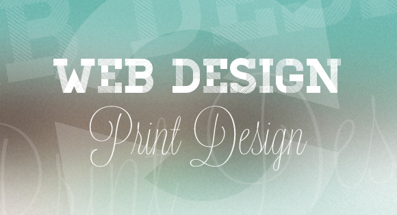
Print design – from newspapers to magazines to ads to books – and web design are often linked because of their differences. The two often come up in conversation at the same time as opposites.
But there is more to the story.
Print and web design are more alike than ever before. The lines are fading and the concepts that dictate good design are becoming more universal every day. Designs in the two mediums also look more similar than ever before and more designers are working in both digital and print.
And it is not just because web designers are learning more about design theory from the world of print. More and more print projects (and designers) are learning from the web. Some of this is because many designers work in environments where both skill sets are necessary but moreover more print designers are looking for inspiration and learn from their digital-publication peers.
New Shapes and Bolder Look


There was a time when almost every layout in a print publication came in the shape of a rectangle. Most were designed horizontally, some vertically and occasionally you would find a square in the mix. Colors were limited in most print design – it has only been in the last decade that many newspapers have began using full-color presses that allow for more than just black and white outside a handful of pages.
No more.
Welcome to the world of new shapes. Many metro newspapers are experimenting with an upside down L-shaped layout that breaks the box mold. Others are using circular shapes for text on feature pages and using more color for an increased “wow” factor. Look at the baubles coming out of the block on the Oliver Russell site; this style of design is where the trend started.
The brighter, bolder color schemes are a direct take-away from web design. While many digital designers have scaled back on the use of animation and bright flashing colors to grab your attention, print designers have evolved with the trend. More ads appear in full color (and bright color), newspaper pages are built using color navigation tools (similar to those on websites) and sport brighter color palettes than in the past.
New navigational tools are also borrowed from web design. Print design has long used forms of indexing but simple navigational keywords (sometimes matched to specific colors) really gained popularity and functionality on the web.
New Details


Rounded corners, more transparent shadows, cutout images and even streamlined typography are just a few of the common web techniques that are becoming more prevalent in print design.
The rigid rectangular form that was used to outline individual stories was also used for all elements in print design. Each photo had corners that came together at 90-degree angles. There were no soft shadows to help “lift” elements off the printed page. These effects, which have been prominent features on websites for a while, can be found in almost any book, magazine or newspaper you pick up now.
Print designers can also thank their web counterparts for eliminating the font mess. There are few restrictions to the number of and type of fonts you can use in print work; this is not the case on the web. The limited font selections used by web designers for years, has helped print designers reign in their desire to use a plethora of typefaces.
The more minimal font palette makes for a cleaner, more streamlined project.
Better Writing


Yes, search engine optimization techniques have helped people working in the print realm write better, sharper, more focused copy.
It has happened over time because most of us publish some form of our print work on the web where keywords of search are key. Rather than rewriting every bit of copy (double the work), designers and writers are using words that provide more information and more description for all of their projects.
Gone are the days of what newspaper editors called the “label headline,” a two- to-three word punch for each story. Now headlines have to sell you each bit of content and filling them with action verbs and impactful keywords are the new norm.
The Lingo

Print designers are learning a whole new set of words that describe things they have been doing for years. Some of the terminology is also changing to reflect the increasingly mainstream web variations as well.
Print designers have always worked in kerning and leading. (Kerning is the space between letters and leading is the space between lines of type). But these terms are becoming replaced with letter-spacing and line-height.
Not only do the web terms sound less jargon-y, they are more easily understandable. There could even come to be a time where letter-spacing and line-height are the common design terms for print and web designers while the terms kerning and leading disappear from the vocabulary.
Software and Technology

Not only are print designers learning more (and emulating) more web design because they are looking at it, they are also using many of the same tools.
Because of products such as the Adobe Creative Suite, which contains software for print and web and tablet design, designers from both disciplines are able to easily learn software that might have otherwise seemed intimidating. Having a set of tools with a uniform look and feel helps encourage designers to cross those borders and work across platforms.
Designers of all kinds must to work harder all the time to stay up-to-date with all the changes in technology. This affects print designers just as much as those working on the web because of cross-platform software. Each update a print designer gets all the same new tools and options that web designers have come to rely on; all designers would be wise to learn and find ways to benefit from those feature updates.
Further, the web world has helped print become more efficient when it comes to file sizes, saving and compression. Working with images that are sized to fit and load quickly is a key part of any web designer’s job – a site that won’t load (or loads slowly) will lose hits. Print designers, too, are learning to better size, scale and package files.
Personal Experience
I spent the first part of my career only designing for print. I have learned firsthand how the design industry as a whole has changed and continues to evolve.
At one point, I thought I would be left behind because I was not labeled as a web developer. But what has become increasingly clear is that design skills are design skills. If you have the eye, and a willingness to learn how to work across multiple platforms, you can create beautiful things.
They may have different names, but the concepts are all the same. It’s just the paper, or screen, that’s different.
Credits: featured image background by Anatoli Nicolae


Oh I have seen this trend happen so much throughout the last 4 years and I am so glad it is happening! 3D effects, beautiful typography on web look stunning..and best of all – here you don’t need to worry about print services, so much about color brightness and differences. On web everything is happening easier, more space for possibilities!
But I think you feel Carrie, how much print experience is helping to become better web designer right? Lovely post – shared on Twitter!
Dainis:
Oh yes. My background in print has helped me learn so much and work so much better on the web. And it goes the other way too. Techniques I have used for web design are popping up in some of my print projects!
I for one am happy to see this trend. As a front-end guy, I find my print publications easier and more enjoyable to ingest when they follow these web-based practices.
Great article!
I love the connections between print and web design, because I find that both industries are working to emulate the other, creating this beautifully cohesive, yet individual, presentation across the platforms. You can see this on publication websites like the New York Times or Vogue. We’ve in a dynamically creative time right now where the ante has been upped for writers, wherein content quality must be first rate. It’s exciting!
Thank you for this refreshing article, Carrie.
Cheers,
Sarah Bauer
Navigator Multimedia
http://www.navigatormm.com
I enjoyed this being both a print designer and web design.
I hate to be a troll, but need to point out that kerning and letter-spacing are not the same.
Kerning is the spacing around an individual character, tracking is a closer equivalent to letter spacing.
Cheers,
Tristan
+1 about kerning.
My first impression is “self indulgent rubbish” – read your history books! I still have a copy of Print Magazine Awards Annual on my shelf from 1992 and I can find all of these so called “new techniques” and “details” represented in the pages. Just because it happened before you went through school doesn’t mean it didn’t exist. Granted, it wasn’t as easy to do then, but to credit the web for somehow inventing things I was copying from other designers 25 years ago, puhleeez!
agree 100%. This article is rubbish. Thank web designers for teaching print designers how to use a limited font pallet correctly? What? Sounds like glorifying the handicap of web. I have yet to see a well-set paragraph on the web, let alone a decent looking header that has been “linespaced” without the benefit and necessity of kerning. Its a shame that articles like this are floating around and worse, being endorsed by linkedin/design taxi etc. Cart before the horse is exactly what this is. Trends don’t come from Print, they don’t come from from web, they come from lazy designers.
Agreed. That was exactly my reaction. It is true that everything influences everything else and therefore web will influence print. But to say it’s teaching print designers things they known well before computers even existed? Seriously?
Thought I was the only one remembering great “pre-web” design…so glad I’m not alone.
Yes, I was wondering about that too. Very peculiar article.
Hi Carrie
Great article, I think having knowledge across multiple platforms like web and print is a great advantage when designing new layouts for either medium. As a web designer I at first found my lack of layout and typography knowledge a real hinderance. The collection of websites you have put together here are a great source of inspiration.
I do agree that both print and web design learn from one another, but if you strip away the fact that they are both visual design, you are left with two very different mediums. For me, web design is more about usable design; how things function, how content flows to guide users through pages. Also I think that web designers should have a grasp of front-end build – that is, how document flow works. From my experience working with designers from a print background, this is a very different way of thinking which often doesn’t hit home, because of the differences in the medium. For example, overlay objects in print is simple, but in web, we have to wrestle with absolute positioning which defies the natural flow of the document. There are also other factors, such as what can and can’t be done with CSS and how you can enhance interaction with JS. It’s something of continual debate.
excelent article .
Good article, Carrie.
I agree with Tristan on the subtle, often-overlooked difference between tracking and kerning.
Having worked in newspapers for more than a decade at the start of my career, I’d have to take exception with one thing: I don’t think the web has led to “better” writing. Concise writing, as you pointed out? Sure. A change in headline-writing style for SEO? Absolutely.
But “better” writing? I don’t think so. If anything, the web has had a negative affect on writing and grammar (this coming from a copy editor). We all make spelling errors from time to time, and perhaps mess up a grammar rule or two (or else the Autocorrect on our iPhones mucks up things!), but in general, web writing is sloppier than anything you’ll find in print.
I agree that print and web influenced each other a lot but one important issue is ; print and web designer need to consider that design for each should have their own planning and consider their own unique user experience. Then you can borrow some elements from your print knowledge (or vise a versa) but it is wrong if you duplicate it.
Thanks for the article
Spot on, Carrie. I’m a classically trained print professional looking to broaden my expertise into web design. The first step is learning not to be intimidated by all things web I don’t know…. nothing can diminish 23+ years of success in print design. For me web design is new inspiration!
Great article, Carrie.
I started my career as an illustrator and graphic journalist and completely agree that the depth of experience I gained in print definitely helps with the web design, but as Matt says, they are very different mediums. Embracing both makes the journey all the more exciting though!
I like your approach to the article and you make some good points Carrie – but drop shadows, rounded corners, cutout images and typography being borrowed from web design? Really? In my experience it’s the reverse. I’ve been waiting years to be able to pull off some of my go-to print effects on the web. And it took new versions of Dreamweaver and hours of CSS training to pull it off. And don’t forget, regardless of the terminology you use, design concepts like spacing between lines of text was started with print before the web was even created. I love the new stuff going on in web design. I think it’s great and I welcome it, but let’s not put the cart before the horse.
I think this article is really mis-informative and is extremely bias towards web-design.
Saying things like… “Print designers can also thank their web counterparts for eliminating the font mess. There are few restrictions to the number of and type of fonts you can use in print work; this is not the case on the web. The limited font selections used by web designers for years, has helped print designers reign in their desire to use a plethora of typefaces. The more minimal font palette makes for a cleaner, more streamlined project.”
…is just flat out not true, and totally dependent on the designer. This isn’t an idea that was started by the principles of web-design. People have been advocating restraint for years.
Furthermore, letter-spacing and line-height are not direct replacements for industry standard terms such as kerning and leading and do not encompass other forms of type-manipulation, such as tracking.
IF ANYTHING, the web is slowly starting to adopt the principles of print, and improve on them through simplified and consideration for restraint. The new Rdio website is a perfect example of this distilled form of design.
I have to agree with the many others who have pointed out that every single thing that you claim print designers have learned from web design, existed in print design long before the web was invented.
Anyone who thinks they are learning something from this article would do well to pick up a copy of this book: http://www.amazon.com/Meggs-History-Graphic-Design-Philip/dp/0471699020
Do enjoy this article very much as it gave me a new perspective of looking at web and graphic design. An inspiration for me to look beyond the classic views we have on things and look for more new perspectives.
I like this site—a lot. It is a great resource, but one thing is keeping it from being truly remarkable. I’ve noticed two patterns:
1. Authors seldom respond to comments, especially negative ones. If a comment isn’t glowingly positive, it usually won’t get a reply, OR
2. It gets a very harsh retort from the author (not you Carrie).
I’d like to suggest admins and authors view David Airey’s logo blog (www.davidairey.com). He makes it a point to interact with all readers and all comments. As a result, he has an incredible following and immense amount of respect from his peers. Just some food for thought…
Hi Josh, thank you for your honesty and I want you to know that I really understand your point and appreciate your suggestion.
I would like to invite you to follow me for one day so that you can understand why a pattern like that emerged: Every day we receive around 100 comments and contact form submissions, of which more than half are questions about how to change/integrate our code. A common example would be something like “Is it possible to have autoplay for this slideshow?” This kind of question is extremely hard to “answer” to since this would basically mean to add autoplay. As you might understand we simply don’t have the capacity to offer support like that.
The comments that we do answer to, which, how you have correctly pointed out, are mostly the positive ones, we answer for a very simple reason: We just want to say thanks. I would feel bad when releasing a tutorial and everybody says they love it and I don’t at least say “Thank you”.
But that’s not the only things we answer to. We’ve created whole solutions, modified demos, example code for our readers; it’s just not possible to do it all the time. Just yesterday I added a new demo with sample code to achieve what a reader asked for. Believe me, I’d love to do that all the time but that would mean no time whatsoever to do new stuff.
Then there is a type of comment which is the “doesn’t work” type: “It doesn’t work in IE”, “It doesn’t work in Opera”, “It does not work when used with X jQuery plugin” etc. Again, there is simply no time to look into every “not working” feedback. If it comes with a detailed description (the OS, the browser etc.) we can work with that but we can’t spend time in asking people over and over again to give us details on “what exactly does not work for you and what’s your OS and your browser?” Sometimes I get frustrated with this kind of unconstructive feedback and I might have answered in a rough way (I did answer once “Do you want you money back? 😛 “).
We are in a very difficult position: either we do engage more with our readers which simply translates to giving support or we spend that time on creating more things. We’ve opted for the latter a long time ago and unfortunately this leads to some kind of seclusion that looks like as if we don’t care. I’m truly sorry about that and I wish there would be a way that we could somehow do both. The nature of our blog does not help solve this problem; our blog is not about simple topics, we try to push limits every day and it’s not easy to balance this.
I hope I could give a little more insight, I’m not trying to give excuses, you’re feedback is very valuable and I can guarantee you that we’ll do our best to offer more engagement possiblities – for us and our readers.
Thanks,
ML
Hi Mary Lou. Thanks for the reply. I’ve been wrapping up projects and taking vacation, so I’m just getting around to reviewing your response.
Let me clarify a few things: First, I totally understand what you mean concerning comments to what I’ll call “code” or “tutorial” posts. I still think an acknowledgment (even when trolls post) is a positive thing to do. You can always address multiple or similar comments with one response. It really goes a long way in readers’ minds when authors are engaged. I don’t equate engaging readers with offering more support. I think in “code” posts, as long as you all have clarified what you’ll be able to answer, a simple acknowledgment would have to suffice. Or maybe ask others making comments to weigh in.
Secondly, there is the other classification of posts, which I’ll call “list” or “opinion” posts, such as this one. In my opinion, these are the ones that should receive the most engagement. Sure, a writer has listed their “top 10” list of some topic or opinion about a trend, and sure, it’s obvious what their opinion is. But, there are some thoughtful questions being asked and comments being made that should probably receive further comment.
I think at the end of the day, it might be helpful to review the purpose of opening stories to comment. Do you want to engage readers and dialogue? If not, I can’t help but ask, why give the option to comment (aside from it helping SEO)?
Anyway, I would love to see more dialogue. I think it’s possible, and I think there are plenty of blogs you can review to see this in action. It builds your credibility and trust among readers—even if you both agree to disagree on a topic or point.
Thanks for listening to my ramblings. You guys have a great site. I truly enjoy it. If you want to dialogue further, feel free to email me. I feel bad for hijacking Carrie’s article like this!
Take care,
Josh
Probably, as others have posted, one the most ill-informed articles recently posted.
I would like to ask where you acquire your facts from, ‘but moreover more print designers are looking for inspiration and learn from their digital-publication peers’ for example.
Will we now all be calling a Sans Serif type faces the : straight up and down font. The Serif type faces: the ones with curly bits on?
Also, ‘it has only been in the last decade that many newspapers have began using full-color presses.
A quick search on the web; (oh the irony), The UK’s first colour newspaper was “Today” launched in 1986 by Eddie Shah.
Yes, its easy to sit here and critique others, but please if you are going publish your opinion, and has you will know from being a print designer, get the basics correct.
Seems like some of the people who indicate that this post is informative and eye-opening are relatively new to the world of design in general. Drop shadows, bright colors, rounded corners, cutout images and typography being borrowed from web design? Do your research. FYI cutout images have been referred to as “silhouettes” for as long as I’ve been in the business. I started out in print 33 years ago and utilized all these techniques since my first project. You have this article quite backwards. All competent web designers borrow from techniques and theories established by print designers many decades ago. A web page shouldn’t be any different than a printed page if the objective is to quickly communicate ideas or information. The web (on the whole with exceptions of course) presently lacks communication disciplines that are essential to effective presentation. Web designers must draw upon the knowledge and experience established by previous and current print design professionals. There is nothing to be learned from a web designer that a good print designer doesn’t already know.
“There is nothing to be learned from a web designer that a good print designer doesn’t already know” Is this your site: http://tonycorbitt.com/ ??? Cause if it is you really need one! 😛
I didn’t realize that using the same 3-4 fonts over and over was a good thing. Good typography was one of the first casualties of the web era. This is why so many print designers have a hard time warming up to the web. It’s frustrating to know that you have so many options available, that you can’t use.
You can use as many fonts as you like in web design, but you have to understand how to use the various tools and codes at your disposal. Not many do because not many actually have any skills.
It seems that since the advent of desktop publishing anybody can call themselves a graphic designer, regardless of the a complete lack of knowledge or skill. All they need is a copy of photoshop. The newspapers , magazines and internet are now crammed full of designs done by totally unskilled but cheap “graphic artists” and secretaries with DTP apps on their PCS.
I can’t imagine any other trade where this could happen. Imagine a chef that could not cook running the Ritz kitchen?
Keith. I agree. I had a former manager who swore that she could be a graphic designer if she knew how to use Photoshop, too. In her mind, knowing how to use the software makes one a graphic designer. Talk about a slap to the face.
Regarding Greg’s comment, I think the idea is to use 2-3 fonts per project—not the same 2-3 fonts for every project. I say 2-3 fonts because in many instances, I think it’s best to use no more than 3 fonts. So, a website for widgets.com should use no more than 3 fonts. It creates unity and cohesion, while being visually appealing and communicating the message clearly without getting lost in a myriad of fonts.
Embarrassing.
This is a great article! I agree 100%. Hopefully one day they will merge some of the CS programs since most of them have very similar functions so that we can Design in Photoshop and have it automatically export as a fully functional Website! I am sure this will never happen since they would loose revenue but us designers can dream right?
That day has come! It’s Adobe Muse!!!
Josh, there’s a lot more to web design than making things look good a Photoshop. There’s no way you could get good results by hitting an export button from PS to get a website. In fact, many web designers are now advocating that we design “in the browser” since Photoshop is such a bad web design tool.
Are you kidding? Most of this is just plain wrong. Editor — please check content for accuracy… Most of the changes in print design came about because traditional print processes (which required much time, effort and money to implement) were replaced with digital processes that allow for simpler and quicker (less expensive) layout, production and printing. These technological changes made it possible for all designers to create more elaborate works within budget and on deadline, beginning with print.
I would agree with a lot of the points in this article. Worth reiterating that online design is so much more accessible than print, so inevitably design features and styles are very visible every day, and from lots of genres. Being involved in designing both online and print it does make me appreciate the plusses of both; the tactility of print, and the ability to create movement and moving ‘stories’ online which can only be a good thing!
This is the most ill-informed article I’ve ever read. College design students have better a better understand of design history than this. Before the author thinks this is coming from a “print” designer, I work in the web space and use both online and offline materials for inspiration. Through all of my designs the one thing I do know is my design history. Apparently this author does not. Talk about an embarrassment to the design community and the great designers of years past. Better writing? Not likely. New details? Do you really think CSS coding would have evolved without some push from designer who wanted to do more? Bolder look? Has the author even opened an art history book within the past century? Cleaning up the font mess? Do you know why there was a limited font pallet when visual based browsers first came onto the scene. Guess you don’t know technology. The lingo? Please check your facts before posting about them, there is a reason why certain terms are used and it’s not because it’s a “fancy designer” term. Also please do some research before you embarrass us all in the design community. Oh wait too late you already have!
As a web designer, this article is too pathetic. The only bright bold colors I see is what I just threw up after reading this post.
Sorry Carrie. I think you’re way off course. If this article was intended to ruffle some feathers, you’ve succeeded. I’m a trained graphic (and web) designer and I don’t even know how to comment. I see so many portfolios of kids that have no idea what design is. It’s much more than a design application…. really. And as far, ” Better writing”… my gosh… I have some trained folks who wrote for WSJ and other major publications who are getting out of the industry. One reason is that there is a shift to a lesser understanding or concern of good writing. Blogging is not real writing. Carrie, arousing article but misplaced. Sorry.
SEO leads to better writing? You’re kidding, right? (Here’s a writing tip: You clutter the lede with the word “more,” which makes the point you’re trying to make difficult to follow.)
… unless, of course, the word “more” is one of your search engine optimization target words, in which case you’ve done a fine job repeating the word high in the first three graphs of the story.
And that is exactly what the problem is. In this industy, a lot of people who own photoshop and don’t even know any other programs call themselves a designer. Design is based on history, knowledge and experience. It has evolved and it’s quit easy for a lot of people to f*ck this industry up. I think that Evolving technology is oke. But in this industry it might screw things up instead of making it better.
Under your Software Section you use the sentence, “Designers of all kinds must to work harder all the time to stay up-to-date with all the changes in technology.” This indicates to me that good design also needs to be backed up by good editing skills and not just a brief scan by spell check. Because getting your point across not only requires a great visual presentation, but diction as well. Too many times copy is ignored for the sake of the visual presentation and its expediting. More care needs to be taken in regard to proof reading an article, advertising or the like. Without that a presentation becomes less professional and more on the amateurish side. With today’s technology I fear that web designers and editors have become more complacent with its use.
kerning ? letter spacing
Web Design did not invented bold colors, and different formats for print or limited pallete of fonts (swiss design at the 70s used mostly only helvetica, akzident grotesk and univers and did it very well for instance)…
There is a lot of things i can disagree too, but i’m not in the mood for writing…
kerning is different than letterspacing, kerning is space between some critical letters, not entire all word…
The author has clearly spent almost no time behind a mouse and has a minimal understanding of her subject. This is compounded by the fact that she did not bother to interview anybody to form the story.
The author seems to have no idea that print design has been using these techniques for years and years.
If there is anything that has changed, is it the overall design aesthetic, which is then interpreted to print and the web. And to paint colors. And to clothing. And to cars. I suppose the author thinks clothing design reflects the web now, too.
This article, basically, sucks rotten eggs.
ABSOLUTE BOLONEY!! I have never read such utter rubbish in all my career, and I have seen plenty. This is completely off the mark. Web designers are primarily technical people who use code. The visual to them is, and always will, be secondary. Designers have training and a keen eye for detail to get the best from images, typefaces and message. Something web designers all too often neglect. Design since day one has inspired and always used COLOUR without restriction, too say colour was limited is a joke beyond belief.
I suggest you do your research into the history of design and come back and write an accurate article.
I think this article while some of the points are debatable and up for discussion gives us a fresh way to look at things. I liked it! When new technology comes in we tend to see the 2 steps forward and one step back thing – however, things do generally catch up (desktop publishing for example-design using early software was tacky and atrocious but it got better – better than before! I was there before and after) When the web started in the early 90s, many of the sites were designed by web techies who would not know good design if they tripped over it. FYI – I am involved in both web and print.
Designers are going through so many changes in the last 25 years (we now have all the prepress and web publishing responsibilities not to mention – designing) Come to think of it, our profession has always been changing in leaps and bounds. You have to learn to adapt in business and ours is no different.
Frankly, I am a little disturbed at some of the comments posted here. I wonder if some of you would be saying the same things, so mean spirited to the writer in person? Just because you can hide anonymously behind the net does not give you the right to forget how to be fair minded and respectful.
I think most of the commenters your referring to could agree that this article is not fair minded or respectful to the history of the design industry and to the great graphic designers who have helped shape the industry to this day.
The early stages of web were nothing pretty, and great print design was once ALL we had, we agree on those fronts. But the author’s points of how web has influenced print have no ground to stand on. I think that is where the frustration lies. I agree some people have said some harsh things, and thats not constructive. But this article itself is a let down, and a slap in the face to a lot of great designers.
There was plenty of great design before and after desktop publishing. Desktop publishing just gave uneducated “designers” access to design tools.
Some documentaries that display greatness across years and years of design:
Art & Copy
Helvetica
Objectified
A history lesson is definitely in order. For example, there is a reason it’s called “leading” (and it isn’t because someone thought it sounded cool).
To save you some research time, the term “leading” refers to the literal thickness of the metal strip of lead which was used for line spacing when type was set by hand using a “job case”. Obviously, the more strips of lead you added, the more space between lines. When utilizing a California Job Case each letter and space was placed by hand. For example, an “en” space was a piece of lead approximately the width of the letter “N”. An “em” space was the approximate width of… you guessed it… the letter, “M”. I could go on and on but research is fun and I wouldn’t want to deprive you of that experience.
However, one statement that really caught my attention is the statement that print designers are learning from web design. Your statement should have begun with, “In my opinion…” because there is absolutely no basis for your observation. For the record, I design both but I dare say, IN MY OPINION many graphic designers would take issue with a blanket statement like that. The chicken and egg question comes to mind!
As mainly a print designer, for 35-plus years, my opinion is that most of the changes Carrie is attributing to the influence of web design… were there before in print design, even before DTP and before Mac (right back to the days when paper outputs were pasted onto boards for artwork). I’ve just checked my samples and I have promotional bottle-collar designs from 1989 and 1991 that are in bright colours and feature curves and circles. Cutouts and rounded corners have been round forever, I recall the problem of matching up rounded-boxes-within-rounded boxes in Letraset. Print designers have always used the brightest colours where it was possible. And ‘line-height’ and ‘line-feed’ came in from photo-typesetting, long before Macs, but never caught on because it was just techy lingo while ‘leading’, the term that had a lot of history to it, was retained in the computer era. Strangely but pleasingly, Carrie retains ‘cutout’ and not the modern ‘clipping-path’. On the whole, I don’t think Carrie has got her facts right but I congratulate her enthusiasm for the topic. All the best from Glasgow, Scotland, UK.
The title of the article should have read: The Importance of Knowing Design Basics in Web Design
This should have placed a well intentioned piece in its proper light.
I agree with most of the criticisms levied against the author of this article.
The article begins with a vague notion which is never really supported with arguments and facts — just more notions.
If I hear a print designer use the phrase letter spacing when they mean kerning it indicates to me that they don’t really know what they’re talking about. Kerning is when you’re making adjustments to the spacing between individual letter pairs. Letter spacing (or tracking) is a more global adjustment. You can do kerning in print design apps like InDesign but there’s no real support for kerning in the CSS spec. I did hear about a jQuery plugin that would apply kerning automatically to you page but to me that misses the point.
The funny thing is… web design probably has influenced print (as well as broadcast) media. It’s a shame that this author doesn’t have the experience or insight to give REAL examples to back up the claim.
I couldn’t believe my eyes as I was reading this article and thinking – who is this person and where did they get their information. Are they referencing printing practices from more than 20 years ago when most stuff was set by hand and limited to the font choices on hand? I have been in the industry for more than 15 years and I have had the pleasure of watching our profession grow to incorporate BOTH web and print applications. But to be honest I have been applying soft drop shadows and line art silhouettes for years and to say that print was limited by font use and colour is complete crap (sorry to be so harsh). In the past before digital print became so widely used most design was kept simple (i.e. 1-3 colour choices) not always because the designer didn’t know how to design with multiple colours it was mainly because it wasn’t always cost effective for the client or the actual design benefited from the limited colour options because it is what got the message across. Just because you have access to millions of colours doesn’t mean you have to use millions of colours – that is what makes what we do art. Not to mention full colour printing in the past was very expensive but since digital printing has become so readily available and main stream print designers have finally been able to let their imaginations fly with how ever many colours we wish to use. But again digital print has its limitations, like offset print does, and like web design does but as designers we design around those limitations that technology presents. What I didn’t appreciate about this article is that it felt like it was saying web design is more cutting edge an innovative than print – when I think the reverse is truer. Web design allows for so many colours because computer monitors evolved to include millions of colours (remember the days of 256 colour monitors) and allowed our clients to used a rainbow of colours without any extra cost. The only reason web design has been able to incorporate the same level of font usage print has been using for many, many years is because the software they use has allowed for it (remember when everything was set to the 8 primary fonts). So in my opinion I would equate the fact that print designers are using more colour in their pieces to the fact that the actual print industry and techniques have been changing not because web design thought if it first. I can’t tell you how many times I have designed something only to be told that the presses themselves or the prepress software couldn’t print or output what I wanted – it wasn’t because I couldn’t think of the idea on my own. As printing has evolved from film-to-plate > direct-to-plate > digital printing as well as prepress software finally catching up to the design software and the ability to convert type to curves/outlines font problems and limitations have rarely been an issue. In my experience with web design I have found more font and typography limitations than with print. Yes the web may have colour, video and animated interactions, but print is just as artistic from the choice of inks, varnishes, papers, textures, overall finished sizes, and bindery choices. In the end remember design can be trendy and people like to reference design and styles from the past (before the electronic age) and make them modern again and since print was around before web so I would say print has had more influence to web design overall. I will not say that there are not great web designs/designers because there are but please give credit where credit is due since there are some great print designs and fantastic print designers out there and have been doing what they do much longer than web design was even a glimmer of an “influence”. We are coming to a time where we influence each other not because one is web and one is print or that one or the other doesn’t know specific techniques in regards to print or web – we influence each other because we are exposed to great design… period.
Carrie, to put it bluntly; look into a History of Graphic Design class, or pick up a handful of books on the history of graphic design.
Bright color pallets, drop shadows, typefaces, and clipped images have been used in great print designs for years. Web design wasn’t always so glamourous as it is today. I can agree that both mediums are progressing together and learning from each other more everyday. Web design has and will continue to expand beyond print due to the limits and cost of printing pieces these days; and print designers will continue to push new ideas especially in advertising and packaged goods. Print and Web Designers have also been using the same tools (ie: Illustrator and Photoshop) for years. We can all thank Adobe for giving us the Creative Suite, its made creating easier for all creatives in general, but I do not see how this applies to web influencing print specifically. Its new features influencing ALL designers across the board. A great designer is eager to learn all the new functions in general.
To say that web design brought the use of all these graphic elements to the table, is an oversight of an entire history of the creative industry.
I would have to agree with Keith Draws. I find this article expressing a very naive viewpoint. I’ve been a designer for over 30 years, mostly
in print and now in increasing web work. Great design for print and web must come from a combination of natural creative gifts combined with high quality education in graphic design, the art of designing with type, negative space, color, photography and illustration built around a great conceptual idea. This author seems completely oblivious to the history of outstanding design for the last 30 years. Geez!—pick up some copies of Communication Arts Design Annuals and Print Design Annuals since the 1980’s and get an eye-full of the evolving trends in great design. Many of this author’s observations about changes between the two mediums are basically laughable—has she been living on some isolated island without media?
The late 80’s and early 90’s had gorgeous graphic design when professional typesetters were still the Gold Standard for setting type and photographers and illustrators created amazing imagery, all without computers, the mid- to late 90’s saw an explosion of collage designs on steroids when designers went overboard with Photo Shop. Desktop computers had a downside, people with zero training in typography were creating published work with egregious typographic errors, not just typos but glaring errors in just setting type correctly. I have seen these errors pop up in professional work from creative firms—their design staff too poorly trained to spot them.
Some designers trained after the mid-90’s would likely be lacking in training in what great typography should be, due to the time involved in learning creative softwares and technical knowledge for print and web. Typography education has suffered due to lack of time in design courses of study, and young designer’s teaching classes who never had proper training in typography to begin with.
I cringe when I read recent articles which now list graphic design as a good career for high school graduates who don’t want to go to college, but can get the “technical training” in a 2-year program and then learn “how to be creative” when you go to work for someone.
This is incredibly bad advice and produces untalented drones operating computers and design softwares with low quality outcomes.
Buying a stethoscope, a blood pressure cuff and a white coat doesn’t make you a doctor anymore than buying a Mac computer and Adobe Creative Suite makes you a graphic designer. Unfortunately, there are too many “weak designers” which are devaluing the professional practice of graphic design.
With two-year technical degrees relacing four year art school degrees, it’s no wonder that designers possess little to no art training. Without a doubt, Carrie has touched a nerve, but the real problem lies with using graphic design as a buzz word just to fill seats in poorly structured associate degree programs. Certainly as designers, with years of training,in art school and experience,in the field,to see what is becoming of the industry must be concerning. To Carrie’s credit, she has made observations that differences do exist between print and web design. However the particular examples weaken her position. Whatever the reason, print design has always reflected a limited use of type and color, irregardless of web design. Art school drilled that into our heads. Line, shape, space, color, texture, limit your palette, avoid dead space, integrate the elements to create a unified piece, direct the eye with the composition-Let’s give credit for what web design taught us: to manipulate software and to make the files smaller.
Carrie,
Thank you for taking the time and presenting your article. I know it’s tough to present ideas to a potentially huge audience in a format that allows them to respond so publicly.
In the end, I feel very strongly about the mis-perceptions presented in your article. You make the same mistakes that so many blog writers make in that you present an opinion piece as an authoritative one. Some of your summations are just flat out wrong and there’s no verifiable data backing up any of your claims.
If you are aiming for an authoritative approach for your articles, I’d suggest research more deeply, know your topic better, validate your sources, and know your audience. Refrain what stating the obvious whenever possible too.
As a general statement, people need to remember that the web is a newer medium when compared to print and even multi-media design, but there isn’t anything revolutionary about web design that hasn’t already been established in print or multi-media.
On a positive note though, your article has brought this site to my attention and I plan to give it a once over to see if I can leverage the resources provided.
I look forward to more articles.
Shades of that large subclass of bad coders that think they are design gurus, yet feel the need blog about designers being nothing but plagiarizers and propeller-heads. The last 10 years I’ve searched in vain for a good coder I can partner with! I look forward to the likes of Adobe Muse forcing them out of business and encouraging good coders and good designers to work together, ignoring this imaginary wall created between web and print.
Why do these ‘us and them’ articles need to be written? Judging from the response it seems to fuel a war that shouldn’t be!
I have been a designer for 40 years. I started in print, of course, and embraced the Web in 1994. I got my first Mac in 1987. My first Adobe product: Illustrator 88. I have taught Photoshop and beta tested for Adobe on several occasions. I have seen the industry change and, although it is true that Web has influenced Print in a few ways, almost all Web design is based on design concepts used in print for many years. I was doing shadows for print in Photoshop, with channels, for a long time before they included the shadow filters and shadows went viral. The Web is lacking quite a bit from print that it could benefit from, such as, the ability to work with text the way you can in print. We are getting closer everyday with cascading styles, and Web fonts, but we are still not anywhere near where design needs to be on the Web. Don’t get me wrong, there are wonderful designs, beautiful pages on the Web where I find a lot of inspiration, but most of them are still done with graphics and not real content. (Very sad about FLASH too, there were some amazing things done with that.) Unfortunately, the majority of the content online has been done by lay people with no knowledge of any design principles and are just plain awful. And now with all the WordPress and Joomla templates–and add your text here–the Web is starting to become very homogenized…everything looks the same. You can recognize the templates that everyone is using. This is also transferring to print and people are “designing” their own ads, business cards, etc… Yikes!
yea…correction, i’m sure that print and web both influence each other today in plenty of ways but things like navigational tools and bold color schemes like you mentioned have been explored beautifully long before anything digital came into existence through out major art movements in history. I thought this was more or less common sense…