From our sponsor: Leverage AI for dynamic, custom website builds with ease.
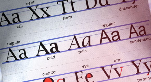
The art of typography is not always the easiest thing to understand. It almost has a language of its own. Understanding ascenders, descenders, ligatures, x-heights and stems will help you better make connections between type and the other features on your website.
The terms associated with typography can be broken into several categories based on use. This glossary contains common phrases, typography jargon, font identification, spacing and specialty lettering.
Commonly-used letter terminology


Understanding the most commonly-used names for the parts of letters can help you better speak the language of type. Many of these terms are used in common speech among designers.
Ascender: Any part of a letter that extends beyond the x-height of a character set.
Descender: Any part of a letter that drops below the baseline of a character set.
Stroke: The individual lines used to create a letterform. Strokes are measured by weight based on how thick or thin letters are. Some letters are created using multiple stokes, while others only use a single stroke. The term dates to when all type was created by hand and each stroke was created when the pen was lifted from paper.
Serif: Short strokes that extend from letters. Serifs generally appear on the bottom and top corners of letters and can range from small and square to large and rather elaborate. Serif fonts refer to type families that include serifs on each letter.
Sans serif: Typefaces without serifs. Sans serif typefaces are sometimes referred to as Gothics.
Stem: Vertical full-length strokes in characters are called stems. This main stroke can be perfectly vertical, such as in the letter “T,” or have a diagonal slant, like in “V.”
Tail: An end stroke that has more of a decorative feel. Some mix and match the terms tail and descender but a tail does not always have to fall below the baseline.
Jargon terms

When you really start talking about the specific parts of a letter, you will hear another set of lingo. While most of these words are common for typographers and font designers, they may be less common for web designers.
Counter: The open space inside letter strokes. Counter space can result from fully-closed or partially closed letter shapes.
Bowl: The fully-closed section of a letter created by single or adjoining strokes.
Arm: A vertical or horizontal stroke that only intersects another stroke at one point and is open on the other end.
Eye: An eye refers to a closed space inside a letter form, specifically the space inside the lowercase “e.”
Bar or Crossbar: The horizontal strokes between letters. Bars are commonly used to connect points on a single stroke, such as in a lowercase “e.” Crossbars connect separate strokes, such as in the uppercase “A.”
Link: A stroke that connects a letter containing two bowls, such as a “g” in certain typefaces.
Terminal: The endpoint of a descender. An actual terminal does not include a serif; a teardrop terminal is a rounded teardrop-shaped serif on a descender.
Fonts


Everyone understands what a font is. But do you really understand how they are measured or what constitutes bold or condensed type?
Point: A measurement of type. There are 72 points in one inch.
Condensed type: Any type style that is designed using narrow proportions. Condensed fonts can have thick or thin strokes.
Bold or boldface: Using a heavier weight for each stroke of a typeface so that each letter appears with more emphasis. Bolding refers to any weight in a typeface that is thicker than the standard or regular variant of the font.
Italic: The slanting or forward lean added to a typeface. Italics can add slant or a combination of slant and cursive details.
Display font: Typefaces used for large type in projects is called display type. These typefaces do not have to be different fonts than used elsewhere in the project but correspond to the size of text. Display fonts are typically used at 16 points or greater and are found in banners, headlines and headers.
Openface: Fonts with open areas included in each letter. Openface fonts will not include bowls.
Spacing and lines

Just as important to the actual letters is the spacing between each letter and between lines of type. Spacing can actually make or break the typography in your project and greatly affects readability.
Baseline: An invisible horizontal line on which upper-and lowercase letters rest. The baseline does not include the space occupied by descenders.
X-height: The height of a font family’s lowercase “x.” Most lowercase letters – minus ascenders and descenders — will rest between the baseline and x-height.
Cap height: The distance between the baseline and the top of a capital letter.
Kerning: Adjusted horizontal space between letters. Kerning adjustments can open of close gaps between letters and can be done based on a preset formula or manually when type is set.
Leading: Vertical space between lines of type. Leading can also be adjusted to bring lines of type closer together or separate them. Extremes in leading can greatly affect readability.
Specialty lettering
Some lettering has a life – and style – of its own. Specialty lettering comes in a variety of forms and tends to have a more artistic than typographic look.
![]()
Icon: Graphic symbol or rendering created from letterforms. Note how online magazine Modern Ink uses letting to create an icon that is used throughout the site for brand identification.
Initial cap: Also called a drop cap, the initial cap is a large or decorative letter used at the beginning of a text block. It can dip into multiple lines of text.
Cloistered initial: Most commonly appear as a single capital letter contained in an ornamental box, but multiple letters can be used. Cloistered initials are also called drop caps and are commonly used as the first letter in a block of text.
Small cap: The use of all capital letters in place of lowercase letters, where the height of each letter is no taller than the character set’s x-height.

Fleuron: Ornamental lettering in which the characters take on elements that look like flowers and leaves. This type of font is usually considered a glyph, although in some cases letters are identifiable.

Monogram: A grouping of letters that create a design based on initials. Note how Tow Arms Inc. combines the first letters from the company name in its logo.
Conclusion
Understanding the language of type is a tool that can help designers better communicate with other creative professionals. Try to get yourself familiar with type lingo, not only so you can talk the talk but so that you can also better understand the basics of typography.
Type is a key part of almost all website design. Understanding it will not only make you feel more confident in working with others but will also help you succeed in a variety of design projects.


this is a lovely piece to read. Though I have been a designer for years, I didn’t know all the technical names for parts that make up a typeface. Thanks for the new knowledge
It is nice to know- not sure remember all terminologies..
Great Article! Thx : )
this is fresh for me.