From our sponsor: Leverage AI for dynamic, custom website builds with ease.
In this tutorial, we are going to create a slideshow with a parallax effect with the help of some CSS3 properties. We’ll use radio buttons and sibling combinators for controlling which slide is shown. There will be two backgrounds and the idea is to change the background positions and the position of the slider with transitions in order to create a slight parallax effect.
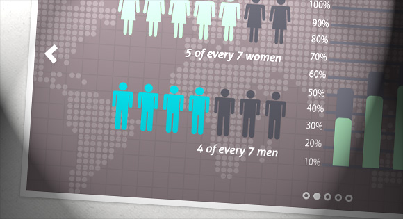
The graphics used in the demo are by: 5Milli (Global Vector Map) and by WeGraphics (Free Vector Infographic Kit).
The Markup
We will “connect” the input elements to the division with the class sp-content by using the general sibling combinator. For that we will leave the inputs on the same level like the sp-content div. When we click on an input we will change the background color and background position of it (grid pattern) and also the background-position of the sp-parallax-bg div (the world map) with transitions. The respective slide will be shown by moving the sp-slider ul to the right position. The markup looks as follows:
<div class="sp-slideshow">

	<input id="button-1" type="radio" name="radio-set" class="sp-selector-1" checked="checked" />
	<label for="button-1" class="button-label-1"></label>

	<input id="button-2" type="radio" name="radio-set" class="sp-selector-2" />
	<label for="button-2" class="button-label-2"></label>

	<input id="button-3" type="radio" name="radio-set" class="sp-selector-3" />
	<label for="button-3" class="button-label-3"></label>

	<input id="button-4" type="radio" name="radio-set" class="sp-selector-4" />
	<label for="button-4" class="button-label-4"></label>

	<input id="button-5" type="radio" name="radio-set" class="sp-selector-5" />
	<label for="button-5" class="button-label-5"></label>

	<label for="button-1" class="sp-arrow sp-a1"></label>
	<label for="button-2" class="sp-arrow sp-a2"></label>
	<label for="button-3" class="sp-arrow sp-a3"></label>
	<label for="button-4" class="sp-arrow sp-a4"></label>
	<label for="button-5" class="sp-arrow sp-a5"></label>

	<div class="sp-content">
		<div class="sp-parallax-bg"></div>
		<ul class="sp-slider clearfix">
			<li><img src="images/image1.png" alt="image01" /></li>
			<li><img src="images/image2.png" alt="image02" /></li>
			<li><img src="images/image3.png" alt="image03" /></li>
			<li><img src="images/image4.png" alt="image04" /></li>
			<li><img src="images/image5.png" alt="image05" /></li>
		</ul>
	</div><!-- sp-content -->

</div><!-- sp-slideshow -->
The list elements are the wrappers for each slide and although we are using simply images here, you can use any kind of content.
The CSS
We’ll set the width of the main container to 80% and set the width of the divisions with class sp-content and class sp-parallax-bg to 100%. The sp-content div will have a background color and a background image (grid) that we will move whenever we slide the slider ul. The sp-parallax-bg div will have a map as background image and we will also move the background position.
.sp-slideshow {
    position: relative;
	margin: 10px auto;
	width: 80%;
	max-width: 1000px;
	min-width: 260px;
	height: 460px;
	border: 10px solid #fff;
	border: 10px solid rgba(255,255,255,0.9);
    box-shadow: 0 2px 6px rgba(0,0,0,0.2);
}

.sp-content {
    background: #7d7f72 url(../images/grid.png) repeat scroll 0 0;
	position: relative;
	width: 100%;
	height: 100%;
	overflow: hidden;
}

.sp-parallax-bg {
    background: url(../images/map.png) repeat-x scroll 0 0;
    background-size: cover;
	position: absolute;
	top: 0;
	left: 0;
	width: 100%;
	height: 100%;
	overflow: hidden;
}
The styles of the inputs and the labels:
.sp-slideshow input {
    position: absolute;
	bottom: 15px;
	left: 50%;
	width: 9px;
	height: 9px;
	z-index: 1001;
	cursor: pointer;
    opacity: 0;
}

.sp-slideshow input + label {
    position: absolute;
    bottom: 15px;
	left: 50%;
    width: 6px;
	height: 6px;
	display: block;
	z-index: 1000;
	border: 3px solid #fff;
	border: 3px solid rgba(255,255,255,0.9);
    border-radius: 50%;
    transition: background-color linear 0.1s;
}
.sp-slideshow input:checked + label {
	background-color: #fff;
    background-color: rgba(255,255,255,0.9);
}

.sp-selector-1, .button-label-1 {
    margin-left: -36px;
}

.sp-selector-2, .button-label-2 {
    margin-left: -18px;
}

.sp-selector-4, .button-label-4 {
    margin-left: 18px;
}

.sp-selector-5, .button-label-5 {
    margin-left: 36px;
}
We’ve set the opacity of the inputs to 0 so that they are not visible. The labels are under the radio button and we will make it look like a little circle. All the inputs and labels will be positioned absolutely and we will place them next to each other by applying a left margin.
Next, we will style the arrows which are simply labels with the respective for attribute. Note, that clicking on a label to active an associated input might not work in mobile browsers. But anyway, you can navigate using the dots since we are actually clicking on the inputs.
The arrow labels have the following style:
.sp-arrow {
    position: absolute;
	top: 50%;
	width: 28px;
	height: 38px;
	margin-top: -19px;
	display: none;
	opacity: 0.8;
	cursor: pointer;
	z-index: 1000;
	background: transparent url(../images/arrows.png) no-repeat;
    transition: opacity linear 0.3s;
}
.sp-arrow:hover{
	opacity: 1;
}
.sp-arrow:active{
	margin-top: -18px;
}
Now, let’s define when each arrow is shown. On the first slide we, for example, don’t want to show the left arrow. And on the last slide we don’t want to show the right arrow:
.sp-selector-1:checked ~ .sp-arrow.sp-a2,
.sp-selector-2:checked ~ .sp-arrow.sp-a3,
.sp-selector-3:checked ~ .sp-arrow.sp-a4,
.sp-selector-4:checked ~ .sp-arrow.sp-a5 {
    right: 15px;
	display: block;
	background-position: top right;
}
.sp-selector-2:checked ~ .sp-arrow.sp-a1,
.sp-selector-3:checked ~ .sp-arrow.sp-a2,
.sp-selector-4:checked ~ .sp-arrow.sp-a3,
.sp-selector-5:checked ~ .sp-arrow.sp-a4 {
    left: 15px;
	display: block;
	background-position: top left;
}
When an input is selected, the sp-content div will have a transition for the background-position and the background-color. The second transition is going to take a bit longer:
.sp-slideshow input:checked ~ .sp-content {
    transition: background-position linear 0.6s, background-color linear 0.8s;
}
The div with the world map (sp-parallax-bg) will also have a transition for the background-position:
.sp-slideshow input:checked ~ .sp-content .sp-parallax-bg {
    transition: background-position linear 0.7s;
}
In this way we can add a background parallax effect.
Let’s define the changes to color and background-position for the sp-content div:
input.sp-selector-1:checked ~ .sp-content {
    background-position: 0 0;
	background-color: #727b7f;
}

input.sp-selector-2:checked ~ .sp-content {
    background-position: -100px 0;
	background-color: #7f7276;
}

input.sp-selector-3:checked ~ .sp-content {
    background-position: -200px 0;
	background-color: #737f72;
}

input.sp-selector-4:checked ~ .sp-content {
    background-position: -300px 0;
	background-color: #79727f;
}

input.sp-selector-5:checked ~ .sp-content {
    background-position: -400px 0;
	background-color: #7d7f72;
}
… and the sp-parallax-bg div:
input.sp-selector-1:checked ~ .sp-content .sp-parallax-bg {
    background-position: 0 0;
}

input.sp-selector-2:checked ~ .sp-content .sp-parallax-bg {
    background-position: -200px 0;
}

input.sp-selector-3:checked ~ .sp-content .sp-parallax-bg {
    background-position: -400px 0;
}

input.sp-selector-4:checked ~ .sp-content .sp-parallax-bg {
    background-position: -600px 0;
}

input.sp-selector-5:checked ~ .sp-content .sp-parallax-bg {
    background-position: -800px 0;
}
The unordered list with the class sp-slider will have a width of 500%. This is because we have 5 slides. It will have a transition for the left value, that we will change depening on the input that is checked:
.sp-slider {
    position: relative;
	left: 0;
    width: 500%;
	height: 100%;
	list-style: none;
    margin: 0;
	padding: 0;
    transition: left ease-in 0.8s;
}
Each list element is a slide and it will also have a transition for the opacity. We will give both, the slide and the image inside the box-sizing property of “border-box”. This will allow us to set a padding but also use 100% values for heights and widths and not worry about any overflow:
.sp-slider > li {
	color: #fff;
	width: 20%;
	box-sizing: border-box;
	height: 100%;
	padding: 0 60px;
    float: left;
	text-align: center;
	opacity: 0.4;
    transition: opacity ease-in 0.4s 0.8s;
}
.sp-slider > li img{
	box-sizing: border-box;
	display: block;
	margin: 0 auto;
	padding: 40px 0 50px 0;
	max-height: 100%;
	max-width: 100%;
}
Now we need to set the correct left values for each selected slide:
input.sp-selector-1:checked ~ .sp-content .sp-slider {
    left: 0;
}

input.sp-selector-2:checked ~ .sp-content .sp-slider {
    left: -100%;
}

input.sp-selector-3:checked ~ .sp-content .sp-slider {
    left: -200%;
}

input.sp-selector-4:checked ~ .sp-content .sp-slider {
    left: -300%;
}

input.sp-selector-5:checked ~ .sp-content .sp-slider {
    left: -400%;
}
Each current slide will then get opacity 1:
input.sp-selector-1:checked ~ .sp-content .sp-slider > li:first-child,
input.sp-selector-2:checked ~ .sp-content .sp-slider > li:nth-child(2),
input.sp-selector-3:checked ~ .sp-content .sp-slider > li:nth-child(3),
input.sp-selector-4:checked ~ .sp-content .sp-slider > li:nth-child(4),
input.sp-selector-5:checked ~ .sp-content .sp-slider > li:nth-child(5){
	opacity: 1;
}
That’s all, hope you like it!