The text-shadow property is used to add shadows to text. It accepts a comma-separated list of shadow effects to be applied to the text of the element.
Each shadow is applied to the element’s text and all its text decorations (composited together).
The shadows are applied front-to-back: the first shadow is on top. The shadows may thus overlay each other, but they never overlay the text itself.
Each shadow is specified by 2 to 3 length values (third value is optional) and an optional <color>. If no color is specified the shadow has the resulting color of the ink that it shadows. The color can be set using the different <color> formats available (including RGB and HSL colors). Using rgba colors has an advantage over using hexadecimal colors, for instance, because it adds yet another dimension to work with. Not only can you set the position, blur and color of the shadow, but you can also set its opacity using the alpha value (same for hsla colors).
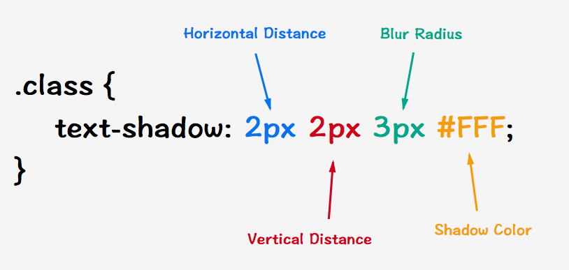
text-shadow propertyThe 3 length values defining each shadow are: the x-offset (horizontal distance), y-offset (vertical distance), and “blur radius” of the shadow.
The blur radius is optional, if you don’t specify it, the browser uses the default blur radius value which is zero. If the blur value is zero, the shadow’s edge is sharp. Otherwise, the larger the value, the more the shadow’s edge is blurred. Negative values are not allowed for the blur radius. The way the blur radius works is that positive values cause the shadow shape to expand in all directions by the specified radius. Negative values cause the shadow shape to contract.
The x and y offsets, on the other hand, are obligatory.
The x-offset is the horizontal offset of the shadow. A positive value moves a shadow to the right of the text along the specified distance, a negative length moves it to the left.
The y-offset is the vertical offset of the shadow. A positive value moves the shadow to the bottom of the text along the specified distance, a negative value moves it to the top.
There is a useful text-shadow generator tool over at CSS3Gen: CSS3 Text Shadow Generator
Trivia & Notes
text-shadow can be used to create some nifty and cool text effects. Some can improve text readability, some create typographic effects that can make designs look more realistic, and other neat attractive text effects. The following image shows 4 of many possible styles that can be created with text-shadow:
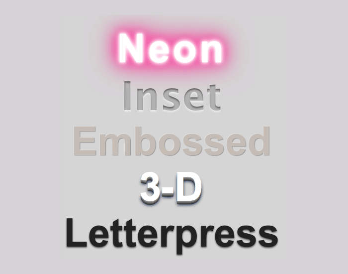
text-shadow propertyShadows can make text more readable if the contrast between the foreground and the background is small.
The text-shadow property can also be applied to both the ::first-line and ::first-letter pseudo-elements.
Official Syntax
-
Syntax:
text-shadow: none | [ <length>{2,3} && <color>? ]# - Initial: none
- Applies To: all elements
- Animatable: yes
Values
- <color>
-
Optional. Can be specified either before or after the offset values. If the color is not specified, a UA-chosen color will be used.
Note: If you want to ensure consistency across browsers, explicitly specify a color.
- <offset-x> <offset-y>
-
Required. These
<length>values specify the shadow’s offset from the text.<offset-x>specifies the horizontal distance; a negative value places the shadow to the left of the text.<offset-y>specifies the vertical distance; a negative value places the shadow above the text. If both values are 0, then the shadow is placed behind the text. - <blur-radius>
-
Optional. This is a
<length>value. If not specified, it defaults to 0. The higher this value, the bigger the blur; the shadow becomes wider and lighter.
Notes
To find out what units you can use for the x and y offsets, see the <length> entry.
Examples
.shadowed {
    text-shadow: 5px 5px 3px #333;
}

.light-shadow {
    text-shadow: 0.2em 0.2em 0.2em rgba(0,0,0,0.2);
}

.multiple-shadows {
    text-shadow: 5px 5px 5px rgba(0, 0, 0, 0.1), 10px 10px 10px rgba(0, 0, 0, 0.2);
}
Live Demo
View this demo on the Codrops PlaygroundBrowser Support
CSS3 Text-shadow
Method of applying one or more shadow or blur effects to text
W3C Candidate Recommendation
Supported from the following versions:
Desktop
- 4
- 3.5
- 10
- 9.5
- 4
Mobile / Tablet
- 3.2
- 2.1
- all
- 123
- 124