The linear-gradient() function is used to create a <gradient>. A <gradient> is an <image> that is made of two or more colors that smoothly fade from one color to another.
A linear gradient is a gradient that fades from one color to another over a line (as opposed to a radial gradient that has a circular or elliptical shape).
Concepts and Terminology
A gradient is drawn into a box with the dimensions of the concrete object size, referred to as the gradient box. However, the gradient itself has no intrinsic dimensions.
A linear gradient is defined by an axis called the gradient line. The colors making up the gradient are then placed along that line. The line can be horizontal, vertical, or diagonal, taking any angle value. The direction of the line and the colors specified are all defined in the function, but we’ll get to these after covering the concept of the gradient line.
The gradient image is constructed by creating an “infinite canvas” and painting it with lines perpendicular to the gradient line, with the color of each line being the color of the gradient line where the two intersect. This produces a smooth fade from each color to the next, progressing in the specified direction. To better understand this, please have a look at the following illustration:
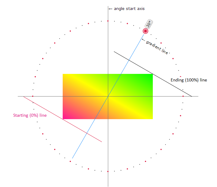
The gradient line is the line along which the colors are going to be painted. The colors you specify will start at the starting point and end at the ending point. The first color your specify will be the color of the starting point, and the final color you specify will be the color of the ending point. Between the starting point and the ending point, the points will be painted by the intermediate colors between the first and last color.
If you specify multiple colors like three, four, or more, those colors will also be spread along the gradient line, starting with the first, going through the intermediate ones, and ending with the last color in the list.
Notice how, though the starting point and ending point are outside of the element, they’re positioned precisely right so that the gradient starts with the pure first color exactly at the starting corner, and is the pure ending color exactly at the opposite corner. That’s intentional, and will always be true for linear gradients.
Notice also how the two perpendicular lines—the starting line and ending line—are positioned. Every point on the starting line is going to be of the starting color. Every point on the ending line is the ending color. In between these two perpendicular lines, imagine a set of similar perpendicular lines, each line colored the same color as its point of intersection with the gradient line.
Creating Linear Gradients: Specifying a Gradient Line
When you want to create your own linear gradient, you need to start by specifying the gradient line. You can do this by specifying an angle value which specifies the angle of the line inside the element. You can also use a keyword value to specify the direction of the gradient line. Possible keywords are to top (which means that the gradient line will be vertical, and will start from the bottom up), to bottom (the opposite of to top), to right (which means that the line will be horizontal and will start from the left and progress to the right), and to left (which is the opposite of to right).
The gradient line will determine how the gradient is laid out inside the element.
The following is an interactive demo forked from this demo by Ana Tudor. In this demo, you can click on any of the points on the circle. Each point specifies an angle value, and when you click on it, the gradient line (the blue line) and its corresponding starting and ending lines (pink and black lines, respectively) will be repositioned so you can see how they react to the angle value you choose. The gradient image inside the element will also be updated for every angle value. The angles start at zero degrees at the y-axis, and move clockwise.
You can also see the syntax of the linear-gradient() function get updated with the value of the angle as you click them. The first value inside the linear-gradient() function specifies the angle or direction of the gradient line.
Creating Linear Gradients: Specifying Color Stops
A gradient can be made up of as many colors as you want. In addition to an angle/direction, the linear-gradient() function accepts a list of comma-separated color stops. A color stop is a color value followed by an optional stop position.
linear-gradient(angle/direction, color stop, color stop, ...);
A very simple linear gradient can be created by specifying only two color stops:
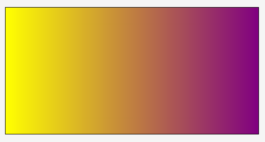
linear-gradient(to right, yellow, purple);
The gradient will start from the left and proceed to the right (notice the to right keyword). It starts with the yellow color and fades smoothly until it becomes purple at the end point of the gradient line.

linear-gradient(to right, yellow, purple);
Using a different angle value, you can change the direction of the gradient. However, in this section we want to focus on the color stops, so we’ll keep using the to right direction.
Now, suppose you want the gradient to contain three or four colors (or even more!). It can look like so:
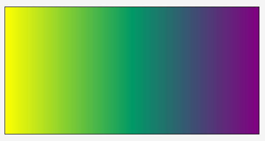
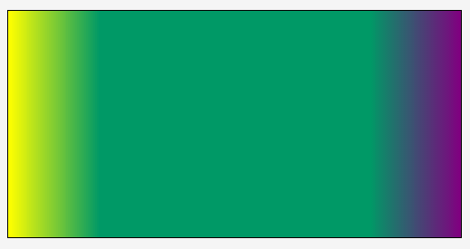
linear-gradient(to right, yellow, #009966, purple);
linear-gradient(to right, yellow, #009966, purple);
When three colors are specified, they are distributed along the gradient line such that the starting point at 0% is pure yellow (in our example), the 50% point along the gradient line is pure #009966 (which is a green color), and the 100% point (ending point) is pure purple. The points lying between 0% and 50% are the intermediate colors you pass through when you’re moving from yellow to #009966. Similarly, the points between the 50% color stop and the 100% position, are the intermediate colors between #009966 and purple.
If you specify four colors, then the 0% color stop will be the first color, the ~33% color stop will be the second color, the ~66% stop will be the third color, and then the 100% will be the fourth color.
In addition to specifying the colors you want to have in your gradient, you can control where each color starts instead of leaving it to the browser to distribute the colors evenly.
If we were to go back to the above three-color example, and change the start position of the green color to be 20% instead of the default 50%:
linear-gradient(to right, yellow, #009966 20%, purple);
we would get the following result:
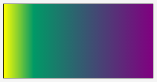
linear-gradient(to right, yellow, #009966 20%, purple);As you can see in the above image, the distance between pure yellow (0%) and pure #009966 decreases, because the line is pure #009966 at 20% instead of 50%.
Controlling where a color starts is useful, but what about creating “sharp” color transitions? For example, what if I want the line to be pure green for more than just one point on the line?
The key to getting complete sections of the same color is to specify the start position of a color at one point where we want that section to start, and then specify another color stop for the same color at the point where we want the section to end.
For example, suppose we want the green color #009966 to start at 20%, and we want the gradient line to remain green until 80%, instead of starting to fade into purple. The gradient function would look like the following:
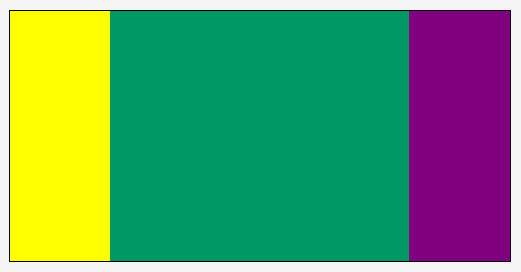
linear-gradient(to right, yellow, #009966 20%, #009966 80%, purple);
The result of the above function looks like this:
linear-gradient(to right, yellow, #009966 20%, #009966 80%, purple);The area between 0% and 20% fades from pure yellow to #009966 as it would by default. Then, the section between 20% and 80% maintains a #009966 color. After that, the color starts fading again to purple.
Using this concept, we can create “sharp” color stops. Suppose we have the following gradient function:
linear-gradient(to right, yellow, yellow 20%, #009966 20%, #009966 80%, purple 80%, purple);
The gradient will look like the following:
linear-gradient(to right, yellow, yellow 20%, #009966 20%, #009966 80%, purple 80%, purple);So what exactly happened there? Well, we’ve specified six color stops: 0%, 20%, 20% again, then 80%, 80% again, and then the final 100%. For each of these stops, we’ve specified a color. Then, the area between these points will be made up of the intermediate colors. So, if we were to take the first section, for example, between 0% and 20%: we have yellow at 0%, and then yellow again at 20%; this means that the color will fade from yellow to yellow which, in other words, means that the entire section will be yellow.
Then, at 20% again we start with #009966 (this could have been specified as 21%, too). The browser will fade the color between #009966 at 20%, and then the next color stop at 80%, which happens to be also #009966. Therefore, the entire section between 20% and 80% will be #009966 green. The same concept applies to the last purple section.
Many examples can be created using different colors and a different number of color stops. For example, the following is a simple rainbow created using the above concept of “sharp” color stops.
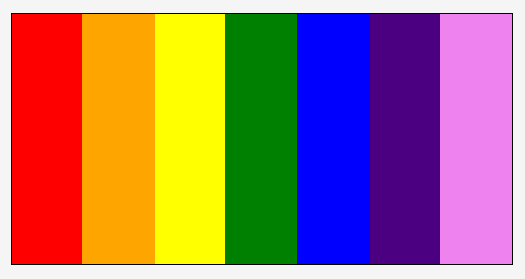
linear-gradient(to right, red, red 14.3%, orange 14.3%, orange 28.6%, yellow 28.6%, yellow 42.9%, green 42.9%, green 57.2%, blue 57.2%, blue 71.5%, indigo 71.5%, indigo 85.8%, violet 85.8%, violet);
The percentages are calculated by dividing 100% over the number of colors we’re using, because we want all sections to be equal in width.
Note that the color stop position can be set in percentages or absolute length values (like pixels, for example, or em), and that the color stop position must come after the color value. So, the following syntax is invalid:
linear-gradient(to right, red, red 14.3%, 14.3% orange, orange 28.6%, 28.6% yellow, yellow 42.9%, 42.9% green, green 57.2%, 57.2% blue, blue 71.5%, 71.5% indigo, indigo 85.8%, 85.8% violet, violet);
The linear-gradient() function accepts any valid <color> value. This means that you can set the colors using any of the possible color functions like rgb() and hsl(), among others. See the <color> entry for more possible values.
Accepting any <color> value also means that you can use a transparent color as well. For example, the following creates a linear gradient that starts with a color, is transparent in the middle, and the ends with another color:
linear-gradient(to right, yellow, transparent, purple);
Notes about Color Stops
Color-stops are points placed along the line defined by the gradient line at the beginning of the rule. Color-stops must be specified in order. Percentages refer to the length of the gradient line, with 0% being at the starting point and 100% being at the ending point. Lengths are measured from the starting point in the direction of the ending point. Color-stops are usually placed between the starting point and ending point, but that’s not required; the gradient line extends infinitely in both directions, and a color-stop can be placed at any position on the line.
At each color-stop, the line is the color of the color-stop. Between two color-stops, the line’s color is linearly interpolated between the colors of the two color-stops, with the interpolation taking place in premultiplied RGBA space. Before the first color-stop, the line is the color of the first color-stop. After the last color-stop, the line is the color of the last color-stop.
The following steps must be applied by user agents in order to process the list of color-stops. They offer some great insight into how gradients work. After applying these rules, all color-stops will have a definite position and they will be in ascending order:
-
If the first color-stop does not have a position, set its position to 0%. If the last color-stop does not have a position, set its position to 100%.
For example, this:
linear-gradient(red, white 20%, blue);is equivalent to:
linear-gradient(red 0%, white 20%, blue 100%); -
If a color-stop has a position that is less than the specified position of any color-stop before it in the list, set its position to be equal to the largest specified position of any color-stop before it.
For example, this:
linear-gradient(red 80px, white 0px, black, blue 100px);becomes:
linear-gradient(red 80px, white 80px, black 90px, blue 100px); -
If any color-stop still does not have a position, then, for each run of adjacent color-stops without positions, set their positions so that they are evenly spaced between the preceding and following color-stops with positions.
For example, this:
linear-gradient(red -50%, white, blue);is equivalent to:
linear-gradient(red -50%, white 25%, blue 100%);
Trivia & Notes
Note that, even though a gradient is made up of colors, it is not a <color> value, and therefore can’t be used as one.
Repeating Gradients (Tiling them)
A linear gradient created using linear-gradient() cannot be tiled by itself. It’s usually painted across the entire area of the element it is applied to, unless you specify otherwise using a property like background-size for example.
To create repeating linear gradients, you can use the repeating-linear-gradient() function. Meanwhile, you can also fake a repeating gradient using the background-size and background-repeat properties to create patterns.
Creating Patterns Using Linear Gradients
Gradients are images. They can be used as background images. And just like background images, they can be sized, positioned, and tiled as a background image. This allows us to create some really nice patterns. We can also use multiple linear gradients as multiple backgrounds on an element.
Because creating the actual patterns is outside the scope of this entry, we suggest you have a look at the following two gradient patterns galleries by Lea Verou and Bennett Feely, respectively:
- CSS3 Patterns Gallery
- New CSS3 Gradients Possibilities (makes use of the CSS
background-blend-modeproperty)
Both of these galleries allow you to view the code for each pattern. You can play with the code to see how the patterns are created and customize them to your will.
Animating Linear Gradients
Linear gradients are not animatable except in IE10+. All other browsers don’t allow you to animate a gradient. Usually, an illusion of gradient color transitions is created by transitioning the position of the gradient image on an element. You can read more about this in the article Animating CSS3 Gradients by Louis Lazaris.
Official Syntax
<linear-gradient> = linear-gradient(
    [ [ <angle> | to <side-or-corner> ] ,]?
    <color-stop>[, <color-stop>]+
)
/* where.. */
<side-or-corner> = [left | right] || [top | bottom]

/* and */
<color-stop> = <color> [ <percentage> | <length> ]?
Values
- <angle>
-
An
<angle>value that specifies the direction of the gradient.0degpoints upward, and positive angles represent clockwise rotation, so90degpoints toward the right. - <side-or-corner>
-
This argument can specify either a side or a corner that are used to specify the angle of the gradient.
Possible side values are:
top,right,bottom, andleft. If a side is specified, it is preceded by the keywordto. For example,to top, which resolves to an angle of0deg,to rightwhich is equivalent to90deg,to bottomwhich resolves to a value of180deg, andto leftwhich is equal to an angle value of270deg.Possible corner values are:
top left,top right,bottom right, andbottom left. Each of these keywords is also preceded by thetokeyword. Resulting corner values areto top left,to top right,to bottom right, andto bottom left.When a corner value is used, it is translated into an angle value that allows the ending point to be in the same quadrant as the specified corner, and so that the line defined by the ending-point and the corner is perpendicular to the gradient line. (See interactive demo in the description section at the beginning of this entry.) This means that the ending line will be positioned exactly so that the last color of the gradient will be applied to the specified corner of the element. The starting line will be positioned so that it’s symmetric to the ending line with respect to the center of the element.
- <color-stop>
-
A
<color>value followed by an optional color stop position. The color stop position can be set in percentage values or fixedlengthvalues such aspxorem, among others. Color stops are positioned along the gradient line, and are used to specify the points along that line that colors start at.
Examples
The following are all simple examples of linear gradients created using linear-gradient():
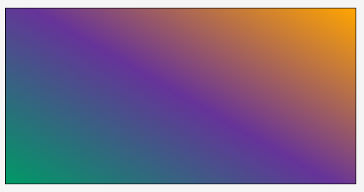
linear-gradient(30deg, #009966, #663399, orange);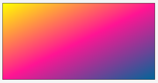
linear-gradient(to bottom right, yellow, deeppink, #006699);
The following creates a striped background image using a linear gradient made up of two colors: black and white. The effect is achieved by using the background-size property and specifying the width of the gradient to any width you want, depending on how thin or thick you want the stripes to be. The gradient will then be repeated because the default value of the background-size property is repeat. Play with the values of the background-size property and try using <a href="http://tympanus.net/codrops/css_reference/background-repeat">background-repeat</a>: no-repeat to see how the gradient is sized.
Live Demo
Play with the values of the angle/direction and color stops of the following demo to see how the gradient changes.
View this demo on the Codrops PlaygroundBrowser Support
CSS Gradients
Method of defining a linear or radial color gradient as a CSS image.
W3C Candidate Recommendation
Supported from the following versions:
Desktop
- 26
- 36
- 10
- 12
- 15
Mobile / Tablet
- 15
- 4.4
- No
- 123
- 124
Notes: Old & New Syntax and Prefixes
The linear-gradient() syntax described in this entry is the latest and newest one, and the stable one. Before this syntax was stabilized, there were other syntaxes used among browsers, in addition to different prefixes. For a recap of the history of the syntax and how it has evolved to the current one, you can check the MDN entry. The support table also shows in which browser versions prefixes are needed.