The mask-mode property is used to specify whether the CSS mask layer image is treated as an alpha mask or a luminance mask.
Mask Modes: Alpha vs Luminance
Alpha Masks
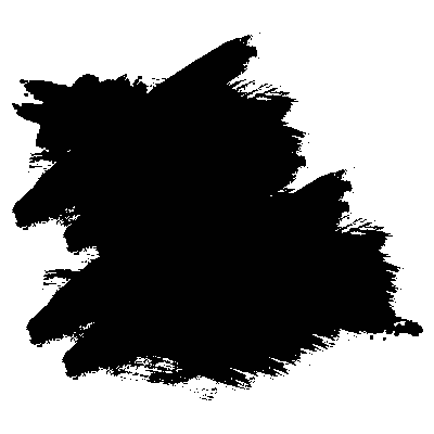
An alpha mask is an image that has an alpha channel, and the alpha values are used as the mask values. A very simple example of an alpha channel is a simple PNG image with black and transparent areas.
In graphics, an alpha channel is a portion of each pixel’s data that is reserved for transparency information. The alpha channel is used extensively in masking operations—it specifies how the pixel’s colors should be merged with another pixel when the two are overlaid, one on top of the other. Different parts of the image would have different levels of transparency depending on how much you wanted the masked element to show through.
In the case of a black and transparent image as the one showed above, the black areas have an alpha value of one (1), and the transparent areas have an alpha value of zero (0).
When an image with an alpha channel is used as an alpha mask, the areas where the image is black (fully opaque) are the areas where the element will be visible, and the areas where the image is transparent, the element will not show. Translucent areas will show the element with a certain level of transparency. The mask value at a given point is simply the value of the alpha channel at that point. The color channels (if present) do not contribute to the mask value.
You can think of it this way: you can imagine your element as one layer and the mask image as another layer placed on top of it, and then get an eraser and start erasing all the parts of the element that are not covered by the black parts of the mask.
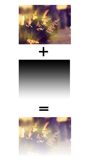
The best way to show how an image with different alpha values affects an element it is used to mask is by using a simple gradient image. The gradient starts fully opaque at the top and then ends with a fully transparent value at the bottom. The element that this mask is applied to will be fully visible where the gradient is opaque, translucent where the alpha channel ranges between 0 and 1 (exclusively), and invisible where the gradient is transparent.
Luminance Masks
A luminance mask is similar to an alpha mask, except that instead of using an image’s alpha channel values as mask values, the image’s luminance values should be used.
For example, a very simple luminance mask is similar to the simple alpha mask we showed above, but instead of using black areas to define where the element will show, the black areas would be white:
When a luminance mask is used, the mask value at a given point is computed from the color channel values by computing the luminance from the color channels first, and then multiplying the computed luminance value by the corresponding alpha value to produce the mask value.
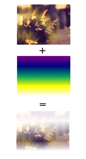
A luminance mask can contain any color, not just white. The luminance value is then determined by the RGB values of the mask and the luminance coefficients as follows: luma = (0.2126 * R + 0.7152 * G + 0.0722 * B). To determine the transparency of the object, the alpha channel of the object is then multiplied by the luminance value and the alpha channel of the mask.
So, if you have a colorful image, that has some fully transparent areas, the element will not show where the image is transparent, but where the image has an alpha value of 1, the value of the mask depends on the colors used (per pixel). See the following image for an example. The masked image shows through the different colors in a different way.
luminance.Trivia & Notes
Regardless of the method used (alpha or luminance), the procedure for calculating mask values assumes the content of the mask is a four-channel RGBA graphics object. For other types of graphics objects, special handling is required as follows.
- For a three-channel RGB graphics object that is used in a mask (e.g., when referencing a three-channel image file), the effect is as if the object were converted into a four-channel RGBA image with the alpha channel uniformly set to 1.
- For a single-channel image that is used in a mask (e.g., when referencing a single-channel grayscale image file), the effect is as if the object were converted into a four-channel RGBA image, where the single channel from the referenced object is used to compute the three color channels and the alpha channel is uniformly set to 1.
Also, SVG graphics elements (e.g., <circle> or <text>) are all treated as four-channel RGBA images for the purposes of masking operations.
Also note that the mask-mode property must not affect the masking mode of mask-border-source.
Official Syntax
-
Syntax:
mask-mode: <masking-mode># /* where */ <masking-mode> = alpha | luminance | match-source - Initial: match-source
- Applies To: All elements. In SVG, it applies to container elements without the <defs> element and all graphics elements
- Animatable: no
Notes
The hash tag (#) indicates that the property takes any number of mask modes. The list of mask modes is comma-separated.
When the mask-mode property takes a list of comma-separated values, each value is applied to a corresponding mask layer image specified in the mask-image property (first value for the first image, second value for the second image, and so on).
Values
- alpha
-
A value of
alphaindicates that the alpha values of the mask layer image should be used as the mask values. - luminance
-
A value of
luminanceindicates that the luminance values of the mask layer image should be used as the mask values. - auto
-
If the mask reference of the
mask-imageproperty is an SVG<mask>element, the luminance values of the mask layer image should be used as the mask values.If the mask reference of the
mask-imageproperty is a CSS<image>element, the alpha values of the mask layer image should be used as the mask values.
Notes
The mask-type property can be used to set the type of an SVG mask. The mask-mode property overrides the value specified in the mask-type property.
Examples
The following example sets the mask-mode of a CSS gradient image to luminance and then uses it as a mask.
.img {
    mask-image: linear-gradient(black, purple, yellow, transparent);
    mask-mode: luminance;
}
The following references an SVG <mask> and specifies its mode using the mask-mode property and the mask-type property. The mask-mode value overrides that of the mask-type‘s value.
.el {
    mask-image: url(#SVGMask);
    mask-type: luminance;
    mask-mode: alpha;
}
<mask id="SVGMask" maskContentUnits="objectBoundingBox">
  <radialGradient id="radialFill">
    <stop stop-color="white" offset="0"/>
    <stop stop-color="black" offset="1"/>
  </radialGradient>
  <circle fill="url(#radialFill)" cx="0.5" cy="0.5" r="0.5"/>
</mask>
Live Demo
The following demo uses a colorful gradient image as a mask. The gradient also has transparent parts, and some black. Since we’re using a CSS gradient, the mask-mode will default to alpha. Try changing the mask-mode value to see how the masked image areas change.
Note that the demo currently doesn’t work in any browser as the mask-mode property isn’t yet implemented anywhere.
Browser Support
CSS Masks
Method of displaying part of an element, using a selected image as a mask
W3C Candidate Recommendation
Supported from the following versions:
Desktop
- 120
- 53
- No
- 106
- 15
Mobile / Tablet
- 15
- 123
- No
- 123
- 124
Notes
This module, as you can see in the support table above, hasn’t been fully implemented in all browsers, so you’re probably not going to be able to use all features even in browsers that have implemented certain properties (for the time being).
In the meantime, you can check out this open source feature support table by Alan Greenblatt on GitHub. The purpose of this table is to provide some insight into what the current state of affairs is with various browser implementations of CSS Clipping and Masking features.