From our sponsor: Leverage AI for dynamic, custom website builds with ease.
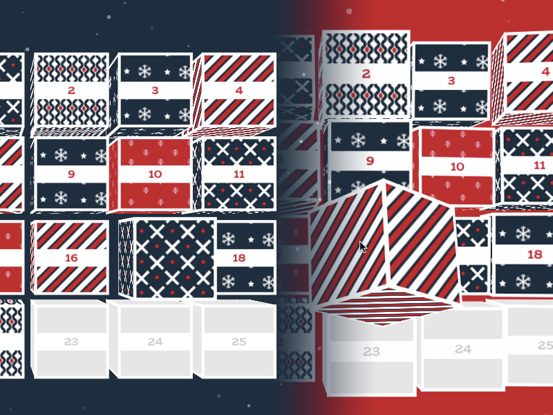
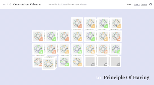
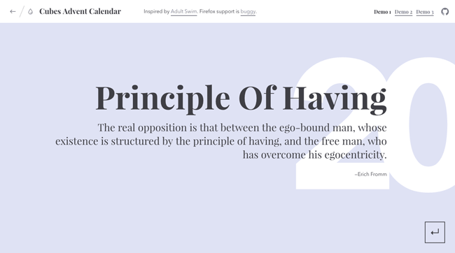
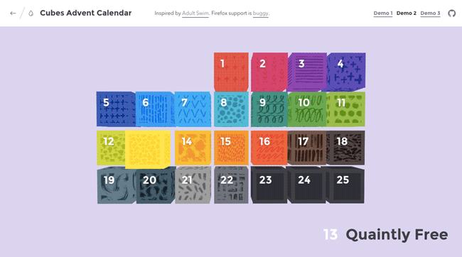
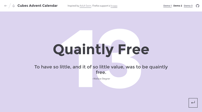
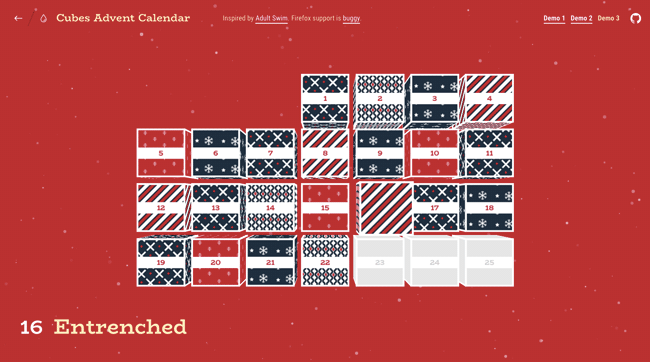
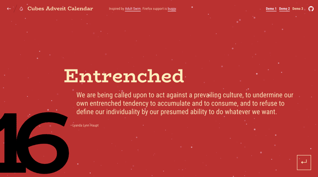
Today we’d like to share a fun little Advent calendar with you. The idea is mainly inspired by the Singles 2016 page of Adult Swim. When hovering over the boxes, they rotate in a fun way and when we click on a box, all boxes disappear with an animation. Then some content shows up, also animating with individual effects. Additionally, we have the option to tilt the whole calendar according to the hover position.
We’ve created some demos for your inspiration and hope that you can use this as a base for your Christmas ideas.
The animations are powered by Julian Garnier’s anime.js. We also use some text animations based on one of our previous demos, Inspiration for Letter Effects, where we employ Charming.js by Yuan Qing. The snow animation if from Om Shankar’s gist snow.html.
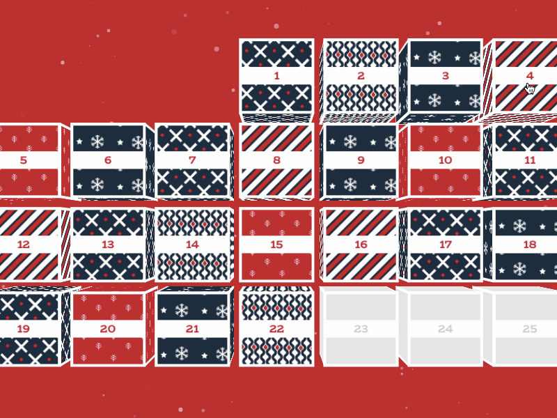
For our Advent calendar we are using a Flexbox layout. The cubes are created from a “flat” structure and transformed into a multi-element structure that allows us to create the three-dimensional look. The respective content elements follow, each enclosed in a content__block:
<div class="calendar-wrap">

	<div class="calendar">

		<div class="cubes">

			<div class="cube">
				<div class="cube__side cube__side--back"></div>
				<div class="cube__side cube__side--left"></div>
				<div class="cube__side cube__side--right"></div>
				<div class="cube__side cube__side--bottom"></div>
				<div class="cube__side cube__side--top"></div>
				<div class="cube__side cube__side--front">
					<div class="cube__number">1</div>
				</div>
			</div>

			<div class="cube">
				<!-- ... -->
			</div>
			<!-- ... -->
		</div><!-- /cubes -->

		<h2 class="title">The Title</h2>

	</div><!-- /calendar -->

	<div class="content">

		<div class="content__block">
			<h3 class="content__title">The Title</h3>
			<p class="content__description">If everyone demanded peace instead of another television set, then there'd be peace.</p>
			<p class="content__meta">John Lennon</p>
		</div>

		<div class="content__block">
			<!-- ... -->
		</div>

		<div class="content__number">0</div>

		<button class="btn-back" aria-label="Back to the grid view">↵</button>

	</div>
	<!-- /content -->
</div>
The shared styles of all demos are defined in common.css while individual adjustments are made in style1.css, style2.css and style3.css.
Note that the initial structure has some data attributes that are used for the background color animation, the inactive class and to construct the title element that appears on hover. Have a look at the html files to see the markup.
Some interesting styles are the ones for building the cubes container and its cubes. Note that the cubes container gets created dynamically in our script. We explicitly use calc() here to show how the padding of the main calendar container is calculated. For seven boxes in a row, we subtract the width of them (counting with their margins) from the viewport width and divide it by two in order to get the padding for one side.
.calendar {
	position: relative;
	width: 100%;
	height: 100%;
	margin: 0 auto;
	overflow: hidden;
	/* we always want 7 boxes in a row */
	padding: 3em calc((100vw - (7 * (7vw + 1vw)))/2);
}

.js .calendar {
	position: absolute;
	perspective: 1000px;
	padding: 0 calc((100vw - (7 * (7vw + 1vw)))/2) 5em;
}

.no-js .calendar {
	display: flex;
	flex-wrap: wrap;
	align-content: center;
	align-items: center;
}

/* Cubes container */

.cubes {
	display: flex;
	flex-wrap: wrap;
	align-content: center;
	align-items: center;
	width: 100%;
	height: 100%;
	transform-style: preserve-3d;
}
The cube is a 3D construct that needs to have the correct transforms for the sides. We use viewport units to make our cube responsive.
/* Single cube */

.cube {
	position: relative;
	display: block;
	flex: none;
	width: 7vw;
	height: 7vw;
	margin: 0.5vw;
}

.js .cube {
	flex: auto;
	transform-style: preserve-3d;
}

/* Push to the right weekday (we have to push 3 boxes) */

.js .cube:first-child {
	margin-left: calc(((7vw + 1vw) * 3) + 0.5vw);
}

.js .cube:not(.cube--inactive) {
	cursor: pointer;
}

/* Cube sides and rotations */

.cube__side {
	position: absolute;
	top: 0;
	left: 0;
	width: inherit;
	height: inherit;
	backface-visibility: hidden;
}

.cube__side--front {
	position: relative;
	transform: translateZ(3.5vw);
}

.cube__side--back {
	transform: rotateY(180deg) translateZ(3.5vw);
}

.cube__side--right {
	transform: rotateY(90deg) translateZ(3.5vw);
}

.cube__side--left {
	transform: rotateY(-90deg) translateZ(3.5vw);
}

.cube__side--top {
	transform: rotateX(90deg) translateZ(3.5vw);
}

.cube__side--bottom {
	transform: rotateX(-90deg) translateZ(3.5vw);
}
Each demo has an individual script file where you’ll find all the functionality and the animations.
- ChromeSupported
- FirefoxNot supported
- Internet ExplorerSupported from version E
- SafariSupported
- OperaSupported
Update: If you need a fix for Firefox, check out xem’s solution here and here. Read more about it in this GitHub issue. Thank you, xem!
References and Credits
- anime.js by Julian Garnier
- Charming.js by Yuan Qing
- Christmas vector patterns designed by Freepik.


Ohh, this is so cool especially demo 3. Christmas is in the air! 🙂
This is really nice. I hav also written a Xmas calendar.
url: http://xmas.wantedlink.de
What did you think? 🙂
Really great and funny!
Super happy with this. Was looking for a cool way to better my portfolio, gonna find a cool way to use this there. Thanks for the share. 🙂
Waaaw that’s really great !!
Amazing Calendar demo!!!
Thank you, really appreciate your effort to making this eye catching calendar cubes.
Fix for Firefox, add to common.css
.cube:nth-child(0){z-index: 25}
.cube:nth-child(1){z-index: 24}
.cube:nth-child(2){z-index: 23}
.cube:nth-child(3){z-index: 22}
.cube:nth-child(4){z-index: 19}
.cube:nth-child(5){z-index: 20}
.cube:nth-child(6){z-index: 29}
.cube:nth-child(7){z-index: 28}
.cube:nth-child(8){z-index: 27}
.cube:nth-child(9){z-index: 26}
.cube:nth-child(10){z-index: 25}
.cube:nth-child(11){z-index: 10}
.cube:nth-child(12){z-index: 12}
.cube:nth-child(13){z-index: 13}
.cube:nth-child(14){z-index: 11}
.cube:nth-child(15){z-index: 10}
.cube:nth-child(16){z-index: 9}
.cube:nth-child(17){z-index: 8}
.cube:nth-child(18){z-index: 24}
.cube:nth-child(19){z-index: 25}
.cube:nth-child(20){z-index: 26}
.cube:nth-child(21){z-index: 4}
.cube:nth-child(22){z-index: 3}
.cube:nth-child(23){z-index: 2}
.cube:nth-child(24){z-index: 1}
This is great. But how do you stop people clicking and activating future dates?
I.e if its the 3rd how do you deactivae the 4th upwards
Nice content! I found it interesting.
Hi! I’m playing around with this script and I’d like to configure it for other years and months. I’m setting the “3” in common.css to “5”, which sets the correct starting day. However, this forces two boxes to the bottom of the page, which are not left aligned. How do I fix this?
I have a question, how can I put an image in my background? I tried and tried but not result!
any ideas on how I can get all of these on just one row instead of in a calendar format (just a single line of cubes that has overflow auto so I can scroll through them?)