From our sponsor: Leverage AI for dynamic, custom website builds with ease.
Today we’d like to share a fullscreen form concept with you. The idea is to extend the minimal form concept and only show one question or form field at a time in fullscreen. The user can enter data in a distraction-free way and it allows to add some fancy animations for the fields. Once all the fields have been filled or moved through, we show a summary in the final step. Here the input data can still be reviewed and corrected. In this final step the form can also be submitted.
Please note that this is a highly experimental component and it was only tested with the latest browsers that support animations, 3D transforms and HTML5 form elements.
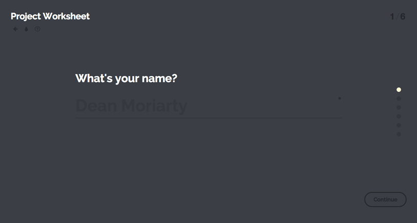
The form has a couple of elements: the form fields (each being shown individually), a dot navigation on the right side (this allows to go back to already filled questions), a number indicator that shows the current step in the form, a continue button that will move to the next field, some details inside of the form fields, like a info icon and a couple of custom inputs, like the fullscreen color picker from the Inspiration for Custom Select Elements post.
The following show the initial view of the form:
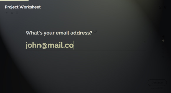
Here’s an example of the info tooltip and a filled email field:

For smaller screens we have a different layout with adjusted elements:
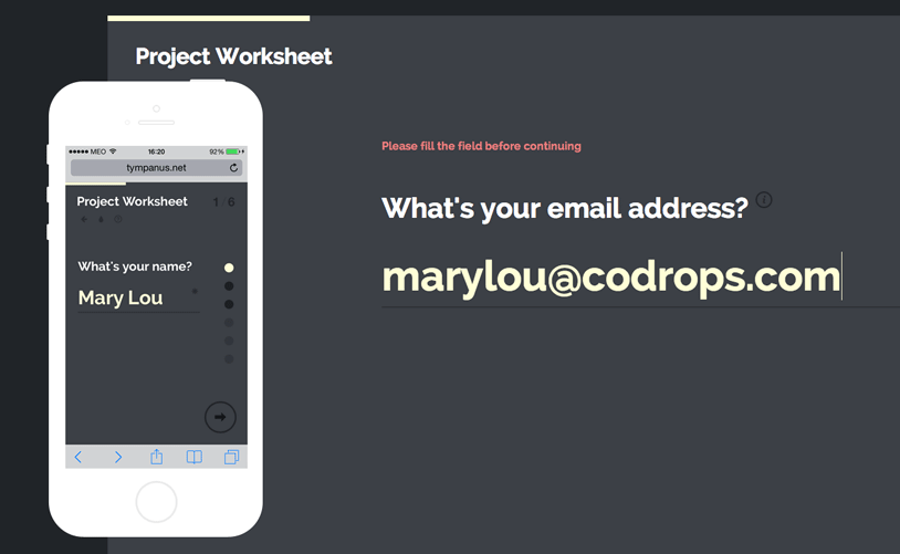
Image credit: Flat iPhone by UIPixels.com
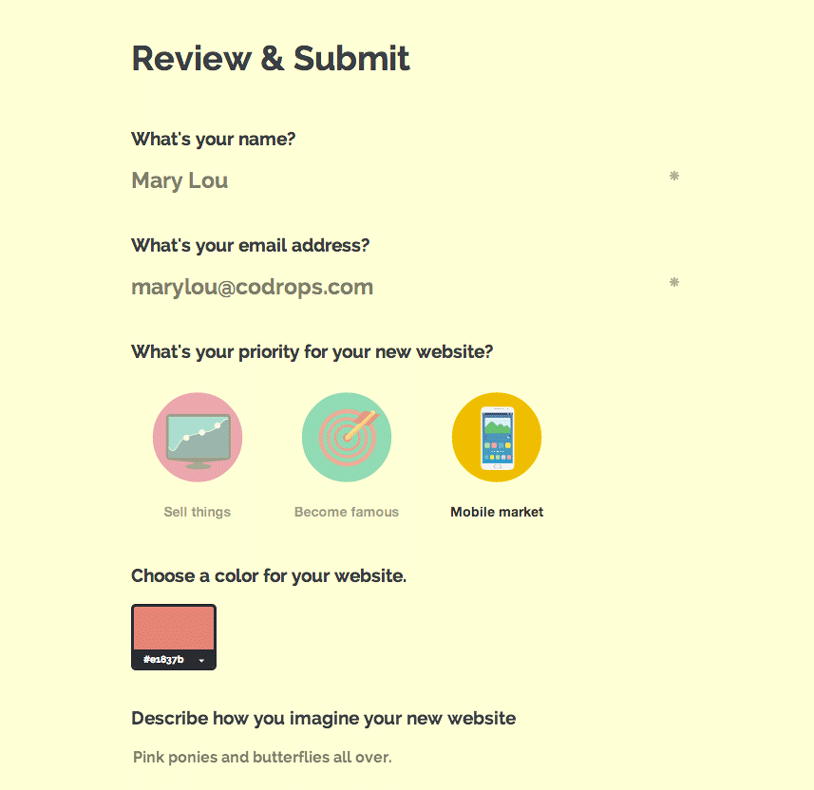
When all fields have been navigated through, we reach the final review step where the form can be corrected and submitted:
The main idea behind the implementation was to take each field (in our case a list item of an ordered list) and display one at a time. When navigating to the next or previous field, animation classes are applied to the exiting and coming fields which make the inner parts (i.e. the label and input) move up or down with delays.
The form script has a couple of options, mainly to show/hide the control elements and a callback for when the review state is reached:
// show progress bar
ctrlProgress : true,

// show navigation dots
ctrlNavDots : true,

// show [current field]/[total fields] status
ctrlNavPosition : true,

// reached the review and submit step
onReview : function() { return false; }
The data-attribute data-input-trigger used in a field (i.e. a list element in our custom form), will trigger the form to move to the next field if the respective input of that field has been entered, meaning, a value was selected.
We hope you enjoyed this experiment and find it inspiring!


Great, but all inputs in the full screen mode should have autofocus.
I support this !
Came here to say the same thing. Otherwise, great article.
Agreed. That’s something that had me puzzled for a few seconds before being forced to click my way through the form. Looks and feels fantastic, but some fix-ups are in place. Mary Lou, amazing as always 🙂
About to say the same.
My thoughts exactly!
I was about to say exaclty this!
Scrolled down here to say this! Brilliant UI though!
The look and the feel are great . . . i know it’s experimental, but this is so good it deserves to be used as soon as possible. So i guess, a fallback for non-modern browsers in the meantime 🙂
Awesome!
this reminds me of the oozled.com interface!
This is so awesome you’re the best mary lou
Stunning!
When I am using a radio button input, the radio buttons do not appear. Is that intentional?
Hi Ben,
sorry, I should have added another class for the custom radio inputs that we are using. I fixed it and default radio inputs should show up now. Thanks a lot for your feedback,
cheers, ML
Any tips on how to easily make this form dynamic (depending on which checkboxes could be selected, etc)?
very nice 🙂
Very nice! Thanks for sharing such awesome stuff!
Cool!
You are obviously a very talented developer Mary, but stuff like this is never, ever something I would do in any real site (I know, I know, this is a “playground”). It’s essentially a bastardized slider with single inputs in each “slide”. I never have any context on the values I eventually will need to fill out, and I cannot navigate back until I enter values.
The code is cool but not so much the idea itself.
Hi Chris,
thanks for your comment, but you’ll need to explain yourself better because I’m not quite understanding what you mean with “not having a context”. In my opinion, this is a very interesting way of offering a user a distraction-free way of entering his data, obviously, in a previously given context. This is an idea for a component which would make part of a website (i.e. a registration, a check-out process, a survey, you name it, etc. ). You can navigate back if the field that you are currently filling is not obligatory and you can review your data in the final step. A form like this requires a lot of adaption to its purpose and context, of course, there are so many things to be considered. But I wouldn’t slash the entire idea like that, give it a chance…
Thanks for your feedback, cheers, ML
By “context” I meant to say that I would want to see this in relation to an entire interface. Do you really see this removing global navigation, etc. that establish where someone is at in the application? From your example, I suppose that you do and that it’s “fullscreen.” So I’d like to know whether you do intend it to function that way. If so, I don’t think a form is a worthy reason to remove that much crucial interface content.
I’m all for new paradigms, but when you place a form inside a slider (which that is at the end of the day what this is), I highly doubt using it lacks any serious cognitive friction. I can’t see until the very end what the full range of inputs I need to supply and can’t make decisions about how to use it. I for one couldn’t use pre-form filler tools like 1Password/LastPass with something like this, and for me that would turn me away instantly.
A few other potential usability issues:
1. No keyboard support as it stands right now (tabbing between fields easily). It’s very convoluted right now.
2. The marker for required fields is very faint, and a lot of current thinking is to instead mark optional fields
3. Instead of faint indicators on the right to progress, it needs descriptive labels, which is a problem with most sliders
4. I think the decision to not allow someone to move back without filling out a required field is a mistake. The only time those errors should happen is on attempting to leave an input (with inline validation) or on submit.
5. You instruct to “hit enter” to advance, but that doesn’t work in your color “slide.” (I continue to harp on it as a slider because that pattern has a lot of the problems I see in something like this as well)
6. Also “hitting enter” in your textarea obviously enters spaces. So in general, the advice to “press enter” doesn’t hold consistently.
7. Your review screen is essentially an entirely rebuilt form itself. So I end up building 2 forms.
I don’t want to detract from the attempt and your obvious technical acumen. I just know how many developers can get excited about something like this but lack critical reflection on its actual use and implementation with potential usability issues.
Hi Chris,
as for the “context”, I’m not providing that. As I mentioned before, this is a component (and it’s very experimental which you seem to neglect here and it’s very easy to really pick on various details, but it’s also easy to take the code and build upon it ;))… I still don’t get why you believe that this would take the user out of any context; I don’t think that users are that stupid. You don’t intend to display all application actions in your UI either, do you? Minimal design requires to carefully think about what you need to show and what you can leave out and you can’t tell me that viewing the entire form interface during all the time is crucial in every case.
Any UI and UX designer will be able to tell you that not providing the view on the full range of inputs can actually be desired in many cases. If that’s beneficial for whatever your goal is in collecting data from the user is worth investigating and you can read the comments on the Minimal Form Interface for an interesting discussion on that.
The term “slider” is really really misplaced here and using it just because things are moving around, is quite arbitrary and inadequate in my opinion.
There are a million potential usability issues, even in classic forms; forms are one of the most complex user interface components that exists. That’s of course no reason to neglect these things so here are some points that I’d like to mention regarding your list:
I believe that it’s time to re-think the classical form input and move on to new “paradigms”, and the “fullscreen” form is definitely one of my favorite candidates for that.
Cheers, ML
Thanks for your thoughtful reply.
I was plain wrong on the 2 forms, I apologize.
I do not want to detract from how impressed I am with your technical ability. I have been and will continue to be a long time subscriber.
Chris, you seam to have no imagination whatsoever. Glad you seemed to suck up to Mary in your last post here. She created something wonderful. What you do with it is entirely up to you. The key here is to at least start thinking outside the tradition box.
as is done for coming to my mail?
// y como hago para que el formulario llegue a mi mail ?
Realy need this.
done for coming to my ouwn mail?
// y como hago para que este formulario llegue a mi correo… ?
Very cool! I think the continue button would be better if placed underneath the the inputs… maybe the pagination dots too? I’m on a 27″ iMac though.
I like this a lot- I kept trying to push the tab button when trying to get to the next field, since I do that so often in forms. Might be worth looking into as an optional functionality?
Great work Mary Lou! Have you seen Typeform before? http://www.typeform.com/#play
This prototype reminds me of their interface a lot.
Thanks Tod,
yes Typeform is really great and a lot of our prototype is based on a concept like that. I think it is also a great example of how forms like that can make filling a form more fun.
Cheers, ML.
I think the concept is great, but the lack of a natural keyboard flow leads people using this to do additional work for screen reader user. Trying VoiceOver on Mac, I was able to read the first question, but then tabbing takes me to the continue button and keeps me there. Upon hitting continue, the user should actually be focused on the label for the next question so a screen reader can pick it up. The idea of autofocus doesn’t work, but if you use the label’s FOR attribute, you achieve the same idea.
Dynamic interaction like this is great, but we need to keep in mind that not all users use the web the same way. Personally, this type of animation actually makes me ill. Being responsive is great because it works for people zoomed in, but keyboard and screen reader user will struggle.
seems like we wanted to say the same thing, but pretty awesome
Love the way you are thinking and implementing the design!
Great Tutorial, very useful Thanks
Great demo, but I’d like to see some form validation implemented here. The fact that my email was just ‘example’ and my budget ‘hello world’ isn’t the most inspiring I’m sure. Otherwise really good work! 🙂
I like this a ton!! Good Job!
Spectacular as always. There are a lot of different ways to create forms, but this is certainly one of the most unique and outside the box ones I’ve seen. Now I’m going to see if I can recreate it without inspecting the demo or downloading the source files.
I’m loving it! ?????
… but what about selecting multiple colors? (I’ve replaced the color selection by all kinds of project parameters, and the user should have the opportunity to pick more than one of them.)
I’m trying to figure this out too! Any solutions?
lovely demo. thanks!
as is done for coming to my mail?
// y como hago para que el formulario llegue a mi mail ?
Pretty, but you guys couldn’t bother focusing the input element on advance?
As usual, this is awesome.
OMG! Muchas gracias!!!
While I understand this is a demo, this does some things very wrongly. Why’s there no “focus” in the text fields when the form loads or we go from field to field? The cursor should be blinking, ready for entry.
Secondly, you’ve broken all navigation with which people are familiar. Back. Tab. Left and Right keys. I’m only left to the mouse, or to taps on mobile devices. Even on mobile, when I press ENTER, I want to move to the next field but the field is not in focus.
Cute script, but usability needs to be MUCH better.
We love the idea en the way it works, but it does resembles http://www.typeform.com/ a lot.
Hi,
Is there a way to set focus on the first field? Seems like .focus() doesn’t work(I’ve already convert the script to jQuery).
Thanks
Really interesting feature there…
But how can I re-design it just for login/password (without the Reminder section at the end)?
I really appreciate if someone here can give me back some hints…
Great, as usual to learn better design with you.
Hi Mary!
Are you in Portugal?
Your iPhone screenshot is using MEO network 🙂
No kidding. I think that’s just a PSD iphone dude. That’s not real.
how configure for it the message arrives at a specific mail?
*Sorry for my bad english
I’m looking into that too 🙂
You need to use PHP.
Try:
-> Once form is submitted, check validity of fields using php
-> If all fields are valid, send email to user
Email can be using the genric mail() function, or you can use other scripts like PHPmail, etc.
Mary Lou, i love you, thanks a lot for this.
That’s great! keep up the good work
I liked the concept of having the full screen form with one field. It empowers the idea of having minimal design. Gonna definitely use it in my coming projects….
Thanks for sharing. Yes, pepper may have been the original spice..!
Hey, can anyone guide me on how to link this form in particular to a database using php and mysquli.
Hi, did you figure this is out? I have been stuck on it for a few hours now. Database doesnt seem to be populating with data from the form. Were you able to get it working?
You guys really amaze me every time I visit this site 🙂 Awesome work!
I will be using this in a forum software called MyBB. Just to get a different & cleaner look than, you know the good ol’ register box 🙂
@Chaitanya Ramji,
Well, please use google. Its really hard to just type it all in a comment. I will hint you, Codrops gave you a form. On Submit Form: checked using, if(isset($_POST[‘someval’])). Just add a hidden field to the form called “key” []. and then, once the form is submittted check if the key is set in $_POST array using php, i hope you know how to, xD
Great! I must use it!
I don’t know why so many are against multistage forms. When used correctly they really can help guide the user experience. I really like these…great work!
hi mary…great job on this…is there a way to vertically center the current question/answer?
Use PHP and write form functions.
i cant setup to send my mail….
anyone know how to do ?
dumb question,
but how do I export the content from the form, it seem to just disappear after you click submit?
I would like some help to do the same. I can’t find how to send info to my email adress .
Please help
Thanks
I liked the plugin very much, I had a small query and would love it if you can actually solve.
I actually do not want to have the section “Review & Submit” before actually submitting it and rather just have a SEND button in the middle of the page and a notification after that.
Can you actually guide me through it?
Did you find a solution to this? We are looking for the same answer
I’ve integrated this form to jotform.com and it becomes this (arabic language) http://molham.ae/FullscreenForm/
now i want to ask you, i hide a field based on a checkbox value condition chosen before it, but it still showing me an empty scroll part of the one that i’ve hide.
So can i hide the whole scroll part … based on a checkbox value?
Did you enable it to send to your email?
You guys are so cool! Always fall in love with your demos/examples/whatever!
Thankx perfext plugin
great job 😉