From our sponsor: Leverage AI for dynamic, custom website builds with ease.
In this tutorial I’m going to explain how to achieve an interesting 3D opening type effect with CSS based on the one I previously created. My experiment was actually inspired by Edenspiekermann’s Open Type project for the Kröller-Müller Museum, a dynamic concept that plays with light and shadow in a simple but incredibly creative way. The aim of this tutorial is to show how we can bring some life to letters using CSS transforms and transitions on pseudo-elements with a technique that will allow to open a letter from all four sides.
The Markup
The markup needed is pretty simple, just a span that contains the character, but since we’re going to work with generated content we must add a custom data-attribute for repeating the text of each letter. We’ll also use a grid as our main wrapping structure where each letter will be inside of a list item. So, each list item will have a specific direction class for the letter:
<ul class="grid">
	<li class="ot-letter-left"><span data-letter="C">C</span></li>
	<li class="ot-letter-top"><span data-letter="J">J</span></li>
	<li class="ot-letter-right"><span data-letter="8">8</span></li>
	<li class="ot-letter-bottom"><span data-letter="A">A</span></li>
</ul>
The CSS
Let’s add some basic styles to the letter span. There will be three elements to our letter: the dark bottom part that makes the background seem cut out, the opening piece and the shadow that appears when we open the letter. This span that we are styling now, is the bottom part. We’ll add the perspective property to the span so that we can have a nice three-dimensional effect on the pseudo elements.
.grid li span {
	display: inline-block;
	font-weight: 900;
	line-height: 1;
	position: relative;
	color: hsla(0, 0%, 0%, 0.6);
	transform-style: preserve-3d;
	perspective: 550px;
	z-index: 1;
}
Note that we have also added position:relative to the span because this will make the pseudo-elements’ absolute positioning work.
To clone the characters we use the content property to access the custom data-attribute. Then we’ll position both our pseudo-elements on top of their parent (the real letter).
.grid li span:before,
.grid li span:after {
	position: absolute;
	content: attr(data-letter);
	line-height: inherit;
	top: 0;
	left: 0;
	right: 0;
	bottom: 0;
	z-index: 2;
	transition: all 0.3s;
}

.grid li span:before {
	text-shadow: none;
	color: hsla(0, 0%, 0%, 0.12);
}
In this way we’ll have the three layers: the first one is our main dark letter; the :before pseudo element will be our dark semi-transparent shadow on top of it, and the last layer is the :after pseudo element, the “peel” or opening piece on top of everything.
At this point it’s time to add our transformations. Let’s take a look at the letter that opens on the right side, i.e. where the peel is connected on the left: we’ll use transform-origin to ensure that the left side will become the hinge of the rotation:
.ot-letter-left span:before,
.ot-letter-left span:after {
	transform-origin: 0 50%;
}
Now we’ll add a little 3D rotation on the Y-axis of the :after element while we scale the shadow on the Y-axis and add a little vertical skew to it. A text-shadow will make the opening side more prominent, adding some thickness to the “peel” and hiding the hinge of the rotation.
.ot-letter-left span:before {
	transform: scale(1.08, 1) skew(0deg, 1deg);
}

.ot-letter-left span:after {
	text-shadow:
		-1px 0px 0px hsla(360, 100%, 100%, 0.1),
		3px 0px 1px hsla(0, 0%, 0%, 0.4);
	transform: rotateY(-15deg);
}
The real effect will now be applied on the :hover state of the list item: we’ll increase both the rotation and the skew of our pseudo-elements so that the letter will open and the shadow will change accordingly:
.ot-letter-left:hover span:before {
	transform: scale(0.85,1) skew(0deg,20deg);
}

.ot-letter-left:hover span:after {
	transform: rotateY(-40deg);
}
Let’s set some colors to finish off the effect (in our demo, each direction will have a different shade of red):
.ot-letter-left {
	background: #e74d3c;
}

.ot-letter-left span {
	text-shadow:
		1px 4px 6px #e74d3c,
		0 0 0 hsla(0, 0%, 0%, 0.3),
		1px 4px 6px #e74d3c;
}

.ot-letter-left span:after {
	color: #e74d3c;
}

.ot-letter-left:hover span:after {
	color: #ea6253;
}
We set the background color of the grid item and then we’ll apply a little inset text-shadow effect to the cut-out part (the main span). That’s why we needed to set the text-shadow to .grid li span:before to none since it would be inherited otherwise. The :after pseudo-element, the top most peel piece, will get the same color as the background and on hover we’ll make it lighter since our imaginary light source is on the opposite side of the opening.
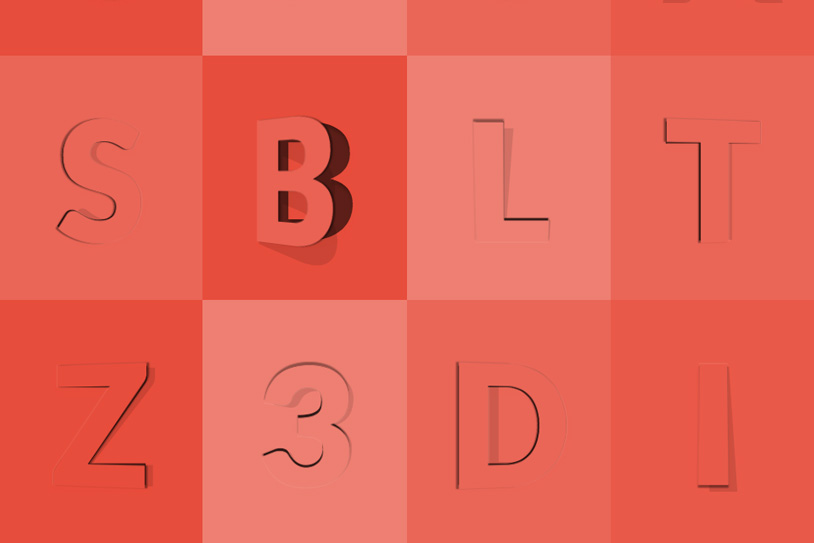
This is how our opening effect works. Beyond this, we can change the opening direction of the letters, playing with the transform-origin, the axis of rotation, the skew angle and some minor tweaks. The following style is an example of how our effect works in the bottom direction:
.ot-letter-bottom span:before,
.ot-letter-bottom span:after {
	transform-origin: 50% 0;
}

.ot-letter-bottom span:before {
	transform: scale(1,1.05) skew(4deg,0deg);
}

.ot-letter-bottom span:after {
	text-shadow:
		0px -1px 0px hsla(360, 100%, 100%, 0.1),
		0px 3px 1px hsla(0, 0%, 0%, 0.4);
	transform: rotateX(15deg);
}

.ot-letter-bottom:hover span:before {
	transform: translateY(-0.035em) scale(1,1.2) skew(10deg,0deg);
}

.ot-letter-bottom:hover span:after {
	transform: translateY(0.045em) rotateX(40deg);
}
As you can see, the transform-origin is always on the opposite side of the opening and the text-shadow is adjusted following the same logic.
Also, the axis of rotation is changed to the X-Axis and both, the scale and skew of the shadow pseudo-element are set to follow the direction of the light (as much as we can). As a final touch, we shifted both pseudo-elements using translateY to clear a little offset of the hinge.
That’s pretty much it, I hope you liked this tutorial and found it useful. Thank you for reading!



Beautiful effect. Thanks Diego.
Amazing !!! Thanks
This would make a good calender effect for Christmas, thanks!
Wow ! that’s crazy !!!
nice effects. cheers!
Thanks. Now i am thinking where can i use this effect 🙂 Offtop: please add attributes to comment form for disabling autocapitalization and keyboard settings for email and website on mobile devices.
Wow! Incredible cool! 🙂
Incredible! Master!
This is amazing!
Wow! That’s very impressive
I’ll use it on my future projects
Thank you! 😀
cool
Works incredibly well on IE11 too…
Very very nice….
original idea, nice \m/
Cool Idea, Nice.
Just great. Loved the animation of my name’s first letter.Cheers!
Really cool – thanks for sharing 🙂
Perfect Tutorial, Thanks for this awesome sharing…
That awesome tutorial, many tks Diego Pardo for sharing
Pretty cool?
This what we call awesome.Keep it up developer.
You could use this to make a pretty cool web based advent calendar. You could use jQuery to only allow people to see behind the right doors for the date of the month.
Way awesome! I’m using custom @font-faces with this technique for a holiday e-card and the effect is so realistic!
Wow!
Awesome!
how do I apply the same effect on fonts from http://icomoon.io/ ?
Thank you so much,this is awesome!:)
Awesome!
I am sooo impressed with codrops in general, every tutorial and effects are so awesome… great job, I have this site on my visible bookmarks 24/7 🙂
Great example
very nice tutorial
Awesome.. effects.. i love all of them
excellen post…. i have sn ask for you.. i need someone type of license for take some templates for a organizational webpage.?
Awesome
Perfecto! Me encanta mucho! Great work.
Amazing Work Man.. Keep it up..
Just wanted to give some feedback: Looks great in SAFARI 9.x (webkit).